
Recommended
More Related Content
What's hot
What's hot (16)
Viewers also liked
Viewers also liked (17)
Similar to Preliminary shot presentation
Similar to Preliminary shot presentation (20)
Recently uploaded
Recently uploaded (20)
Preliminary shot presentation
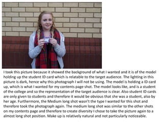
- 1. I took this picture because it showed the background of what I wanted and it is of the model holding up the student ID card which is relatable to the target audience. The lighting in this picture is dark, hence why this photograph I will not be using. The model is holding a ID card up, which is what I wanted for my contents page shot. The model looks like, and is a student of the college and so the representation of the target audience is clear. Also student ID cards are only given to students and therefore it would be obvious that she was a student, also by her age. Furthermore, the Medium long shot wasn’t the type I wanted for this shot and therefore took the photograph again. The medium long shot was similar to the other shots on my contents page and therefore to create diversity I chose to take the picture again to a almost long shot position. Make up is relatively natural and not particularly noticeable.
- 2. This photograph is one of the photos I will not be using. The reason for this is, that although the colours are bright, it is next to some paintings and does not link in with the rest of my magazine, in hindsight. This photograph is also off centered slightly which may not work in the structure of the contents page and the way I want them. Also there is a lot of dead space on the left side which is blank and dark making the photograph less appealing again. Make up on this shot is unnoticeable.
- 3. This is also very similar to the picture before, but this includes more of the background and looks slightly cluttered and too much to look at, hence why the other picture is what I will be using. This image is also less bright and is dimmed lighting on the face and is focused on the right of the image, this means it will be less appealing than if the light was focused on the model’s face entirely.
- 4. This is the image that will not be on my front cover, the reason for this, is because it is slightly blurry. The lighting is also slightly dark in some areas and the model is slanted.
- 5. This photograph I will be using on my contents page, also and it is good because it has the main reception area in the background and also the colourful building. This is good because for other people, for example parents who may read the magazine will be able to see where the main building is. Also, the costume the model is wearing is ordinary clothes, which fit into the relaxed and student lifestyle. The props are a waterbottle and pencil case insinuating that the student is ready to learn and go to class. The lighting is good as it was taken outside and it was bright. Furthermore, the colourful building is eye catching and will stand out. This is the building most students come in first to get to their lessons and so it is very familiar to all students.
- 6. This photograph is one I will be using in my contents page. This was taken in the canteen area of the sixth form making it a familiar place for students to hang out during breaks and lunch. The setting is relaxed and chilled, giving that vibe to the magazine. The chairs are placed around the tables to show a group sitting and the mise-en-scene props are a folder and pens with the model writing. This represents what the target audience would do and can relate to. The lighting is fairly good, with lots of light where it is focused on the main model and also the background. Acting is pretending to write on a folder.
- 7. This shot is what I will be using on my contents page, the lighting is better in the photograph as there is more light from the wall as apposed to the previous picture where more darkness was visible. A lighter picture will look better on a contents page as it helps it to stand out. The model is in the middle of the image and I will probably crop the sides out. This shot is more of a long shot and adds variety to the other shots and therefore I have mediated it. In this photograph the college ID is also visible but not as much, which is better as details don’t need to be shown. The representation that this photograph is giving off is that college is a relaxed atmosphere, this can be seen by the casual clothing and the smile on the model’s face.
- 8. This picture I will be using in my contents page, also. It is of the model reading a book in the library. The model is wearing no make up and is wearing very casual clothing. The lighting in this photo is good as it is bright and also some of the light is reflected onto the books on the bookshelf highlighting the wide range of books the library has. The target audience may be familiar with the library and it’s surroundings. The lighting is done well as it also reflects off the model’s hair aswell. The representation of the model is that student who come to this college are hard working and dedicated. Here you can see more of the model’s face as apposed to the other picture where it is covered slightly.
- 9. This image will be on my front cover, the reason for this, is because the lighting is good on this photograph, also the representation of this photograph is that the student is hard working and this is the front cover main image. The front cover is what the target audience will see first. The props used in this photograph are 2 folder and this links with the representation of a ‘good’ student and the model’s wearing glasses further linking to the student representation. The model is a student and is wearing casual clothing and natural style make up. The setting and background is white faint brick wall which is plain and good for a background as it will be easy to put coverlines and straplines on top and it will be easily visible to see.