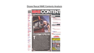
2. The NME masthead is in big block capitals which is
also in red. This is to stand out on the contents page
as there is very little red on the rest of the page. The
white outline also helps it get noticed. This shows the
brand identity.
The contents is in a similar font but this time in white.
Its’s once again in the font of big block capitals. Though
there being a lot of white on the contents, the fact its
placed on top of a black background, the contrast is
clear and allows it to be noticed.
The articles title and content is in black and quite
standard font. It’s clear to see due to the white
behind it. It’s split up into different sub-headings of
‘NEWS’, ‘REVIEWS’ and ‘PLUS’. The page numbers are
in red to stand out due to it being on a white
background, next to black text and the lack of red on
the page.
The contents defies the typical codes and
conventions and it doesn’t include the main cover
star. The main image is a blonde girl pointing towards
a bus. This is a mid shot. The bus is meant to
resemble the tour which is mentioned in the article.
The main image is linked to the editorial letter.
The date of the issue is placed just underneath
the ‘contents’ text. It’s not very big as it’s
important but not massively vital to be seen.
The address of the text in the article is direct as
seen from the word ‘you’, it’s not heavily direct
but is still. The register of the text is quite
informal which allows the reader to feel more
comfortable to relax and read the magazine.
The house style is quite similar to the front cover with the
use of white not as much red but still a slight use.
However there is a very heavy use of black on the
contents page which wasn’t used on the cover. The house
style of the contents page is white and black with slight
use of red.
The sub-headings, similar to the ‘contents’ heading, is
clear due to the white block capital font contrasting
with the black background. It’s important that this is
easily noticeable as it directs the readers to the
different types of articles.
The main article’s title is again the white capital
letters placed on the black background, this seems
to be a theme on the contents page. It’s trying to
create the effect of a faded font on, what appears
to be, a blackboard. This slightly prevents it from
standing out due to this, the only reason it does is
because its placed very centralised on the page.
They have added a promotional puff which includes
their social media. It has a picture, which other than
the main image there isn’t another on the page, to
help it stand out. On top of this they have a black
border with yellow and white font. There is no yellow
elsewhere on the page so it definitely stands out. Also
it’s in the terminal area, which helps it get noticed.
The mise-en-scene is very different from the front
cover. It’s not as urban as it is on the front cover.
There is nothing too significant to say about mise-
en-scene on the main image here. This suggests
that their main intention is to just direct the
reader to the specific article(s) they are looking
for.
3. The editor’s letter is so large I believe
is to help fill up the page. The main
image is slightly related as the bus is
meant to connote the ‘tour’ that is
mentioned in the article. It is a
summary of the articles and gives
more information about them. It
directs them to the page they can
find each of these articles. This is
following codes and conventions as it
is very common to see an editorial
letter on the contents page.