
Recommended
More Related Content
What's hot
What's hot (17)
Viewers also liked
Viewers also liked (20)
Similar to Front cover page analysis
Similar to Front cover page analysis (20)
Recently uploaded
Recently uploaded (20)
Front cover page analysis
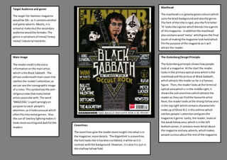
- 1. Target Audience and genre The target for Hammermagazine wouldbe 20+, as it containsalcohol and game adverts.Mostly,itis aimedat malesbutthe secondary audience wouldbe females.The genre isvariationsof metal/heavy metal/industrial metaletc. Main Image The model creditisthe extra informationonthe mainartist, whichisthe Black Sabbath. The phrase underneathmaincoverline catchesthe reader’sattention;as we can see the iconographicimage of a cross.This symbolisesthe anti- religiousviewthatmanymetal artistsassociate with.The word ‘MAGICKAL’isspeltwronglyon purpose tocatch people’s attention,asitlooksunusual which oftenfitsintometal genres. Also the use of lowkeylightingmakesit looksmore excitinganddarkforthe readers. Masthead The mastheadisin gloomygreencolourswhich suitsthe blackbackgroundand alsothe genre. The font of the title isrigid,alsothe firstletter ‘H’ lookslike aguitarwhichblendsintoagenre of thismagazine. Inadditionthe masthead alsocontainsword‘meta;’whichgivesthe final touch of makingthe magazine lookhardwhich fitsthe purpose of the magazine asit will attract the reader. The GutenbergDesignPrinciple The Gutenbergprinciple showshowpeople lookat a magazine.Atthe start the reader looksinthe primaryoptical area whichisthe mastheadandthe picture of BlackSabbath, whichattracts the readeras he isa famous figure. Then,the readerlooksatthe terminal optical areawhichis inthe middle right,it showsthe subcoverlineswhichattractsthe readeras theycan findthe favourite artist. Next,the readerlooksatthe strong fallowarea inthe topright whichcontainscharacteristic make up of Ghost B.C inthiseditionwhich catchespeople’sattentionandgivesthe magazine itgenre.Lastly,the reader,looksat the weakfallowarea,whichisinthe left bottomcorner,it containsmore detail about the magazine andany adverts,whichmakes people curiousaboutthe restof the magazine. Coverlines The coverlinesgive the readermore insight intowhatisin the magazine;more details.‘The Algorithm’isacoverline, the fontlookslike ithasbeenscribbled,itwhite soitin contrast withthe background.However,itisalsoitis put in the shallowfallowfield.
- 2. Model credit The main image isof KingDiamond,BlackSabbathand Ghost B.C.As thisimagesare justbelowthe masthead.These imagessymboliseimportance of themand probablythe mainsubjectinthiseditionof Hammer. Aswe lookat howthe musicianlookwe canassociate thiswithmetal,the use of blackcolourssymbolise dangerbut alsosomethingdeepandheavy.Also,the satanicmake upof Ghost face makesthismagazine lookeerie andtherefore thisimpliesthatthe use of lowkey lightingmakesthe readerknowthatisa metal magazine.The atmosphere created makesthe audience be interestedinthiskindof genre.Especially,asBlackSabbath isa knownband. Main CoverLine The main coverline isthe ‘BLACKSABBATH’as thiseditionof Hammerfocuseson thisband,whichishighlypopularamongstmetal fans,asthisbandis quite importance asin the pedestal f othermetal bands.Therefore,BlackSabbathhasthe creditof beingon the maincoverline.Also,the fontsuitsthiskindof magazine asit standsout, andthe eye inthe middle makesitlookbizarre;whichisdone on purpose tocatch the reader’sattentionaspeople whoare intometal genre are also intodemonicdarkcoloursand unusual fonts. Colours/Typefaces/House style The type of house style of the Hammermagazine isconsistentasthe mastheadisusuallyonthe top,and the maincover line isinthe middle. Thisgivesthe audience asense of familiarisationasthe readersare used to it.Also,the constantuse of lowkeylightingsuitsthe genre andstyle of the magazine. Lastly,the use of gruesome image andsatanicsensations fitsto the target audience. Banners/Flashes/badges The bannersusedinthismagazine are thissame colour masthead. The bannerof a star inthe circle createsa satanicatmosphere andtherefore suitsthe metal genre.The advertof ‘VipTickets’attractsthe readeras the readermightgatherticketforthe favourite band.Atthe endan iconic fontof howRammsteinisspeltgive afamiliarlookforthe audience of that band;alsothe provocative quote togowithitattracts the readers as it contextinterestmany people.