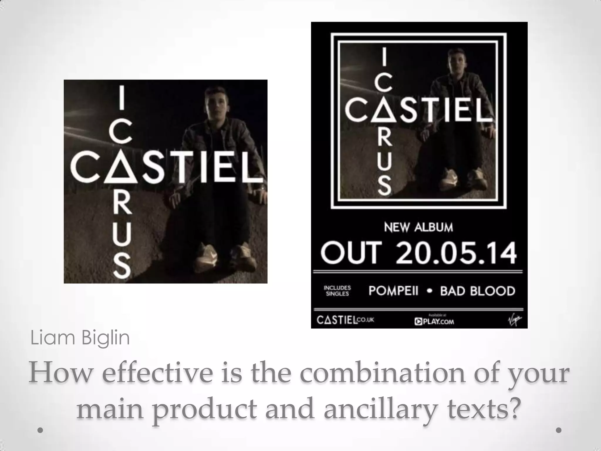
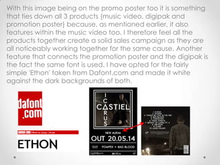
This document discusses the author's creation of ancillary texts like a digipak and promotional poster to accompany a music video.
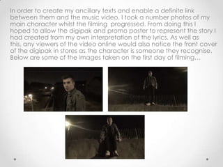
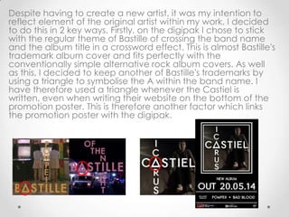
The author took photos during filming to use on the digipak and poster to represent the story and make the character recognizable. The same image is used in the closing scene of the video and on the digipak cover to create a connection.
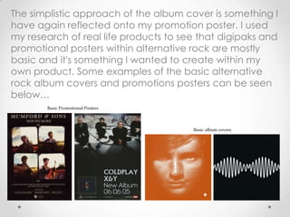
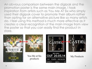
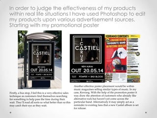
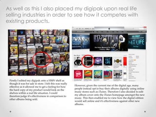
Both the digipak and poster use a simple, basic design inspired by other alternative rock artists. They feature the same main image and font to clearly connect the products. Placement of the poster at a bus stop and in music magazines could effectively promote the band. Photoshop was used to see how the digital and physical copies of the