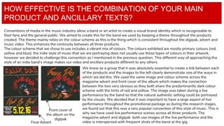
The combination of the band's main album, digipak, and magazine advertisement was very effective due to consistent use of themes, colors, fonts, and imagery across all three products. A vibrant color scheme including red, yellow, and blue was used throughout, with live performance photos matching between the front cover, digipak, and music video. The same fonts featured on the band's own work were adapted for the products to feel authentic while coordinated colors created visual links between items promoting the album. Feedback confirmed the products clearly promoted the same band through their connected design.