Question 2
How effective is the combination
of your main and ancillary texts?
By: Maximilian Mayo-Dell
My Three Texts
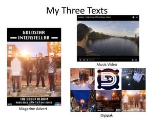
Magazine Advert
Music Video
Digipak
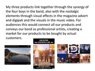
My three products link together through the synergy of
the four boys in the band, also with the nostalgic
elements through visual effects in the magazine advert
and digipak and the visuals in the music video. For
audiences this would connect all our products and
conveys our band as professional artists, creating a
market for our products to be bought by actual
customers.
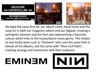
We kept the same font for our album name, band name and the
song list in both our magazine advert and our digipak, creating a
synergistic element and the font also representing a futuristic
culture which links to the house/dance music genre. This relates
to real media texts such as “Eminem” who uses the same font in
almost all his albums, and the same with “Nine Inch Nails”,
creating synergy and connection with their audience.
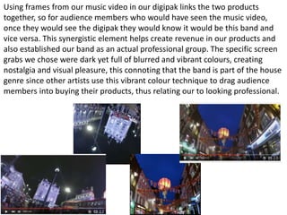
Using frames from our music video in our digipak links the two products
together, so for audience members who would have seen the music video,
once they would see the digipak they would know it would be this band and
vice versa. This synergistic element helps create revenue in our products and
also established our band as an actual professional group. The specific screen
grabs we chose were dark yet full of blurred and vibrant colours, creating
nostalgia and visual pleasure, this connoting that the band is part of the house
genre since other artists use this vibrant colour technique to drag audience
members into buying their products, thus relating our to looking professional.
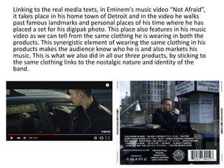
Linking to the real media texts, in Eminem's music video “Not Afraid”,
it takes place in his home town of Detroit and in the video he walks
past famous landmarks and personal places of his time where he has
placed a set for his digipak photo. This place also features in his music
video as we can tell from the same clothing he is wearing in both the
products. This synergistic element of wearing the same clothing in his
products makes the audience know who he is and also markets his
music. This is what we also did in all our three products, by sticking to
the same clothing links to the nostalgic nature and identity of the
band.
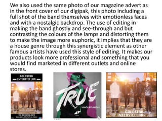
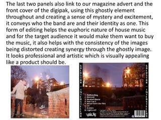
We also used the same photo of our magazine advert as
in the front cover of our digipak, this photo including a
full shot of the band themselves with emotionless faces
and with a nostalgic backdrop. The use of editing in
making the band ghostly and see-through and but
contrasting the colours of the lamps and distorting them
to make the image more euphoric, it implies that they are
a house genre through this synergistic element as other
famous artists have used this style of editing. It makes our
products look more professional and something that you
would find marketed in different outlets and online
stores.
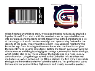
When finding our unsigned artist, we realised that he had already created a
logo for himself, from which with his permission we incorporated the idea
into our digipak and magazine advert. However we edited and changed a lot
of the design so it would create a nostalgic and eye catching feature for the
identity of the band. This synergistic element lets audiences members who
know the logo from listening to the music know who the band is and gives
them identity and in some cases fame. Editing the logo in such a way with the
vibrant colours and the glistening lights conveys a journey like feel to the logo,
which relates also to our music video of the band going on a huge journey
around London. Using the logo as well as the CD holder links to other real
media texts as when pulling out the CD in a digipak, the first thing it reveals is
the logo and hence the identity of who the band are. This professional styled
look created our product into a high valued and visually enjoyable product.
The last two panels also link to our magazine advert and the
front cover of the digipak, using this ghostly element
throughout and creating a sense of mystery and excitement,
it conveys who the band are and their identity as one. This
form of editing helps the euphoric nature of house music
and for the target audience it would make them want to buy
the music, it also helps with the consistency of the images
being distorted creating synergy through the ghostly image.
It looks professional and artistic which is visually appealing
like a product should be.
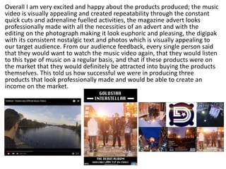
Overall I am very excited and happy about the products produced; the music
video is visually appealing and created repeatability through the constant
quick cuts and adrenaline fuelled activities, the magazine advert looks
professionally made with all the necessities of an advert and with the
editing on the photograph making it look euphoric and pleasing, the digipak
with its consistent nostalgic text and photos which is visually appealing to
our target audience. From our audience feedback, every single person said
that they would want to watch the music video again, that they would listen
to this type of music on a regular basis, and that if these products were on
the market that they would definitely be attracted into buying the products
themselves. This told us how successful we were in producing three
products that look professionally made and would be able to create an
income on the market.

Evaluation Question 2

  • 1.
    Question 2 How effectiveis the combination of your main and ancillary texts? By: Maximilian Mayo-Dell
  • 2.
    My Three Texts MagazineAdvert Music Video Digipak
  • 3.
    My three productslink together through the synergy of the four boys in the band, also with the nostalgic elements through visual effects in the magazine advert and digipak and the visuals in the music video. For audiences this would connect all our products and conveys our band as professional artists, creating a market for our products to be bought by actual customers.
  • 4.
    We kept thesame font for our album name, band name and the song list in both our magazine advert and our digipak, creating a synergistic element and the font also representing a futuristic culture which links to the house/dance music genre. This relates to real media texts such as “Eminem” who uses the same font in almost all his albums, and the same with “Nine Inch Nails”, creating synergy and connection with their audience.
  • 5.
    Using frames fromour music video in our digipak links the two products together, so for audience members who would have seen the music video, once they would see the digipak they would know it would be this band and vice versa. This synergistic element helps create revenue in our products and also established our band as an actual professional group. The specific screen grabs we chose were dark yet full of blurred and vibrant colours, creating nostalgia and visual pleasure, this connoting that the band is part of the house genre since other artists use this vibrant colour technique to drag audience members into buying their products, thus relating our to looking professional.
  • 6.
    Linking to thereal media texts, in Eminem's music video “Not Afraid”, it takes place in his home town of Detroit and in the video he walks past famous landmarks and personal places of his time where he has placed a set for his digipak photo. This place also features in his music video as we can tell from the same clothing he is wearing in both the products. This synergistic element of wearing the same clothing in his products makes the audience know who he is and also markets his music. This is what we also did in all our three products, by sticking to the same clothing links to the nostalgic nature and identity of the band.
  • 7.
    We also usedthe same photo of our magazine advert as in the front cover of our digipak, this photo including a full shot of the band themselves with emotionless faces and with a nostalgic backdrop. The use of editing in making the band ghostly and see-through and but contrasting the colours of the lamps and distorting them to make the image more euphoric, it implies that they are a house genre through this synergistic element as other famous artists have used this style of editing. It makes our products look more professional and something that you would find marketed in different outlets and online stores.
  • 8.
    When finding ourunsigned artist, we realised that he had already created a logo for himself, from which with his permission we incorporated the idea into our digipak and magazine advert. However we edited and changed a lot of the design so it would create a nostalgic and eye catching feature for the identity of the band. This synergistic element lets audiences members who know the logo from listening to the music know who the band is and gives them identity and in some cases fame. Editing the logo in such a way with the vibrant colours and the glistening lights conveys a journey like feel to the logo, which relates also to our music video of the band going on a huge journey around London. Using the logo as well as the CD holder links to other real media texts as when pulling out the CD in a digipak, the first thing it reveals is the logo and hence the identity of who the band are. This professional styled look created our product into a high valued and visually enjoyable product.
  • 9.
    The last twopanels also link to our magazine advert and the front cover of the digipak, using this ghostly element throughout and creating a sense of mystery and excitement, it conveys who the band are and their identity as one. This form of editing helps the euphoric nature of house music and for the target audience it would make them want to buy the music, it also helps with the consistency of the images being distorted creating synergy through the ghostly image. It looks professional and artistic which is visually appealing like a product should be.
  • 10.
    Overall I amvery excited and happy about the products produced; the music video is visually appealing and created repeatability through the constant quick cuts and adrenaline fuelled activities, the magazine advert looks professionally made with all the necessities of an advert and with the editing on the photograph making it look euphoric and pleasing, the digipak with its consistent nostalgic text and photos which is visually appealing to our target audience. From our audience feedback, every single person said that they would want to watch the music video again, that they would listen to this type of music on a regular basis, and that if these products were on the market that they would definitely be attracted into buying the products themselves. This told us how successful we were in producing three products that look professionally made and would be able to create an income on the market.