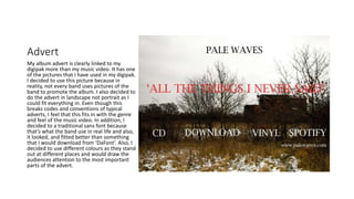
How effective is the combination
of your main product and your
ancillary texts?
Music Video.
For my music video, I have used a song from
indie pop band Pale Waves called ‘Television
Romance’. In this song, I have decided to
have the protagonist ‘running’ away from her
problems – her boyfriend- who we never
meet- but is central to the storyline. I
decided to only have the main singer of the
band as my main protagonist as its not sole
performance piece. In most of Pale Waves’
music videos, it normally is the lead singer.
The main message/theme of the music video
is trying to get away from a toxic relationship
which is shown through shots. As well as this,
before the end of the music video, she is
talking in-between shots which shows the
audience that she is just a normal girl.
https://www.youtube.com/watch?v=Qkt3BUuVxGw
This is the video so here you can see that the toxicity is very
prominent. Above is the link so you will be able watch the
music video in full.
As the screen grabs show, they fit in with the brand identity and the reoccurring motifs that have developed throughout
the video are clearly evident.
Digipak side 1
On the first side of my digipak,
the pictures clearly link with the
music video as there is a picture
of the main singer and the
actress of the band. The back
picture clearly displays the songs
that will be on the album with all
the conventional information
that is on the back of an album.
Like Pale Waves, the band is a 4
piece made up of 2 boys and 2
females. I decided to have them
to be spaced apart because that’s
a convention of an indie pop
band – spaces between them to
create a sense of tension.
According to the Uses and Gratifications Theory, my first side of my digipak offers
community as when people by it, they might have a friend or a member of family
who like this artist so they might share it and talk about it within the community
that they’re in; whether that is friends or family. Also, the Uses and Gratifications
theory links with my side one of my digipak as it offers personal identity. This is
because a fan for example, might relate to the songs on the back of the digipak.
Digipak side 2
This is the second side of my digipak. Again,
this is fairly identifiable with the brand that I
am going for. I have decided to do the inside
left a different colour as it would be very
generic and the colours would be very
generic and therefore quite boring to look at.
Again, this goes with the combination with
the music video as the main protagonist is
featured on the inside cover with the rest of
her band mates. With three other photos of
the photoshoot. I used clouds to represent
the freedom from the toxicity of the
relationship she is in in the music video. And
then I used a track to represent the her long
road to freedom.
Advert
My album advert is clearly linked to my
digipak more than my music video. It has one
of the pictures that I have used in my digipak.
I decided to use this picture because in
reality, not every band uses pictures of the
band to promote the album. I also decided to
do the advert in landscape not portrait as I
could fit everything in. Even though this
breaks codes and conventions of typical
adverts, I feel that this fits in with the genre
and feel of the music video. In addition, I
decided to a traditional sans font because
that’s what the band use in real life and also,
it looked, and fitted better than something
that I would download from ‘DaFont’. Also, I
decided to use different colours as they stand
out at different places and would draw the
audiences attention to the most important
parts of the advert.
In conclusion…
Overall, my promotional package is evidentially linked thematically,
visually and generically as they all follow the same theme of freedom
and release. Furthermore, this also makes my promotional package
effective and coherent in what I was aiming to achieve. In addition, the
typography and the colours throughout the promotional package,
means I have constructed a brand style that my potential fan base and
easily recognise and identify with.

Evaluation question 2x

  • 1.
    How effective isthe combination of your main product and your ancillary texts?
  • 2.
    Music Video. For mymusic video, I have used a song from indie pop band Pale Waves called ‘Television Romance’. In this song, I have decided to have the protagonist ‘running’ away from her problems – her boyfriend- who we never meet- but is central to the storyline. I decided to only have the main singer of the band as my main protagonist as its not sole performance piece. In most of Pale Waves’ music videos, it normally is the lead singer. The main message/theme of the music video is trying to get away from a toxic relationship which is shown through shots. As well as this, before the end of the music video, she is talking in-between shots which shows the audience that she is just a normal girl. https://www.youtube.com/watch?v=Qkt3BUuVxGw This is the video so here you can see that the toxicity is very prominent. Above is the link so you will be able watch the music video in full.
  • 3.
    As the screengrabs show, they fit in with the brand identity and the reoccurring motifs that have developed throughout the video are clearly evident.
  • 4.
    Digipak side 1 Onthe first side of my digipak, the pictures clearly link with the music video as there is a picture of the main singer and the actress of the band. The back picture clearly displays the songs that will be on the album with all the conventional information that is on the back of an album. Like Pale Waves, the band is a 4 piece made up of 2 boys and 2 females. I decided to have them to be spaced apart because that’s a convention of an indie pop band – spaces between them to create a sense of tension. According to the Uses and Gratifications Theory, my first side of my digipak offers community as when people by it, they might have a friend or a member of family who like this artist so they might share it and talk about it within the community that they’re in; whether that is friends or family. Also, the Uses and Gratifications theory links with my side one of my digipak as it offers personal identity. This is because a fan for example, might relate to the songs on the back of the digipak.
  • 5.
    Digipak side 2 Thisis the second side of my digipak. Again, this is fairly identifiable with the brand that I am going for. I have decided to do the inside left a different colour as it would be very generic and the colours would be very generic and therefore quite boring to look at. Again, this goes with the combination with the music video as the main protagonist is featured on the inside cover with the rest of her band mates. With three other photos of the photoshoot. I used clouds to represent the freedom from the toxicity of the relationship she is in in the music video. And then I used a track to represent the her long road to freedom.
  • 6.
    Advert My album advertis clearly linked to my digipak more than my music video. It has one of the pictures that I have used in my digipak. I decided to use this picture because in reality, not every band uses pictures of the band to promote the album. I also decided to do the advert in landscape not portrait as I could fit everything in. Even though this breaks codes and conventions of typical adverts, I feel that this fits in with the genre and feel of the music video. In addition, I decided to a traditional sans font because that’s what the band use in real life and also, it looked, and fitted better than something that I would download from ‘DaFont’. Also, I decided to use different colours as they stand out at different places and would draw the audiences attention to the most important parts of the advert.
  • 7.
    In conclusion… Overall, mypromotional package is evidentially linked thematically, visually and generically as they all follow the same theme of freedom and release. Furthermore, this also makes my promotional package effective and coherent in what I was aiming to achieve. In addition, the typography and the colours throughout the promotional package, means I have constructed a brand style that my potential fan base and easily recognise and identify with.