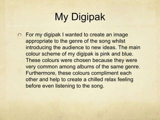
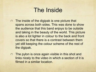
The document discusses the design and purpose of a digipak and magazine advertisement for a band's new album. The digipak uses a pink and blue color scheme inspired by other albums in the same genre. It features photos related to the band's music video, including images of a pylon, to create branding and links between the products. The ad in the magazine also uses the front cover photo for consistency. Together, the digipak, ad, and music video employ genre-related codes and imagery of a pylon to promote the band and form connections that will increase audience recognition and satisfaction.
Drawing a clothed figure presents the challenge of drawing drapery in addition to the usual figure structure and gives you the opportunity to add a narrative element to the drawing.
Prepare several sheets of paper using free-form ink wash, salt, maybe Gesso. After it's completely dry, draw any subject of your choosing on top - in pencil, ink. charcoal, marker - letting the color fall where it may. Or you can find shapes in the washes and elaborate on them.
Presentation used during the CMSDay 2014 for the innovation backend.
The format was Pecha Kucha, meaning I had 20 seconds per slides and only 20 slides to explain what is the innovation in Magnolia CMS.
Obviously the jury liked the presentation because Magnolia won the award.
Here the video https://www.youtube.com/watch?v=i8DdBHuN07I&list=UUJad-in7fKuulw4dkyWK8Iw#t=1535
Model Attribute Check Company Auto PropertyCeline George
In Odoo, the multi-company feature allows you to manage multiple companies within a single Odoo database instance. Each company can have its own configurations while still sharing common resources such as products, customers, and suppliers.
Students, digital devices and success - Andreas Schleicher - 27 May 2024..pptxEduSkills OECD
Andreas Schleicher presents at the OECD webinar ‘Digital devices in schools: detrimental distraction or secret to success?’ on 27 May 2024. The presentation was based on findings from PISA 2022 results and the webinar helped launch the PISA in Focus ‘Managing screen time: How to protect and equip students against distraction’ https://www.oecd-ilibrary.org/education/managing-screen-time_7c225af4-en and the OECD Education Policy Perspective ‘Students, digital devices and success’ can be found here - https://oe.cd/il/5yV
How to Make a Field invisible in Odoo 17Celine George
It is possible to hide or invisible some fields in odoo. Commonly using “invisible” attribute in the field definition to invisible the fields. This slide will show how to make a field invisible in odoo 17.
The French Revolution, which began in 1789, was a period of radical social and political upheaval in France. It marked the decline of absolute monarchies, the rise of secular and democratic republics, and the eventual rise of Napoleon Bonaparte. This revolutionary period is crucial in understanding the transition from feudalism to modernity in Europe.
For more information, visit-www.vavaclasses.com
Unit 8 - Information and Communication Technology (Paper I).pdfThiyagu K
This slides describes the basic concepts of ICT, basics of Email, Emerging Technology and Digital Initiatives in Education. This presentations aligns with the UGC Paper I syllabus.
Instructions for Submissions thorugh G- Classroom.pptxJheel Barad
This presentation provides a briefing on how to upload submissions and documents in Google Classroom. It was prepared as part of an orientation for new Sainik School in-service teacher trainees. As a training officer, my goal is to ensure that you are comfortable and proficient with this essential tool for managing assignments and fostering student engagement.
The Art Pastor's Guide to Sabbath | Steve ThomasonSteve Thomason
What is the purpose of the Sabbath Law in the Torah. It is interesting to compare how the context of the law shifts from Exodus to Deuteronomy. Who gets to rest, and why?
MARUTI SUZUKI- A Successful Joint Venture in India.pptx
Evaluation Question 2
1. How effective is the
combination of your
main product and
ancillary texts?
2. The Purpose of my Digipak
and Magazine Advert
The primary purpose of the digipak and advert is
to promote the artist, song and album to an
audience. This has been prominent within the
music industry for many years and is the most
common way of advertising an artist.
The theme of the digipak and advert usually
comes from ideas portrayed in the video and
from the genre of music. This is to help identify
one artist form another.
3. My Digipak
For my digipak I wanted to create an image
appropriate to the genre of the song whilst
introducing the audience to new ideas. The main
colour scheme of my digipak is pink and blue.
These colours were chosen because they were
very common among albums of the same genre.
Furthermore, these colours compliment each
other and help to create a chilled relax feeling
before even listening to the song.
4. My Front Cover
When creating the front cover of my digipak I wanted to
advertise the bands name above anything else as they are
a relatively new band, I achieved this by having the only
text on the front cover as the bands name. Furthermore,
my front cover follows many codes and conventions of
similar product by having a pink and blue theme along with
a solitary person on the front. However, this challenges
conventions of other products by having a band member
on the front rather than a random character.
The front cover links to my main product by using a similar
location to where the video is filmed. This is evident by the
pylon in the background and the plants surrounding the
band member. This creates a link for the audience to make,
and once the link is made it fulfills the audiences need for
completion which subliminally makes the consumer more
satisfied with the product.
5. The Back Cover
When it come to my back cover I decided to keep
the theme of pink and blue but slightly change it
from the front cover by having a different subject.
The back cover still uses a picture of a pylon
which links to a scene in my music video and it
also helps break up the very large section of blue
and pink.
I kept the design of the back very simple and
clean which keeps the digipak looking fresh and
aesthetically pleasing.
6. The Inside
The inside of the digipak is one picture that
spans across both sides. This was done to show
the audience that this band enjoys to be outside
and taking in the beauty of the world. This picture
is also a lot lighter in colour to the back and front
covers so that there is a contrast between them
yet still keeping the colour scheme of the rest of
the digipak.
The pylon is once again visible in this shot and
links nicely to the video in which a section of it is
filmed in a similar location.
7. The Magazine Advert
For my magazine advert I used the same image
used on the digipak front cover. This adds
consistency between the product and the
marketing and means that once the auidence
has seen this advert they will easily be able to
recognise the album when in a shop - this could
link to Maslow's Heirarchy of needs in which the
consumer will see the album and when they fit
the two together (discovering that he's seen the
album before in that advert) he will fulfill his need
for 'completion' and this will make the consumer
more likely to buy the album.
8. The Video
My video has many links to my digipak and advert.
The first and most obvious is the image of a pylon
appearing in the video as well as all the images on
the digipak. This was done to create a brand identity
for the band so that any image of a pylon that the
consumer sees will help promote the album.
I also believe that there is a strong link between my
video and ancillary tasks through the genre they all
represent. Each piece of work includes different
codes and conventions that are associated with the
alternative rock genre and this helps to create
continuity between each of the products.