The digi-pak and music video were effectively connected through shared bright colors. A rebellious feel was prominent in both through unconventional designs.
The album advert and digi-pak were also connected through their adherence to conventions - both featured the album cover art. This consistency created brand recognition.
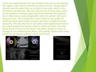
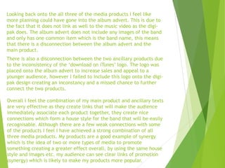
A grey scale color scheme linked all three products and reinforced themes of rebellion, simplicity, and raw music associated with indie rock. Lighting beams in the music video were also featured in the logo designs of the ancillary products.
However, the album advert could have been better connected to the music video by including images of the band. And the "download on iTunes" logo was inconsistently used