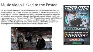
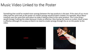
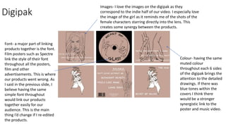
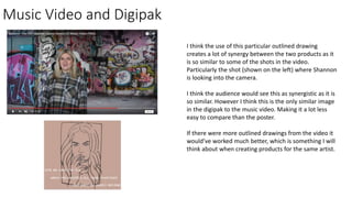
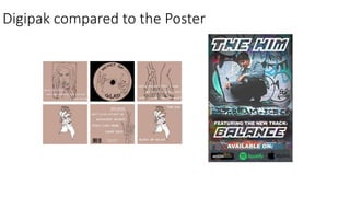
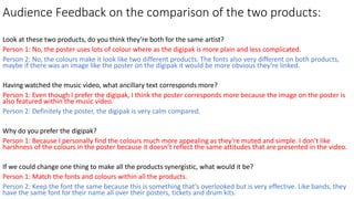
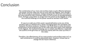
How effective is the
combination of your media
product and ancillary texts?
Emily Willmer 6193
Link to Music Video: Balance- The Him (Bastian Lorenz Remix)
Introduction
I’ve produced three media products for the artist Bastian Lorenz. Having used his song we created the music video,
digipak and poster. Even though I think the music video is the perfect fit for the song, I’m not sure our products as a
whole have a synergistic link. However I still think they all appeal to our over all teenage/ young adult, target
audience as they’re current and colourful.
The most successful product we created is the music video, our research and planning all had a huge part to play
because without this I personally believe the video would not have made sense or link together. I then think the
poster is our second most impressive product, it has the most synergy with the video. This is probably because it’s
based in the same location as one of the scenes. Lastly, I think the digipak has the least amount of synergy because
of the colours and different fonts. However, I really like the product as a whole and so maybe this is something we
could have spotted whilst creating the product.
Music Video Linked to the Poster
The music video linked with the poster both use colour to grab the attention of our
target audience. The location, costume and colouring of the two products creates a
strong link as it’s obvious they’re both products from our group. However, as there’s
two locations within our music video perhaps having the poster located in only one
may through some of the audience off. I think if I was to do the poster again I’d spend
a different day in new costumes and location and do a separate shoot. However, I
really like how the two products have similar colouring within them. Which is why
shooting the location and the poster was successful in some sense.
Music Video Linked to the Poster
Something that could’ve created more synergy between the two products is the text. If the start of our music
video had the same text as the poster an instant synergy would’ve been created. For example, Mura Masa-
Love$ick uses the same font and colour to make it obvious they’re the same product. This is one thing I
would change if editing the video because it looks so effective. Also having the name on a plain, black screen
is effective although it’s so easy as there’s no need to create synergy through the an on the poster to the
video.
Digipak
Colour- having the same
muted colour
throughout each 6 sides
of the digipak brings the
attention to the detailed
drawings. If there was
blue tones within the
covers I think there
would be a stronger
synergistic link to the
poster and music video.
Font- a major part of linking
products together is the font.
Film posters such as Spectre
link the style of their font
throughout all the posters,
film and other
advertisements. This is where
our products went wrong. As
I said in the previous slide, I
believe having the same
simple font throughout
would link our products
together easily for our
audience. This is the main
thing I’d change if I re-edited
the products.
Images- I love the images on the digipak as they
correspond to the indie half of our video. I especially love
the image of the girl as it reminds me of the shots of the
female characters starring directly into the lens. This
creates some synergy between the products.
Music Video and Digipak
I think the use of this particular outlined drawing
creates a lot of synergy between the two products as it
is so similar to some of the shots in the video.
Particularly the shot (shown on the left) where Shannon
is looking into the camera.
I think the audience would see this as synergistic as it is
so similar. However I think this is the only similar image
in the digipak to the music video. Making it a lot less
easy to compare than the poster.
If there were more outlined drawings from the video it
would’ve worked much better, which is something I will
think about when creating products for the same artist.
Digipak compared to the Poster
Audience Feedback on the comparison of the two products:
Look at these two products, do you think they’re both for the same artist?
Person 1: No, the poster uses lots of colour where as the digipak is more plain and less complicated.
Person 2: No, the colours make it look like two different products. The fonts also very different on both products,
maybe if there was an image like the poster on the digipak it would be more obvious they’re linked.
Having watched the music video, what ancillary text corresponds more?
Person 1: Even though I prefer the digipak, I think the poster corresponds more because the image on the poster is
also featured within the music video.
Person 2: Definitely the poster, the digipak is very calm compared.
Why do you prefer the digipak?
Person 1: Because I personally find the colours much more appealing as they’re muted and simple. I don’t like
harshness of the colours in the poster because it doesn’t reflect the same attitudes that are presented in the video.
If we could change one thing to make all the products synergistic, what would it be?
Person 1: Match the fonts and colours within all the products.
Person 2: Keep the font the same because this is something that’s overlooked but is very effective. Like bands, they
have the same font for their name all over their posters, tickets and drum kits.
Conclusion
The combination of our main and ancillary texts is quite effective between
the poster and the video yet not so much with the digipak. Even though I
like all the products produced, I believe keeping the same font and colours
the same would’ve had a dramatic effect on the success of synergy between
them. Perhaps using either an image from the shoot on the digipak or using
the outlined drawings on the poster would’ve worked much better.
If I was to re-edit any of this work I would definitely re-do one of the
ancillary texts as I believe this is what is bringing down the synergistic link
between the three products. However, I do think there is some successful
combination of the products due to the indie style that’s been fully explored
in the digipak. The outlined drawings are so simple and effective, especially
the outline of the girls face as I think this works with the close up shots in
the video.
Therefore, the effectiveness of our main product and ancillary texts isn’t as
well combined as it could’ve potentially been, however I know how to
change this for future reference.

Evaulation 2

  • 1.
    How effective isthe combination of your media product and ancillary texts? Emily Willmer 6193
  • 2.
    Link to MusicVideo: Balance- The Him (Bastian Lorenz Remix)
  • 3.
    Introduction I’ve produced threemedia products for the artist Bastian Lorenz. Having used his song we created the music video, digipak and poster. Even though I think the music video is the perfect fit for the song, I’m not sure our products as a whole have a synergistic link. However I still think they all appeal to our over all teenage/ young adult, target audience as they’re current and colourful. The most successful product we created is the music video, our research and planning all had a huge part to play because without this I personally believe the video would not have made sense or link together. I then think the poster is our second most impressive product, it has the most synergy with the video. This is probably because it’s based in the same location as one of the scenes. Lastly, I think the digipak has the least amount of synergy because of the colours and different fonts. However, I really like the product as a whole and so maybe this is something we could have spotted whilst creating the product.
  • 4.
    Music Video Linkedto the Poster The music video linked with the poster both use colour to grab the attention of our target audience. The location, costume and colouring of the two products creates a strong link as it’s obvious they’re both products from our group. However, as there’s two locations within our music video perhaps having the poster located in only one may through some of the audience off. I think if I was to do the poster again I’d spend a different day in new costumes and location and do a separate shoot. However, I really like how the two products have similar colouring within them. Which is why shooting the location and the poster was successful in some sense.
  • 5.
    Music Video Linkedto the Poster Something that could’ve created more synergy between the two products is the text. If the start of our music video had the same text as the poster an instant synergy would’ve been created. For example, Mura Masa- Love$ick uses the same font and colour to make it obvious they’re the same product. This is one thing I would change if editing the video because it looks so effective. Also having the name on a plain, black screen is effective although it’s so easy as there’s no need to create synergy through the an on the poster to the video.
  • 6.
    Digipak Colour- having thesame muted colour throughout each 6 sides of the digipak brings the attention to the detailed drawings. If there was blue tones within the covers I think there would be a stronger synergistic link to the poster and music video. Font- a major part of linking products together is the font. Film posters such as Spectre link the style of their font throughout all the posters, film and other advertisements. This is where our products went wrong. As I said in the previous slide, I believe having the same simple font throughout would link our products together easily for our audience. This is the main thing I’d change if I re-edited the products. Images- I love the images on the digipak as they correspond to the indie half of our video. I especially love the image of the girl as it reminds me of the shots of the female characters starring directly into the lens. This creates some synergy between the products.
  • 7.
    Music Video andDigipak I think the use of this particular outlined drawing creates a lot of synergy between the two products as it is so similar to some of the shots in the video. Particularly the shot (shown on the left) where Shannon is looking into the camera. I think the audience would see this as synergistic as it is so similar. However I think this is the only similar image in the digipak to the music video. Making it a lot less easy to compare than the poster. If there were more outlined drawings from the video it would’ve worked much better, which is something I will think about when creating products for the same artist.
  • 8.
  • 9.
    Audience Feedback onthe comparison of the two products: Look at these two products, do you think they’re both for the same artist? Person 1: No, the poster uses lots of colour where as the digipak is more plain and less complicated. Person 2: No, the colours make it look like two different products. The fonts also very different on both products, maybe if there was an image like the poster on the digipak it would be more obvious they’re linked. Having watched the music video, what ancillary text corresponds more? Person 1: Even though I prefer the digipak, I think the poster corresponds more because the image on the poster is also featured within the music video. Person 2: Definitely the poster, the digipak is very calm compared. Why do you prefer the digipak? Person 1: Because I personally find the colours much more appealing as they’re muted and simple. I don’t like harshness of the colours in the poster because it doesn’t reflect the same attitudes that are presented in the video. If we could change one thing to make all the products synergistic, what would it be? Person 1: Match the fonts and colours within all the products. Person 2: Keep the font the same because this is something that’s overlooked but is very effective. Like bands, they have the same font for their name all over their posters, tickets and drum kits.
  • 10.
    Conclusion The combination ofour main and ancillary texts is quite effective between the poster and the video yet not so much with the digipak. Even though I like all the products produced, I believe keeping the same font and colours the same would’ve had a dramatic effect on the success of synergy between them. Perhaps using either an image from the shoot on the digipak or using the outlined drawings on the poster would’ve worked much better. If I was to re-edit any of this work I would definitely re-do one of the ancillary texts as I believe this is what is bringing down the synergistic link between the three products. However, I do think there is some successful combination of the products due to the indie style that’s been fully explored in the digipak. The outlined drawings are so simple and effective, especially the outline of the girls face as I think this works with the close up shots in the video. Therefore, the effectiveness of our main product and ancillary texts isn’t as well combined as it could’ve potentially been, however I know how to change this for future reference.