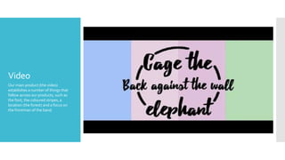
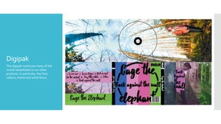
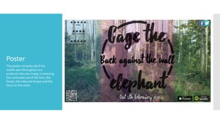
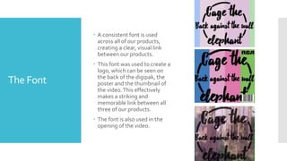
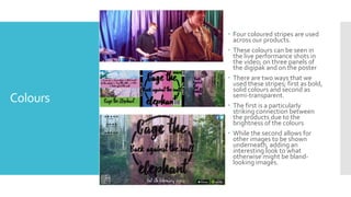
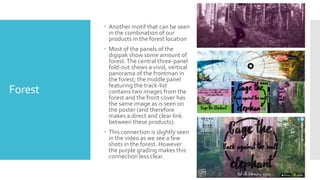
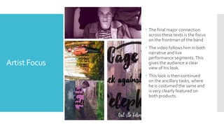
How effective is the
combination of your
main product and
ancillary texts?
Video
Our main product (the video)
establishes a number of things that
follow across our products, such as
the font, the coloured stripes, a
location (the forest) and a focus on
the frontman of the band.
Digipak
The digipak continues many of the
motifs established in our other
products. In particular, the font,
colours, forest and artist focus.
Poster
The poster compiles all of the
motifs seen throughout our
products into one image; containing
the continued use of the font, the
forest, the coloured stripes and the
focus on the artist.
The Font
 A consistent font is used
across all of our products,
creating a clear, visual link
between our products.
 This font was used to create a
logo, which can be seen on
the back of the digipak, the
poster and the thumbnail of
the video.This effectively
makes a striking and
memorable link between all
three of our products.
 The font is also used in the
opening of the video.
Colours
 Four coloured stripes are used
across our products.
 These colours can be seen in
the live performance shots in
the video; on three panels of
the digipak and on the poster
 There are two ways that we
used these stripes; first as bold,
solid colours and second as
semi-transparent.
 The first is a particularly
striking connection between
the products due to the
brightness of the colours
 While the second allows for
other images to be shown
underneath, adding an
interesting look to what
otherwise might be bland-
looking images.
Forest
 Another motif that can be seen
in the combination of our
products in the forest location
 Most of the panels of the
digipak show some amount of
forest.The central three-panel
fold-out shows a vivid, vertical
panorama of the frontman in
the forest; the middle panel
featuring the track-list
contains two images from the
forest and the front cover has
the same image as is seen on
the poster (and therefore
makes a direct and clear link
between these products).
 This connection is slightly seen
in the video as we see a few
shots in the forest. However
the purple grading makes this
connection less clear.
Artist Focus
 The final major connection
across these texts is the focus
on the frontman of the band
 The video follows him in both
narrative and live
performance segments.This
gives the audience a clear
view of his look.
 This look is then continued
on the ancillary tasks, where
he is costumed the same and
is very clearly featured on
both products.
Conclusion:
How effective
is the
combination
of your main
product and
ancillary
texts?
 Our products combine quite effectively to generate a clear brand
for the artist, allowing consumers to make connections across our
products in order to be drawn towards our album.
 We made sure to use the same font and logo and emphasise
certain images throughout our products.
 There were some parts that may be less effective (the forest in the
video).
 Overall, however, the products combine quite effectively.

Eval2

  • 1.
    How effective isthe combination of your main product and ancillary texts?
  • 2.
    Video Our main product(the video) establishes a number of things that follow across our products, such as the font, the coloured stripes, a location (the forest) and a focus on the frontman of the band.
  • 3.
    Digipak The digipak continuesmany of the motifs established in our other products. In particular, the font, colours, forest and artist focus.
  • 4.
    Poster The poster compilesall of the motifs seen throughout our products into one image; containing the continued use of the font, the forest, the coloured stripes and the focus on the artist.
  • 5.
    The Font  Aconsistent font is used across all of our products, creating a clear, visual link between our products.  This font was used to create a logo, which can be seen on the back of the digipak, the poster and the thumbnail of the video.This effectively makes a striking and memorable link between all three of our products.  The font is also used in the opening of the video.
  • 6.
    Colours  Four colouredstripes are used across our products.  These colours can be seen in the live performance shots in the video; on three panels of the digipak and on the poster  There are two ways that we used these stripes; first as bold, solid colours and second as semi-transparent.  The first is a particularly striking connection between the products due to the brightness of the colours  While the second allows for other images to be shown underneath, adding an interesting look to what otherwise might be bland- looking images.
  • 7.
    Forest  Another motifthat can be seen in the combination of our products in the forest location  Most of the panels of the digipak show some amount of forest.The central three-panel fold-out shows a vivid, vertical panorama of the frontman in the forest; the middle panel featuring the track-list contains two images from the forest and the front cover has the same image as is seen on the poster (and therefore makes a direct and clear link between these products).  This connection is slightly seen in the video as we see a few shots in the forest. However the purple grading makes this connection less clear.
  • 8.
    Artist Focus  Thefinal major connection across these texts is the focus on the frontman of the band  The video follows him in both narrative and live performance segments.This gives the audience a clear view of his look.  This look is then continued on the ancillary tasks, where he is costumed the same and is very clearly featured on both products.
  • 9.
    Conclusion: How effective is the combination ofyour main product and ancillary texts?  Our products combine quite effectively to generate a clear brand for the artist, allowing consumers to make connections across our products in order to be drawn towards our album.  We made sure to use the same font and logo and emphasise certain images throughout our products.  There were some parts that may be less effective (the forest in the video).  Overall, however, the products combine quite effectively.