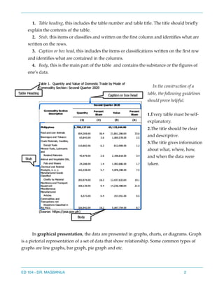
Here are the answers to the questions:
A.
1. The variables in the graph are age (x-axis) and frequency (y-axis).
2. The variables are quantitative.
3. The variables are discrete.
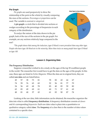
4. No, a pie chart could not be used to display this data since it involves quantitative variables rather than categorical variables.
B.
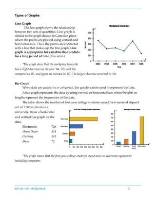
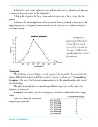
1. A line graph would most appropriately represent the number of students enrolled at a local college for each year during the last 5 years. This involves two quantitative variables - years on the x-axis and enrollments on the y-axis.
2. A bar graph would most appropriately represent the frequency of each type of crime committed in