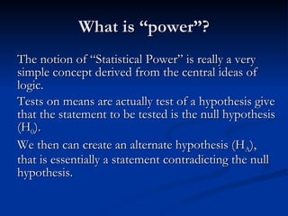
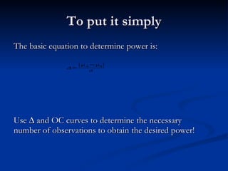
The document discusses statistical power analysis. It defines statistical power as the probability of rejecting the null hypothesis when the alternative hypothesis is true. It notes that power depends on sample size - the larger the sample size, the greater the power and lower the probability of a Type II error. The document recommends using power calculators online to calculate power for different experimental designs and determine necessary sample sizes.


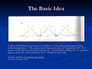
![The Basic Idea Expected distribution of means of samples of 5 housefly wing lengths from normal populations. The center curve represents the null hypothesis H0=45.5, curves to the side are alternate hypotheses. Vertical lines delimit the 5% rejection regions from the null hypothesis (2.5% shaded in each tail). [Graphic and Data from Biometry (2 nd edition) by Sokal & Rohlf, 1981]](https://image.slidesharecdn.com/poweranalysis-090721081244-phpapp02/85/Power-Analysis-for-Beginners-8-320.jpg)
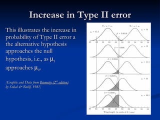
![Increase in Type II error This illustrates the increase in probability of Type II error a the alternative hypothesis approaches the null hypothesis, i.e., as 1 approaches 0 . [Graphic and Data from Biometry (2 nd edition) by Sokal & Rohlf, 1981]](https://image.slidesharecdn.com/poweranalysis-090721081244-phpapp02/85/Power-Analysis-for-Beginners-9-320.jpg)
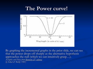
![The Power curve! By graphing the incremental graphs in the prior slide, we can see that the power drops off sharply as the alternative hypothesis approaches the null (which we can intuitively grasp…). [Graphic and Data from Biometry (2 nd edition) by Sokal & Rohlf, 1981]](https://image.slidesharecdn.com/poweranalysis-090721081244-phpapp02/85/Power-Analysis-for-Beginners-10-320.jpg)