Download as PDF, PPTX

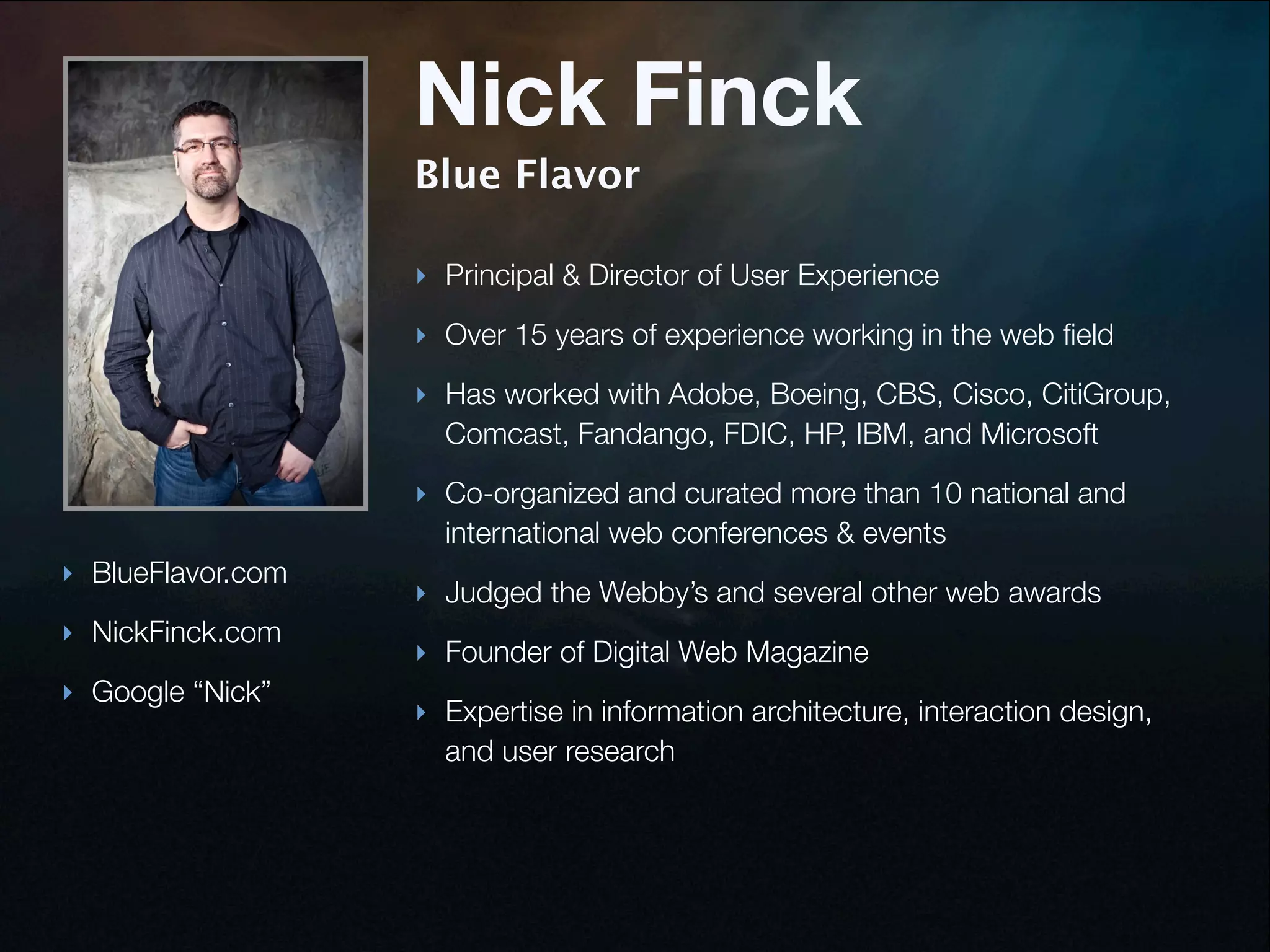


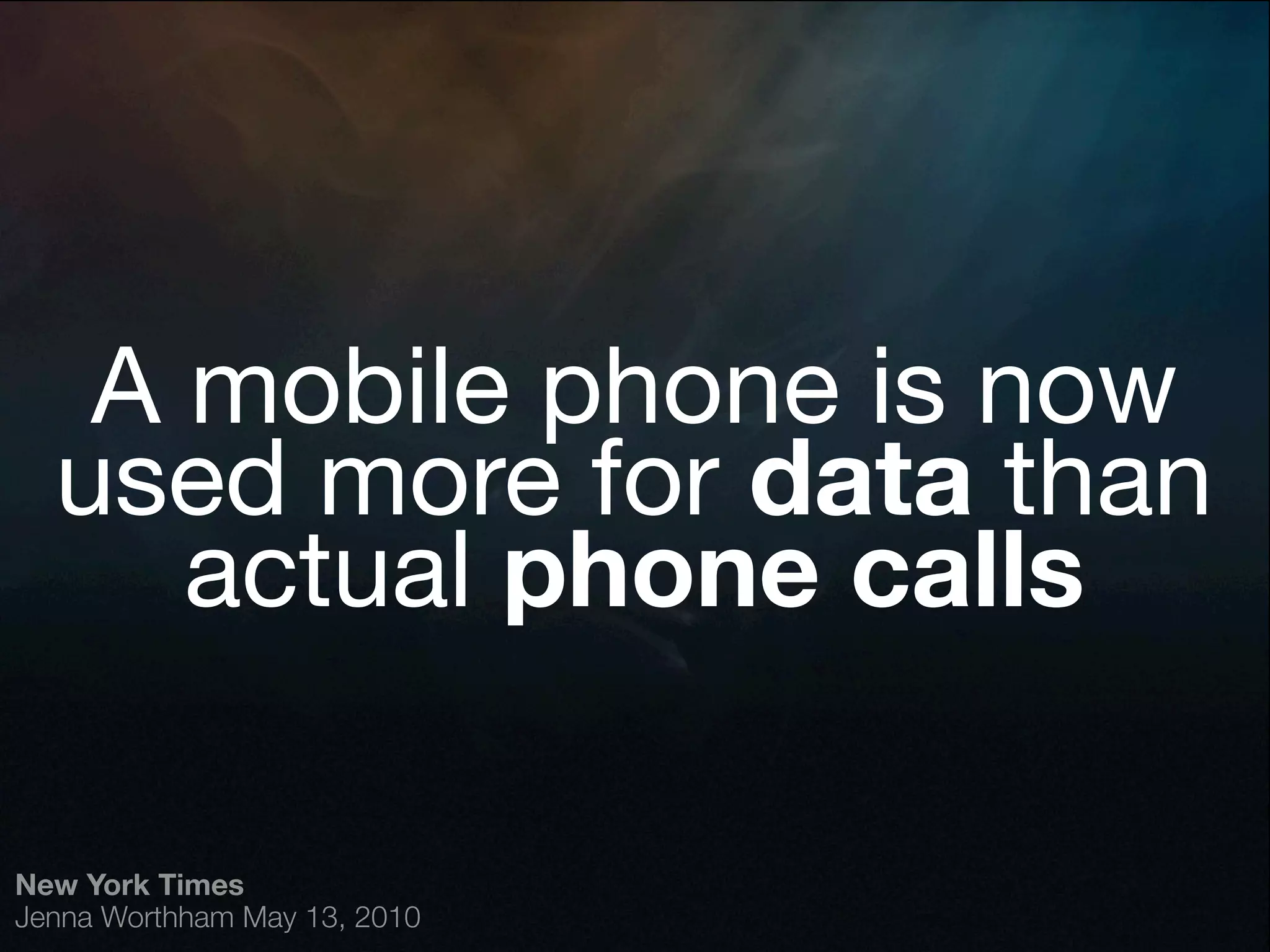


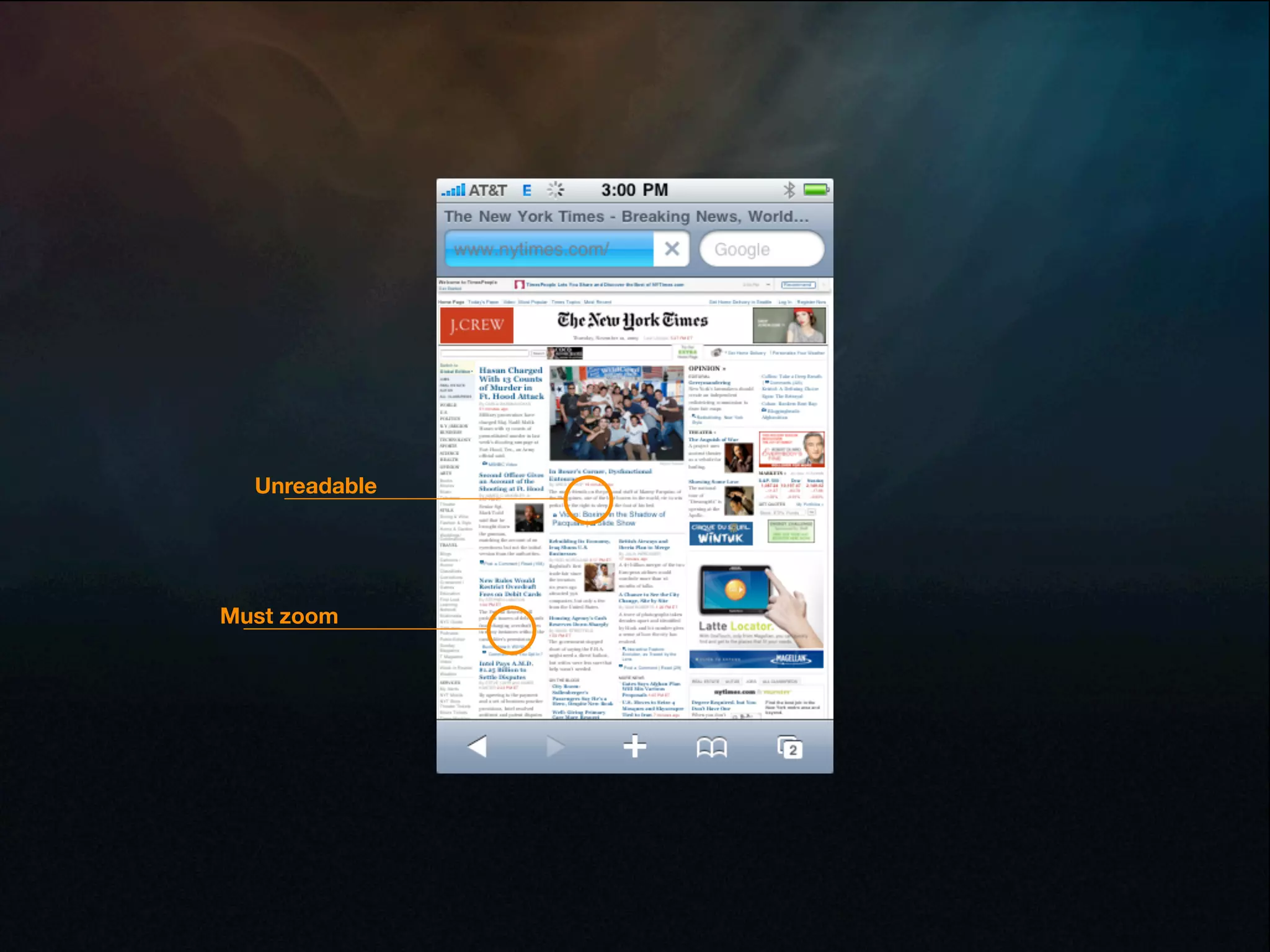

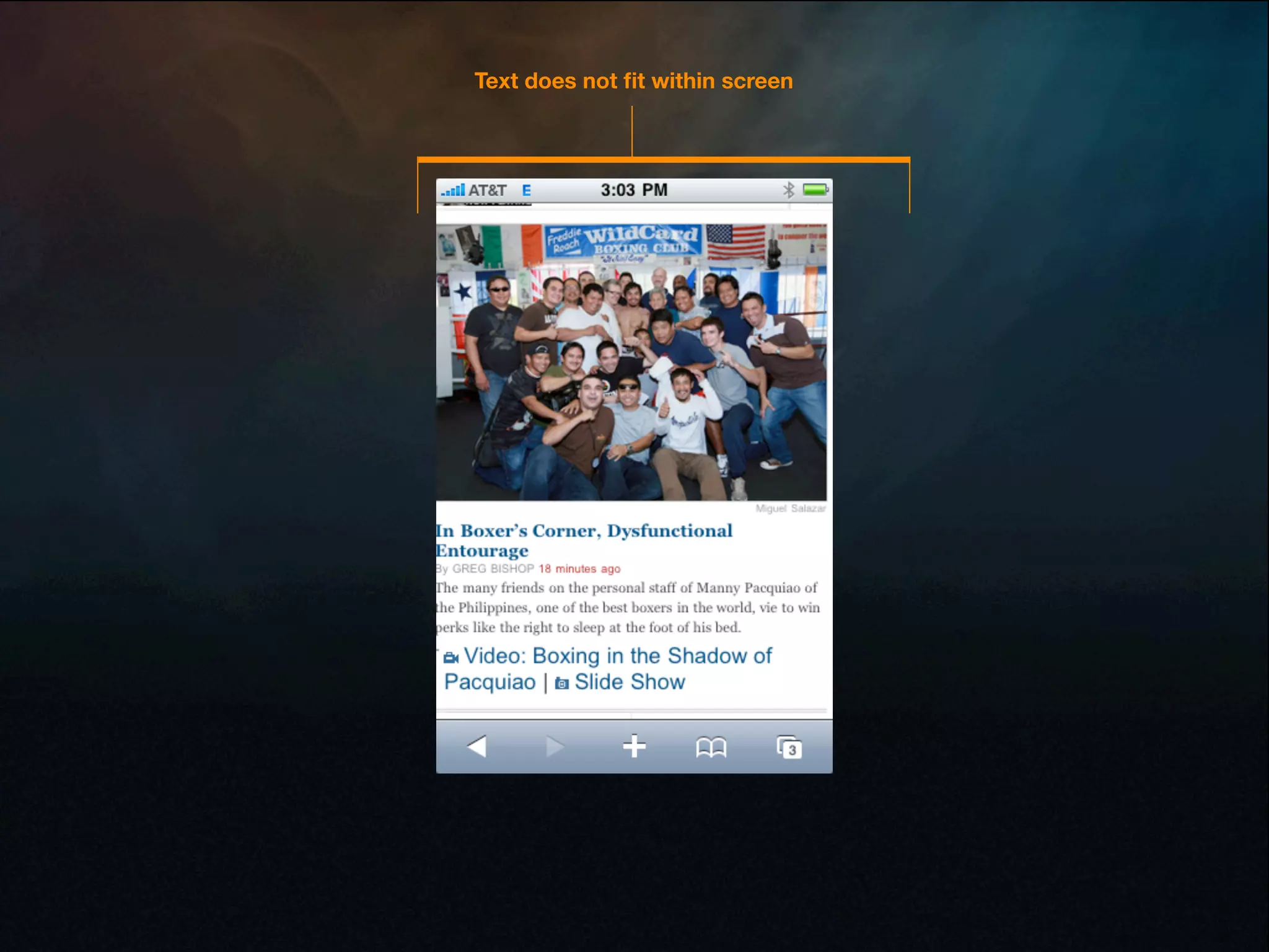

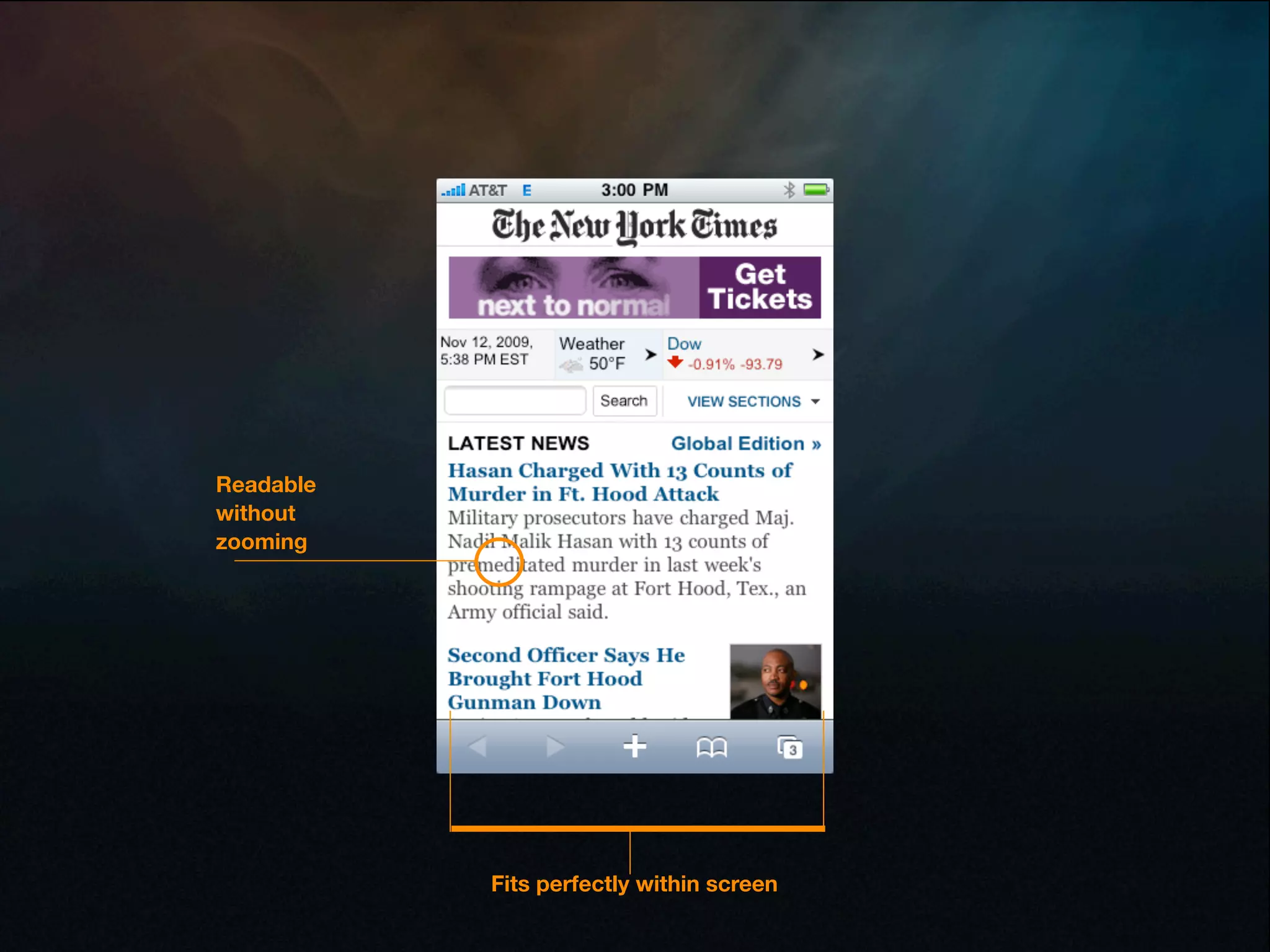
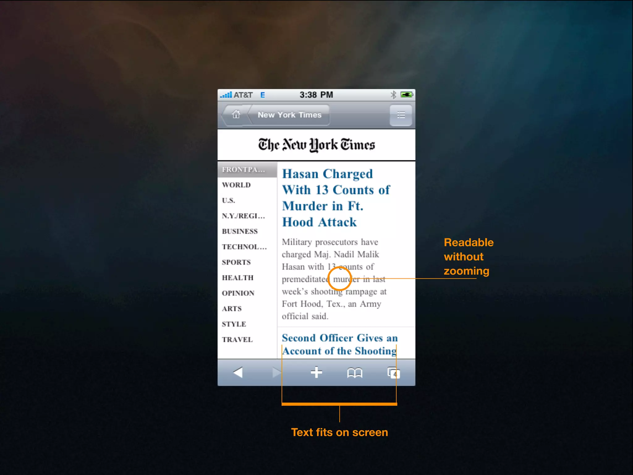


Nick Finck is a principal and director of user experience with over 15 years of experience in web design. He has worked with many large companies to improve their mobile user experience. In his presentation, he discusses how the way people use mobile devices has changed, with phones now being used more for data than calls. He advocates rethinking the web for the mobile context and provides technical examples of optimizing content, interactions, and interfaces for mobile.


![Intro to Adaptive Web Design [edUi 2013]](https://cdn.slidesharecdn.com/ss_thumbnails/introtoadaptivewebdesignedui2013-131031100934-phpapp01-thumbnail.jpg?width=640&height=640&fit=bounds)