Mixd RWD Workshop
•
1 like•197 views

This document introduces responsive web design, which creates flexible and fluid web content that adapts to different devices. The key principles of responsive design are to be device agnostic, build mobile-first, have a resolution-independent and fluid approach, and optimize for performance. Responsive design involves a process of designing across various screen sizes without creating separate fixed-width comps, and using relative units, media queries, and fluid grids when building websites.

Recommended
Recommended
More Related Content
What's hot
What's hot (9)
Viewers also liked
Viewers also liked (20)
Similar to Mixd RWD Workshop
Similar to Mixd RWD Workshop (20)
Mixd RWD Workshop
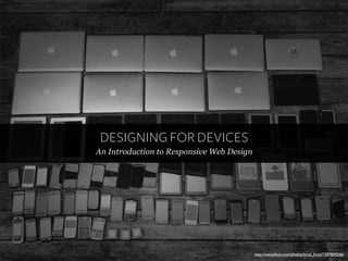
- 1. DESIGNING FOR DEVICES An Introduction to Responsive Web Design http://www.flickr.com/photos/brad_frost/7387824246/
- 2. Who are we? Aaron Jason @_acthomas @thecodezombie
- 3. Who are we?
- 4. Who are we?
- 5. Who are we?
- 6. Who are we?
- 7. Who are we?
- 8. What is Responsive Web Design? http://www.flickr.com/photos/brad_frost/7387759388/
- 9. What is Responsive Web Design? “A responsively designed website is flexible to the conditions in which it will be viewed, in order to offer every user an optimised experience.” – The Mixd definition
- 10. What is Responsive Web Design?
- 11. What is Responsive Web Design?
- 12. Where it all started http://www.flickr.com/photos/superpope/4835946664
- 13. Where it all started
- 14. Five Key Principles Be Device Agnostic Be fluid Build Mobile first Be Resolution independent Optimise, optimise, optimise
- 15. Device Agnostic http://www.flickr.com/photos/brad_frost/7387824246/
- 16. Device Agnostic Screen size? Resolution? Connection speed? Touch enabled? JavaScript?
- 17. The Web is Fluid http://www.flickr.com/photos/ixdoslo/4947697567/
- 18. The Web is Fluid “The web has always been fluid; we’ve just wasted a good number of years forcing fixed pixels onto an inherently responsive framework. The time to stop is now. – Elliot Jay Stocks, 2013 http://www.flickr.com/photos/ixdoslo/4947697567/
- 19. The Web is Fluid % px em rem
- 20. Mobile First http://www.flickr.com/photos/brad_frost/7387767300
- 21. Mobile First
- 22. Mobile First O N E W E B
- 23. Mobile First
- 26. Optimisation
- 27. Optimisation
- 28. Five Key Principles Be Device Agnostic Be fluid Build Mobile first Be Resolution independent Optimise, optimise, optimise
- 29. Design Process
- 30. Design Process
- 31. Design Process http://www.flickr.com/photos/brad_frost/7387721458/
- 32. Design Process “designers waste a shitload of time creating fully fleshed-out comps of what a website could look like [...] It’s an increasingly-pathetic process that makes less and less sense in this multi-device age.” - Brad Frost, 2013
- 33. Design Process
- 34. Design Process
- 35. Design Process
- 36. Design Process
- 37. Design Process
- 50. Let’s start!