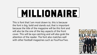
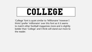
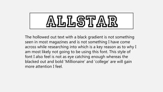
This font is eye-catching and bold, making it suitable for magazine titles and covers where grabbing attention is important. It also matches styles seen in other football magazines. Although a similar "College" font could work, the author prefers "Millionaire" as it seems bolder and better suited to matching other magazines. A hollowed out black gradient text is unusual for magazines and not eye-catching enough for the author's purposes.