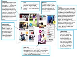
Masthead 
The masthead appears again 
on the contents page and 
once again it is placed in the 
top left hand corner. This 
time however it is red and 
not white and the same size 
as the heading contents . 
Having the masthead on the 
contents page is one of the 
codes and conventions. The 
more the masthead is shown 
the more it becomes a 
brand. 
Date 
Not very easily readable due to 
being grey text on a black 
background. This is probably 
because it isn't a very important 
feature. 
Columns 
The page is split into four 
columns to make it easy on 
the eye and attractive. A 
thin black line is used to 
separate each column and 
make it look tidy. 
Images 
There are many images used to give 
this contents page a very visual and 
colourful look. The images used relate 
to the articles as the features on the 
artists use the same or very similar 
photos. Many of the images appeal 
to different target audiences for 
example Sam Smith has a more 
female fan base than the Foo 
Fighters. Several different shot types 
are used for example a long shot for 
the image of Jenny Lewis and a 
medium shot for Sinead O’Connor. 
One or two of the images have 
captions in them. 
Colour scheme 
The colour scheme is 
much more varied than 
the front cover was. The 
numbers are multi - 
coloured but due to the 
white background and 
black headings, the page 
is still very organised. The 
headings of each section 
are just the artists name 
in bold black print and 
this is always the same. 
Page numbers 
The page numbers 
go in order which 
makes it easy for the 
audience if they are 
particular interested 
in a certain section. 
Each page number is 
the same shape but 
vary slightly in size. 
Cover story 
This links it back to the main image. It doesn’t look 
particularly different to the other articles but due to 
already being showcased on the front cover , it 
doesn’t need to greatly stand out. A two shot is used 
to show the two Gallagher brothers.

Contents page

  • 1.
    Masthead The mastheadappears again on the contents page and once again it is placed in the top left hand corner. This time however it is red and not white and the same size as the heading contents . Having the masthead on the contents page is one of the codes and conventions. The more the masthead is shown the more it becomes a brand. Date Not very easily readable due to being grey text on a black background. This is probably because it isn't a very important feature. Columns The page is split into four columns to make it easy on the eye and attractive. A thin black line is used to separate each column and make it look tidy. Images There are many images used to give this contents page a very visual and colourful look. The images used relate to the articles as the features on the artists use the same or very similar photos. Many of the images appeal to different target audiences for example Sam Smith has a more female fan base than the Foo Fighters. Several different shot types are used for example a long shot for the image of Jenny Lewis and a medium shot for Sinead O’Connor. One or two of the images have captions in them. Colour scheme The colour scheme is much more varied than the front cover was. The numbers are multi - coloured but due to the white background and black headings, the page is still very organised. The headings of each section are just the artists name in bold black print and this is always the same. Page numbers The page numbers go in order which makes it easy for the audience if they are particular interested in a certain section. Each page number is the same shape but vary slightly in size. Cover story This links it back to the main image. It doesn’t look particularly different to the other articles but due to already being showcased on the front cover , it doesn’t need to greatly stand out. A two shot is used to show the two Gallagher brothers.