
More Related Content
What's hot
What's hot (15)
Similar to Contents page analysis
Similar to Contents page analysis (20)
More from LiamKeenan
More from LiamKeenan (20)
Recently uploaded
Recently uploaded (20)
Contents page analysis
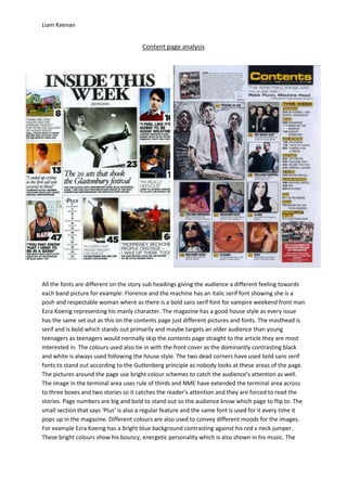
- 1. Liam Keenan Content page analysis All the fonts are different on the story sub headings giving the audience a different feeling towards each band picture for example: Florence and the machine has an italic serif font showing she is a posh and respectable woman where as there is a bold sans serif font for vampire weekend front man Ezra Koenig representing his manly character. The magazine has a good house style as every issue has the same set out as this on the contents page just different pictures and fonts. The masthead is serif and is bold which stands out primarily and maybe targets an older audience than young teenagers as teenagers would normally skip the contents page straight to the article they are most interested in. The colours used also tie in with the front cover as the dominantly contrasting black and white is always used following the house style. The two dead corners have used bold sans serif fonts to stand out according to the Guttenberg principle as nobody looks at these areas of the page. The pictures around the page use bright colour schemes to catch the audience’s attention as well. The image in the terminal area uses rule of thirds and NME have extended the terminal area across to three boxes and two stories so it catches the reader’s attention and they are forced to read the stories. Page numbers are big and bold to stand out so the audience know which page to flip to. The small section that says ‘Plus’ is also a regular feature and the same font is used for it every time it pops up in the magazine. Different colours are also used to convey different moods for the images. For example Ezra Koenig has a bright blue background contrasting against his red v neck jumper. These bright colours show his bouncy, energetic personality which is also shown in his music. The
- 2. Liam Keenan colours red and yellow are used maybe to connote power. In contrast the image of the klaxons guitarist has dark colours showing the bands new found dark side but the bright light in the background shows their bouncy side also. The main image shows Blur front man Damon Albarn leaning on stage representing his lay back, chilled out personality. The image is in black and white stressing how old it is. The font used for the story sub heading is serif, bold and italic in a slightly posh font showing Damon’s good upbringing and blurs posh side standing out on the page against all the other normal fonts. The few fonts used on the contents page can be found regularly throughout the magazine. The language used has a persuasive, friendly tone to it but doesn’t use any slang. Instead it uses quite formal language to appeal to teenagers and an older audience widening the target audience for the magazine. Yellow is a big conventional colour of Kerrang and could connote power. It pops up regularly throughout most issues. There is rarely a serif font found in Kerrang as it is aimed at teenagers so many simple sans serif fonts are used to appeal to them. Many bold fonts are used to stand out and the dominant contrast between the black and yellow of the ‘contents’ masthead attracts the eyes of the target audience primarily. The smaller story sub headings and page numbers also stand out using these colours and continue the house style of the magazine. The white background is also a regular feature of the magazine and the red subscription box in the terminal area is red connoting desire or death, a big aspect of metal, and standing out against the whole page. This also persuades and ensures you will buy the magazine again. The main article image stands out the most using bleak colours giving an eerie atmosphere. The colour red stands out against the dull background and could connote danger or death also standing out. The picture shows the band members acting like zombies and the front man acting like ‘Shaun of the dead ‘this also displays intertextuality. The image is the biggest on the page catching the reader’s eyes and showing it is the main article. The warm colours orange, yellow and red could connote hell, a major aspect of the metal and rock genre. The band members on most images wear black costumes showing their dark personalities expressed through their music. In comparison to the NME contents page the language used is more informal and uses more slang terms. This is because it is targeted at a younger audience than NME.Both contents page are set out differently and convey different moods for different types of people. Kerrang is aimed at a young audience so uses informal language to connect with its audience where as NME’s audience is aimed at the same age group but also stretches slightly older. This is shown by formal language being used and serif fonts being used appealing to a slightly older audience rather than teenagers. The music contained in NME is listened to by a more higher class, fashionable audience than Kerrang which could also be why it is set out differently. Brighter colours are used on the Kerrang contents page than the NME which I found strange as Kerrang contains darker subject matter and genres. But the colours connote danger, death, power and Hell which are all big parts of the Rock/metal genre. I like the way that the contents masthead in Kerrang has been put in the top dead corner of the page as nobody needs to read it. I also like the way the subscription box in the terminal area has been put there so the audience read it last where as there is no subscription box on the NME page. I prefer the layout of the NME contents page though as i like how the boxes are symmetrical but slightly disorderly at the bottom to catch your eye. In conclusion I like both contents pages but the NME page appeals more to me and would fit in better with my genre of magazine.