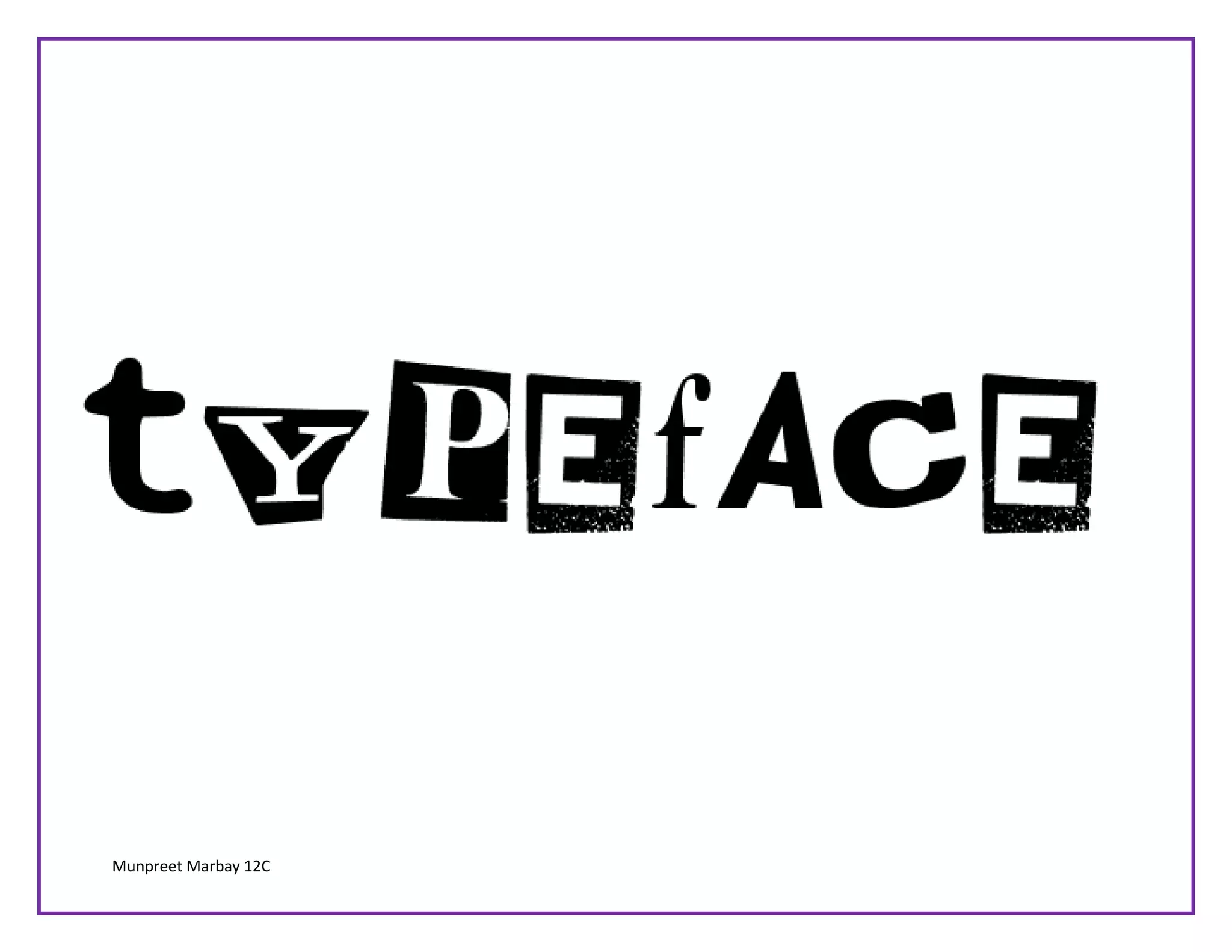
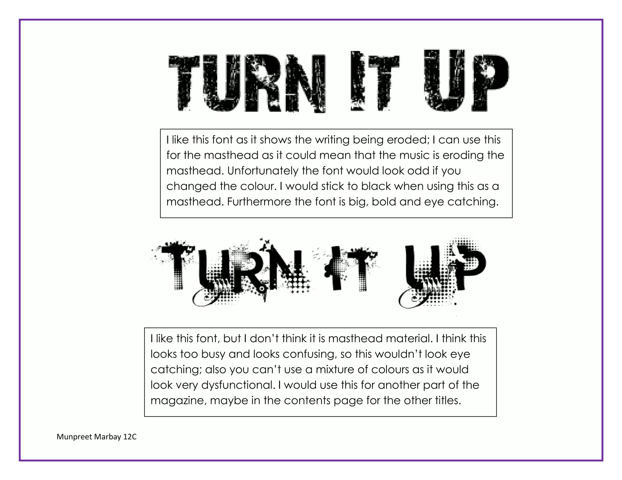
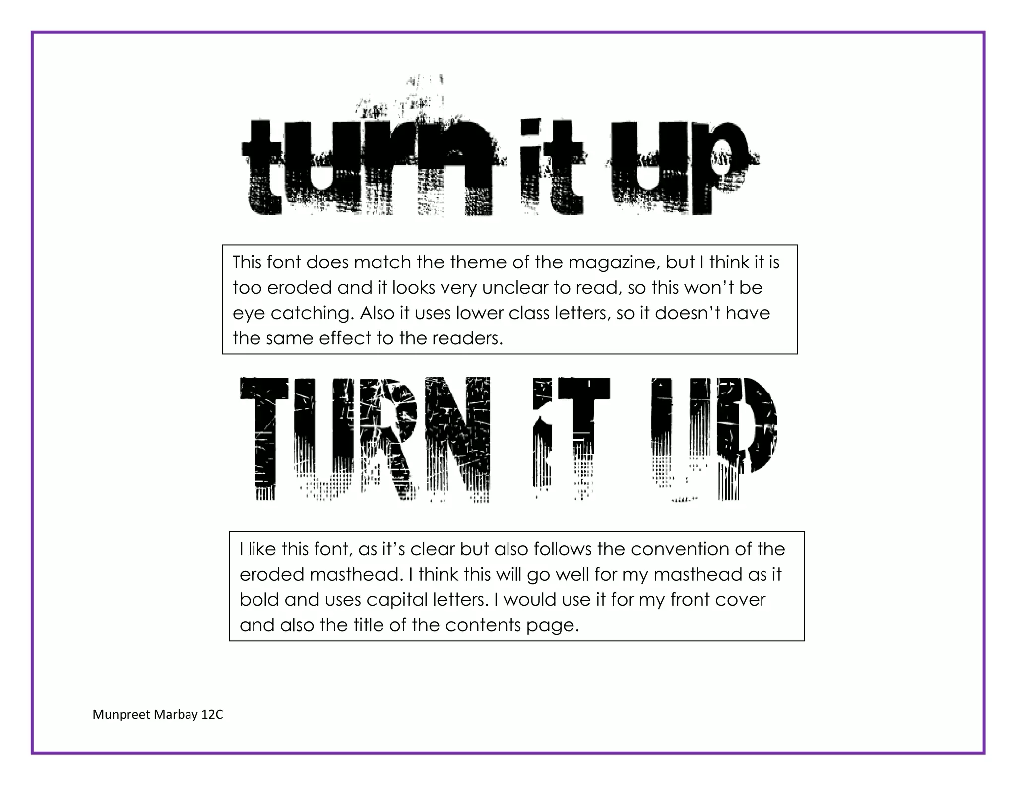
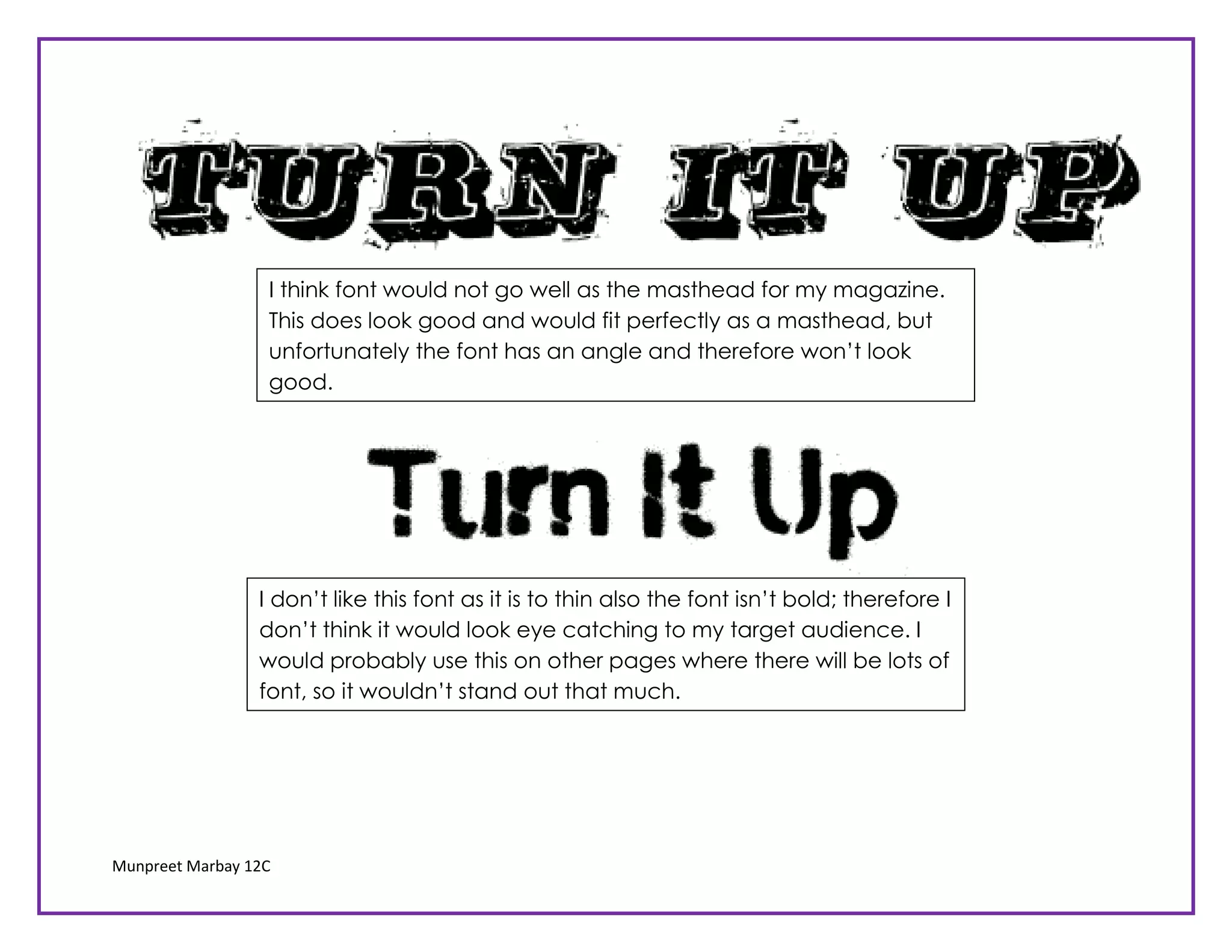
The document discusses several fonts being considered for use as a magazine masthead. For each font, short evaluations are provided about whether the font is suitable and why. Some fonts are deemed too busy, unclear to read, thin and not bold enough to be eye-catching for the masthead. One font is found to be clear while following the eroded convention and using capital letters, making it suitable for the masthead and contents page.