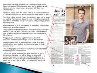
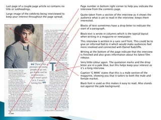
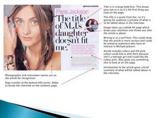
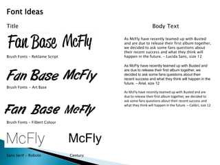
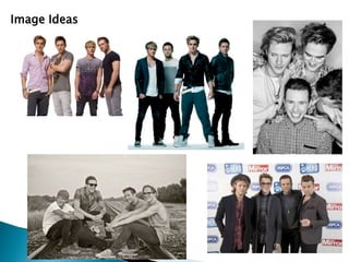
Emma Taylor
Magazines use large images of the celebrity to show who is 
being interviewed. The magazine want you to read the article, 
which is why the image is very large, so it will draw your 
attention to it. 
Written in a serif font, this font is seen to be easier to read than 
a sans serif font which is why it is used for large bodies of text. 
Very little colour is used. This is because they want you to focus 
on reading the interview. Colour is used in the photograph and 
sometimes in the title and/or subheading. They want you to see 
the image first. 
Interviews tend to be in a black font as it makes it easy to read 
against the white background. 
They use bold text to highlight the important facts such as the 
words ‘GLAMOUR’ and ‘JOSH HUTCHERSON’. This shows you 
who is talking and being in capital letters also helps you to 
identify this. 
Image usually contains a caption underneath which 
describes it and the other images used in the interview 
Page number is seen in the bottom left corner as it helps 
to indentify it when looking at the contents page to find 
the interview. 
The photographer and interviewers names are mentioned to 
have recognition for the article. 
Title of the article is always in a large bold font as this is 
the section that your eye will be drawn to which will 
decide if you want to read it or not. The introduction to 
the article is usually in a larger font to the body text as it 
helps you to get a feel of what’s to come in the rest of the 
interview.
Last page of a couple page article so contains no 
title or subheadings. 
Large image of the celebrity being interviewed to 
keep your interest throughout the page spread. 
Page number in bottom right corner to help you indicate the 
interview from the contents page. 
Quote taken from a section of the interview as it shows the 
audience what is yet to read in the interview; keeps them 
interested. 
Blocks of text sometimes have a drop letter to indicate the 
start of a paragraph. 
Block text is wrote in columns which is the typical layout 
when writing in a magazine or newspaper. 
This interview is written in a sans serif font. This could be to 
give an informal feel to it which would make audiences feel 
more involved and connected with Daniel Radcliffe. 
Writing at the bottom of the page indicate that the interview 
is finished and also gives information about his latest film 
release. 
Very little colour again. The quotation marks and the drop 
letter are in a pale blue, but this helps keep your interest as 
it’s a long interview. 
Caption ‘G MAN’ states that this is a male section of the 
magazine, showing you that it tailors to both the male and 
female market. 
Black font is used as this makes it easy to read. Also stands 
out against the pale background.
Title is in a large bold font. This draws 
your eye to it so it’s the first thing you 
read on the page. 
The title is a quote from her, so it’s 
giving the audience a preview of what is 
to be talked about in the interview. 
Image takes up a whole A4 page which 
draws your attention and shows you who 
the article is about. 
Writing is in a serif font. This could show 
that the article is more serious and could 
be aimed at audiences who have an 
interest in Michael Jackson. 
Article includes colour and the pink 
colour could link in with Paris because 
she’s a teenage girl and could like the 
colour pink. Also gives you something 
else to look at on the page. 
Photographer and interviewer names are on 
the article for recognition. 
Page number at the bottom left corner. Helps 
to locate the interview on the contents page. 
Introduction to the article gives a brief 
summary of what will be talked about in 
the interview
McFly 
Font Ideas 
Title 
Brush Fonts – Reklame Script 
Brush Fonts - Art Base 
Brush Fonts – Filbert Colour 
Sans Serif - Roboto Century 
Body Text 
As McFly have recently teamed up with Busted 
and are due to release their first album together, 
we decided to ask some fans questions about 
their recent success and what they think will 
happen in the future. – Lucida Sans, size 12 
As McFly have recently teamed up with Busted and 
are due to release their first album together, we 
decided to ask some fans questions about their 
recent success and what they think will happen in the 
future. – Arial, size 12 
As McFly have recently teamed up with Busted and are 
due to release their first album together, we decided to 
ask some fans questions about their recent success and 
what they think will happen in the future. – Calibri, size 12
Image Ideas
Flat Plan 
Image 
Title 
Introduction 
Body Text 
Body Text 
Side Bar 
Page Number
Title 
Image 
Introduction 
Body Text 
Body Text 
Page Number
Body Text 
Title 
Introduction 
Page Number 
Image 
Body Text 
Body Text
Image 
Title 
Introduction Image 
Body Text

Task 8

  • 1.
  • 2.
    Magazines use largeimages of the celebrity to show who is being interviewed. The magazine want you to read the article, which is why the image is very large, so it will draw your attention to it. Written in a serif font, this font is seen to be easier to read than a sans serif font which is why it is used for large bodies of text. Very little colour is used. This is because they want you to focus on reading the interview. Colour is used in the photograph and sometimes in the title and/or subheading. They want you to see the image first. Interviews tend to be in a black font as it makes it easy to read against the white background. They use bold text to highlight the important facts such as the words ‘GLAMOUR’ and ‘JOSH HUTCHERSON’. This shows you who is talking and being in capital letters also helps you to identify this. Image usually contains a caption underneath which describes it and the other images used in the interview Page number is seen in the bottom left corner as it helps to indentify it when looking at the contents page to find the interview. The photographer and interviewers names are mentioned to have recognition for the article. Title of the article is always in a large bold font as this is the section that your eye will be drawn to which will decide if you want to read it or not. The introduction to the article is usually in a larger font to the body text as it helps you to get a feel of what’s to come in the rest of the interview.
  • 3.
    Last page ofa couple page article so contains no title or subheadings. Large image of the celebrity being interviewed to keep your interest throughout the page spread. Page number in bottom right corner to help you indicate the interview from the contents page. Quote taken from a section of the interview as it shows the audience what is yet to read in the interview; keeps them interested. Blocks of text sometimes have a drop letter to indicate the start of a paragraph. Block text is wrote in columns which is the typical layout when writing in a magazine or newspaper. This interview is written in a sans serif font. This could be to give an informal feel to it which would make audiences feel more involved and connected with Daniel Radcliffe. Writing at the bottom of the page indicate that the interview is finished and also gives information about his latest film release. Very little colour again. The quotation marks and the drop letter are in a pale blue, but this helps keep your interest as it’s a long interview. Caption ‘G MAN’ states that this is a male section of the magazine, showing you that it tailors to both the male and female market. Black font is used as this makes it easy to read. Also stands out against the pale background.
  • 4.
    Title is ina large bold font. This draws your eye to it so it’s the first thing you read on the page. The title is a quote from her, so it’s giving the audience a preview of what is to be talked about in the interview. Image takes up a whole A4 page which draws your attention and shows you who the article is about. Writing is in a serif font. This could show that the article is more serious and could be aimed at audiences who have an interest in Michael Jackson. Article includes colour and the pink colour could link in with Paris because she’s a teenage girl and could like the colour pink. Also gives you something else to look at on the page. Photographer and interviewer names are on the article for recognition. Page number at the bottom left corner. Helps to locate the interview on the contents page. Introduction to the article gives a brief summary of what will be talked about in the interview
  • 5.
    McFly Font Ideas Title Brush Fonts – Reklame Script Brush Fonts - Art Base Brush Fonts – Filbert Colour Sans Serif - Roboto Century Body Text As McFly have recently teamed up with Busted and are due to release their first album together, we decided to ask some fans questions about their recent success and what they think will happen in the future. – Lucida Sans, size 12 As McFly have recently teamed up with Busted and are due to release their first album together, we decided to ask some fans questions about their recent success and what they think will happen in the future. – Arial, size 12 As McFly have recently teamed up with Busted and are due to release their first album together, we decided to ask some fans questions about their recent success and what they think will happen in the future. – Calibri, size 12
  • 6.
  • 7.
    Flat Plan Image Title Introduction Body Text Body Text Side Bar Page Number
  • 8.
    Title Image Introduction Body Text Body Text Page Number
  • 9.
    Body Text Title Introduction Page Number Image Body Text Body Text
  • 10.
    Image Title IntroductionImage Body Text