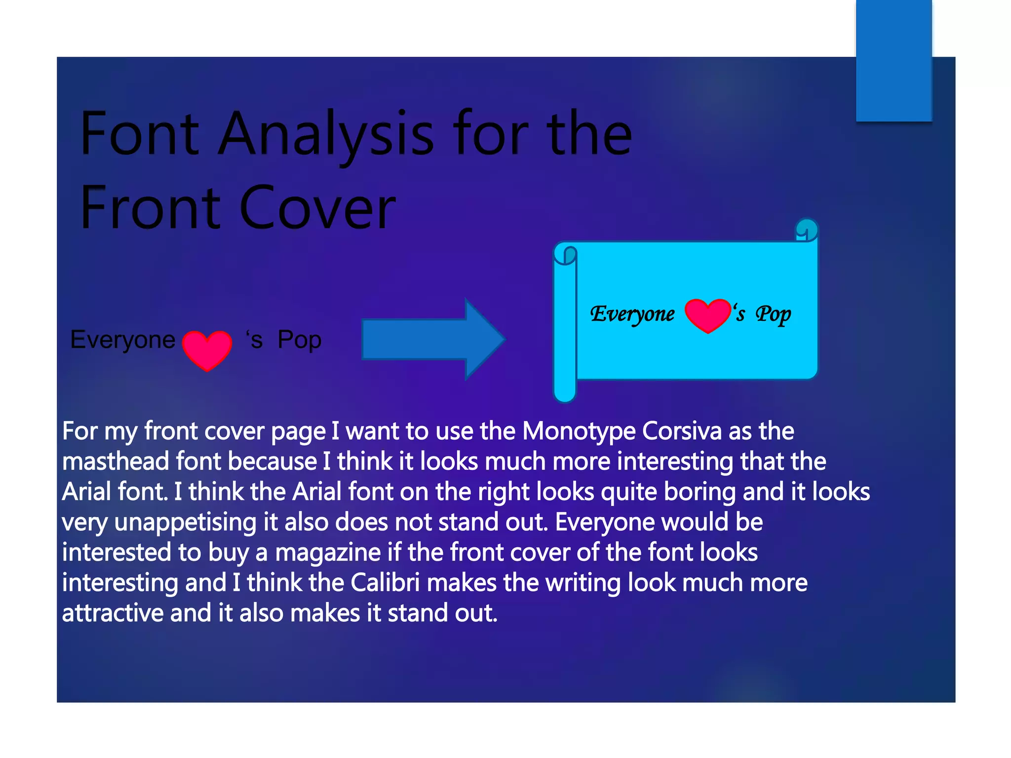
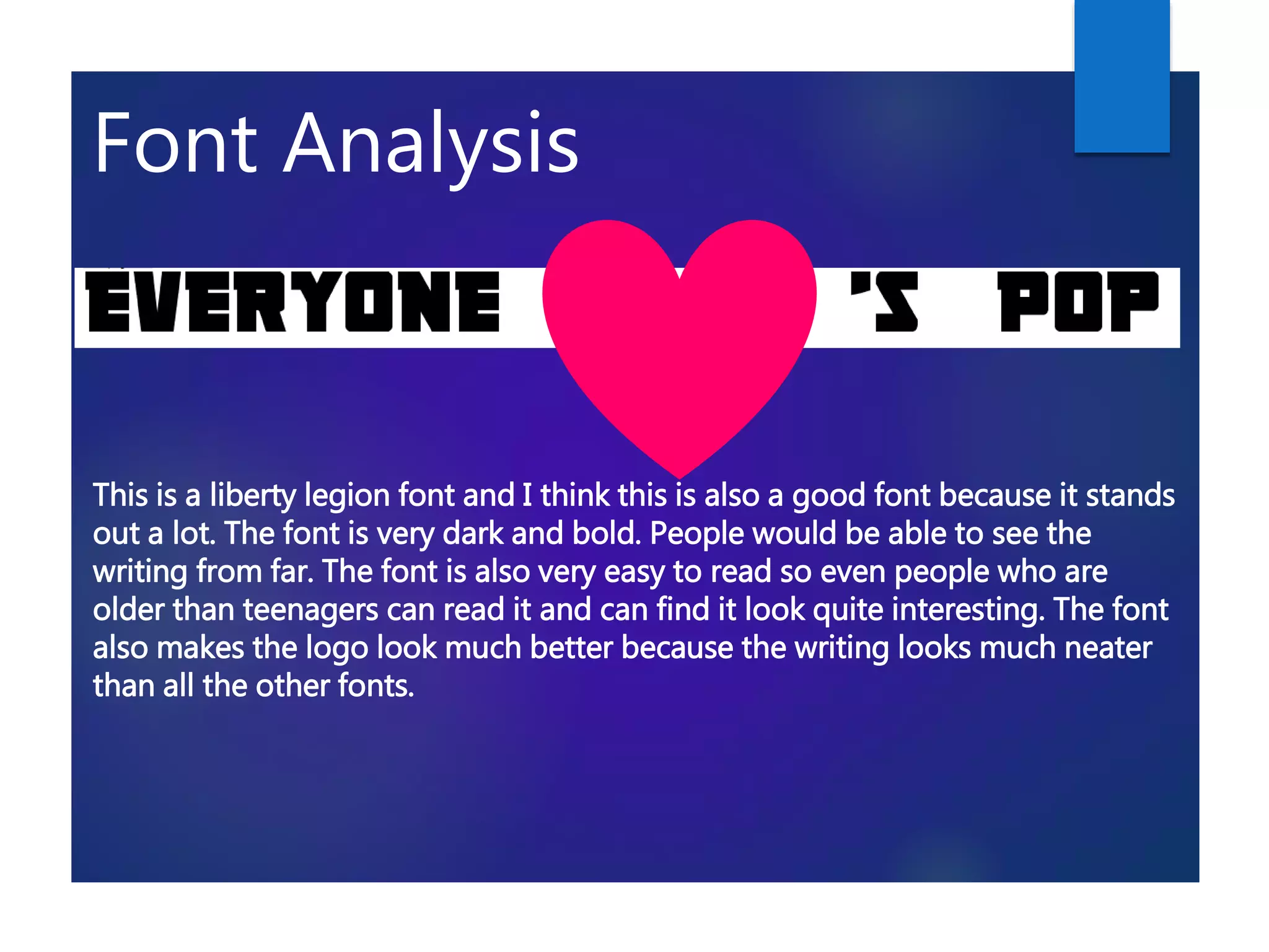
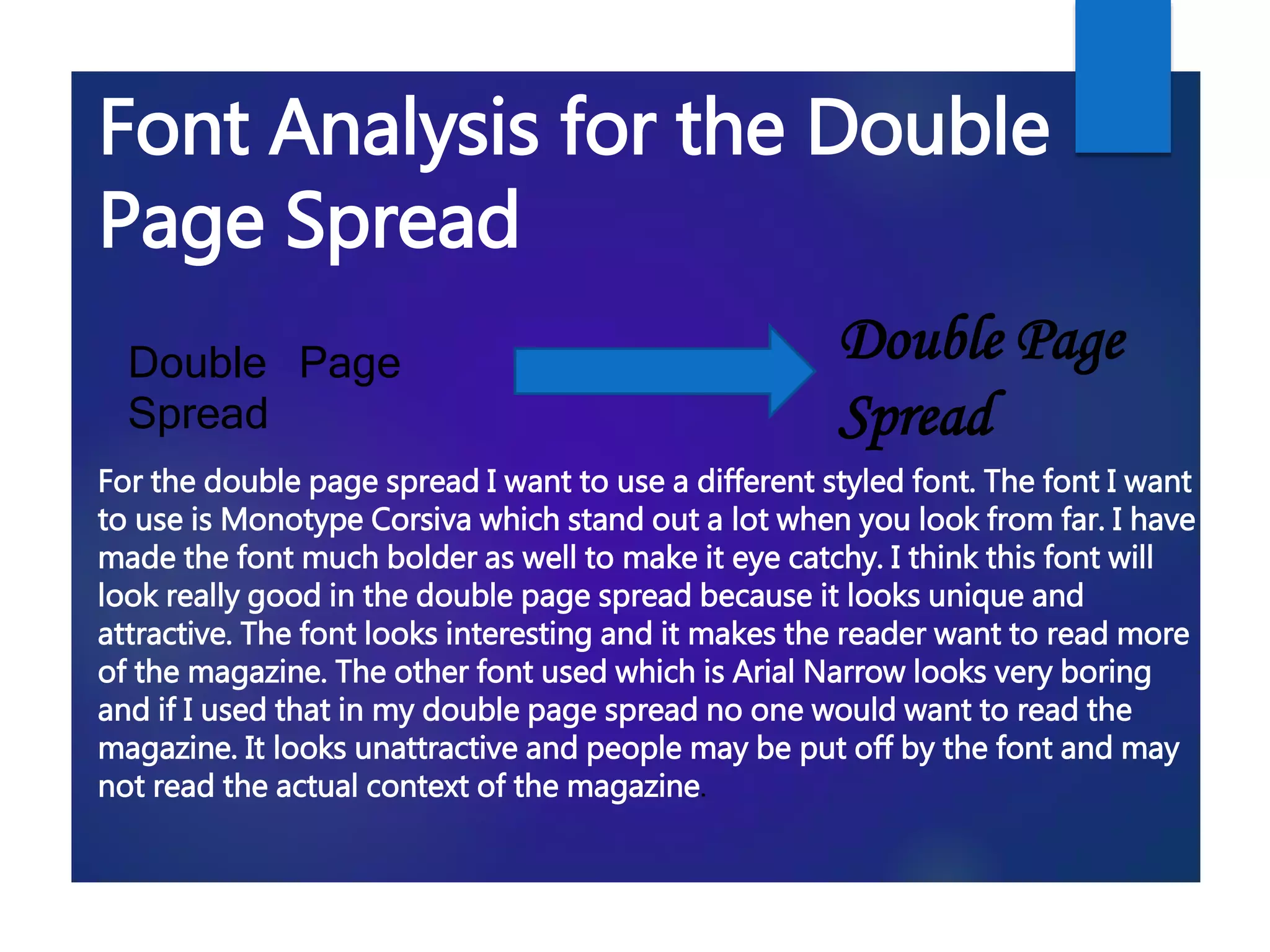
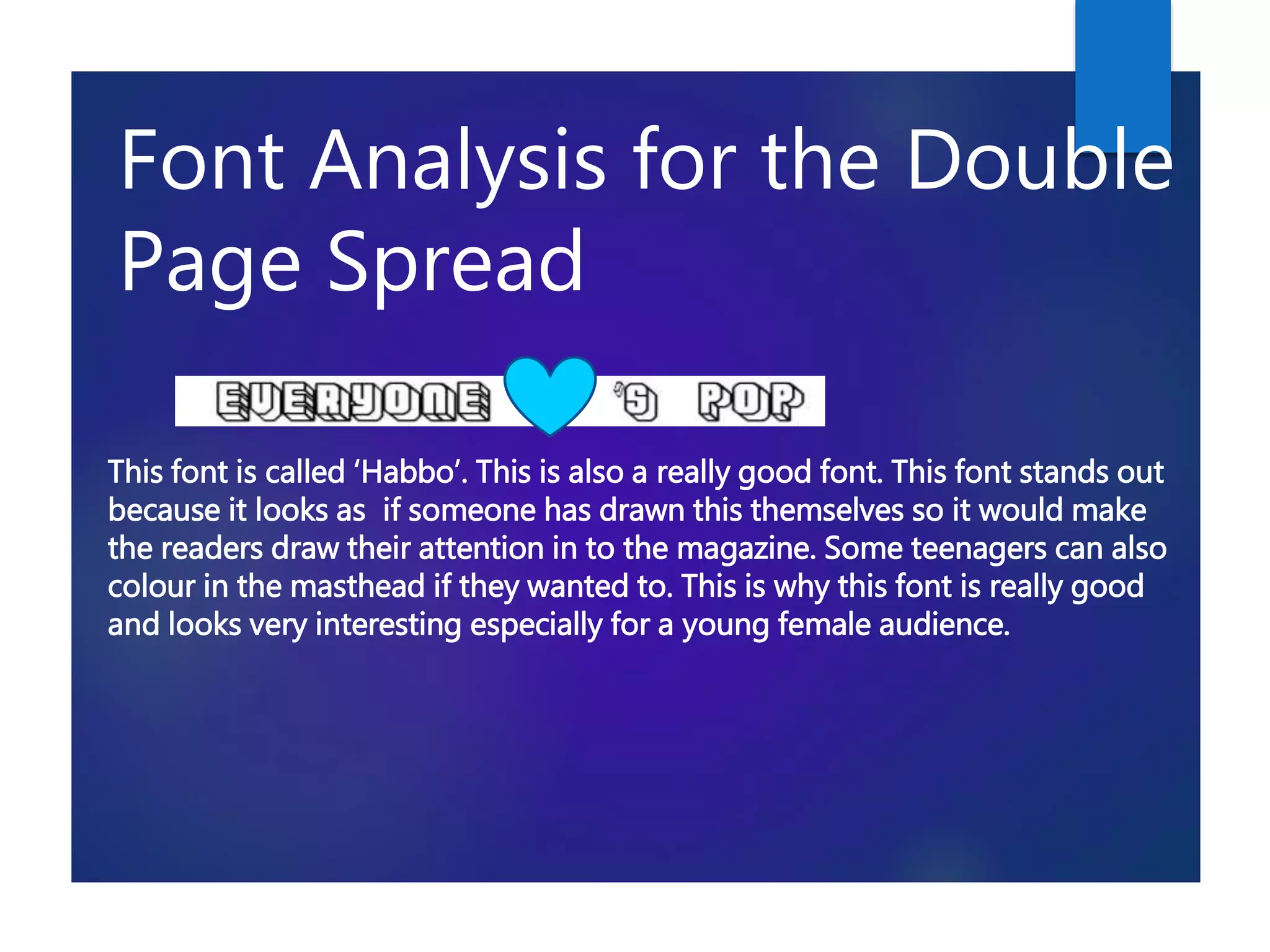
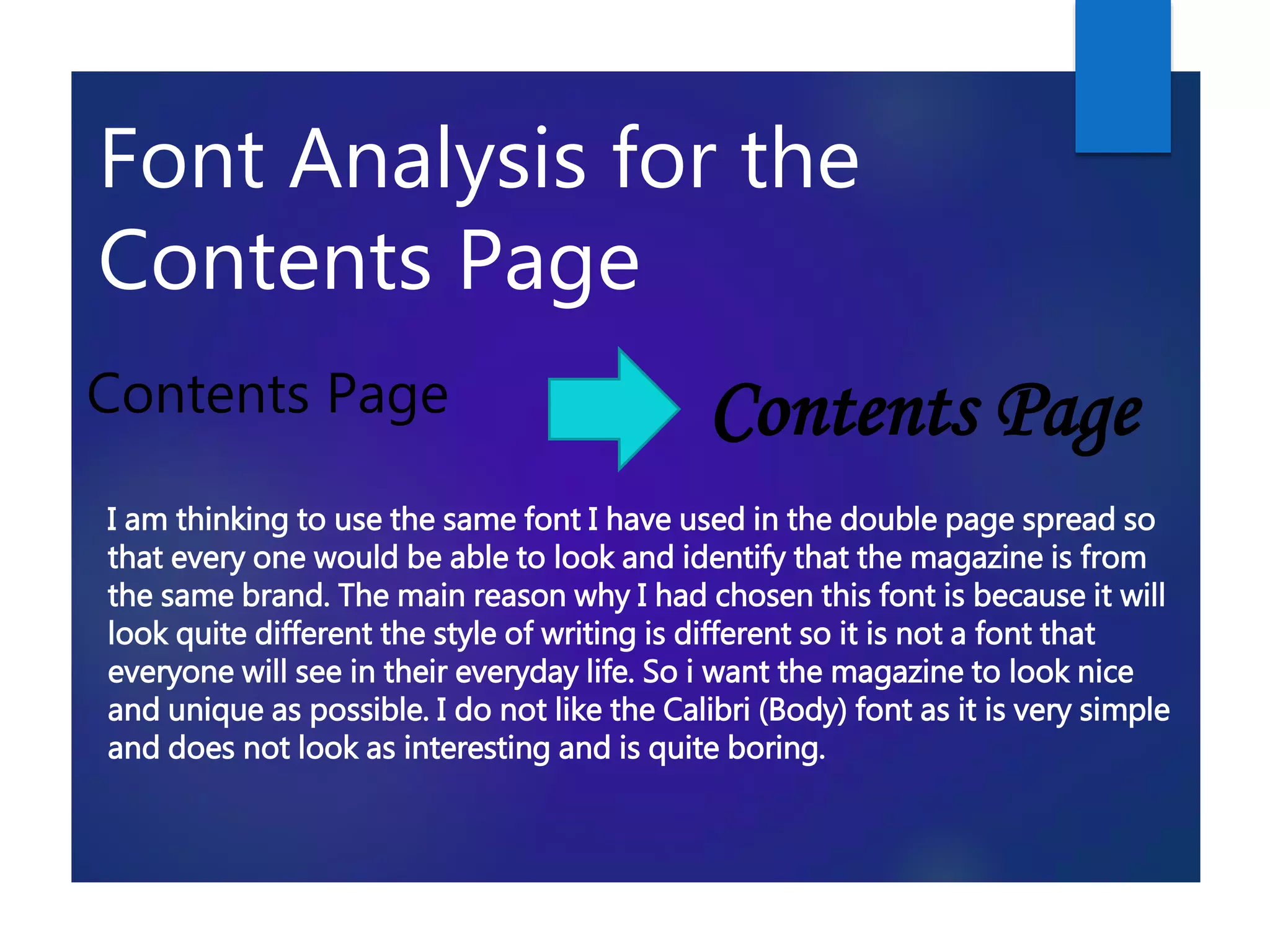
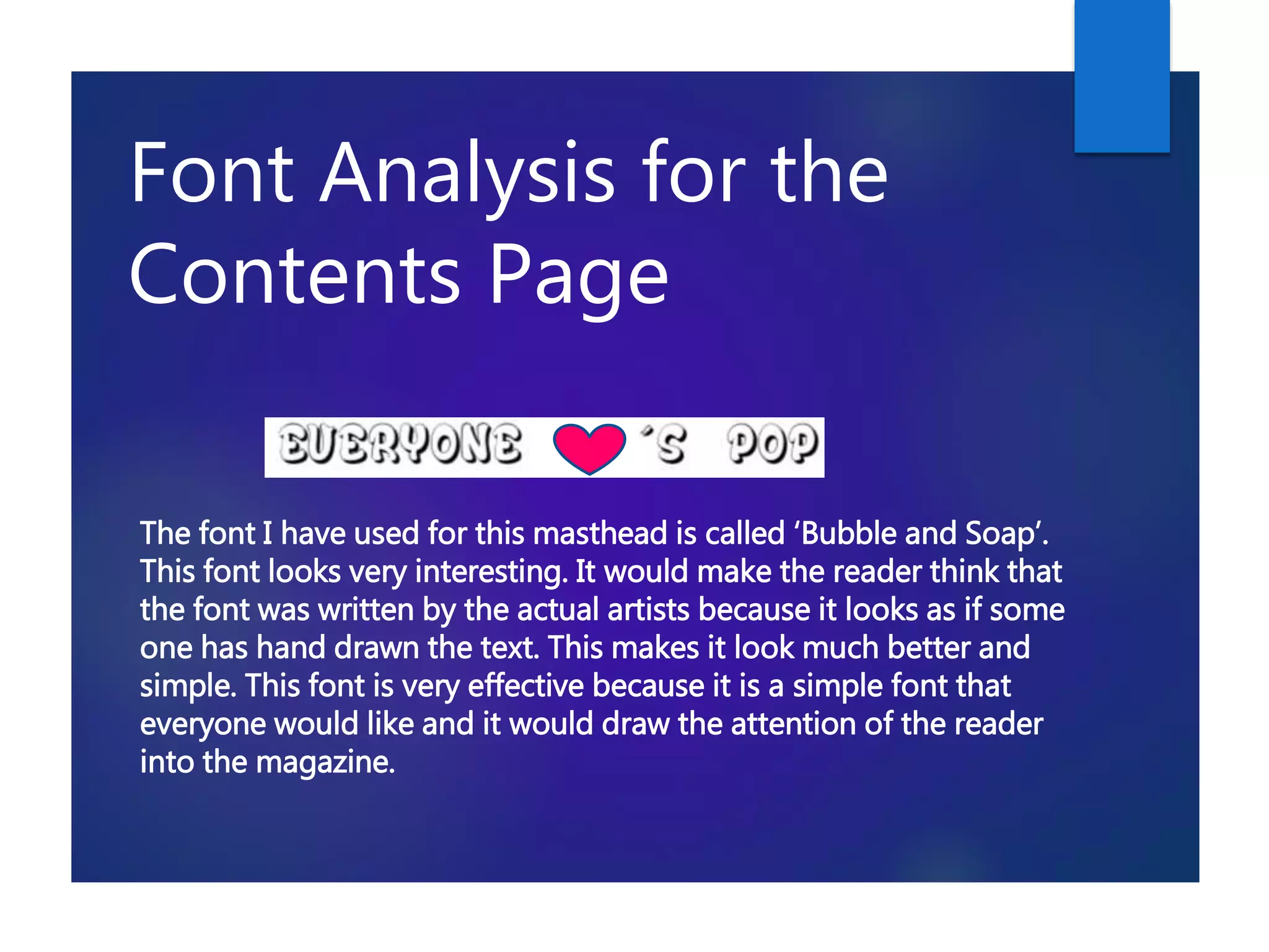
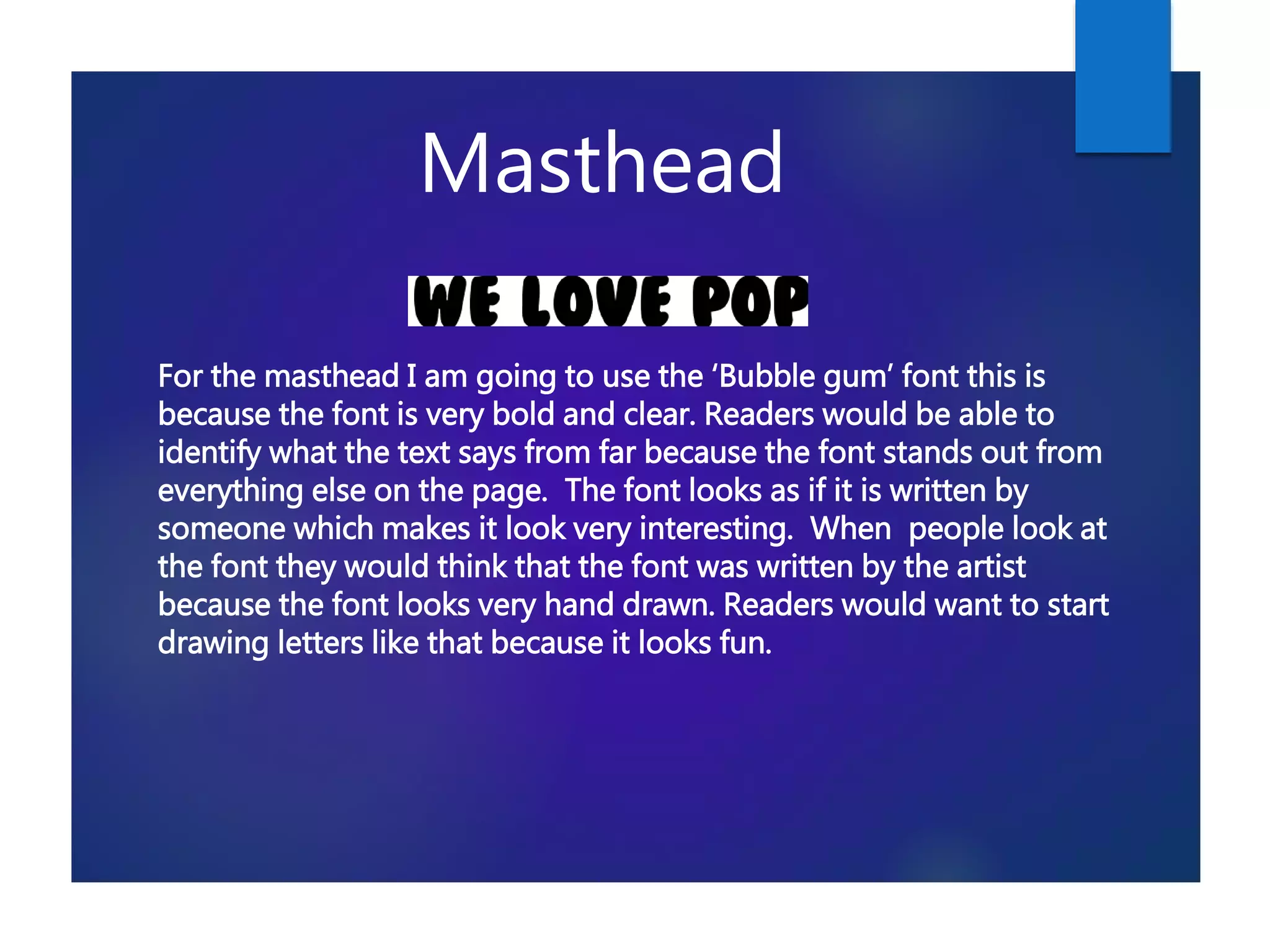
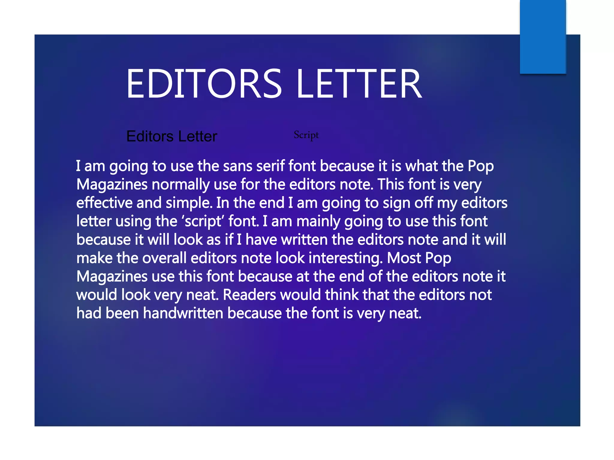
This document analyzes and summarizes the different fonts used for various sections of a magazine, including the masthead, double page spread, contents page, sell lines, main body text, and editor's letter. For each section, 2-3 font options are presented and their suitability is discussed based on readability, eye-catching design, and attracting the target young audience. The fonts are selected to stand out visually while still being clear and easy to read.

