Beyond the EU: DORA and NIS 2 Directive's Global Impact
Magazine cover q arctic monkeys
1. Salford City College
Eccles Centre
AS Media Studies
Foundation Portfolio
Masthead
Comment on how the design of the magazine cover attracts the target audience:
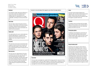
Colour
The masthead is simple, bold and very effective, as
the red colour stands out completely from the
image and cover lines. The simplicity of the
masthead adds to it’s effectiveness as it is easily
recognisable, consisting of a red box and the letter
‘Q’.
The colours used are typical of general rock
magazines, with red, black and white being the main
palette. However, blue is also used in places to
provide a contrast with the red, and perhaps to give
the magazine a possible ‘British’ feel.
Main image
Typefaces
The main image is dynamically posed so that the
frontman is clearly visible, as all the other members
are looking in separate directions whereas he is
looking straight into the camera and therefore the
reader from their perspective.
The typefaces used are primarily hard and straightedged, with the exception of the masthead which is
rounded, providing contrast but more importantly
giving a formal feel to the cover.
Photography Lighting
Model credit
The lighting in the photograph is prominently very
dark, with the band wearing primarily very dark
clothing. However, light is used on the faces to catch
the focus of the models and give the cover a nice
contrast in dark and light.
The model credit on this cover is clearly visible and
therefore highly effective. It composes of the
largest font and therefore stands out as the main
magazine cover story and gives the band the
spotlight.
Coverlines
The cover lines on this cover are very formal, lining
up against the right hand side and in between the
faces of two band members. Like the main cover
line, the white bold font stands out heavily from the
dark background.
Design Principles Used?
Main cover line
The main cover line is highly effective and stands
out well from the rest of the cover lines, with the
eye catching bold white font spelling ‘The Q
interview: Arctic Monkeys’ and being clearly visible
over the dark clothing of the band. The title itself
fits nicely around the jaw of Alex and underneath
Jamie’s chin, therefore showing considerable
thought being put into placement by the graphic
designer.
House Style
The house style is hard edged and, coupled with the image, gives off a ‘rock and roll’ feel to
the magazine cover. It also has a slight smugness or smartness about it, looking much more
formal than other rock magazines such as Kerrang! and therefore presenting a different,
more light form of rock such as indie as opposed to metal for example.
One feature of this magazine is that it shows to
perhaps defy the Gutenberg principle, in that the
most important aspects of the cover, ie. The main
cover line and the focus of the image (frontman Alex
turner) are both in the weak fallow area, although
one could argue that his face is a bit more central
than left. However, the cover does conform to the
Gutenberg principle in the fact that the masthead is
in the top left primary optical focus area. Another
considerable point is that both the masthead and
main cover line are in the left third, which is highly
effective for a western audience and catches the eyes
of passers -by inquiring about the magazines on offer.