1. Salford City College
Eccles Centre
AS Media Studies
Foundation Portfolio
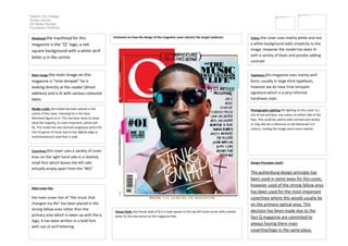
Comment on how the design of the magazine cover attracts the target audience: Colour the cover uses mainly white and red,
a white background adds simplicity to the
image. However the model has been lit
with a variety of blues and purples adding
contrast
Masthead the masthead for this
magazine is the “Q” logo, a red
square background with a white serif
letter q in the centre
Typefaces this magazine uses mainly serif
fonts, usually in large thick typefaces,
however we do have tinie tempahs
signature which is a very informal
handrwan style
Main image the main image on this
magazine is “tinie tempah” he is
looking directly at the reader (direct
address) and is lit with various coloured
lights
Photography Lighting the lighting on this cover is a
mix of red and blue, one colour on either side of the
face. This could be used to add contrast and variety
or may also be a reference to old fashioned 3-d
colours, making the image seem more realistic .
Model credit: the model has been placed in the
centre of the cover, meaning he is the most
dominant figure on it. This has been done to show
what the majority, or most important, article will
be. The model has also donned sunglasses which fits
into his genre of music due to the slightly edgy or
confrontationa;ll style that is used
Coverlines this cover uses a variety of cover
lines on the right hand side in a realitvly
small font which leaves the left side
virtually empty apart from the “#01”
Design Principles Used?
The guttenburg design principle has
been used in some ways for this cover,
however used of the strong fallow area
has been used for the most important
coverlines where this would usually be
on the primary optical area. This
decision has been made due to the
fact Q magazine are commited to
always having there main
coverline/logo in the same place.
Main cover line
the main cover line of “the music that
changed my life” has been placed in the
strong fallow area rather than the
primary area which is taken up with the q
logo, it has been written in a bold font
with use of serif lettering
House Style: the House style of Q is a read square in the top left hand corner with a white
letter Q, this also serves as the magazine title.