
Recommended
More Related Content
What's hot
What's hot (20)
Similar to Contents page analysis gorilaz
Similar to Contents page analysis gorilaz (20)
More from 12299701
More from 12299701 (12)
Recently uploaded
Recently uploaded (20)
Contents page analysis gorilaz
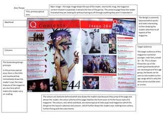
- 1. Alex Thorpe Main image – the large image drawsthe eye of the reader,nexttothe imag,the magazine contentrelatedisexplained,itattractsthe fansof the gorilaz.The contentspage helpsthe reader findwhattheyare lookingforwithouthavingtosiftthroughanythingtheyaren’tinterestedin Columns Masthead Title,primaryoptical area The coloursare boldand definedwhichalsodrawsthe readerseye because theyjumpof the page and attract the reader,the colourscheme of thispage matchesthe frontcover to fitthe house style of Q magazine.The colours,red,white andblack,are stereotypical of indie pop/rockmagazineswhichfits the genre the layoutisabstract and uneven,whichfurtherdrawsthe readerseye,lookingmore carless, furtherfittingwiththe indietheme. The designisunevenly balancedwhichworks and looksinteresting, furtherdrawingthe readersattentiontoall aspectsof the magazine. The Guttenbergdesign principle In the primaryoptical area,there is the tittle and mastheadthat immediatelydrawsthe reader’seye,the main featuresof the magazine are alsohere which makesthe readercarry on reading Target audience The target audience of this magazine isaimedat younger,indie fans,aimed 16 – 26. Thisisshown threwthe use of the clothingandbandswhich are stereotypicalof thisage group,the bands can be seenasrole modelstothis age range whichiswhythe dresssense couldbe seen as similar.