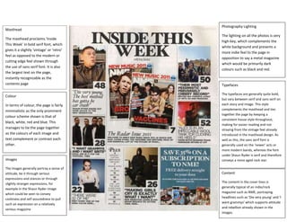
1. Colour
In terms of colour, the page is fairly
minimalistic as the only prominent
colour scheme shown is that of
black, white, red and blue. This
manages to tie the page together
as the colours of each image and
text complement or contrast each
other.
Masthead
The masthead proclaims ‘Inside
This Week’ in bold serif font, which
gives it a slightly ‘vintage’ or ‘retro’
feel as opposed to the modern or
cutting edge feel shown through
the use of sans serif font. It is also
the largest text on the page,
instantly recognizable as the
contents page
Images
The images generally portray a sense of
attitude, be it through serious
expressions and stances or through
slightly stranger expressions, for
example in the Shaun Ryder image
which could be seen to convey
cockiness and self assuredness to pull
such an expression on a relatively
serious magazine
Photography Lighting
The lighting on all the photos is very
high-key, which complements the
white background and presents a
more indie feel to the page in
opposition to say a metal magazine
which would be primarily dark
colours such as black and red.
Typefaces
The typefaces are generally quite bold,
but vary between serif and sans serif on
each story and image. This style
complements the masthead and ties
together the page by keeping a
consistent house style throughout,
making for easier reading and not
straying from the vintage feel already
introduced in the masthead design. As
well as this, the sans serif font is
generally used on the ‘newer’ acts or
more modern bands, whereas the font
under Shaun Ryder is serif and therefore
conveys a more aged rock star.
Content
The content in the cover lines is
generally typical of an indie/rock
magazine such as NME, portraying
headlines such as ‘Die very young’ and ‘I
want grammys’ which supports attitude
and rebellion already shown in the
images.