
Recommended
More Related Content
What's hot
What's hot (20)
Viewers also liked
Viewers also liked (20)
Similar to Front Cover Analysis
Similar to Front Cover Analysis (20)
Recently uploaded
Recently uploaded (20)
Front Cover Analysis
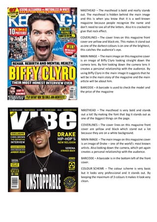
- 1. MASTHEAD – The masthead is bold and really stands out. The masthead is hidden behind the main image and this is when you know that it is a well-known magazine because people recognize the name and don’t need to see all of the letters. Also it is cracked to give that rock effect. COVERLINES – The cover lines on this magazine front cover are yellow and black etc. This makes it stand out as one of the darkest colours is on one of the brightest, this catches the audience’s eye. MAIN IMAGE – The main image on this magazine cover is an image of Biffy Clyro looking straight down the camera lens. By him looking down the camera lens it creates a personal relationship with the audience. By using Biffy Clyro in the main image it suggests that he will be in the main story of the magazine and the main article will be about him. BARCODE – A barcode is used to check the model and the price of the magazine MASTHEAD – The masthead is very bold and stands out a lot! By making the font that big it stands out as one of the biggest things on the page. COVERLINES – The cover lines on this magazine front cover are yellow and black which stand out a lot because they are on a white background. MAIN IMAGE – The main image on this magazine cover is an image of Drake – one of the world’s most known artists. Also looking down the camera, which yet again creates a personal relationship with the audience. BARCODE – A barcode is in the bottom left of the front cover. COLOUR SCHEME – The colour scheme is very basic but it looks very professional and it stands out. By keeping the maximum of 3 colours it makes it look very clean.