
Recommended
More Related Content
What's hot
What's hot (20)
Viewers also liked
Viewers also liked (13)
Similar to 3 magazines
Similar to 3 magazines (20)
More from kelseyhaslam
More from kelseyhaslam (20)
Recently uploaded
Recently uploaded (20)
3 magazines
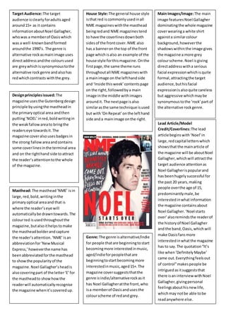
- 1. Target Audience: The target audience is clearly for adults aged around 15+ as it contains information about Noel Gallagher, who was a member of Oasis which was a well-known band formed around the 1990’s. The genre is alternative rock as main image uses direct address and the colours used are grey which is synonymous to the alternative rock genre and also has red which contrasts with the grey. House Style: The general house style is that red is commonly used in all NME magazines with the masthead being red and NME magazines tend to have the coverlines down both sides of the front cover. NME also has a banner on the top of the front page which is also an example of the house style for this magazine. On the first page, the same theme runs throughout all NME magazines with a main image on the left hand side and ‘Inside this week’ contents page on the right, followed by a main image in the middle with images around it. The next page is also similar as the same technique is used but with ‘On Repeat’ on the left hand side and a main image on the right. Design principles issued: The magazine uses the Gutenberg design principle by using the masthead in the primary optical area and then putting ‘NOEL’ in red, bold writing in the weak fallow area to bring the readers eye towards it. The magazine cover also uses badges in the strong fallow area and contains some cover lines in the terminal area and on the right hand side to attract the reader’s attention to the whole of the magazine. Main Images/Image: The main image features Noel Gallagher dominating the whole magazine cover wearing a white shirt against a similar colour background, however the shadows within the image gives the magazine a more grey colour scheme. Noel is giving direct address with a serious facial expression which is quite formal, attracting the target audience, but his facial expression is also quite careless but aggressive which may be synonymous to the ‘rock’ part of the alternative rock genre. Masthead: The masthead ‘NME’ is in large, red, bold, writing in the primary optical area and that is where the reader’s eye will automatically be drawn towards. The colour red is used throughout the magazine, but also it helps to make the masthead bolder and capture the reader’s attention. ‘NME’ is an abbreviation for ‘New Musical Express,’ however the name has been abbreviated for the masthead to show the popularity of the magazine. Noel Gallagher’s head is also covering part of the letter ‘E’ for the masthead to show how the reader will automatically recognise the magazine when it’s covered up. Lead Article/Model Credit/Coverlines: The lead article begins with ‘Noel’ in large, red capital letters which shows that the main article of the magazine will be about Noel Gallagher, which will attract the target audience attention as Noel Gallagher is popular and has been hugely successful for the past 20 years, making people over the age of 15, predominantly male, be interested in what information the magazine contains about Noel Gallagher. ‘Noel starts over’ also reminds the reader of the history of Noel Gallagher and the band, Oasis, which will make Oasis fans more interested in what the magazine has to say. The quotation “It’s like when ‘Definitely Maybe’ came out. Everything feels out of control” makes people be intrigued as it suggests that there is an interview with Noel Gallagher, giving personal feelings about his new life, which may not be able to be read anywhere else. Genre: The genre is alternative/indie for people that are beginning to start becoming more interested in music, aged/indie for people that are beginning to start becoming more interested in music, aged 15+. The magazine cover suggests that the genre is indie/alternative rock as it has Noel Gallagher at the front, who is a member of Oasis and uses the colour scheme of red and grey.
- 2. Target Audience: The target audience of this magazine is for people, mainly male, aged 16-35 maybe older as The Smiths are the main image, which were more popular in the 1980’s. The masthead also uses serif writing which may make the target audience be aimed at adults rather than 16 year olds as the writing is more formal. House Style: Main Images/Image: The main image features The Smiths bands containing only 2 of the members. This is because the 2 members are the main band members, Johnny Marr and Morrissey, which the target audience will be more interested in reading about. Both members are wearing black clothing like a leather jacket which is synonymous to the alternative rock genre which the magazine is part of. The main image is in black and white white is also quite iconic to the genre and they are close together in terms of proxemics . Lead Article/Model Credit/Coverlines: Genre: The genre of this magazine is alternative rock for people interested in older bands such as The Smiths, but also newer bands within this genre such as the 1975, who are mentioned on a cover line. The magazine suggests how the genre is alternative rock as it has the main members of The Smiths as the front cover and uses the colour scheme of black and white. Design principles issued: The magazine uses the Gutenberg principle by putting the masthead in the primary optical area in a red background with white writing, making it so that the reader will notice the name of the magazine straight away. The magazine cover also uses cover lines within the weak fallow area to make the readers eyes draw towards it. ‘The Smiths’ cover line is in the terminal area which the reader will automatically be drawn to, which will advertise the magazine well as fans of The Smiths will be able to find out that there is information of the band as there is an image and a main cover line. Inserts such as ‘The 1975’ is in the strong fallow area also to help fans know that they will be in the magazine. Masthead: The masthead uses a serif font which attracts the target audience. It is also in the primary optical area, which the reader will instantly look at so the name of the magazine will be memorable and noticeable. The colours that the masthead has are bright and bold such as red and white, which will attract the reader’s attention alone.
- 3. Target Audience: House Style: Design principles issued: Masthead: Genre: Main Images/Image: Lead Article/Model Credit/Coverlines: