1. Salford City College
Eccles Centre
AS Media Studies
Foundation Portfolio
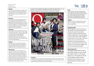
Masthead
‘Q’ – This is the primary optical area which is where
the buyer will first look so the main masthead is
usually placed here. The red background makes the
letter ‘Q’ stands out because it makes the white
look bolder.
Comment on how the design of the magazine cover attracts the target audience: the target
audience for this magazine is the older generation, ages 30 plus. This because it is a
sophisticated magazine as shown by the colours and what the band is wearing.
Main image
The main image is of the band Mumford and Sons.
Each member is doing something different but
generally looks like they are having fun. Two of the
members have there feet kicking out which makes it
look like the magazine is in 3D. Within the mise en
scene the members are wearing casual clothing. All
wearing plain white tops and jeans.
The main colours which are being used are
white, black and red. There are other colours
such as gold, pink and denim blue but these are
just colour backgrounds and the clothing.
These colours are bright which make them
stand out on the dark background colours.
Typefaces
Most of the text is in capitals and is san serif
font. It is in capitals so it stands out which
attracts peoples eye.
Photography Lighting
High key lighting is used on their faces so
the members are easily identifiable. This
will help the readers know what the
magazine is going to be able before they
read the model credit. No low key lighting
is used this will make the whole magazine
stand out when it is on a shelf. In the mise
en scene, we can see that the band
members are all wearing leather boots
which is associated with rock artists. Their
clothing is very casual which suggests that
they are very laid back individuals.
Model credit
The model credit is in the weak fallow area and is in
bold; capitals which make it stand out. Even though
it is placed at the bottom, it attracts people to look
as it is eye catching. This goes against the
Gutenberg design rule as least important
information should go here. However they are a
very famous band so the model credit doesn’t need
to be in the strong fallow area
Coverlines
The cover lines are in the terminal area which is
where the reader would look last. The colours are
red, white and gold which stand out against the
background which is a members black trousers.
Main cover line
The main cover line is ‘The CLASH special, lost
interviews- unseen pictures’ The writing is in bold
capitals, gold, white and black writing and is San
serif. ‘Unseen pictures’ will draw the attention of
readers as it draws there attention. It is placed in
the strong fallow area as most people will take note
of this area. The picture which is next to it is in
bright pink with only a splash of dark colours which
helps the main cover line stand out more.
Colour
Design Principles Used?
House Style
The house style is very masculine as the colour scheme shows. All of the colours are used
consistently over the pages which all work well together. The font is very simple and which
shows the target audience would be relaxed and laid back.
The design principle which is used is
Gutenberg’s design rule even though
the model credit isn’t in the strong
fallow area, it still stands out. We can
tell the design principle is being
followed as the masthead is in the
primary optical area where people
look first.