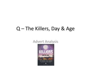
2. This advert for The Killers’
album Day & Age is
particularly stylized, using
the album art and stylistic
font to catch the eye of the
audience. The artists’ name
is significantly large, taking
up most of the top half of
the page, followed by the
dark bold font of ‘Day &
Age’, which highlights the
name of the album. The
bright bold font of the
information at the bottom
of the screen is contrasted
by the black background,
which in turn is in contrast
to the vivid colour of the
album art.
The gutenberg design
principle is put into
effect here, with the
artist’s name taking up a
large part of both the
primary optical area and
the strong fallow area.
Both the weak fallow
and terminal areas at
the bottom of the page
are in black, drawing the
reader’s attention to the
top of the page where
the most important
information is, along
with the bright and
colourful artwork of the
album.