1. Salford City College
Eccles Centre
AS Media Studies
Foundation PortfolioMasthead
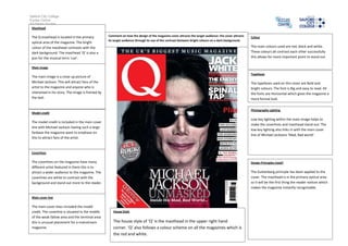
The Q masthead is located in the primary
optical area of the magazine. The bright
colour of the masthead contrasts with the
dark background. The masthead ‘Q’ is also a
pun for the musical term ‘cue’.
Main image
The main image is a close up picture of
Michael Jackson. This will attract fans of the
artist to the magazine and anyone who is
interested in his story. The image is framed by
the text.
Model credit
The model credit is included in the main cover
line with Michael Jackson having such a large
fanbase the magazine want to emphaze on
this to attract fans of the artist.
Coverlines
The coverlines on the magazine have many
different artist featured in them this is to
attract a wider audience to the magazine. The
coverlines are white to contrast with the
background and stand out more to the reader.
Main cover line
The main cover lines included the model
credit. The coverline is situated in the middle
of the weak fallow area and the terminal area
this is unusual placement for a mainstream
magazine.
Colour
The main colours used are red, black and white.
These colours all contrast each other successfully
this allows for more important point to stand out.
Typefaces
The typefaces used on this cover are Bold and
bright colours. The font is Big and easy to read. All
the fonts are Horizontal which gives the magazine a
more formal look.
Photography Lighting
Low key lighting within the main image helps to
make the coverlines and masthead stand out. The
low key lighting also links in with the main cover
line of Michael Jacksons ‘Mad, Bad world’.
Design Principles Used?
The Guttenberg principle has been applied to the
cover. The masthead is in the primary optical area
so it will be the first thing the reader notices which
makes the magazine instantly recognisable.
House Style
The house style of ‘Q’ is the masthead in the upper right hand
corner. ‘Q’ also follows a colour scheme on all the magazines which is
the red and white.
Comment on how the design of the magazine cover attracts the target audience: the cover attracts
its target audience through its use of the contrast between bright colours on a dark background.