
Recommended
More Related Content
What's hot
What's hot (20)
Similar to Front cover analysis 1
Similar to Front cover analysis 1 (20)
More from LaraDobsonx
More from LaraDobsonx (20)
Recently uploaded
Recently uploaded (20)
Front cover analysis 1
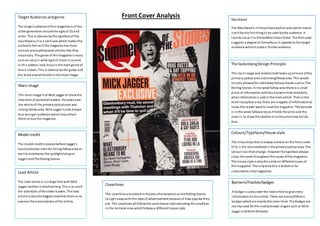
- 1. Target Audience and genre The ta rget audience of this magazine is of the older generation around the ages of 25 and older. This is obvious by the typeface of the mas thead as it is a serif sans which makes the audience feel as if the magazine has more mature and sophisticated articles that they may enjoy. The genre of this magazine is music and can vary in what type of music is current. In thi s edition, rock music is the main genre of mus ic shown. This is obvious by the guitar and the black and white edit in the main image. Main Image The main image is of Mick Jagger to draw the attention of potential readers. He takes over the whole of the primary optical area and s trong fallow area. Mick Jagger is also known by a younger audience which may attract them to buy the magazine. Model credit The model cre dit is placed behind Jagger’s head and takes over the strong fallow area as wel l to emphasise the spotlight being on Jagger and The Rolling Stones. Lead Article The lead article is in a large font with Mick Jagger written in black wri ting. This is to catch the attention of the older readers. The lead articl e is also the biggest coverline there as to express the exclusiveness of the article. Masthead The Mas thead is in the primary optical area which means i t wi ll be the first thing to be seen by the audience. It s tands out as i t is the boldest colour there. The font used suggests a degree of formality as it appeals to the target audience which is quite a formal audience. The Gutenberg Design Principle The main image and model credit takes up all most of the primary optical area and s trong fallow area. This would only be allowed for ultimately famous bands such as The Rol ling Stones. In the weak fallow area there is a small piece of information with less known artists related to what information i s said in the main article. Then in the terminal optical area, there are snippets of information to leave the reader want to read the magazine. The barcode i s in the weak fallow area as it holds the price and the cover i s to draw the readers in so the price may not do that. Colours/Typefaces/House style The only colour that is always present on the front cover of Q i s the red masthead in the primary optical area. The colours can then change. However the typeface always s tays the same throughout the issues of the magazine. The house s tyle is also the same on different issues of the magazine. The only time this is broken is for subscription only magazines. Coverlines The coverlines are placed in the axis of orientation as the Rolling Stones can get away with this type of advertisement because of how popular they are. The coverlines all follow the same house s tyle excluding the small box in the terminal area which follows a different house s tyle. Banners/Flashes/badges A badge is used under the lead article to give extra information on the article. There are many different badges which are mainly the cover lines. The Badges are mainly used for the mostly known singers such as Mick Jagger and Keith Richards. Front Cover Analysis