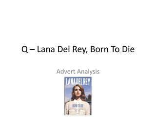
2. The artist name and album
name both stand out
significantly, using bold
block capitals and heavily
contrasting colours. The
artist name lies in front of a
simplistic background made
up of a mild blue, which
contrasts and is reversed in
the album title which is blue
over the white shirt.
The advert uses a very
limited palette of blue and
white, contrasted by the red
hair and lips, which stand
out in a provocative manner
as red is symbolic of love
and danger as opposed to
the gentle innocence of the
mild blues and whites.
The model (in this case the
artist herself) is making direct
contact with the viewer,
provoking the audience to
avert eye contact and read the
text and album information. In
a sense, the model is drawing
the reader in, like the sirens in
Greek mythology, using
conventions of beauty and
simplicity to appeal to a wider
audience.
The use of the sky and
outdoors, coupled with the
colour palette, creates a warm
summer feel, despite the
connotations of blue being a
‘cold’ colour. The summer
clouds and green trees add to
this warm nostalgic feeling, as
well as the light shirt and warm
radiance of her red hair and lips
enticing the audience through
these feelings of nostalgia and
summer happiness.