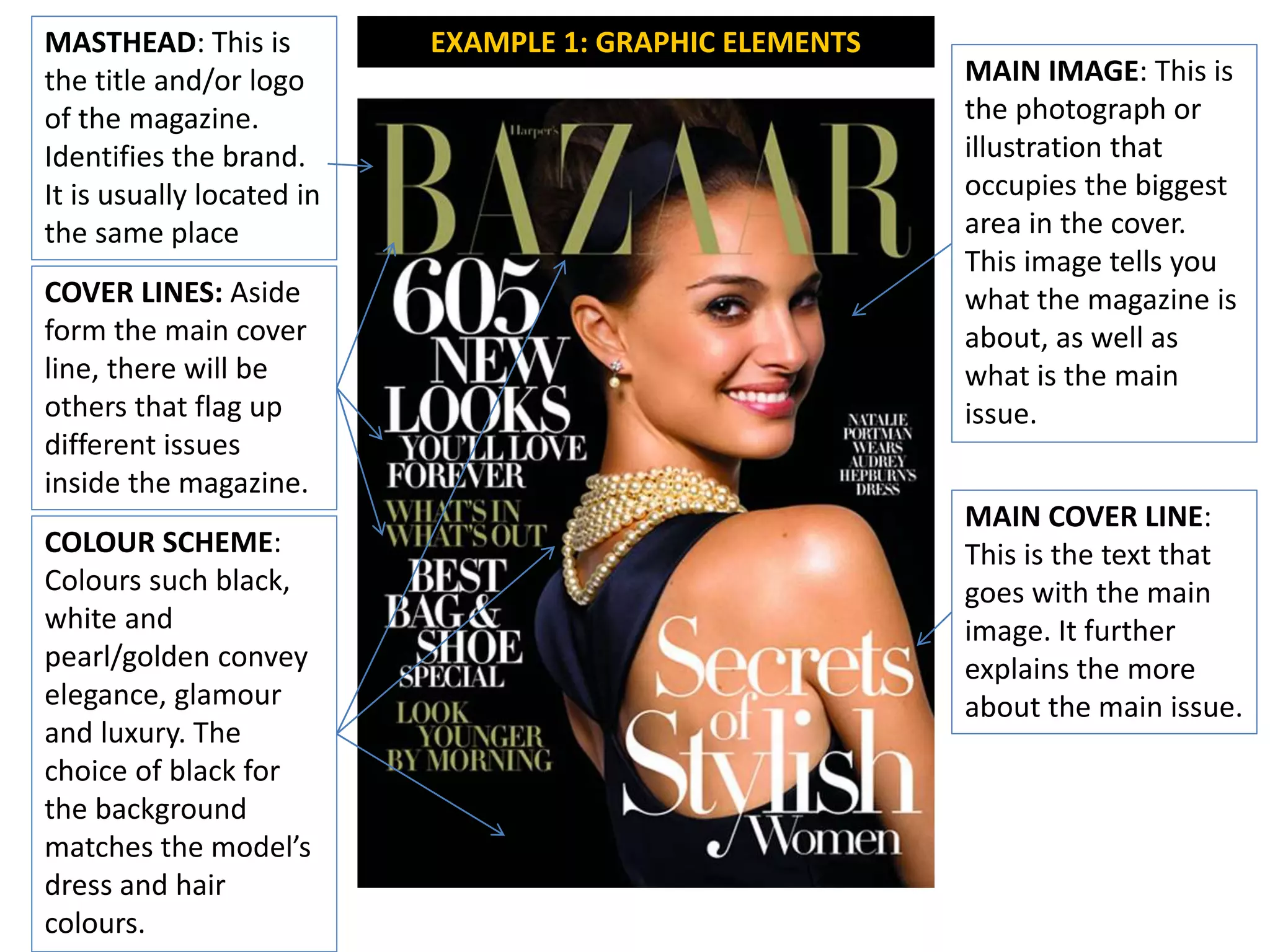
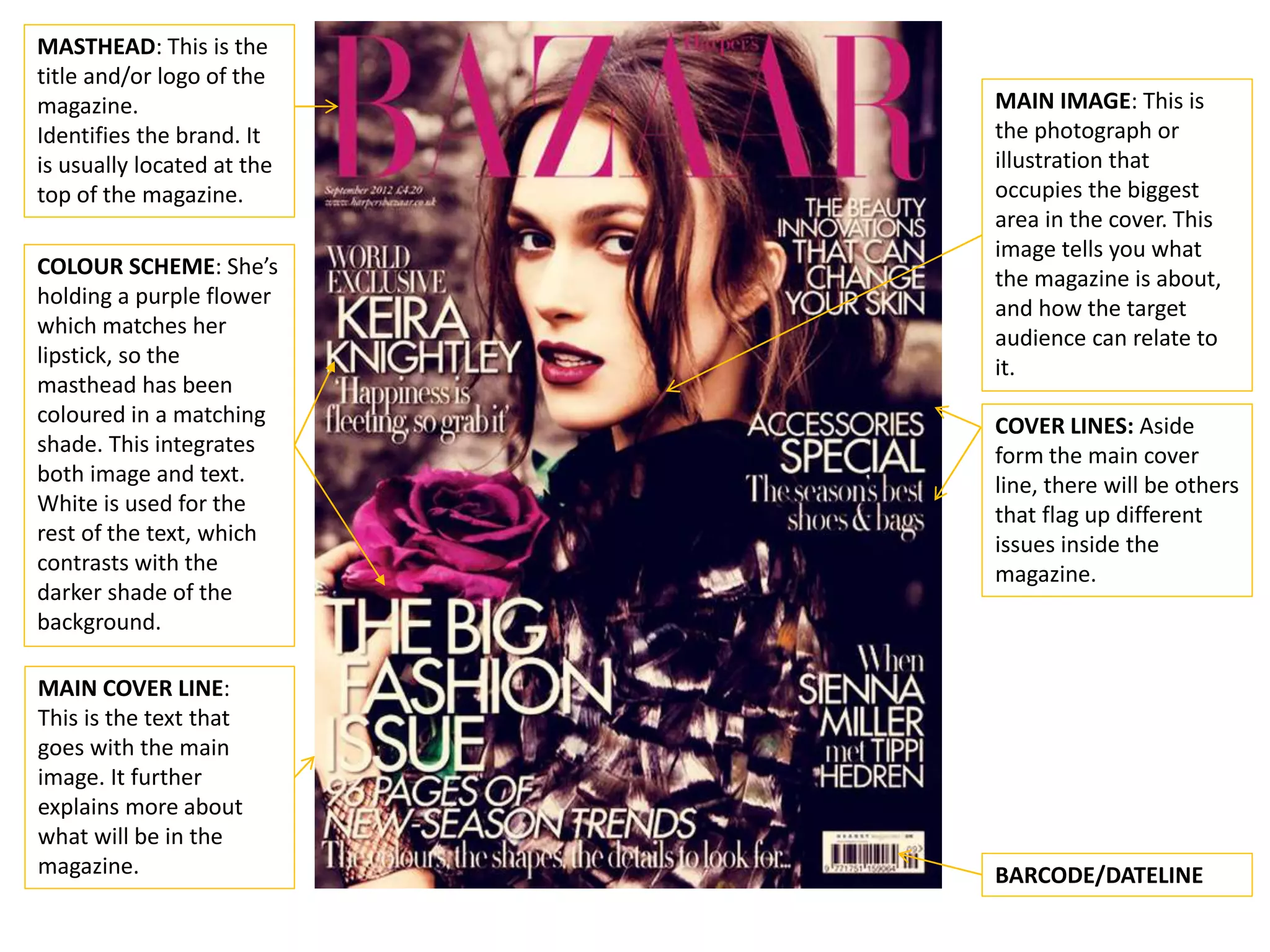
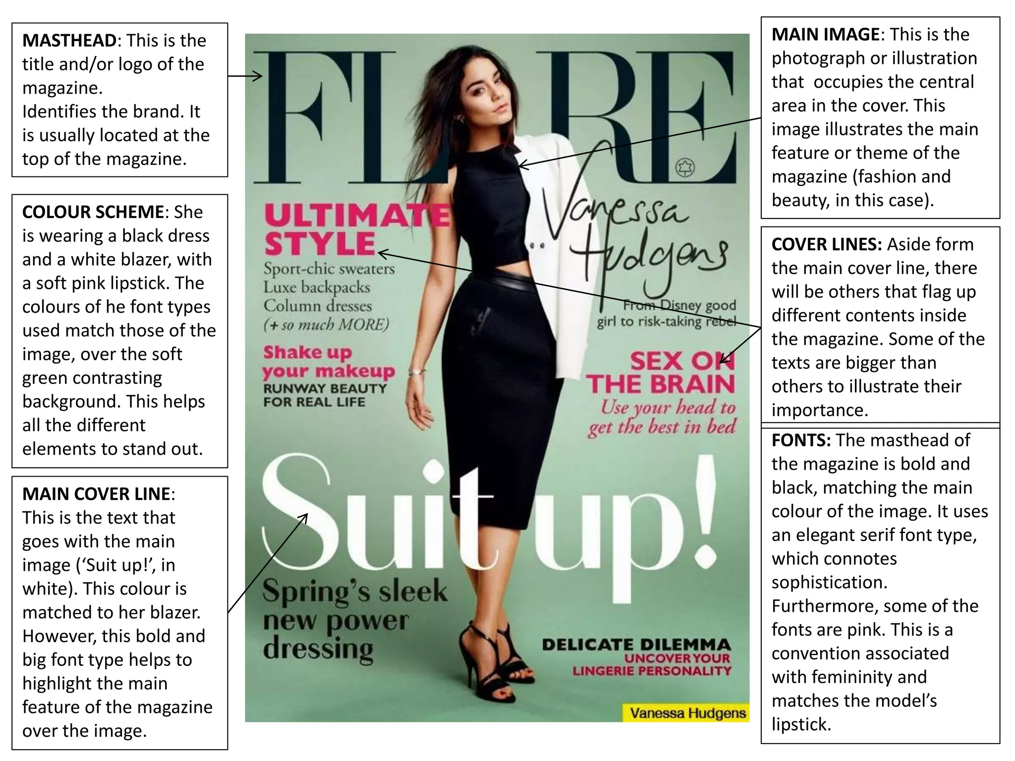
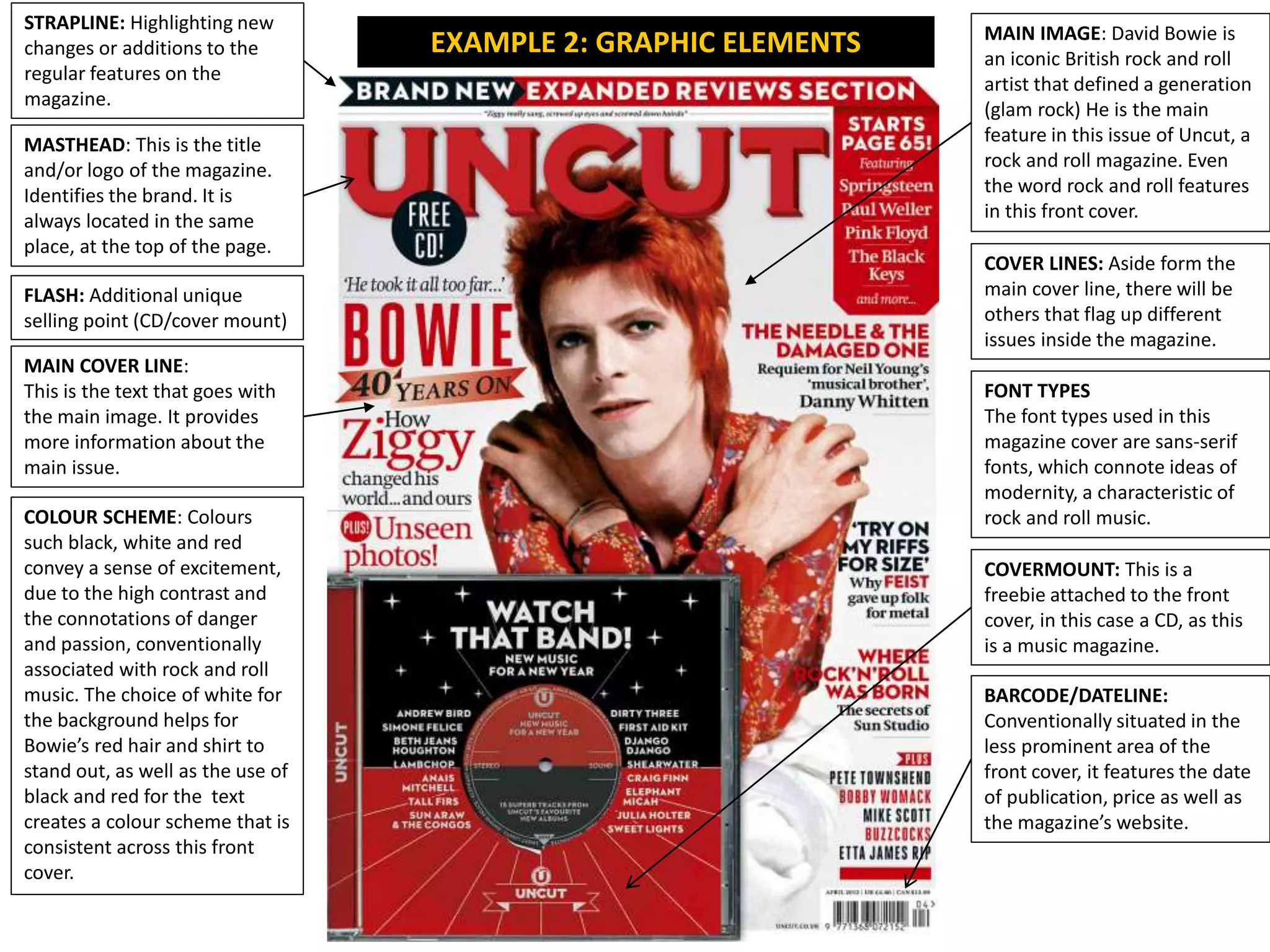
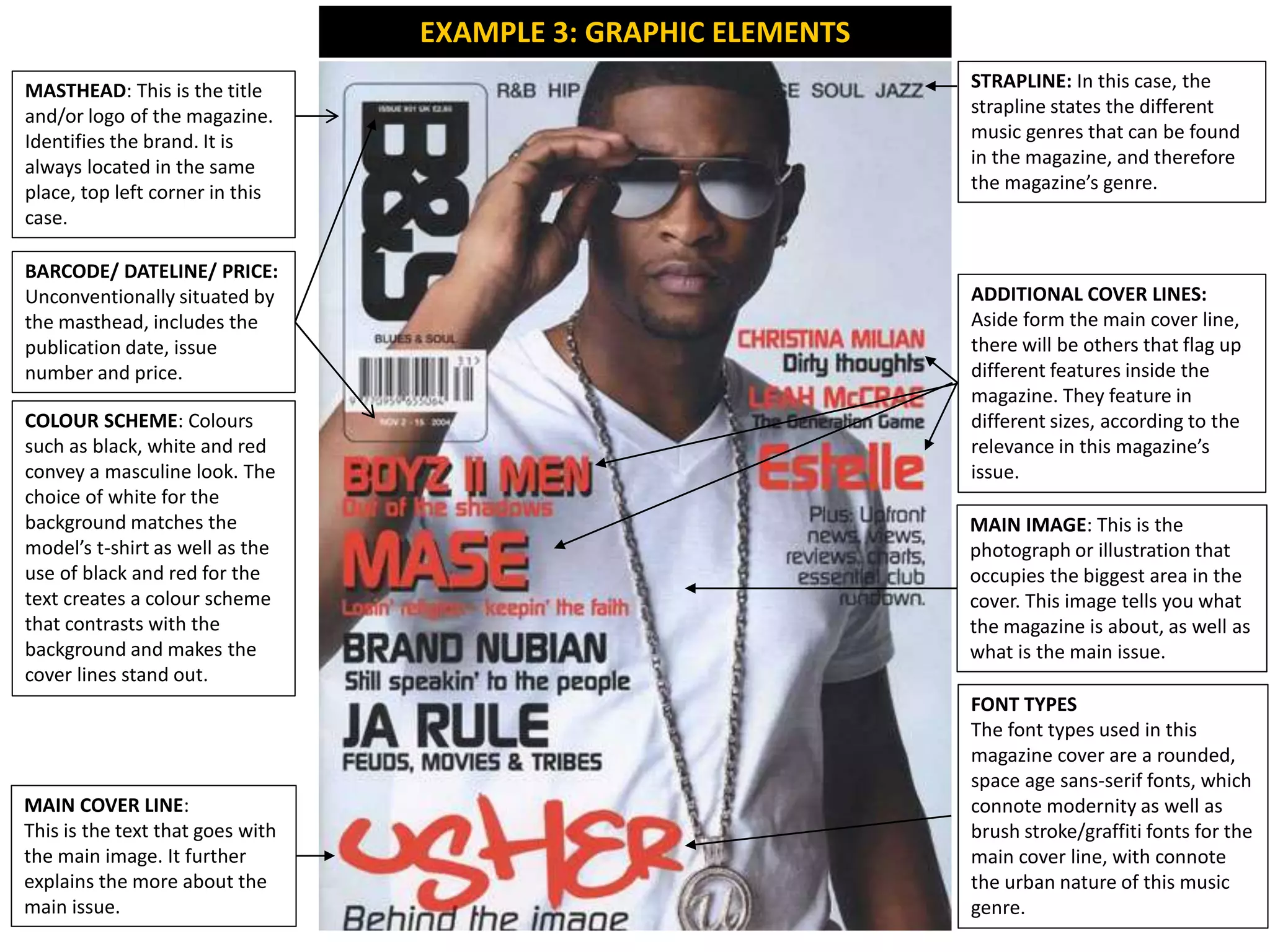
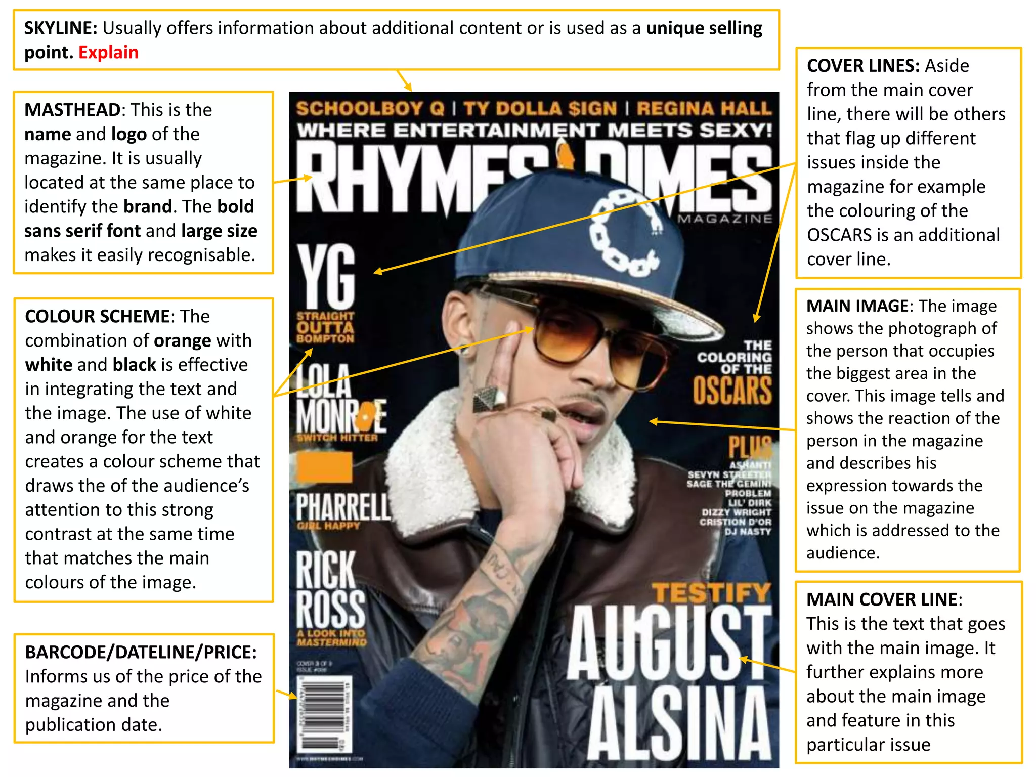
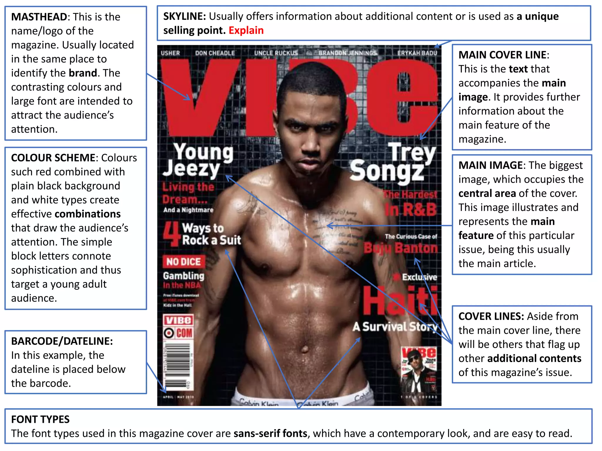
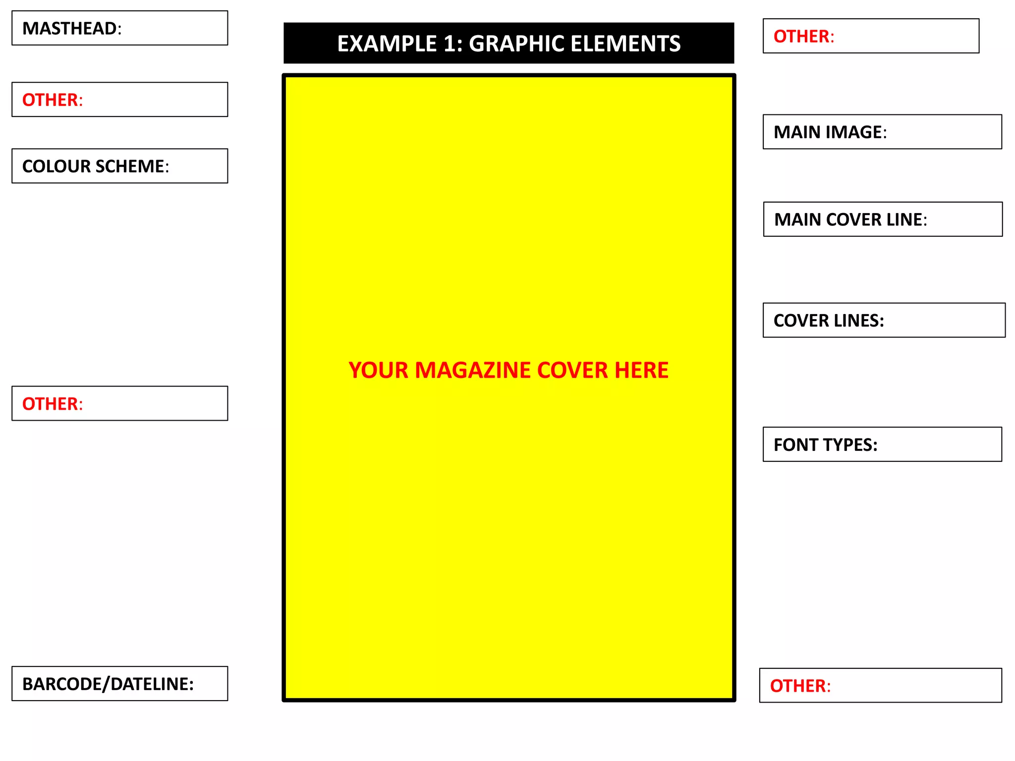
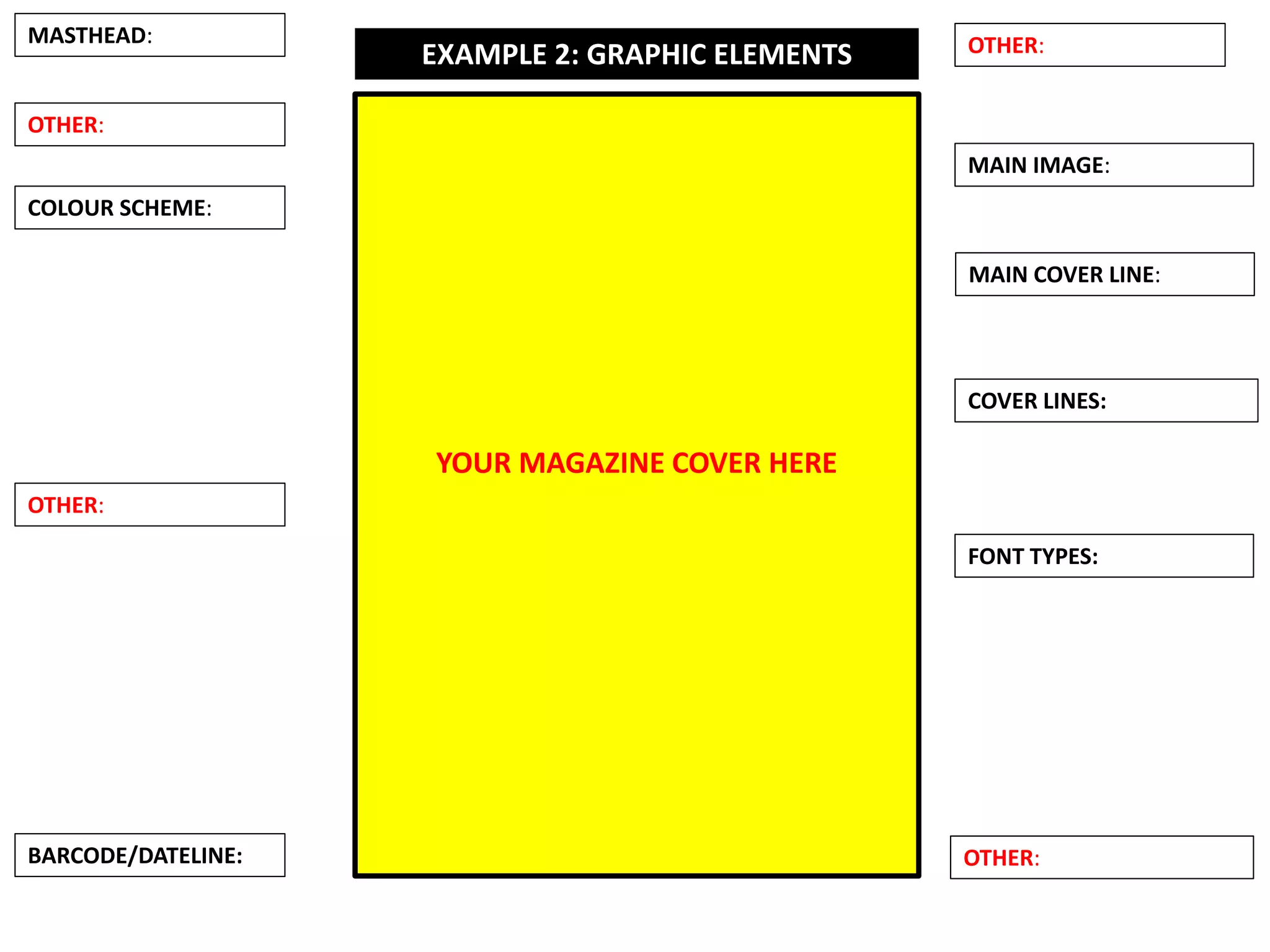
Identify and explain in your own words the graphic elements in these magazine
covers.
Looking at your chosen magazine cover, answer these questions:
 How many graphic elements can you spot?
 How has been the masthead designed (choice of font types, composition,
colour? Is it a conventional one? Is it conventional for this specific genre?
 What is the headline/main cover line (image/cover line)?
 What other cover lines are included?
 What is the composition of the text and images?Think of size of text and
position of images.
 What are the main two colours in the image?
 What are the main two colours in the text?
 What are the codes and conventions of that particular genre.
(See some examples in the next slides)
Examples and templates
MASTHEAD: This is
the title and/or logo
of the magazine.
Identifies the brand.
It is usually located in
the same place
MAIN IMAGE: This is
the photograph or
illustration that
occupies the biggest
area in the cover.
This image tells you
what the magazine is
about, as well as
what is the main
issue.
MAIN COVER LINE:
This is the text that
goes with the main
image. It further
explains the more
about the main issue.
COVER LINES: Aside
form the main cover
line, there will be
others that flag up
different issues
inside the magazine.
COLOUR SCHEME:
Colours such black,
white and
pearl/golden convey
elegance, glamour
and luxury. The
choice of black for
the background
matches the model’s
dress and hair
colours.
EXAMPLE 1: GRAPHIC ELEMENTS
MASTHEAD: This is the
title and/or logo of the
magazine.
Identifies the brand. It
is usually located at the
top of the magazine.
COVER LINES: Aside
form the main cover
line, there will be others
that flag up different
issues inside the
magazine.
COLOUR SCHEME: She’s
holding a purple flower
which matches her
lipstick, so the
masthead has been
coloured in a matching
shade. This integrates
both image and text.
White is used for the
rest of the text, which
contrasts with the
darker shade of the
background.
MAIN COVER LINE:
This is the text that
goes with the main
image. It further
explains more about
what will be in the
magazine.
MAIN IMAGE: This is
the photograph or
illustration that
occupies the biggest
area in the cover. This
image tells you what
the magazine is about,
and how the target
audience can relate to
it.
BARCODE/DATELINE
MASTHEAD: This is the
title and/or logo of the
magazine.
Identifies the brand. It
is usually located at the
top of the magazine.
COVER LINES: Aside form
the main cover line, there
will be others that flag up
different contents inside
the magazine. Some of the
texts are bigger than
others to illustrate their
importance.
FONTS: The masthead of
the magazine is bold and
black, matching the main
colour of the image. It uses
an elegant serif font type,
which connotes
sophistication.
Furthermore, some of the
fonts are pink. This is a
convention associated
with femininity and
matches the model’s
lipstick.
COLOUR SCHEME: She
is wearing a black dress
and a white blazer, with
a soft pink lipstick. The
colours of he font types
used match those of the
image, over the soft
green contrasting
background. This helps
all the different
elements to stand out.
MAIN COVER LINE:
This is the text that
goes with the main
image (‘Suit up!’, in
white). This colour is
matched to her blazer.
However, this bold and
big font type helps to
highlight the main
feature of the magazine
over the image.
MAIN IMAGE: This is the
photograph or illustration
that occupies the central
area in the cover. This
image illustrates the main
feature or theme of the
magazine (fashion and
beauty, in this case).
COVER LINES: Aside form the
main cover line, there will be
others that flag up different
issues inside the magazine.
FONT TYPES
The font types used in this
magazine cover are sans-serif
fonts, which connote ideas of
modernity, a characteristic of
rock and roll music.
MAIN IMAGE: David Bowie is
an iconic British rock and roll
artist that defined a generation
(glam rock) He is the main
feature in this issue of Uncut, a
rock and roll magazine. Even
the word rock and roll features
in this front cover.
BARCODE/DATELINE:
Conventionally situated in the
less prominent area of the
front cover, it features the date
of publication, price as well as
the magazine’s website.
COVERMOUNT: This is a
freebie attached to the front
cover, in this case a CD, as this
is a music magazine.
FLASH: Additional unique
selling point (CD/cover mount)
STRAPLINE: Highlighting new
changes or additions to the
regular features on the
magazine.
MASTHEAD: This is the title
and/or logo of the magazine.
Identifies the brand. It is
always located in the same
place, at the top of the page.
MAIN COVER LINE:
This is the text that goes with
the main image. It provides
more information about the
main issue.
COLOUR SCHEME: Colours
such black, white and red
convey a sense of excitement,
due to the high contrast and
the connotations of danger
and passion, conventionally
associated with rock and roll
music. The choice of white for
the background helps for
Bowie’s red hair and shirt to
stand out, as well as the use of
black and red for the text
creates a colour scheme that is
consistent across this front
cover.
EXAMPLE 2: GRAPHIC ELEMENTS
MASTHEAD: This is the title
and/or logo of the magazine.
Identifies the brand. It is
always located in the same
place, top left corner in this
case.
MAIN COVER LINE:
This is the text that goes with
the main image. It further
explains the more about the
main issue.
FONT TYPES
The font types used in this
magazine cover are a rounded,
space age sans-serif fonts, which
connote modernity as well as
brush stroke/graffiti fonts for the
main cover line, with connote
the urban nature of this music
genre.
COLOUR SCHEME: Colours
such as black, white and red
convey a masculine look. The
choice of white for the
background matches the
model’s t-shirt as well as the
use of black and red for the
text creates a colour scheme
that contrasts with the
background and makes the
cover lines stand out.
MAIN IMAGE: This is the
photograph or illustration that
occupies the biggest area in the
cover. This image tells you what
the magazine is about, as well as
what is the main issue.
BARCODE/ DATELINE/ PRICE:
Unconventionally situated by
the masthead, includes the
publication date, issue
number and price.
STRAPLINE: In this case, the
strapline states the different
music genres that can be found
in the magazine, and therefore
the magazine’s genre.
EXAMPLE 3: GRAPHIC ELEMENTS
ADDITIONAL COVER LINES:
Aside form the main cover line,
there will be others that flag up
different features inside the
magazine. They feature in
different sizes, according to the
relevance in this magazine’s
issue.
MASTHEAD: This is the
name and logo of the
magazine. It is usually
located at the same place to
identify the brand. The bold
sans serif font and large size
makes it easily recognisable.
COLOUR SCHEME: The
combination of orange with
white and black is effective
in integrating the text and
the image. The use of white
and orange for the text
creates a colour scheme that
draws the of the audience’s
attention to this strong
contrast at the same time
that matches the main
colours of the image.
MAIN COVER LINE:
This is the text that goes
with the main image. It
further explains more
about the main image
and feature in this
particular issue
MAIN IMAGE: The image
shows the photograph of
the person that occupies
the biggest area in the
cover. This image tells and
shows the reaction of the
person in the magazine
and describes his
expression towards the
issue on the magazine
which is addressed to the
audience.
COVER LINES: Aside
from the main cover
line, there will be others
that flag up different
issues inside the
magazine for example
the colouring of the
OSCARS is an additional
cover line.
BARCODE/DATELINE/PRICE:
Informs us of the price of the
magazine and the
publication date.
SKYLINE: Usually offers information about additional content or is used as a unique selling
point. Explain
MASTHEAD: This is the
name/logo of the
magazine. Usually located
in the same place to
identify the brand. The
contrasting colours and
large font are intended to
attract the audience’s
attention.
COVER LINES: Aside from
the main cover line, there
will be others that flag up
other additional contents
of this magazine’s issue.
FONT TYPES
The font types used in this magazine cover are sans-serif fonts, which have a contemporary look, and are easy to read.
COLOUR SCHEME: Colours
such red combined with
plain black background
and white types create
effective combinations
that draw the audience’s
attention. The simple
block letters connote
sophistication and thus
target a young adult
audience.
MAIN COVER LINE:
This is the text that
accompanies the main
image. It provides further
information about the
main feature of the
magazine.
MAIN IMAGE: The biggest
image, which occupies the
central area of the cover.
This image illustrates and
represents the main
feature of this particular
issue, being this usually
the main article.
BARCODE/DATELINE:
In this example, the
dateline is placed below
the barcode.
SKYLINE: Usually offers information about additional content or is used as a unique
selling point. Explain
MASTHEAD: This is the
name and branding image
(logo) of the magazine. It is
usually located in the same
place to identify the brand.
The bold colours and large
font is intended to make it
immediately recognisable
for its target audience.
COVER LINES: Aside from
the main cover line, there
will be others that flag up
other additional contents
of this magazine’s issue.
Cover lines are
conventionally written in
CAPITALS.
The FONT TYPES used in this magazine cover are sans-serif fonts in capitals, which have a
contemporary look, and are easy to read.
COLOUR SCHEME: The
colours used in the font
types match, harmonise or
contrast with those of the
main image. It is paramount
that both graphic elements
(text and image) are
perfectly integrated in a
balanced and coherent
design.
MAIN COVER LINE: This is
the text that accompanies
the main image. It further
explains the more about
the main feature of the
magazine. It is usually the
biggest text box after the
masthead.
MAIN IMAGE: The biggest
image, which occupies the
central area of the cover.
This image illustrates and
represents the main
feature of this particular
issue, being this usually
the main article.
BARCODE: Is not a graphic
element as such, but a
purely functional element.
DATELINE/PRICE: Informs us
of the price of the magazine
and the publication date.
SKYLINE: Usually offers information about additional content or is used as a unique selling point. Explain
Template for your analyses
Task:
• Using the examples and templates provided in this
presentation, analyse the graphic elements of
three magazine covers of your choice, from three
different genres.
• Use the same format as in the previous examples
and the following slides as a template for your
analyses.
MASTHEAD:
COVER LINES:
FONT TYPES:
COLOUR SCHEME:
MAIN COVER LINE:
MAIN IMAGE:
BARCODE/DATELINE:
YOUR MAGAZINE COVER HERE
EXAMPLE 1: GRAPHIC ELEMENTS
OTHER:
OTHER:
OTHER:
OTHER:
MASTHEAD:
COVER LINES:
FONT TYPES:
COLOUR SCHEME:
MAIN COVER LINE:
MAIN IMAGE:
BARCODE/DATELINE:
YOUR MAGAZINE COVER HERE
EXAMPLE 2: GRAPHIC ELEMENTS
OTHER:
OTHER:
OTHER:
OTHER:
MASTHEAD:
COVER LINES:
FONT TYPES:
COLOUR SCHEME:
MAIN COVER LINE:
MAIN IMAGE:
BARCODE/DATELINE:
YOUR MAGAZINE COVER HERE
EXAMPLE 3: GRAPHIC ELEMENTS
OTHER:
OTHER:
OTHER:
OTHER:

Magazine cover graphic elements analysis

  • 1.
    Identify and explainin your own words the graphic elements in these magazine covers.
  • 2.
    Looking at yourchosen magazine cover, answer these questions:  How many graphic elements can you spot?  How has been the masthead designed (choice of font types, composition, colour? Is it a conventional one? Is it conventional for this specific genre?  What is the headline/main cover line (image/cover line)?  What other cover lines are included?  What is the composition of the text and images?Think of size of text and position of images.  What are the main two colours in the image?  What are the main two colours in the text?  What are the codes and conventions of that particular genre. (See some examples in the next slides)
  • 3.
  • 4.
    MASTHEAD: This is thetitle and/or logo of the magazine. Identifies the brand. It is usually located in the same place MAIN IMAGE: This is the photograph or illustration that occupies the biggest area in the cover. This image tells you what the magazine is about, as well as what is the main issue. MAIN COVER LINE: This is the text that goes with the main image. It further explains the more about the main issue. COVER LINES: Aside form the main cover line, there will be others that flag up different issues inside the magazine. COLOUR SCHEME: Colours such black, white and pearl/golden convey elegance, glamour and luxury. The choice of black for the background matches the model’s dress and hair colours. EXAMPLE 1: GRAPHIC ELEMENTS
  • 5.
    MASTHEAD: This isthe title and/or logo of the magazine. Identifies the brand. It is usually located at the top of the magazine. COVER LINES: Aside form the main cover line, there will be others that flag up different issues inside the magazine. COLOUR SCHEME: She’s holding a purple flower which matches her lipstick, so the masthead has been coloured in a matching shade. This integrates both image and text. White is used for the rest of the text, which contrasts with the darker shade of the background. MAIN COVER LINE: This is the text that goes with the main image. It further explains more about what will be in the magazine. MAIN IMAGE: This is the photograph or illustration that occupies the biggest area in the cover. This image tells you what the magazine is about, and how the target audience can relate to it. BARCODE/DATELINE
  • 6.
    MASTHEAD: This isthe title and/or logo of the magazine. Identifies the brand. It is usually located at the top of the magazine. COVER LINES: Aside form the main cover line, there will be others that flag up different contents inside the magazine. Some of the texts are bigger than others to illustrate their importance. FONTS: The masthead of the magazine is bold and black, matching the main colour of the image. It uses an elegant serif font type, which connotes sophistication. Furthermore, some of the fonts are pink. This is a convention associated with femininity and matches the model’s lipstick. COLOUR SCHEME: She is wearing a black dress and a white blazer, with a soft pink lipstick. The colours of he font types used match those of the image, over the soft green contrasting background. This helps all the different elements to stand out. MAIN COVER LINE: This is the text that goes with the main image (‘Suit up!’, in white). This colour is matched to her blazer. However, this bold and big font type helps to highlight the main feature of the magazine over the image. MAIN IMAGE: This is the photograph or illustration that occupies the central area in the cover. This image illustrates the main feature or theme of the magazine (fashion and beauty, in this case).
  • 7.
    COVER LINES: Asideform the main cover line, there will be others that flag up different issues inside the magazine. FONT TYPES The font types used in this magazine cover are sans-serif fonts, which connote ideas of modernity, a characteristic of rock and roll music. MAIN IMAGE: David Bowie is an iconic British rock and roll artist that defined a generation (glam rock) He is the main feature in this issue of Uncut, a rock and roll magazine. Even the word rock and roll features in this front cover. BARCODE/DATELINE: Conventionally situated in the less prominent area of the front cover, it features the date of publication, price as well as the magazine’s website. COVERMOUNT: This is a freebie attached to the front cover, in this case a CD, as this is a music magazine. FLASH: Additional unique selling point (CD/cover mount) STRAPLINE: Highlighting new changes or additions to the regular features on the magazine. MASTHEAD: This is the title and/or logo of the magazine. Identifies the brand. It is always located in the same place, at the top of the page. MAIN COVER LINE: This is the text that goes with the main image. It provides more information about the main issue. COLOUR SCHEME: Colours such black, white and red convey a sense of excitement, due to the high contrast and the connotations of danger and passion, conventionally associated with rock and roll music. The choice of white for the background helps for Bowie’s red hair and shirt to stand out, as well as the use of black and red for the text creates a colour scheme that is consistent across this front cover. EXAMPLE 2: GRAPHIC ELEMENTS
  • 8.
    MASTHEAD: This isthe title and/or logo of the magazine. Identifies the brand. It is always located in the same place, top left corner in this case. MAIN COVER LINE: This is the text that goes with the main image. It further explains the more about the main issue. FONT TYPES The font types used in this magazine cover are a rounded, space age sans-serif fonts, which connote modernity as well as brush stroke/graffiti fonts for the main cover line, with connote the urban nature of this music genre. COLOUR SCHEME: Colours such as black, white and red convey a masculine look. The choice of white for the background matches the model’s t-shirt as well as the use of black and red for the text creates a colour scheme that contrasts with the background and makes the cover lines stand out. MAIN IMAGE: This is the photograph or illustration that occupies the biggest area in the cover. This image tells you what the magazine is about, as well as what is the main issue. BARCODE/ DATELINE/ PRICE: Unconventionally situated by the masthead, includes the publication date, issue number and price. STRAPLINE: In this case, the strapline states the different music genres that can be found in the magazine, and therefore the magazine’s genre. EXAMPLE 3: GRAPHIC ELEMENTS ADDITIONAL COVER LINES: Aside form the main cover line, there will be others that flag up different features inside the magazine. They feature in different sizes, according to the relevance in this magazine’s issue.
  • 9.
    MASTHEAD: This isthe name and logo of the magazine. It is usually located at the same place to identify the brand. The bold sans serif font and large size makes it easily recognisable. COLOUR SCHEME: The combination of orange with white and black is effective in integrating the text and the image. The use of white and orange for the text creates a colour scheme that draws the of the audience’s attention to this strong contrast at the same time that matches the main colours of the image. MAIN COVER LINE: This is the text that goes with the main image. It further explains more about the main image and feature in this particular issue MAIN IMAGE: The image shows the photograph of the person that occupies the biggest area in the cover. This image tells and shows the reaction of the person in the magazine and describes his expression towards the issue on the magazine which is addressed to the audience. COVER LINES: Aside from the main cover line, there will be others that flag up different issues inside the magazine for example the colouring of the OSCARS is an additional cover line. BARCODE/DATELINE/PRICE: Informs us of the price of the magazine and the publication date. SKYLINE: Usually offers information about additional content or is used as a unique selling point. Explain
  • 10.
    MASTHEAD: This isthe name/logo of the magazine. Usually located in the same place to identify the brand. The contrasting colours and large font are intended to attract the audience’s attention. COVER LINES: Aside from the main cover line, there will be others that flag up other additional contents of this magazine’s issue. FONT TYPES The font types used in this magazine cover are sans-serif fonts, which have a contemporary look, and are easy to read. COLOUR SCHEME: Colours such red combined with plain black background and white types create effective combinations that draw the audience’s attention. The simple block letters connote sophistication and thus target a young adult audience. MAIN COVER LINE: This is the text that accompanies the main image. It provides further information about the main feature of the magazine. MAIN IMAGE: The biggest image, which occupies the central area of the cover. This image illustrates and represents the main feature of this particular issue, being this usually the main article. BARCODE/DATELINE: In this example, the dateline is placed below the barcode. SKYLINE: Usually offers information about additional content or is used as a unique selling point. Explain
  • 11.
    MASTHEAD: This isthe name and branding image (logo) of the magazine. It is usually located in the same place to identify the brand. The bold colours and large font is intended to make it immediately recognisable for its target audience. COVER LINES: Aside from the main cover line, there will be others that flag up other additional contents of this magazine’s issue. Cover lines are conventionally written in CAPITALS. The FONT TYPES used in this magazine cover are sans-serif fonts in capitals, which have a contemporary look, and are easy to read. COLOUR SCHEME: The colours used in the font types match, harmonise or contrast with those of the main image. It is paramount that both graphic elements (text and image) are perfectly integrated in a balanced and coherent design. MAIN COVER LINE: This is the text that accompanies the main image. It further explains the more about the main feature of the magazine. It is usually the biggest text box after the masthead. MAIN IMAGE: The biggest image, which occupies the central area of the cover. This image illustrates and represents the main feature of this particular issue, being this usually the main article. BARCODE: Is not a graphic element as such, but a purely functional element. DATELINE/PRICE: Informs us of the price of the magazine and the publication date. SKYLINE: Usually offers information about additional content or is used as a unique selling point. Explain
  • 12.
    Template for youranalyses Task: • Using the examples and templates provided in this presentation, analyse the graphic elements of three magazine covers of your choice, from three different genres. • Use the same format as in the previous examples and the following slides as a template for your analyses.
  • 13.
    MASTHEAD: COVER LINES: FONT TYPES: COLOURSCHEME: MAIN COVER LINE: MAIN IMAGE: BARCODE/DATELINE: YOUR MAGAZINE COVER HERE EXAMPLE 1: GRAPHIC ELEMENTS OTHER: OTHER: OTHER: OTHER:
  • 14.
    MASTHEAD: COVER LINES: FONT TYPES: COLOURSCHEME: MAIN COVER LINE: MAIN IMAGE: BARCODE/DATELINE: YOUR MAGAZINE COVER HERE EXAMPLE 2: GRAPHIC ELEMENTS OTHER: OTHER: OTHER: OTHER:
  • 15.
    MASTHEAD: COVER LINES: FONT TYPES: COLOURSCHEME: MAIN COVER LINE: MAIN IMAGE: BARCODE/DATELINE: YOUR MAGAZINE COVER HERE EXAMPLE 3: GRAPHIC ELEMENTS OTHER: OTHER: OTHER: OTHER: