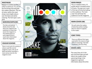
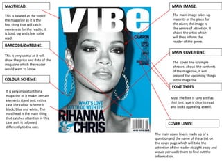
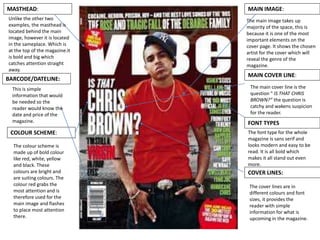
The document discusses the design elements of a magazine cover. It notes that the main image takes up most of the space to draw attention to the featured artist and genre. The large masthead is located at the top in a contrasting color to catch the reader's eye. Sans serif fonts are used throughout for clarity. The main cover line is a question about the artist that would intrigue readers. Other elements like the barcode and dateline provide needed information but in understated ways so as not to distract from the main visual elements.