This document analyzes the target audience of a magazine cover. The target audience is teenage girls based on the masthead title of "Seventeen", stereotypically feminine colors, and a boy band member as the main image. The geo-demographics are English-speaking countries like the UK, US, and elsewhere. The socio-economics target groups D and E who can afford the £2.90 price. The psychographic profile is mainstreamers interested in mainstream brands and celebrities featured on the cover and in the magazine.
This 7-second Brain Wave Ritual Attracts Money To You.!nirahealhty
Discover the power of a simple 7-second brain wave ritual that can attract wealth and abundance into your life. By tapping into specific brain frequencies, this technique helps you manifest financial success effortlessly. Ready to transform your financial future? Try this powerful ritual and start attracting money today!
ER(Entity Relationship) Diagram for online shopping - TAEHimani415946
https://bit.ly/3KACoyV
The ER diagram for the project is the foundation for the building of the database of the project. The properties, datatypes, and attributes are defined by the ER diagram.
1.Wireless Communication System_Wireless communication is a broad term that i...JeyaPerumal1
Wireless communication involves the transmission of information over a distance without the help of wires, cables or any other forms of electrical conductors.
Wireless communication is a broad term that incorporates all procedures and forms of connecting and communicating between two or more devices using a wireless signal through wireless communication technologies and devices.
Features of Wireless Communication
The evolution of wireless technology has brought many advancements with its effective features.
The transmitted distance can be anywhere between a few meters (for example, a television's remote control) and thousands of kilometers (for example, radio communication).
Wireless communication can be used for cellular telephony, wireless access to the internet, wireless home networking, and so on.
Multi-cluster Kubernetes Networking- Patterns, Projects and GuidelinesSanjeev Rampal
Talk presented at Kubernetes Community Day, New York, May 2024.
Technical summary of Multi-Cluster Kubernetes Networking architectures with focus on 4 key topics.
1) Key patterns for Multi-cluster architectures
2) Architectural comparison of several OSS/ CNCF projects to address these patterns
3) Evolution trends for the APIs of these projects
4) Some design recommendations & guidelines for adopting/ deploying these solutions.
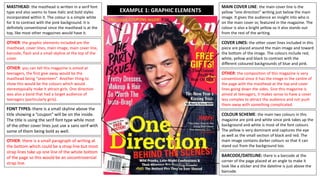
1. MASTHEAD: the masthead is written in a serif font
type and also seems to have italic and bold styles
incorporated within it. The colour is a simple white
for it to contrast with the pink background. It is
definitely conventional since the masthead is at the
top, like most other magazines would have it.
COVER LINES: the other cover lines included in this
piece are placed around the main image and toward
the bottom of the image. The colours include red,
white, yellow and black to contrast with the
different coloured backgrounds of blue and pink.
FONT TYPES: there is a small skyline above the
title showing a “coupon” will be on the inside.
The title is using the serif font type while most
of the other cover lines just use a sans serif with
some of them being bold as well.
COLOUR SCHEME: the main two colours in this
magazine are pink and white since pink takes up the
background and white is most of the font colours.
The yellow is very dominant and captures the eye
as well as the small section of black and red. The
main image contains darker colours so that it can
stand out from the background too.
MAIN COVER LINE: the main cover line is the
yellow “one direction” writing just below the main
image. It gives the audience an insight into who is
on the main cover or, featured in the magazine. The
colour is also a bright yellow so it also stands out
from the rest of the writing.
BARCODE/DATELINE: there is a barcode at the
corner of the page placed at an angle to make it
look like a sticker and the dateline is just above the
barcode.
EXAMPLE 1: GRAPHIC ELEMENTS
OTHER: the graphic elements included are the
masthead, cover lines, main image, main cover line,
barcode, flash and a small skyline at the top of the
cover.
OTHER: the composition of this magazine is very
conventional since it has the image in the centre of
the page with the masthead at the top and cover
lines going down the sides. Sine this magazine is
aimed at teenagers, it makes sense to have a cover
less complex to attract the audience and not push
them away with something complicated.
OTHER: there is a small paragraph of writing at
the bottom which could be a strap line but most
strap lines take up one line of the whole bottom
of the page so this would be an uncontroversial
strap line.
OTHER: you can tell this magazine is aimed at
teenagers, the first give away would be the
masthead being “seventeen”. Another thing to
show this would be the colours which would
stereotypically make it attract girls. One direction
was also a band that had a target audience of
teenagers (particularly girls).
2. MASTHEAD: the masthead on this magazine cover
is much less conventional than the others because
the masthead takes place in the corner of the
magazine and not along the top. it is also in a red
box which most mastheads wouldn’t have, they
would just be the masthead without a background
colour.
COVER LINES: this magazine cover has a lot of
cover lines going round the sides of the main
image. It has a lot more cover lines than the last
magazine. From the colours (pink, white and black)
we can tell this magazine is aimed at women
interested in fashion and health. It looks as though
none of the cover lines have the same font either.
COLOUR SCHEME: the colour scheme of this
magazine uses very similar colours, different shades
of pink and black and white to contrast with it. The
red of the title also works with the pink of the
magazine. The font is really what makes the cover
lines stand out instead of the colours.
MAIN COVER LINE: there are multiple main cover
lines including “happier fitter you” and “fashion to lift
your mood” these are both in a pink colour to
contrast with the dark red title and work with the pink
shade in the background. The writing on this
magazine uses multiple font types, some with the
serif, bold and italic.
MAIN IMAGE: the main image is also very
conventional in this magazine genre since the image is
in the centre of the page and shows the face of a
woman and part of her body. Having someone’s face
could attract readers to buy the magazine because it
is like the person is looking into them to buy the
magazine.
BARCODE/DATELINE: the dateline on this magazine
is placed under the title which is quite conventional.
However, the barcode is put on the side of the
magazine when they would normally be in the corner
or on the back making this part unconventional.
EXAMPLE 2: GRAPHIC ELEMENTSOTHER: the graphic elements included in this are
the masthead, cover lines, main image, multiple
main cover lines and a bar code.
OTHER: this magazine does have a strap line but
no sky line. The strap line includes different words
which might show what is included in the
magazine, almost like contents so people know
what is in the magazine they are buying.
OTHER: the composition of this magazine is also
quite conventional because it has the main image in
the centre and the cover lines on the sides. The only
thing unconventional about this magazine is the
masthead being in the corner and not along the top.
OTHER: from the main image, cover lines and
colour scheme, we can see this magazine is aimed
generally at women who like to have a healthy life
style. This is shown by a woman being on the main
image, the colours are stereotypically aimed at
women and the cover lines talk about health and
fashion.
3. MASTHEAD: the masthead in this magazine is
similar to first magazine except this masthead
goes in front of the image instead of behind it. A
serif font type is also used in this masthead in a
black colour to contrast with the white
background.
COVER LINES: the other cover lines are written
in pink or black and use either a bold or sans serif
font type, this makes it stand out in comparison
to the masthead but doesn’t take all the
attention away from the masthead and the main
image.
COLOUR SCHEME: the colour scheme of this
magazine includes colours like pink, black, white
and a green/blonde shade. The main image uses
all of these colours which helps it match with the
writing so they all merge into one. The pink
catches the eye because it is much more bold,
pink was also used on the main image’s eye to
show it captures the eye.
MAIN COVER LINE: the main cover line reads
“spring fever” written in a bold pink colour and a
serif font type showing this magazine could be
about spring fashion. It catches the eye of the
reader because most of the other writing is in
black.
MAIN IMAGE: the main image uses all the
colours from the colour scheme so that any dark
or different colours used can then contrast with it
and stand out. This main image is quite
conventional because all we are seeing is the
woman’s face with a neutral expression to not
take attention away from the cover lines.
BARCODE/DATELINE: there is no visible date
line but the barcode is in the bottom left corner
very conventionally so it doesn’t take attention
away from anything else on the magazine cover.
EXAMPLE 3: GRAPHIC ELEMENTS
OTHER: the graphic elements included in this
magazine cover are; the main image, cover lines,
main cover line, masthead, a sky line and the bar
code.
OTHER: this magazine doesn’t have a strap line
but it does have a sky line at the top, above the
masthead. The sky line seems to be advertising
something in a way to make people feel like they
need it (hence why it is at the top because that is
where people start reading from).
OTHER: the composition of this magazine is the
most controversial of all of the magazines. This is
because the title is in front of the image instead
of behind, the coverlines go around the main
image and the serif font type in the masthead
and main cover line also makes it very traditional.
OTHER: the target audience if this magazine
would also be women, perhaps younger mums
(this could be because a cover line talks about
mums and daughters). The colours indicate a
target audience of women and the cover
lines/masthead show people who are interested
in fashion and beauty.
4. CONVENTIONS: the head of the main image is
in front of the masthead and so is the ribbon
in the top corner. We are still able to read it
though because our mind visualizes the full
masthead.
CODES: the yellow cover line and main cover
line on this magazine can also have codes
attached to them since the colours of them
match with the ribbon in the top right corner
of the page
EXAMPLE 1: CODES AND CONVENTIONS
GENRE: Fashion for teen
girls.
CODES: the colour in the background of
this magazine is a pink shade to contrast
with the darker main image and the
yellow cover lines. However, the codes of
this colour would stereotypically appeal to
woman/girls because the colour pink is
typically connoted with women.
CODES: the cover line “the party issue!” is
written in a type of font which looks quite
fun and intriguing it is also in black and this
can attract the audience. The type of font
looks like something you would use to
advertise a party too.
CONVENTIONS: the size of some of the cover
lines will vary depending on how important it
is. “one direction”, “the party issue” and “free
gifts” are all written in larger writing because
they are the most interesting things of this
magazine. They can advertise the magazine
better because that is what might sell it to
people, knowing this is what they will get
inside.
CONVENTIONS: the masthead in this
magazine cover is in a different font type to
the rest of the cover lines, it is also the
biggest writing and so it stands out.
CONVENTIONS: the main image in this
magazine cover is of a well known member of
a boy band, he appeals to teenage girls
because their music is aimed at that
age/target audience.
CONVENTIONS: the bar code in this magazine
cover is placed in the bottom left corner
which is very conventional for any magazine.
The bar code is only used for functional
purposes so it makes sense for it to be in the
bottom corner.
5. CONVENTIONS: the main image of this magazine
is still in the centre but because the masthead is
in the corner of the page we are able to see
both of them clearly. The masthead is also Red
and the magazine is called Red too.
CODES: the original colours of the masthead
in this magazine are red and white so
naturally the colours of the cover lines would
need to match this to make the magazine
appeal to the target audience. The pink of
the cover lines and background compliment
both the title and the skin colour of the main
image.
EXAMPLE 2: CODES AND CONVENTIONS
GENRE: Fashion
CODES: the various pink colours can also
represent femininity as pink is stereotypically
associated with women, this magazine is also
targeted at women and women’s fashion so
the pink helps reach that target audience.
The pink also works with the lip and skin
colour of the main image.
CODES: the main image is a lot darker than
the rest of the magazine. The woman’s hair
colour, eye shadow and clothing are all
shades of black, this contrasts with the rest
of the magazine but the colour has also been
used in two of the cover lines. One of the
cover lines is coloured in black and it says the
name “Katie Holmes” this helps us to identify
the woman on the front as the colours
matching might tell us that is her name.
CONVENTIONS: the makeup and colours of this
woman in the main image are darker than the
rest of the magazine, the makeup is also
unnatural and doesn’t fit the stereotypes,
making women feel inspired to step outside the
stereotypes too.
CONVENTIONS: the cover lines written in larger
font and bolder colours will catch the eye of the
reader and make them intrigued, they also
advertise the main aspects of the magazine,
telling the reader what they might be buying
before they have actually bought it.
CONVENTIONS: the strap line is a conventional
aspect to most magazines and in this case it acts
like a contents of what will be in the magazine. It
shows the magazine is mostly about fashion but
the other aspects are listed below including
shopping, beauty, food, homes, travel and
health.
CONVENTIONS: since this magazine has a
strap line, there is no space for a bar code to
be at the bottom of the page so it has been
placed to the side. This is unconventional but
makes sense to put it in an area where
nothing else is.
6. CONVENTIONS: the masthead in this magazine
cover is in serif font type and a black colour, it is
also in front of the main image instead of behind
but because it is in black font it stands out from
the rest of the magazine but doesn’t completely
cover the main image to the point where we cant
see it.
EXAMPLE 3: CODES AND CONVENTIONS
GENRE: Fashion
CODES: the two dominant colours in this
magazine are the pink and yellow/green
colour. Since this magazine is from spring
(the main cover line “spring fever” tells us
this) these two colours can be symbolised as
spring colours that are quite vibrant and
seasonal.
CODES: the woman in the main image has a
shade of pink eyeshadow on her eyes and
her lips are also a pink shade, the coverlines
are then also pink to match with her makeup
and make the magazine cover more
aesthetically pleasing and not chaotic.
CODES: just like all of the other magazine
covers, this magazine is aimed towards
women and women’s fashion so the cover
line’s being pink would stereotypically be
aimed at women. It also contrasts with the
white background and stands out quite bold.
CONVENTIONS: the main cover line is larger than
the rest of the cover lines because it is one of the
most advertising parts of the magazine cover.
The main cover line “spring fever” advertises
itself to the audience and shows us that this
magazine is about spring fashion and that time of
the year.
CONVENTIONS: each cover line in this magazine
has been typed using different fonts or colours,
this can attract the audience into wanting to read
it because each part of the magazine seems
different. They might read something bold and
then want to read something pink because it has
attracter them towards it.
CONVENTIONS: the bar code on this magazine
has also been placed in the bottom left corner as
a function and not as something to make the
magazine look better or to fit in with its colours.
This makes it easier to find and easier to scan
when in the shop.
CONVENTIONS: this magazine has a cover line
stating “fashion targets breast cancer…you
should too!” this can make anyone reading
feel inclined to buy the magazine because
one of their reasons for buying it would be for
this cause and to support those with breast
cancer. This then means the magazine will be
gaining more profit because more people will
be buying the magazine because of that one
cover line.
7. Target audience: the target audience for this magazine would be aimed at teenagers, most
likely teenage girls. The masthead is called “seventeen” showing this as one reason teenagers
might read it, the colours are stereotypically aimed at girls and the main image is of a member
of a well known boy band who’s music might appeal to girls and teenagers more than anybody
else. I don’t think this magazine applies to any specific race and anyone could read it if they
wanted to, no matter their skin colour or ethnicity.
The geo-demographics for this magazine would be any country that speaks English (the UK,
USA and anywhere else). If this magazine was printed in a different language then it could be
for any other country but since it is in English, it is meant for English speakers. Although, the
magazine is made in America and initially is made for Americans.
The socio-economics for this magazine would be aimed towards groups D and E. if this
magazine is aimed towards teenagers then it needs to be affordable for them and at a
reasonable price. This magazine is priced at £2.90 and teenagers not working would probably
get pocket money which they can use to spend on this magazine.
The psychographic profile of this magazine is most likely aimed towards mainstreamers since
they are interested in mainstream brands and texts. Seventeen is a well-known magazine
because they normally have different well-known celebrities on the front, since one direction
was also a mainstream band it makes sense for those reading to be mainstreamers.
Seventeen is a magazine aimed towards teenagers advertising celebrities, fashion/makeup
and celebrity gossip. The magazine was founded in 1944 and has been based in New York
since then. On Seventeen’s website there pages include “celebs and entertainment, fashion,
beauty, love, life, health and prom” showing the target audience to be teenage girls who want
a lifestyle that includes these things as well as making their lives fit into these categories.
the magazine is clearly aimed at teenage girls and you can tell that from all the codes and
conventions as well as the graphic elements. The audience statistics of the magazine clearly
show it is aimed at teenage girls, of any race and any class and most likely English speaking
(most likely in America). The magazine is affordable telling us the audience would be from
groups D and E and aimed at mainstreamers.
8. Target audience: the target audience for this magazine would be aimed at women, most likely
middle aged or young adults. The biggest give-away of this magazine being aimed at women
would be the main image on the front is a middle aged woman. The cover lines also show
things aimed at women of that age and things that would interest them. The magazine
shouldn’t be aimed at any specific race but because a white woman is on the front, other
white women might feel more inclined to buy this magazine.
The geo-demographics for this magazine would be mostly the UK, this is because this
magazine is a UK based magazine and is developed in the UK. Most of the people featured on
the front of this magazine are also celebrities well known in the UK and not other countries.
The socio-economics for this magazine would be aimed towards groups C1 and C2 more than
any of the others. This is because the price of these magazines is usually £4 which is more
expensive than the last magazine. The things advertised in this magazine would be for people
with a reasonable amount of money and who want a nice lifestyle so it couldn’t really be for
the unemployed or low paid.
The psychographic profile of this magazine is most likely aimed towards mainstreamers and
aspirers since they are interested in mainstream brands and texts and having nice lifestyles.
Normally the celebrities advertised on these magazines are mainstream and people might
look up to them as inspiration.
Red magazine is a UK based magazine aimed towards middle aged and young adults (the
average ages being 20 up to 40), generally women. The magazine includes fashion, shopping,
beauty, food, homes, travel and health, as it states in the strap line and on their website. They
don’t have a specific date for when they were founded but their magazines seem to have been
published since the early 2000’s.
This magazine is clearly aimed at women and their website states independent women, who
thrive doing what they want to be doing. We can also see this from the codes, convention and
graphic elements of this magazine. Audience statistics also show the magazine to be aimed at
women from 20-40 and any race. Since the magazine is slightly less affordable than the last, it
gives the impression that aspirers and mainstreamers would be interested in this magazine, as
well as those form groups C1 and C2.
9. Target audience: the target audience for this magazine would also be women, perhaps
younger than the last magazine (from ages 20-30) but still adults. The woman on the front
gives us the impression that other women would read this magazine, the cover lines also show
things women in this age range might be interested in. like the last magazine, it shouldn’t be
aimed at any specific race but because of the woman in the main image being white, other
white women might feel more inclined to buy it.
The geo-demographics for this magazine would be any country that speaks English (the UK,
USA and anywhere else). This magazine is actually a Canadian based magazine and so it would
be more likely to see this magazine in Canada than any other place making the geo-
demographics mostly Canadian.
The socio-economics for this magazine would be aimed towards groups C1, C2 and D. this
magazine costs around $3.99 which is slightly more affordable than the last, however it can
still be a little too expensive for group E and the cover lines advertise things aimed towards
those with full time jobs and with a family.
The psychographic profile of this magazine is most likely aimed towards mainstreamers and
aspirers for the same reasons as the last magazine, because this magazine might advertise
brands within fashion and different lifestyles.
Fashion magazine is a Canadian based magazine aimed towards women between the ages of
20 to 30. the magazine was first established in 1977 and is now based in Toronto. As shown on
the magazine cover and their website, they advertise things like fashion, style, face and body,
culture and wellness. These aspects will attract the target audience of women in that age
range and it also shows the magazine can be aimed towards anyone of any culture.
Since the magazine is clearly aimed at women and we can also see they aim to attract any
woman of any culture this may also attract other people to read because they can see this
magazine has many different readers. The cover lines also show this and their website as well
as audience statistics showing they attract 20-30 year olds and aspirers, mainstreamers and
groups C1, C2 and D. Since the magazine is slightly more affordable, that also shows us how it
attracts these groups.
10. Total teens- 3,908,000
Female- 3,651,000
Male- 256,000
Females 12-15- 1,579,000
Females 16-19- 2,072,000
http://www.seventeenmediakit.com/r5/home.
asp
https://brandongaille.com/18-great-seventeen-magazine-
demographics/
13. Format/proportions/dimensions: the format on these magazines is vertical or portrait since
the main images on the front are all of peoples faces down to the hips.
Use of colours and shapes: the colours of the mastheads match with the outfits of the two
women where as the mastheads for the men contrast with the colours they are wearing. The
colours they use on their website are pink and white, so any colours on these magazine’s also
use the same as the website.
Images: the images on all of these magazine covers is of a person, showing their face down to
their waist or hips. The head of all the images on every seventeen magazine covers part of the
masthead by either being in front of it, or behind it.
Camera shots: almost all of the camera shots are mid shots with some different seventeen
magazine covers being wide shots.
Composition: the masthead is at the top of the cover, with a skyline above all of them. The
main image is in the centre of the cover and the main cover line is always near the bottom of
the magazine cover with the rest of the cover lines scattered around the page.
Codes: seventeen magazine was founded in 1944 and has always advertised towards
teenagers, showing beauty, fashion, celebrities and more. The magazine covers have always
had something in common, this is the main image always going partially over the masthead
with a person always featuring on the front cover. The masthead always uses the same font
type of serif and has been since some of the first magazines.
Conventions: the most conventional element of seventeen
magazine is its masthead because of how recognisable it is. Even
though it uses different colours on each magazine, the font type
stays the same and the main images are also similar making it more
recognisable.
14. Format/proportions/dimensions: the format of these magazines is also portrait/vertical
because the main images in these magazines are also of women’s faces.
Use of colour and shapes: the colours on this magazine are all different shades of pink
because the pink in the cover lines can work with the red of the masthead. The red box in the
corner containing the masthead is the only bold shape on the cover making it stand out from
the rest of the magazine.
Images: the images on this magazine cover only contain women because red, is a female
based magazine to inspire and show off independent women. The images used are all quite
different but because it is only women it makes them also quite similar. Brighter colours are
also used either in their makeup, skin colour or clothing.
Camera shots: the camera shots of this magazine are similar to the last and use mid shots
because we can see the women from the waist up.
Composition: the masthead of this magazine is always in the top corner with the main image
always in the centre and always being a woman. The coverlines are quite randomly scattered
around the page but because they are all different it makes each one unique, even with
everything else being the same. The barcodes on these magazines are also always in different
places and two of the four magazines have straplines.
Codes: the magazine doesn’t seem to have a specific date it was founded other than
sometime in the early 2000’s but they have always advertised towards women by making their
magazine about independent women only. The masthead of the magazine is also very
recognisable in the UK since it also hasn’t changed and is always in the same place.
Conventions: just like seventeen magazine, the most conventional part of the magazine is its
masthead since it is bold and different. Most other mastheads take up the whole top of the
magazine but this masthead only takes up the top corner. The colours are also quite
conventional because they all match.
15. Format/proportions/dimensions: the format of these magazines is also portrait/vertical
because the main images in these magazines are also of women’s faces or full body shots.
Use of colour and shapes: all the colours on the front of these magazines are different because
they have to work with the colours that the main image has, this then means the title is
recognisable because of the font and not its colours, but the colours are bold and also stand
out.
Images: the women on these main covers are well known for fashion and since this magazine
advertises fashion, they need to be recognisable. None of the women on the front have the
same makeup but they can all seem similar because of their hair colour and beauty.
Camera shots: the camera shots of this magazine are similar to the last and use mid shots
because we can see the women from the waist up.
Composition: these magazines always have the masthead at the top of the page and the main
image in the centre, the face of the people covers some of the masthead by either going in
front of it or behind it and the cover lines are placed either side of the main images.
Codes: FASHION magazine was founded in 1977 and is a Canadian based magazine that
advertises fashion. They have most-likely done this since the start of their magazine has been
published since the name hasn’t changed and only means one thing. The masthead uses the
same font type of serif, making it recognisable because of that feature, as well as the bold
colours which make it stand out.
Conventions: this magazine’s most conventional aspect would be its masthead even though
each cover has a different coloured masthead, the font type makes it recognisable. Another
thing that is conventional about the masthead would be the connotations it has with actual
fashion. If anyone searches anything to do with fashion, this magazine would come up, making
its name very recognisable.
16. Seventeen magazine
There is a main image in the corner
of both these pages to show the
main aspect of this page.
Both pages include the same font
types just in different places and
for different things.
Typography composition.
The images look like they have
been stuck onto the page and
not like they are already there.
Similar font types and colours are
used around the whole of this page
(blue, pink and serif font).While the other pages uses
completely different colours to
show a different page about
different things (orange, red and
yellow).
Other images on both pages
look like they have been stuck
on in order to make them look
realistic or rough.
17. Typography compositionThe main images are very
different for these two pages
since one has the main image
over the whole page while the
other only has images in the
corner.
One of the pages looks more like a
chapter page to start a new topic
while the other one includes
actual information (as it says on
the top, red woman).
Each page has a theme, one page
includes a blue background and
the girl is wearing blue. The other
page uses whites and contrasts
with blacks to make it look clean.
Both pages are very clean and
don’t look chaotic by using
simple colours and nothing too
bold.
Red magazine
On both pages the masthead or the
start of the main information
stands out from the rest. Whether
that is the colour or the size, they
are one of the first things you see.
18. One of the pages is an actual
contents page to show what is in
the magazine while the other is
part of one of those contents.
Both pages have the writing on
the sides of the page although
they use different fonts, they still
kept to the same organisations.
The masthead/main section of
writing stands out from everything
else because of its size and colour.
Both pages have them in different
places but they are still bold.
Typography composition
Both images use very bold
colours and makeup to contrast
with the smaller contents of
writing.
The main images are very
different on both pages but
they each take up most of the
space and the writing is on the
sides.
Both pages have different
colours, on one the main colour
is yellow with black to contrast
and the other page is blue, also
using black to contrast.
FASHION magazine