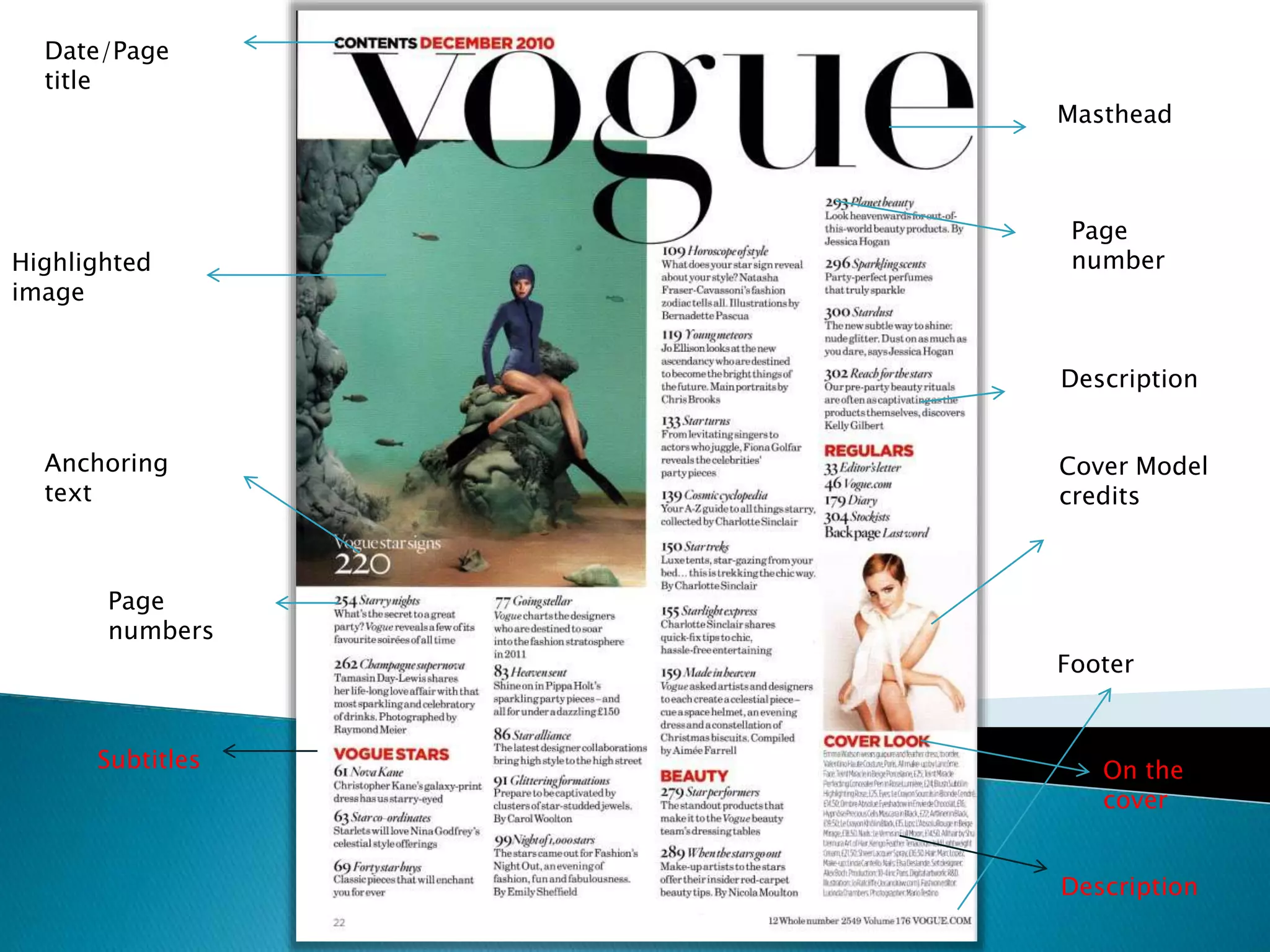
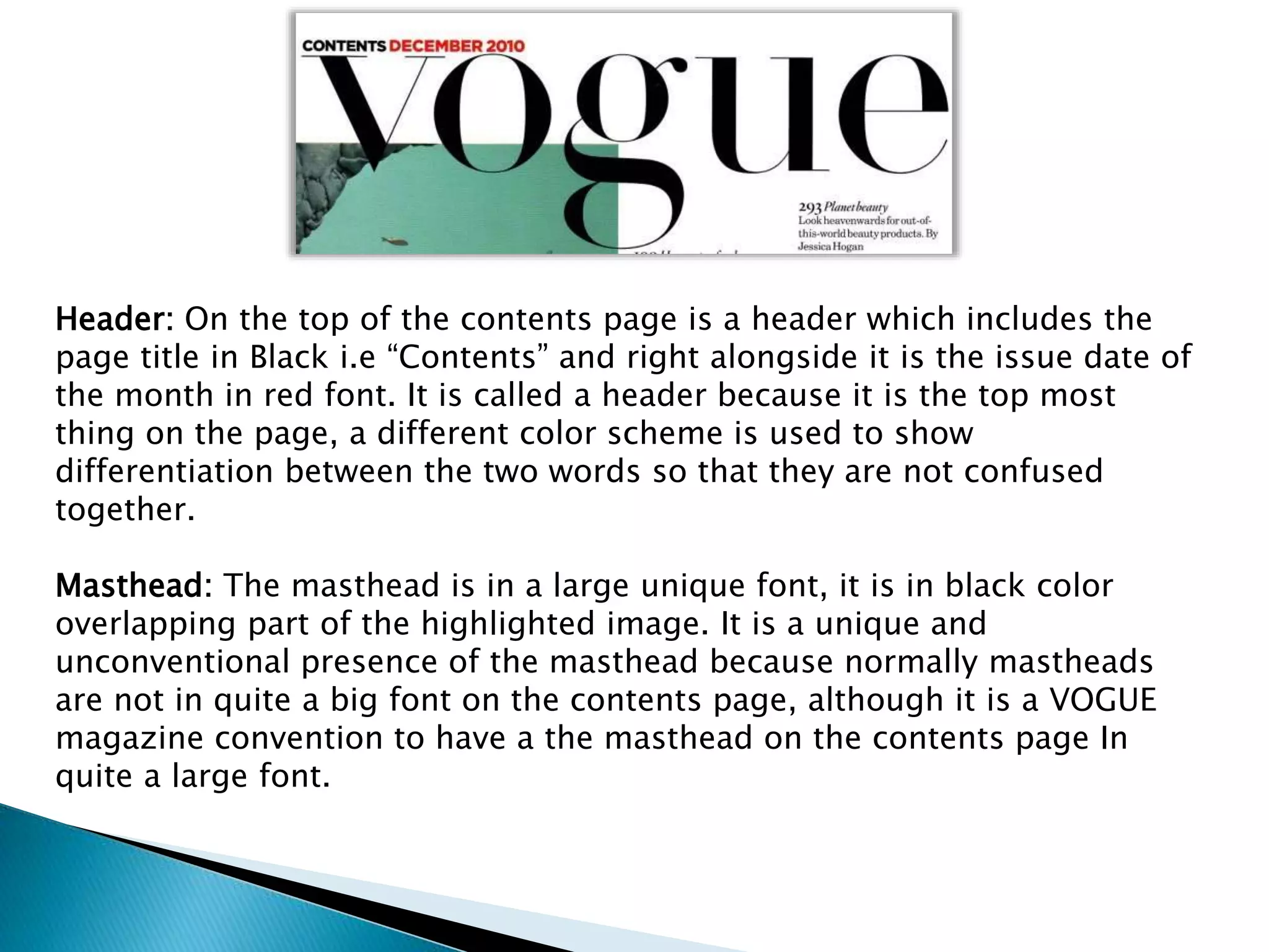
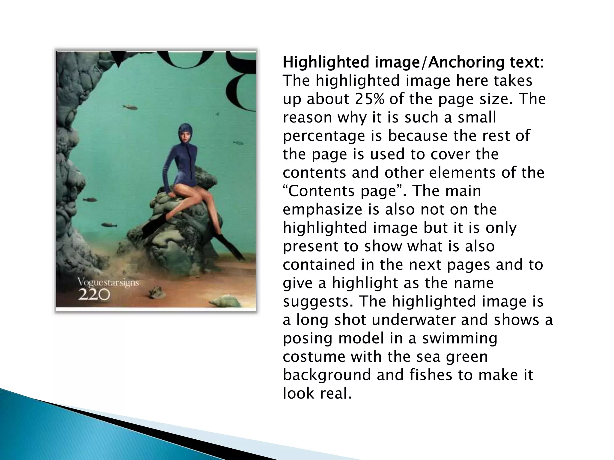
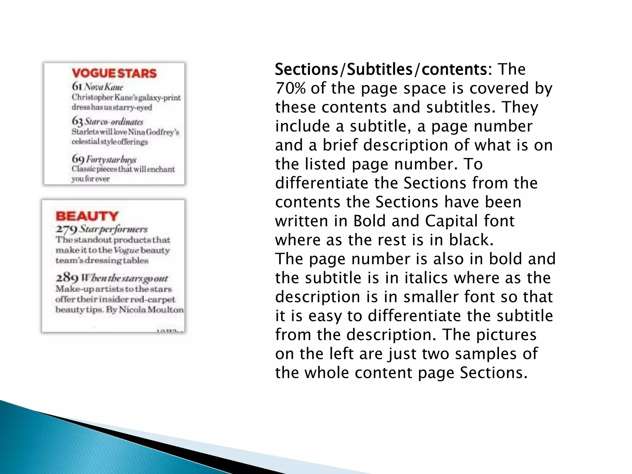
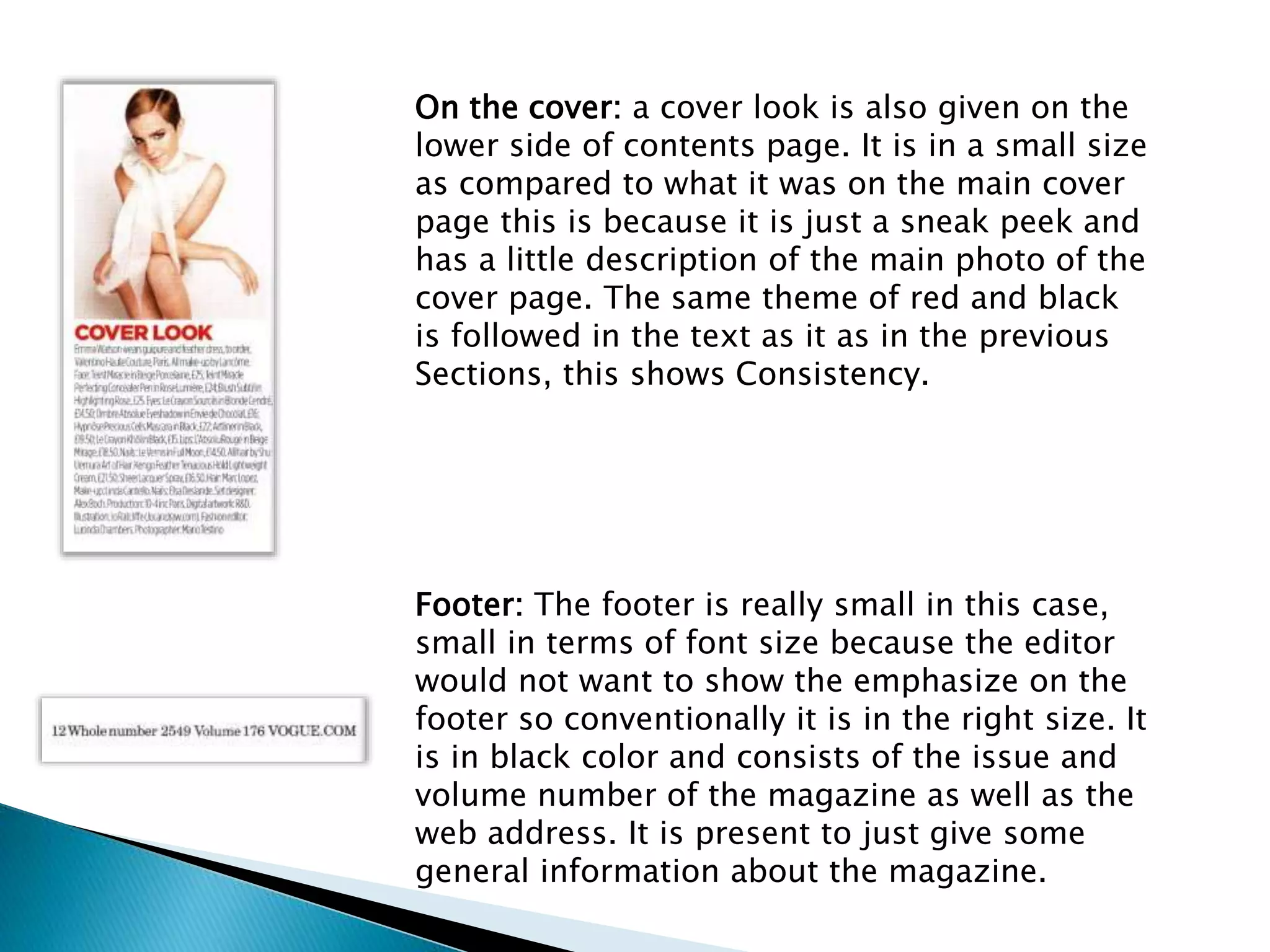
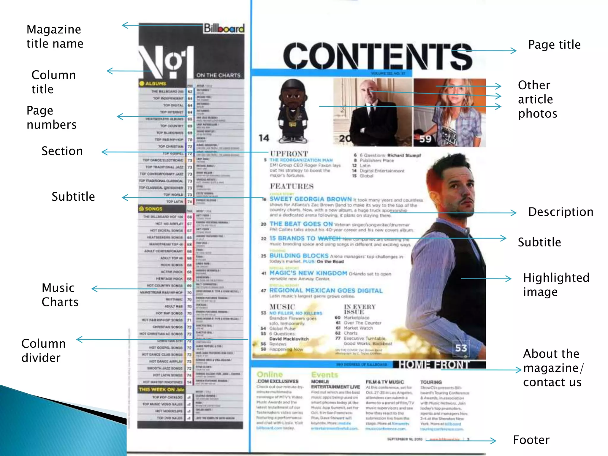
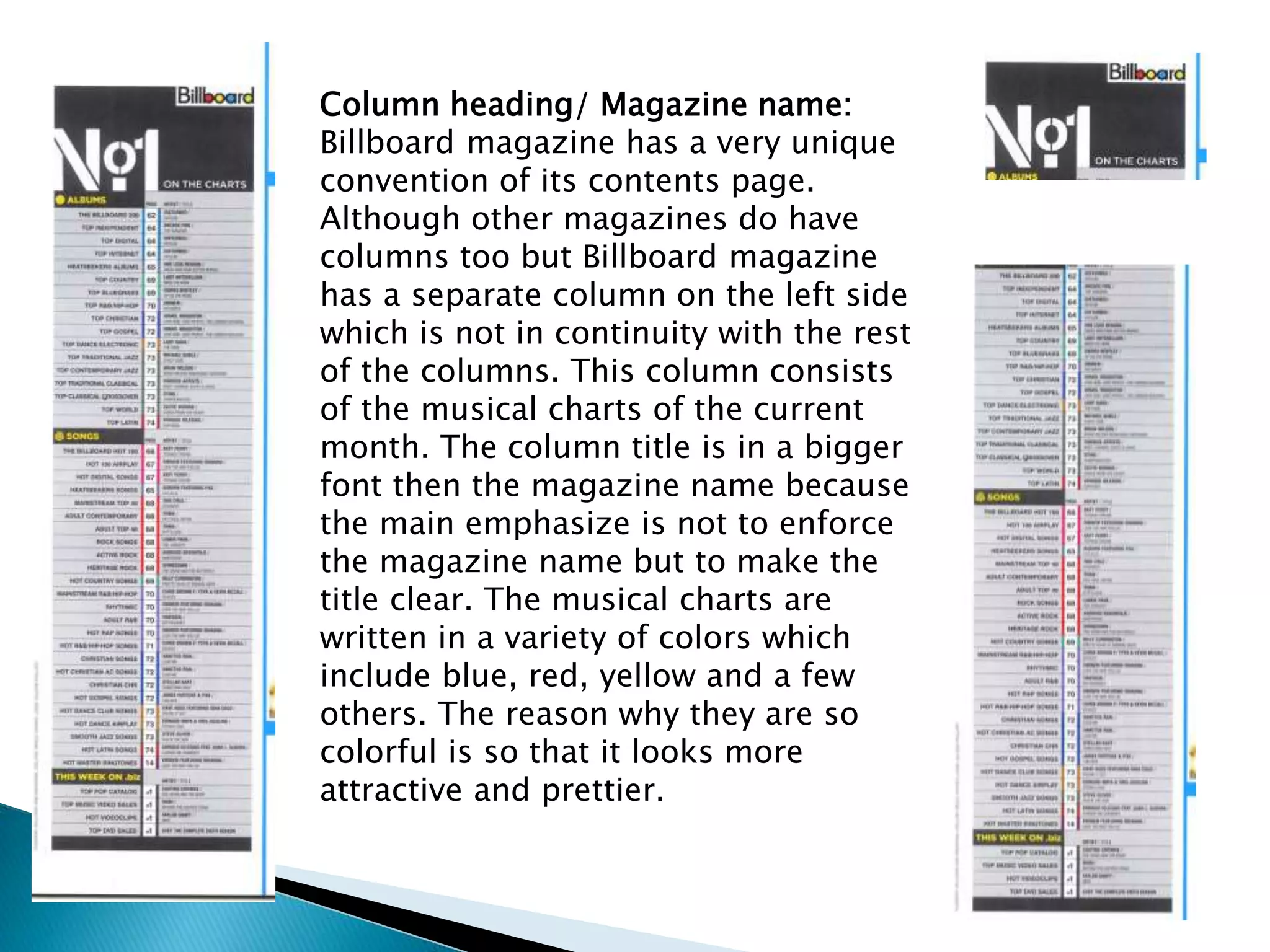
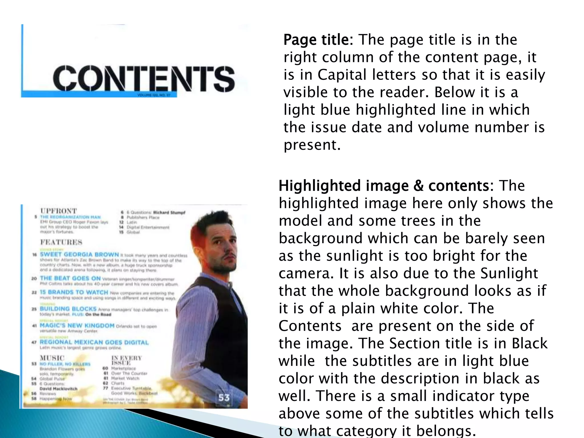
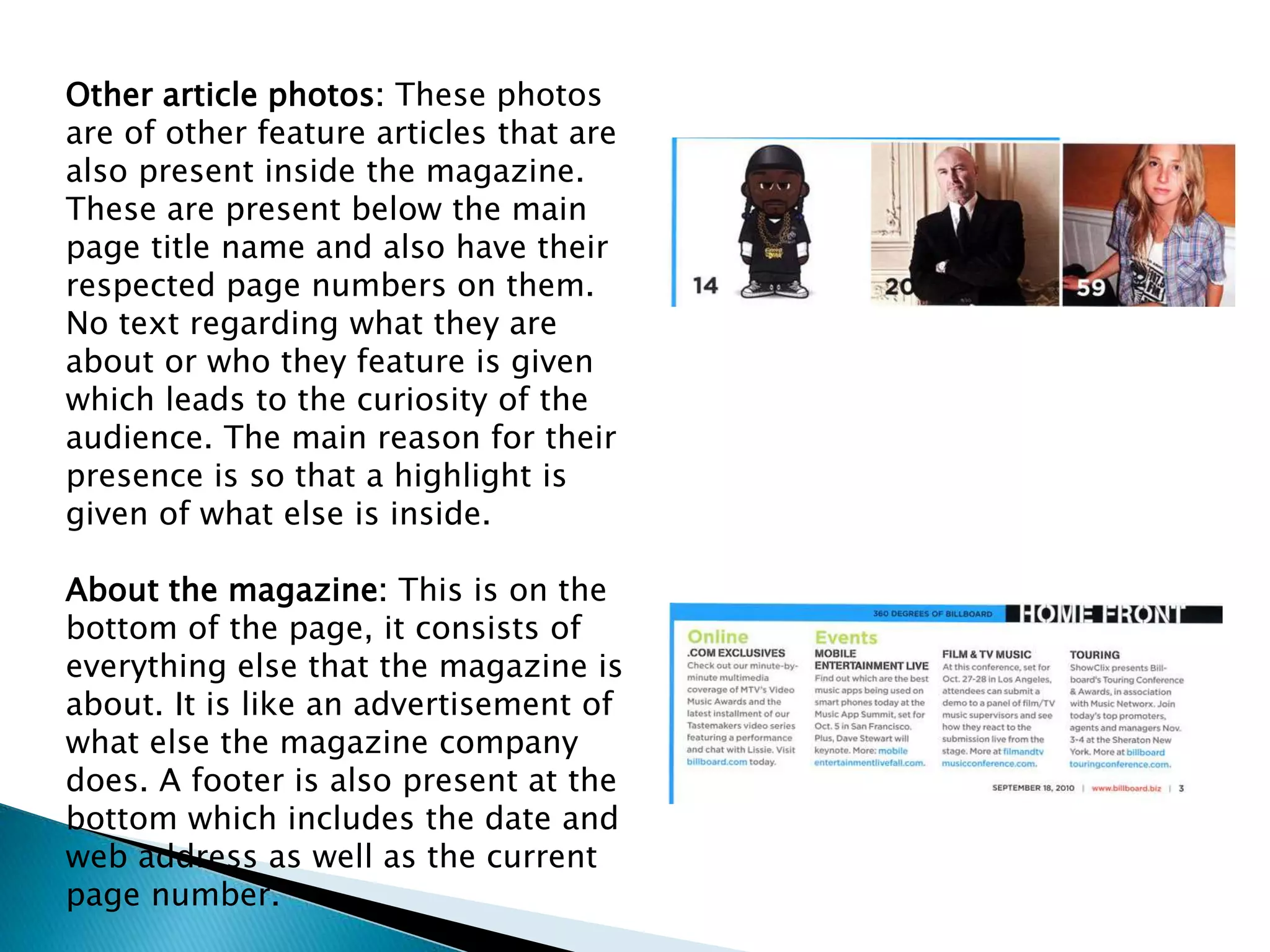
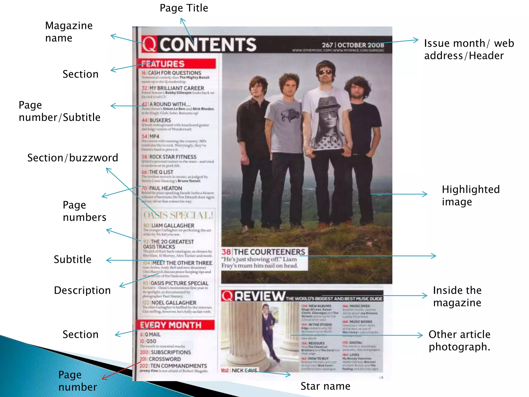
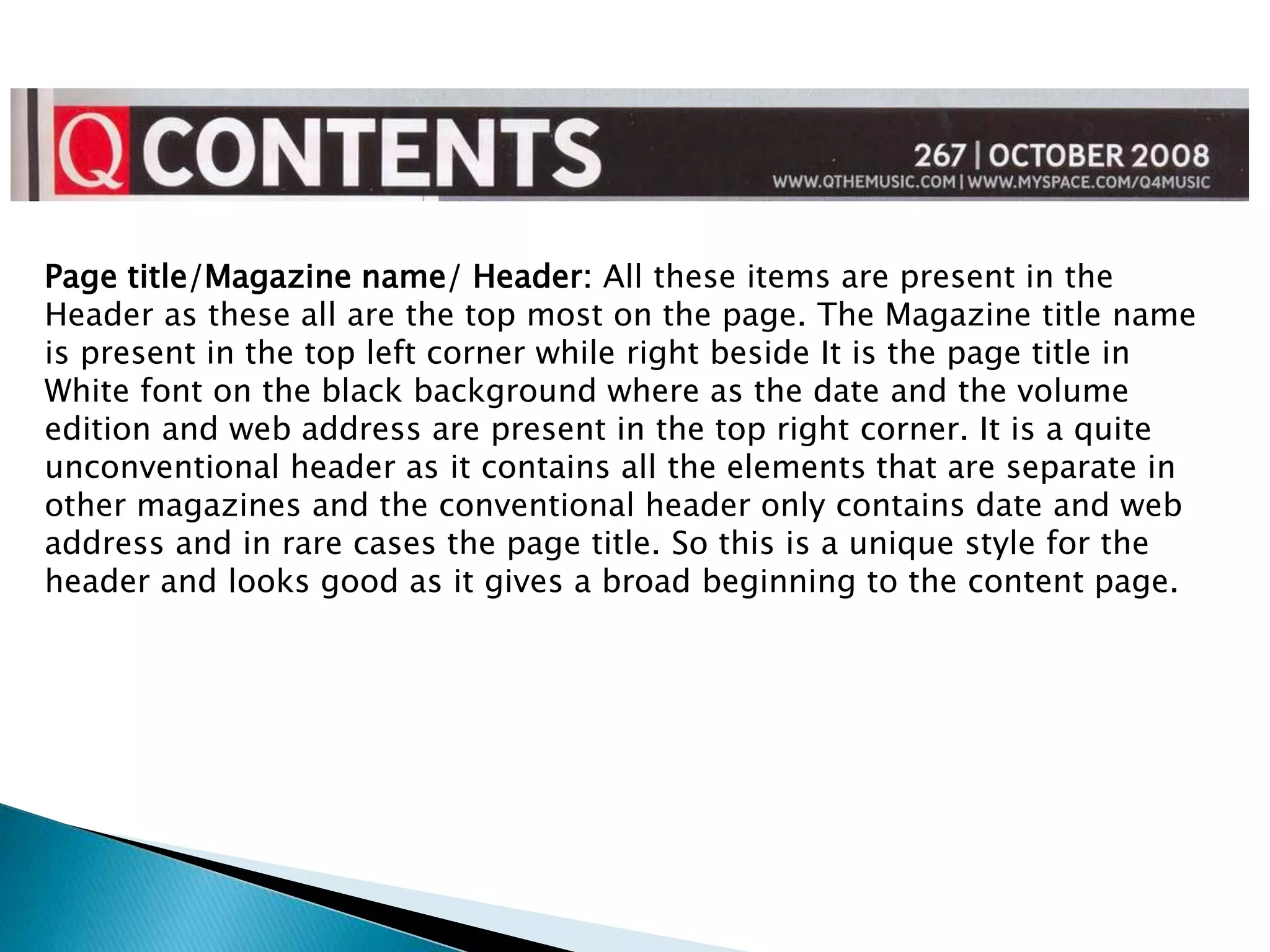
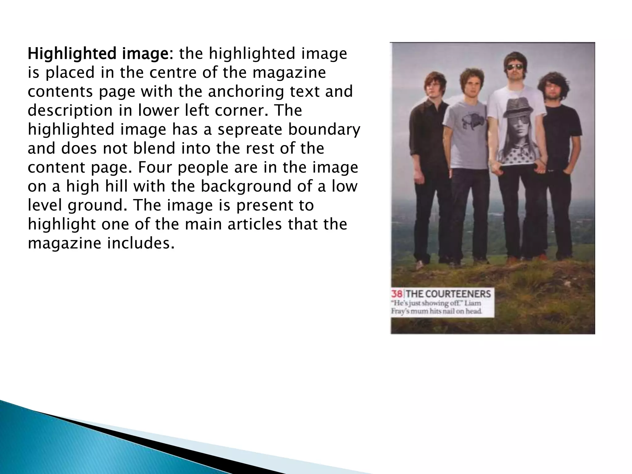
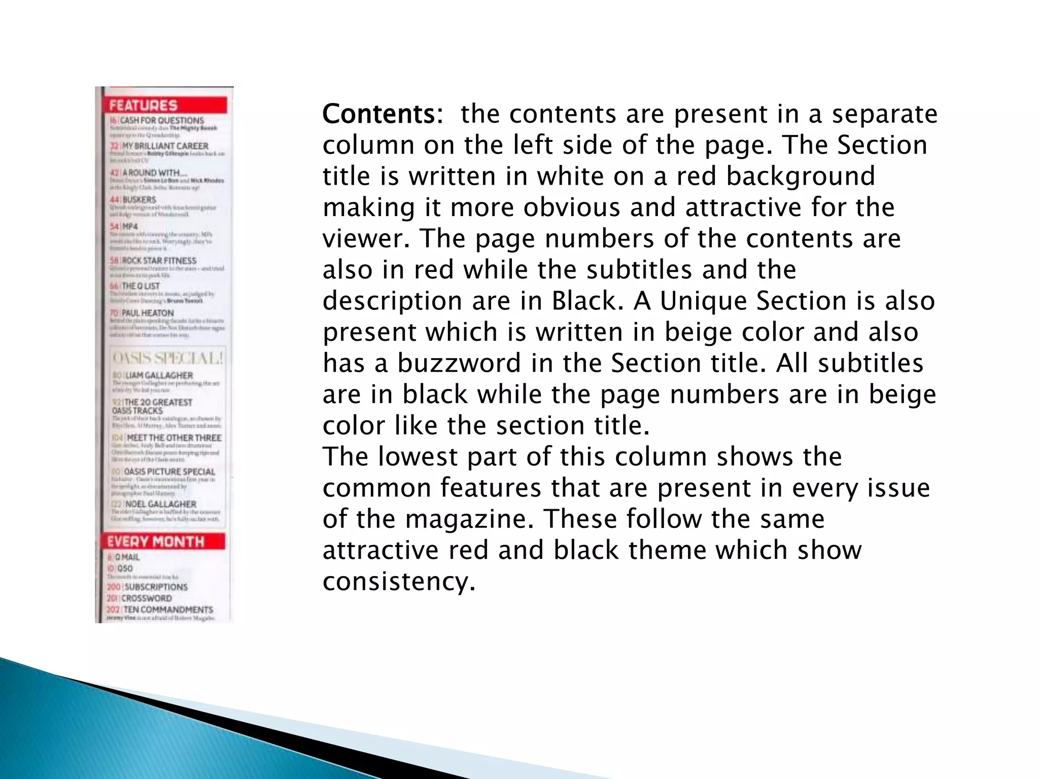
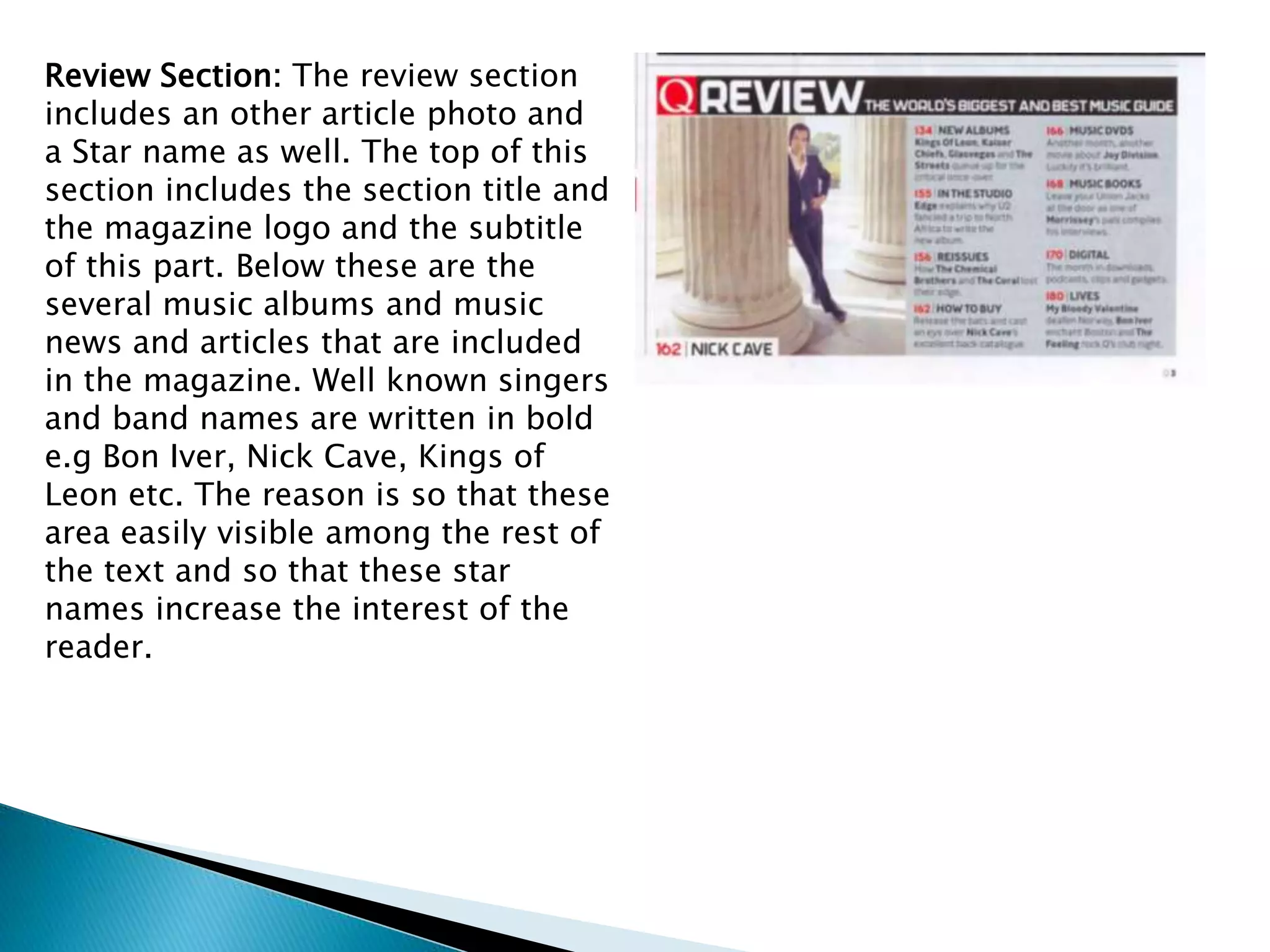
The document describes the layout and design elements of magazine contents pages. It discusses the placement and styling of items like the masthead, header, footer, highlighted images, sections and subtitles. Specific details are provided about how Billboard magazine formats its contents page with a separate column for music charts. The document also notes unique design choices for Vogue and another unnamed magazine's contents pages and aims to analyze the purpose behind each stylistic decision.
This is an entertaining presentation about analysis of 2 music magazine articles, it shows how the photos are different and unconventional in the different magazines. This is an entertaining presentation about analysis of 2 music magazine articles, it shows how the photos are different and unconventional in the different magazines!!
Chatty Kathy - UNC Bootcamp Final Project Presentation - Final Version - 5.23...John Andrews
SlideShare Description for "Chatty Kathy - UNC Bootcamp Final Project Presentation"
Title: Chatty Kathy: Enhancing Physical Activity Among Older Adults
Description:
Discover how Chatty Kathy, an innovative project developed at the UNC Bootcamp, aims to tackle the challenge of low physical activity among older adults. Our AI-driven solution uses peer interaction to boost and sustain exercise levels, significantly improving health outcomes. This presentation covers our problem statement, the rationale behind Chatty Kathy, synthetic data and persona creation, model performance metrics, a visual demonstration of the project, and potential future developments. Join us for an insightful Q&A session to explore the potential of this groundbreaking project.
Project Team: Jay Requarth, Jana Avery, John Andrews, Dr. Dick Davis II, Nee Buntoum, Nam Yeongjin & Mat Nicholas
Data Centers - Striving Within A Narrow Range - Research Report - MCG - May 2...pchutichetpong
M Capital Group (“MCG”) expects to see demand and the changing evolution of supply, facilitated through institutional investment rotation out of offices and into work from home (“WFH”), while the ever-expanding need for data storage as global internet usage expands, with experts predicting 5.3 billion users by 2023. These market factors will be underpinned by technological changes, such as progressing cloud services and edge sites, allowing the industry to see strong expected annual growth of 13% over the next 4 years.
Whilst competitive headwinds remain, represented through the recent second bankruptcy filing of Sungard, which blames “COVID-19 and other macroeconomic trends including delayed customer spending decisions, insourcing and reductions in IT spending, energy inflation and reduction in demand for certain services”, the industry has seen key adjustments, where MCG believes that engineering cost management and technological innovation will be paramount to success.
MCG reports that the more favorable market conditions expected over the next few years, helped by the winding down of pandemic restrictions and a hybrid working environment will be driving market momentum forward. The continuous injection of capital by alternative investment firms, as well as the growing infrastructural investment from cloud service providers and social media companies, whose revenues are expected to grow over 3.6x larger by value in 2026, will likely help propel center provision and innovation. These factors paint a promising picture for the industry players that offset rising input costs and adapt to new technologies.
According to M Capital Group: “Specifically, the long-term cost-saving opportunities available from the rise of remote managing will likely aid value growth for the industry. Through margin optimization and further availability of capital for reinvestment, strong players will maintain their competitive foothold, while weaker players exit the market to balance supply and demand.”
06-04-2024 - NYC Tech Week - Discussion on Vector Databases, Unstructured Data and AI
Discussion on Vector Databases, Unstructured Data and AI
https://www.meetup.com/unstructured-data-meetup-new-york/
This meetup is for people working in unstructured data. Speakers will come present about related topics such as vector databases, LLMs, and managing data at scale. The intended audience of this group includes roles like machine learning engineers, data scientists, data engineers, software engineers, and PMs.This meetup was formerly Milvus Meetup, and is sponsored by Zilliz maintainers of Milvus.
Explore our comprehensive data analysis project presentation on predicting product ad campaign performance. Learn how data-driven insights can optimize your marketing strategies and enhance campaign effectiveness. Perfect for professionals and students looking to understand the power of data analysis in advertising. for more details visit: https://bostoninstituteofanalytics.org/data-science-and-artificial-intelligence/
2. Header: On the top of the contents page is a header which includes the
page title in Black i.e “Contents” and right alongside it is the issue date of
the month in red font. It is called a header because it is the top most
thing on the page, a different color scheme is used to show
differentiation between the two words so that they are not confused
together.
Masthead: The masthead is in a large unique font, it is in black color
overlapping part of the highlighted image. It is a unique and
unconventional presence of the masthead because normally mastheads
are not in quite a big font on the contents page, although it is a VOGUE
magazine convention to have a the masthead on the contents page In
quite a large font.
3. Highlighted image/Anchoring text:
The highlighted image here takes
up about 25% of the page size. The
reason why it is such a small
percentage is because the rest of
the page is used to cover the
contents and other elements of the
“Contents page”. The main
emphasize is also not on the
highlighted image but it is only
present to show what is also
contained in the next pages and to
give a highlight as the name
suggests. The highlighted image is
a long shot underwater and shows a
posing model in a swimming
costume with the sea green
background and fishes to make it
look real.
4. Sections/Subtitles/contents: The
70% of the page space is covered by
these contents and subtitles. They
include a subtitle, a page number
and a brief description of what is on
the listed page number. To
differentiate the Sections from the
contents the Sections have been
written in Bold and Capital font
where as the rest is in black.
The page number is also in bold and
the subtitle is in italics where as the
description is in smaller font so that
it is easy to differentiate the subtitle
from the description. The pictures
on the left are just two samples of
the whole content page Sections.
5. On the cover: a cover look is also given on the
lower side of contents page. It is in a small size
as compared to what it was on the main cover
page this is because it is just a sneak peek and
has a little description of the main photo of the
cover page. The same theme of red and black
is followed in the text as it as in the previous
Sections, this shows Consistency.
Footer: The footer is really small in this case,
small in terms of font size because the editor
would not want to show the emphasize on the
footer so conventionally it is in the right size. It
is in black color and consists of the issue and
volume number of the magazine as well as the
web address. It is present to just give some
general information about the magazine.
7. Column heading/ Magazine name:
Billboard magazine has a very unique
convention of its contents page.
Although other magazines do have
columns too but Billboard magazine
has a separate column on the left side
which is not in continuity with the rest
of the columns. This column consists
of the musical charts of the current
month. The column title is in a bigger
font then the magazine name because
the main emphasize is not to enforce
the magazine name but to make the
title clear. The musical charts are
written in a variety of colors which
include blue, red, yellow and a few
others. The reason why they are so
colorful is so that it looks more
attractive and prettier.
8. Page title: The page title is in the
right column of the content page, it
is in Capital letters so that it is easily
visible to the reader. Below it is a
light blue highlighted line in which
the issue date and volume number is
present.
Highlighted image & contents: The
highlighted image here only shows the
model and some trees in the
background which can be barely seen
as the sunlight is too bright for the
camera. It is also due to the Sunlight
that the whole background looks as if
it is of a plain white color. The
Contents are present on the side of
the image. The Section title is in Black
while the subtitles are in light blue
color with the description in black as
well. There is a small indicator type
above some of the subtitles which tells
to what category it belongs.
9. Other article photos: These photos
are of other feature articles that are
also present inside the magazine.
These are present below the main
page title name and also have their
respected page numbers on them.
No text regarding what they are
about or who they feature is given
which leads to the curiosity of the
audience. The main reason for their
presence is so that a highlight is
given of what else is inside.
About the magazine: This is on the
bottom of the page, it consists of
everything else that the magazine is
about. It is like an advertisement of
what else the magazine company
does. A footer is also present at the
bottom which includes the date and
web address as well as the current
page number.
11. Page title/Magazine name/ Header: All these items are present in the
Header as these all are the top most on the page. The Magazine title name
is present in the top left corner while right beside It is the page title in
White font on the black background where as the date and the volume
edition and web address are present in the top right corner. It is a quite
unconventional header as it contains all the elements that are separate in
other magazines and the conventional header only contains date and web
address and in rare cases the page title. So this is a unique style for the
header and looks good as it gives a broad beginning to the content page.
12. Highlighted image: the highlighted image
is placed in the centre of the magazine
contents page with the anchoring text and
description in lower left corner. The
highlighted image has a sepreate boundary
and does not blend into the rest of the
content page. Four people are in the image
on a high hill with the background of a low
level ground. The image is present to
highlight one of the main articles that the
magazine includes.
13. Contents: the contents are present in a separate
column on the left side of the page. The Section
title is written in white on a red background
making it more obvious and attractive for the
viewer. The page numbers of the contents are
also in red while the subtitles and the
description are in Black. A Unique Section is also
present which is written in beige color and also
has a buzzword in the Section title. All subtitles
are in black while the page numbers are in beige
color like the section title.
The lowest part of this column shows the
common features that are present in every issue
of the magazine. These follow the same
attractive red and black theme which show
consistency.
14. Review Section: The review section
includes an other article photo and
a Star name as well. The top of this
section includes the section title and
the magazine logo and the subtitle
of this part. Below these are the
several music albums and music
news and articles that are included
in the magazine. Well known singers
and band names are written in bold
e.g Bon Iver, Nick Cave, Kings of
Leon etc. The reason is so that these
area easily visible among the rest of
the text and so that these star
names increase the interest of the
reader.