SlideShare a Scribd company logo
MASTHEAD
“The Gospel According To Nicki Minaj” The use of the
word gospel suggests that the artist is holy in some form,
like a god. Her name is in a bold pink font larger than
other words on the masthead. Her name stands out from
the page suggesting she is very important and has a large
personality.
MAIN IMAGE
The image of Nicki is placed almost in the centre of the page
with the text framing her. The image grabs reader attention as
she is dressed in bright, patterned clothing and jewelry. Nicki’s
lipstick matches the colour of her name in the masthead,
signifying they are the same person. Overall the image creates
a sense of fun and mirrors the pop genre of her music. She is
looking directly at the camera which entices the audience and
allows them to feel connected with the artist.
TEXT CONTENT
The text used is split up into sections discussing different
topics. The text is lighthearted and had used pull quotes
to highlight the most important parts of the article and to
attract readers attention to these parts. This style of
article would appeal to a younger target audience such as
teenage girls as they can read the article in small chunks
rather than one long piece of text.
HOUSE STYLE
This article is vibrant and
exciting. It is very different to
the articles usually featured in
NME magazine but as Nicki
Minaj is a more mainstream
pop artist compared to who
they usually feature they have
changed the style of the page
to fit her fun personality and
music style.
DESIGN BALANCE
This article is balanced as
it is spread evenly across
the two pages with the
text framing the image.
The main text within the
article is in symmetrical
columns and the
masthead and image fit in
with the symmetry.
DESIGN PRINCIPLES
This article uses the Guttenberg design principle to
some extent as the masthead is placed in the
primary optical area. However the start of the
main text is placed in the weak fallow area and the
negative space at the top of the article shows that
this double page spread has gone against the
conventions of a typical article.
MASTHEAD
“Best Of Both Worlds” This masthead is a pun as both
artists featured in this article are also part of another
band. Similarly to the Nicki Minaj masthead, the test
used is bold and uses colour to stand out from the rest
of the text on the page. However this masthead
stretches along the top of the page leaving more room
for images and text.
MAIN IMAGE
The image used is the background of this article taking up the whole page. The two
men featured in the article are on either sides of the text, suggesting they have
barriers to overcome to produce their music. Both men are dressed in typical rock
and roll style outfits, with mod haircuts and sunglasses. This suggests the music is
very cool and alternative. Compared to the Nicki Minaj double page, this article
uses a lot less colour, suggesting the music is more dark, serious and rock.
HOUSE STYLE
The house style used
throughout this article is
stereotypical of a rock/
indie band from the use of
dark colours and clothes
on the artists. The page is
quite simple, with the text
down the middle being
framed by the images. This
article does not feature
the element of fun that
the Nicki Minaj article
features.
TEXT CONTENT
The article is only small
and the text used is
more serious than the
Nicki Minaj article. It
speaks more about the
actual music of the
band rather than the
artists themselves. The
text has a large kicker
to create a small and
vague introduction to
attract the audience to
read on further. This
type of article would
appeal to an older
audience than that of
the Nicki Minaj article
as it features less
lighthearted text and
focuses on the career
of the artists.
DESIGN BALANCE
This article is balanced as both
halves of the page are completely
symmetrical to each other, taken up
half by the artist and half by the
text.
DESIGN PRINCIPLES
This article uses the rule of thirds as
all parts of the page are covered and
the article is evenly spaced out. The
Guttenberg design principle has been
used as the main text features in the
strong fallow area.

More Related Content

What's hot

Codes and conventions of a double page spread
Codes and conventions of a double page spreadCodes and conventions of a double page spread
Codes and conventions of a double page spread
Laurengibney
 
Analysis of Magazine Double Page Spreads
Analysis of Magazine Double Page SpreadsAnalysis of Magazine Double Page Spreads
Analysis of Magazine Double Page Spreads
Gemma
 
Codes and conventions of a magazine contents page
Codes and conventions of a magazine contents pageCodes and conventions of a magazine contents page
Codes and conventions of a magazine contents page
RachLou96
 
Media coursework content page analysis
Media coursework content page analysisMedia coursework content page analysis
Media coursework content page analysis
mattmosey1
 
Codes and Conventions of a magazine contents page
Codes and Conventions of a magazine contents pageCodes and Conventions of a magazine contents page
Codes and Conventions of a magazine contents page
liam-lim-horgan
 
Annotations of double page spreads
Annotations of double page spreadsAnnotations of double page spreads
Annotations of double page spreads
lucyvh
 
The generic conventions of magazines cover
The generic conventions of magazines   coverThe generic conventions of magazines   cover
The generic conventions of magazines cover
Jenny McNulty
 
Appealing to the audience
Appealing to the audienceAppealing to the audience
Appealing to the audience
OliviaBolt
 
Conventions of a Fashion Magazine
Conventions of a Fashion Magazine Conventions of a Fashion Magazine
Conventions of a Fashion Magazine
Lexshort
 
Analysis of magazine double page spreads
Analysis of magazine double page spreadsAnalysis of magazine double page spreads
Analysis of magazine double page spreads
sarah123ashcroft
 

What's hot (20)

GCSE Media Studies Coursework - Magazine research and planning
GCSE Media Studies Coursework - Magazine research and planningGCSE Media Studies Coursework - Magazine research and planning
GCSE Media Studies Coursework - Magazine research and planning
 
Codes and conventions of a double page spread
Codes and conventions of a double page spreadCodes and conventions of a double page spread
Codes and conventions of a double page spread
 
Magazine Cover Analysis
Magazine Cover AnalysisMagazine Cover Analysis
Magazine Cover Analysis
 
GCSE Magazine Research and Planning
GCSE Magazine Research and PlanningGCSE Magazine Research and Planning
GCSE Magazine Research and Planning
 
Magazine analysis
Magazine analysisMagazine analysis
Magazine analysis
 
Music magazine double page spread 1
Music magazine double page spread 1Music magazine double page spread 1
Music magazine double page spread 1
 
Magazine Cover Terminology
Magazine Cover TerminologyMagazine Cover Terminology
Magazine Cover Terminology
 
Graphic media language magazine double page spread analysis
Graphic media language magazine double page spread analysisGraphic media language magazine double page spread analysis
Graphic media language magazine double page spread analysis
 
Analysis of Magazine Double Page Spreads
Analysis of Magazine Double Page SpreadsAnalysis of Magazine Double Page Spreads
Analysis of Magazine Double Page Spreads
 
Codes and Conventions of Magazines
Codes and Conventions of MagazinesCodes and Conventions of Magazines
Codes and Conventions of Magazines
 
Codes and conventions of a magazine contents page
Codes and conventions of a magazine contents pageCodes and conventions of a magazine contents page
Codes and conventions of a magazine contents page
 
Media coursework content page analysis
Media coursework content page analysisMedia coursework content page analysis
Media coursework content page analysis
 
What are pugs and puffs on magazines
What are pugs and puffs on magazinesWhat are pugs and puffs on magazines
What are pugs and puffs on magazines
 
Media magazine cover analysis.
Media magazine cover analysis.Media magazine cover analysis.
Media magazine cover analysis.
 
Codes and Conventions of a magazine contents page
Codes and Conventions of a magazine contents pageCodes and Conventions of a magazine contents page
Codes and Conventions of a magazine contents page
 
Annotations of double page spreads
Annotations of double page spreadsAnnotations of double page spreads
Annotations of double page spreads
 
The generic conventions of magazines cover
The generic conventions of magazines   coverThe generic conventions of magazines   cover
The generic conventions of magazines cover
 
Appealing to the audience
Appealing to the audienceAppealing to the audience
Appealing to the audience
 
Conventions of a Fashion Magazine
Conventions of a Fashion Magazine Conventions of a Fashion Magazine
Conventions of a Fashion Magazine
 
Analysis of magazine double page spreads
Analysis of magazine double page spreadsAnalysis of magazine double page spreads
Analysis of magazine double page spreads
 

Viewers also liked (11)

Analysis of music magazine double page spreads
Analysis of music magazine double page spreadsAnalysis of music magazine double page spreads
Analysis of music magazine double page spreads
 
Double page spread analysis
Double page spread analysisDouble page spread analysis
Double page spread analysis
 
DPS analysis
DPS analysisDPS analysis
DPS analysis
 
Tv article double page spread
Tv article double page spreadTv article double page spread
Tv article double page spread
 
Magazine analysis
Magazine analysisMagazine analysis
Magazine analysis
 
General billboard adverts analysis
General billboard adverts   analysisGeneral billboard adverts   analysis
General billboard adverts analysis
 
Question three
Question threeQuestion three
Question three
 
Question two
Question twoQuestion two
Question two
 
Analysis of billboard advertisements
Analysis of billboard advertisementsAnalysis of billboard advertisements
Analysis of billboard advertisements
 
Double page spread analysis
Double page spread analysisDouble page spread analysis
Double page spread analysis
 
Newspaper billboards analysis
Newspaper billboards analysisNewspaper billboards analysis
Newspaper billboards analysis
 

Similar to Double page spread analysis (20)

Double page spread analysis 1
Double page spread analysis 1Double page spread analysis 1
Double page spread analysis 1
 
Question 1
Question 1Question 1
Question 1
 
Double page spreads for analysis
Double page spreads for analysisDouble page spreads for analysis
Double page spreads for analysis
 
Article research
Article researchArticle research
Article research
 
Article analysis
Article analysisArticle analysis
Article analysis
 
Pre production drafting
Pre production draftingPre production drafting
Pre production drafting
 
Vibe music magazine
Vibe music magazineVibe music magazine
Vibe music magazine
 
Dps
DpsDps
Dps
 
Dps
DpsDps
Dps
 
Q Double Page Analysis
Q Double Page AnalysisQ Double Page Analysis
Q Double Page Analysis
 
Q Double Page Analysis
Q Double Page AnalysisQ Double Page Analysis
Q Double Page Analysis
 
DPS
DPSDPS
DPS
 
Pre production drafting
Pre production draftingPre production drafting
Pre production drafting
 
Double page spread
Double page spreadDouble page spread
Double page spread
 
House Styles for music magazine
House Styles for music magazineHouse Styles for music magazine
House Styles for music magazine
 
Music magazine double page spread
Music magazine double page spreadMusic magazine double page spread
Music magazine double page spread
 
Music magazine double page spread
Music magazine double page spreadMusic magazine double page spread
Music magazine double page spread
 
House Style
House Style House Style
House Style
 
Dps analysis
Dps analysisDps analysis
Dps analysis
 
Finished front cover essay
Finished front cover essayFinished front cover essay
Finished front cover essay
 

More from zoeksmith

What have you learnt about technologies from the process of constructing this...
What have you learnt about technologies from the process of constructing this...What have you learnt about technologies from the process of constructing this...
What have you learnt about technologies from the process of constructing this...
zoeksmith
 
Who would be the audience for your media product?
Who would be the audience for your media product?Who would be the audience for your media product?
Who would be the audience for your media product?
zoeksmith
 
Contents page analysis
Contents page analysisContents page analysis
Contents page analysis
zoeksmith
 

More from zoeksmith (7)

Q7
Q7Q7
Q7
 
Q7
Q7Q7
Q7
 
Q6
Q6Q6
Q6
 
Question 6
Question 6Question 6
Question 6
 
What have you learnt about technologies from the process of constructing this...
What have you learnt about technologies from the process of constructing this...What have you learnt about technologies from the process of constructing this...
What have you learnt about technologies from the process of constructing this...
 
Who would be the audience for your media product?
Who would be the audience for your media product?Who would be the audience for your media product?
Who would be the audience for your media product?
 
Contents page analysis
Contents page analysisContents page analysis
Contents page analysis
 

Double page spread analysis

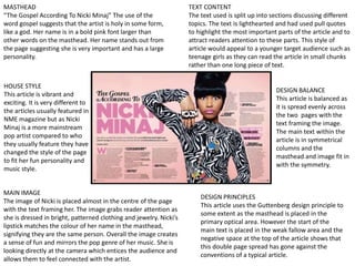
  • 1. MASTHEAD “The Gospel According To Nicki Minaj” The use of the word gospel suggests that the artist is holy in some form, like a god. Her name is in a bold pink font larger than other words on the masthead. Her name stands out from the page suggesting she is very important and has a large personality. MAIN IMAGE The image of Nicki is placed almost in the centre of the page with the text framing her. The image grabs reader attention as she is dressed in bright, patterned clothing and jewelry. Nicki’s lipstick matches the colour of her name in the masthead, signifying they are the same person. Overall the image creates a sense of fun and mirrors the pop genre of her music. She is looking directly at the camera which entices the audience and allows them to feel connected with the artist. TEXT CONTENT The text used is split up into sections discussing different topics. The text is lighthearted and had used pull quotes to highlight the most important parts of the article and to attract readers attention to these parts. This style of article would appeal to a younger target audience such as teenage girls as they can read the article in small chunks rather than one long piece of text. HOUSE STYLE This article is vibrant and exciting. It is very different to the articles usually featured in NME magazine but as Nicki Minaj is a more mainstream pop artist compared to who they usually feature they have changed the style of the page to fit her fun personality and music style. DESIGN BALANCE This article is balanced as it is spread evenly across the two pages with the text framing the image. The main text within the article is in symmetrical columns and the masthead and image fit in with the symmetry. DESIGN PRINCIPLES This article uses the Guttenberg design principle to some extent as the masthead is placed in the primary optical area. However the start of the main text is placed in the weak fallow area and the negative space at the top of the article shows that this double page spread has gone against the conventions of a typical article.
  • 2. MASTHEAD “Best Of Both Worlds” This masthead is a pun as both artists featured in this article are also part of another band. Similarly to the Nicki Minaj masthead, the test used is bold and uses colour to stand out from the rest of the text on the page. However this masthead stretches along the top of the page leaving more room for images and text. MAIN IMAGE The image used is the background of this article taking up the whole page. The two men featured in the article are on either sides of the text, suggesting they have barriers to overcome to produce their music. Both men are dressed in typical rock and roll style outfits, with mod haircuts and sunglasses. This suggests the music is very cool and alternative. Compared to the Nicki Minaj double page, this article uses a lot less colour, suggesting the music is more dark, serious and rock. HOUSE STYLE The house style used throughout this article is stereotypical of a rock/ indie band from the use of dark colours and clothes on the artists. The page is quite simple, with the text down the middle being framed by the images. This article does not feature the element of fun that the Nicki Minaj article features. TEXT CONTENT The article is only small and the text used is more serious than the Nicki Minaj article. It speaks more about the actual music of the band rather than the artists themselves. The text has a large kicker to create a small and vague introduction to attract the audience to read on further. This type of article would appeal to an older audience than that of the Nicki Minaj article as it features less lighthearted text and focuses on the career of the artists. DESIGN BALANCE This article is balanced as both halves of the page are completely symmetrical to each other, taken up half by the artist and half by the text. DESIGN PRINCIPLES This article uses the rule of thirds as all parts of the page are covered and the article is evenly spaced out. The Guttenberg design principle has been used as the main text features in the strong fallow area.