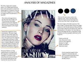
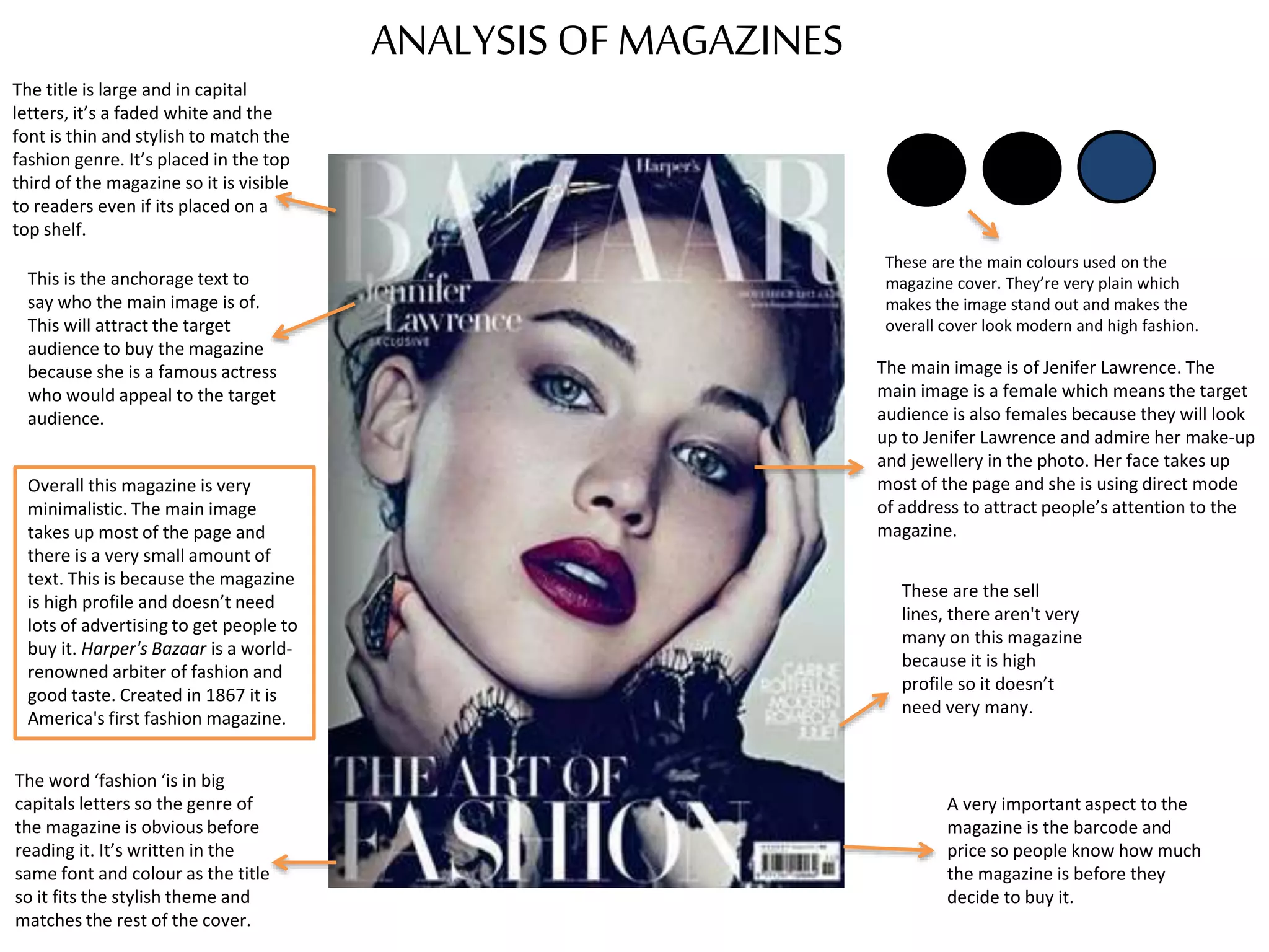
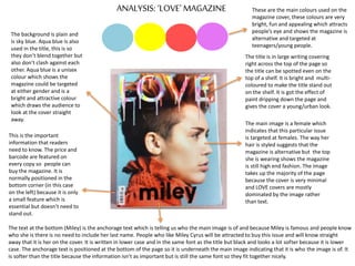
ANALYSIS OF MAGAZINES
The title is large and in capital
letters, it’s a faded white and the
font is thin and stylish to match the
fashion genre. It’s placed in the top
third of the magazine so it is visible
to readers even if its placed on a
top shelf.
The main image is of Jenifer Lawrence. The
main image is a female which means the target
audience is also females because they will look
up to Jenifer Lawrence and admire her make-up
and jewellery in the photo. Her face takes up
most of the page and she is using direct mode
of address to attract people’s attention to the
magazine.
A very important aspect to the
magazine is the barcode and
price so people know how much
the magazine is before they
decide to buy it.
The word ‘fashion ‘is in big
capitals letters so the genre of
the magazine is obvious before
reading it. It’s written in the
same font and colour as the title
so it fits the stylish theme and
matches the rest of the cover.
This is the anchorage text to
say who the main image is of.
This will attract the target
audience to buy the magazine
because she is a famous actress
who would appeal to the target
audience.
These are the sell
lines, there aren't very
many on this magazine
because it is high
profile so it doesn’t
need very many.
Overall this magazine is very
minimalistic. The main image
takes up most of the page and
there is a very small amount of
text. This is because the magazine
is high profile and doesn’t need
lots of advertising to get people to
buy it. Harper's Bazaar is a world-
renowned arbiter of fashion and
good taste. Created in 1867 it is
America's first fashion magazine.
These are the main colours used on the
magazine cover. They’re very plain which
makes the image stand out and makes the
overall cover look modern and high fashion.
ANALYSIS: ‘LOVE’ MAGAZINE
The title is in large writing covering
right across the top of the page so
the title can be spotted even on the
top of a shelf. It is bright and multi-
coloured to make the title stand out
on the shelf. It is got the effect of
paint dripping down the page and
gives the cover a young/urban look.
This is the important
information that readers
need to know. The price and
barcode are featured on
every copy so people can
buy the magazine. It is
normally positioned in the
bottom corner (in this case
on the left) because it is only
a small feature which is
essential but doesn’t need to
stand out.
The main image is a female which
indicates that this particular issue
is targeted at females. The way her
hair is styled suggests that the
magazine is alternative but the top
she is wearing shows the magazine
is still high end fashion. The image
takes up the majority of the page
because the cover is very minimal
and LOVE covers are mostly
dominated by the image rather
than text.
The text at the bottom (Miley) is the anchorage text which is telling us who the main image is of and because Miley is famous and people know
who she is there is no need to include her last name. People who like Miley Cyrus will be attracted to buy this issue and will know straight
away that it is her on the cover. It is written in lower case and in the same font as the title but black and looks a lot softer because it is lower
case. The anchorage text is positioned at the bottom of the page so it is underneath the main image indicating that it is who the image is of. It
is softer than the title because the information isn’t as important but is still the same font so they fit together nicely.
The background is plain and
is sky blue. Aqua blue is also
used in the title, this is so
they don’t blend together but
also don’t clash against each
other. Aqua blue is a unisex
colour which shows the
magazine could be targeted
at either gender and is a
bright and attractive colour
which draws the audience to
look at the cover straight
away.
These are the main colours used on the
magazine cover, these colours are very
bright, fun and appealing which attracts
people’s eye and shows the magazine is
alternative and targeted at
teenagers/young people.
ANALYSIS: ‘ID’ MAGAZINEThis is the title of ID magazine,
unlike other magazines the title of
ID is sideways on the left hand
side of the magazine but still at
the top so it can be seen on the
top shelf of a rack . The font is
large so it can be identified as ID
magazine from a distance. The
title is white and seems to lend
into the background slightly but
because ID is a big and high end
magazine its readers can
recognize it is ID magazine from
its other iconic features.
On every cover of ID magazine
the model on the front has one
eye covered. This is the main,
most iconic feature of ID
magazine which means the
magazine can be identified
without the title standing out so
much.
These are the cover lines which tell us about
what's inside the magazine. They are in a
small font as they aren’t as important as
other information on the cover. They are in
red so they don’t blend into the background
and give the cover a little colour.
The barcode and price are a very
important aspect of the cover
and need to be visible which is
why they are placed in the top
corner isolated from everything
else.
The main image is of a model who has
short hair which is quite alternative. She
is using direct mode of address to draw
in the reader and attract them to the
magazine. She has black nail polish and is
wearing a black lace bandeau which
looks high fashion. Her collar bones and
arms are exposed and she isn’t wearing
very much make-up which makes her
look young and innocent. Because the
model is female and around 18 years old
this shows us the target audience would
be girls 16+.
This is the main cover line of the magazine
which is smaller than the title but larger
than the other cover lines. Apart from the
title it is the biggest typeface on the page
and has a soft font. The colour is white
(same as the title) so it matches the black
and white theme. The font is soft and looks
delicate like the model. ‘There are no rules’
sounds very rebellious and is a cover line
which would appeal to teenagers because
stereotypically teenagers are rebellious.
Overall the cover is very
minimal and the main image
dominates the page rather
than text because the
magazine is high end.
The colours are very modern
and are used commonly in
alternative magazines because
they look new and interesting.

Magazine Cover Analysis

  • 1.
    ANALYSIS OF MAGAZINES Thetitle is large and in capital letters, it’s a faded white and the font is thin and stylish to match the fashion genre. It’s placed in the top third of the magazine so it is visible to readers even if its placed on a top shelf. The main image is of Jenifer Lawrence. The main image is a female which means the target audience is also females because they will look up to Jenifer Lawrence and admire her make-up and jewellery in the photo. Her face takes up most of the page and she is using direct mode of address to attract people’s attention to the magazine. A very important aspect to the magazine is the barcode and price so people know how much the magazine is before they decide to buy it. The word ‘fashion ‘is in big capitals letters so the genre of the magazine is obvious before reading it. It’s written in the same font and colour as the title so it fits the stylish theme and matches the rest of the cover. This is the anchorage text to say who the main image is of. This will attract the target audience to buy the magazine because she is a famous actress who would appeal to the target audience. These are the sell lines, there aren't very many on this magazine because it is high profile so it doesn’t need very many. Overall this magazine is very minimalistic. The main image takes up most of the page and there is a very small amount of text. This is because the magazine is high profile and doesn’t need lots of advertising to get people to buy it. Harper's Bazaar is a world- renowned arbiter of fashion and good taste. Created in 1867 it is America's first fashion magazine. These are the main colours used on the magazine cover. They’re very plain which makes the image stand out and makes the overall cover look modern and high fashion.
  • 2.
    ANALYSIS: ‘LOVE’ MAGAZINE Thetitle is in large writing covering right across the top of the page so the title can be spotted even on the top of a shelf. It is bright and multi- coloured to make the title stand out on the shelf. It is got the effect of paint dripping down the page and gives the cover a young/urban look. This is the important information that readers need to know. The price and barcode are featured on every copy so people can buy the magazine. It is normally positioned in the bottom corner (in this case on the left) because it is only a small feature which is essential but doesn’t need to stand out. The main image is a female which indicates that this particular issue is targeted at females. The way her hair is styled suggests that the magazine is alternative but the top she is wearing shows the magazine is still high end fashion. The image takes up the majority of the page because the cover is very minimal and LOVE covers are mostly dominated by the image rather than text. The text at the bottom (Miley) is the anchorage text which is telling us who the main image is of and because Miley is famous and people know who she is there is no need to include her last name. People who like Miley Cyrus will be attracted to buy this issue and will know straight away that it is her on the cover. It is written in lower case and in the same font as the title but black and looks a lot softer because it is lower case. The anchorage text is positioned at the bottom of the page so it is underneath the main image indicating that it is who the image is of. It is softer than the title because the information isn’t as important but is still the same font so they fit together nicely. The background is plain and is sky blue. Aqua blue is also used in the title, this is so they don’t blend together but also don’t clash against each other. Aqua blue is a unisex colour which shows the magazine could be targeted at either gender and is a bright and attractive colour which draws the audience to look at the cover straight away. These are the main colours used on the magazine cover, these colours are very bright, fun and appealing which attracts people’s eye and shows the magazine is alternative and targeted at teenagers/young people.
  • 3.
    ANALYSIS: ‘ID’ MAGAZINEThisis the title of ID magazine, unlike other magazines the title of ID is sideways on the left hand side of the magazine but still at the top so it can be seen on the top shelf of a rack . The font is large so it can be identified as ID magazine from a distance. The title is white and seems to lend into the background slightly but because ID is a big and high end magazine its readers can recognize it is ID magazine from its other iconic features. On every cover of ID magazine the model on the front has one eye covered. This is the main, most iconic feature of ID magazine which means the magazine can be identified without the title standing out so much. These are the cover lines which tell us about what's inside the magazine. They are in a small font as they aren’t as important as other information on the cover. They are in red so they don’t blend into the background and give the cover a little colour. The barcode and price are a very important aspect of the cover and need to be visible which is why they are placed in the top corner isolated from everything else. The main image is of a model who has short hair which is quite alternative. She is using direct mode of address to draw in the reader and attract them to the magazine. She has black nail polish and is wearing a black lace bandeau which looks high fashion. Her collar bones and arms are exposed and she isn’t wearing very much make-up which makes her look young and innocent. Because the model is female and around 18 years old this shows us the target audience would be girls 16+. This is the main cover line of the magazine which is smaller than the title but larger than the other cover lines. Apart from the title it is the biggest typeface on the page and has a soft font. The colour is white (same as the title) so it matches the black and white theme. The font is soft and looks delicate like the model. ‘There are no rules’ sounds very rebellious and is a cover line which would appeal to teenagers because stereotypically teenagers are rebellious. Overall the cover is very minimal and the main image dominates the page rather than text because the magazine is high end. The colours are very modern and are used commonly in alternative magazines because they look new and interesting.