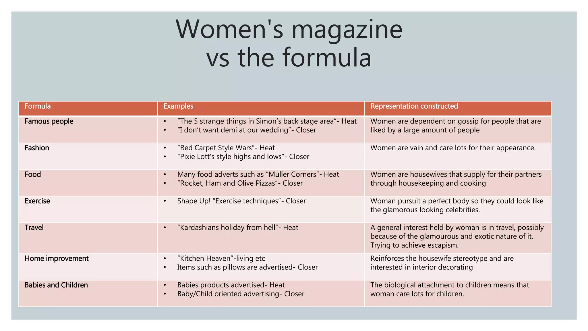
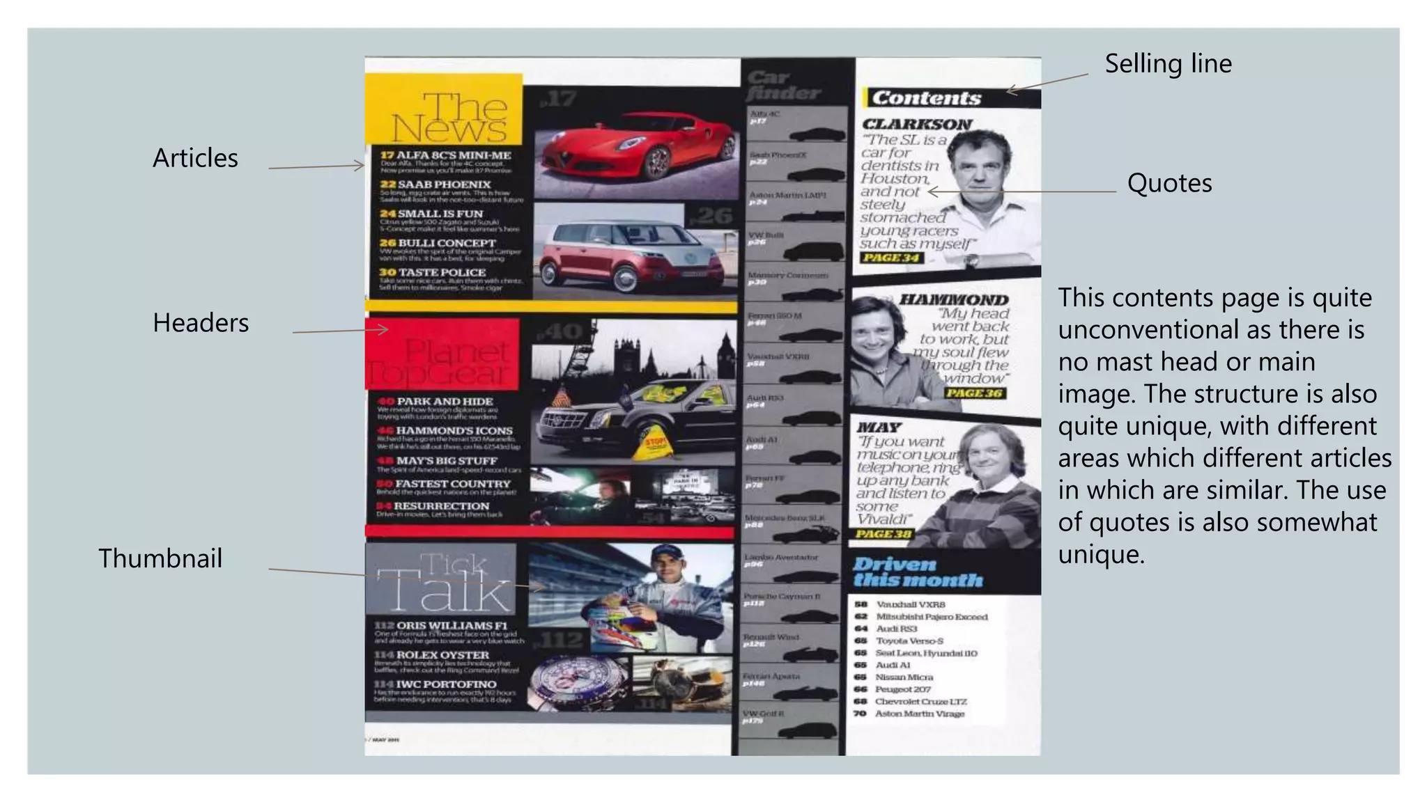
for my advanced media coursework portfolio. In this I evaluate how effectively my three media products work together- one main video and two printed media texts
Target audience research for A2 Media production Film Posterbobonthedrums
In this task I conducted a questionnaire in to what people within my target audience think about films posters so I have a greater of what I need to do within my own poster for it to be conventional.
This presentation was made for my A2 media coursework. In this task, I looked at film studio's, what make them successful and the differences between independent film companies and conglomerates.
In this task I reviewed how much genre can affect the marketing of a film. This was made for my A2 coursework as this is research to help me with my production.
Analysis of similar texts in the thriller genrebobonthedrums
This is used for my As Media research so I can have a greater understanding of common conventions within thriller movies and how I can apply them to my own production
Operation “Blue Star” is the only event in the history of Independent India where the state went into war with its own people. Even after about 40 years it is not clear if it was culmination of states anger over people of the region, a political game of power or start of dictatorial chapter in the democratic setup.
The people of Punjab felt alienated from main stream due to denial of their just demands during a long democratic struggle since independence. As it happen all over the word, it led to militant struggle with great loss of lives of military, police and civilian personnel. Killing of Indira Gandhi and massacre of innocent Sikhs in Delhi and other India cities was also associated with this movement.
How to Make a Field invisible in Odoo 17Celine George
It is possible to hide or invisible some fields in odoo. Commonly using “invisible” attribute in the field definition to invisible the fields. This slide will show how to make a field invisible in odoo 17.
Unit 8 - Information and Communication Technology (Paper I).pdfThiyagu K
This slides describes the basic concepts of ICT, basics of Email, Emerging Technology and Digital Initiatives in Education. This presentations aligns with the UGC Paper I syllabus.
The Art Pastor's Guide to Sabbath | Steve ThomasonSteve Thomason
What is the purpose of the Sabbath Law in the Torah. It is interesting to compare how the context of the law shifts from Exodus to Deuteronomy. Who gets to rest, and why?
Read| The latest issue of The Challenger is here! We are thrilled to announce that our school paper has qualified for the NATIONAL SCHOOLS PRESS CONFERENCE (NSPC) 2024. Thank you for your unwavering support and trust. Dive into the stories that made us stand out!
The Roman Empire A Historical Colossus.pdfkaushalkr1407
The Roman Empire, a vast and enduring power, stands as one of history's most remarkable civilizations, leaving an indelible imprint on the world. It emerged from the Roman Republic, transitioning into an imperial powerhouse under the leadership of Augustus Caesar in 27 BCE. This transformation marked the beginning of an era defined by unprecedented territorial expansion, architectural marvels, and profound cultural influence.
The empire's roots lie in the city of Rome, founded, according to legend, by Romulus in 753 BCE. Over centuries, Rome evolved from a small settlement to a formidable republic, characterized by a complex political system with elected officials and checks on power. However, internal strife, class conflicts, and military ambitions paved the way for the end of the Republic. Julius Caesar’s dictatorship and subsequent assassination in 44 BCE created a power vacuum, leading to a civil war. Octavian, later Augustus, emerged victorious, heralding the Roman Empire’s birth.
Under Augustus, the empire experienced the Pax Romana, a 200-year period of relative peace and stability. Augustus reformed the military, established efficient administrative systems, and initiated grand construction projects. The empire's borders expanded, encompassing territories from Britain to Egypt and from Spain to the Euphrates. Roman legions, renowned for their discipline and engineering prowess, secured and maintained these vast territories, building roads, fortifications, and cities that facilitated control and integration.
The Roman Empire’s society was hierarchical, with a rigid class system. At the top were the patricians, wealthy elites who held significant political power. Below them were the plebeians, free citizens with limited political influence, and the vast numbers of slaves who formed the backbone of the economy. The family unit was central, governed by the paterfamilias, the male head who held absolute authority.
Culturally, the Romans were eclectic, absorbing and adapting elements from the civilizations they encountered, particularly the Greeks. Roman art, literature, and philosophy reflected this synthesis, creating a rich cultural tapestry. Latin, the Roman language, became the lingua franca of the Western world, influencing numerous modern languages.
Roman architecture and engineering achievements were monumental. They perfected the arch, vault, and dome, constructing enduring structures like the Colosseum, Pantheon, and aqueducts. These engineering marvels not only showcased Roman ingenuity but also served practical purposes, from public entertainment to water supply.
This is a presentation by Dada Robert in a Your Skill Boost masterclass organised by the Excellence Foundation for South Sudan (EFSS) on Saturday, the 25th and Sunday, the 26th of May 2024.
He discussed the concept of quality improvement, emphasizing its applicability to various aspects of life, including personal, project, and program improvements. He defined quality as doing the right thing at the right time in the right way to achieve the best possible results and discussed the concept of the "gap" between what we know and what we do, and how this gap represents the areas we need to improve. He explained the scientific approach to quality improvement, which involves systematic performance analysis, testing and learning, and implementing change ideas. He also highlighted the importance of client focus and a team approach to quality improvement.
2. Introduction
As I’m creating a magazine front cover to promote my A2 media production ‘End Process’, I will
be doing some research in to magazines in general, which includes an analysis of 3 front covers,
and their contents. This will include: what context the magazines are released in in terms of
publication; Why particular features of the front cover are used; How language in general is used
within a magazine and how effective the main anchor image is. I will be looking at a variety of
different magazines which appeal to different target audiences. I’ve also decided to analyse briefly
contents pages and also look at theories surrounding how gender is represented in magazine as
this will give me broader understanding of how magazines are used which will in turn help me
make a more conventional magazine cover.
4. The Publication of the ‘Love of Knitting’
This magazine itself is about a rather niche hobby meaning it doesn’t have mainstream appeal like
other magazines which involve around gossip and lifestyle. This therefore means that this
magazine will be more focused around distribution through people being subscribed to the
magazine. This can somewhat be seen within the front cover as it doesn’t try to oversell itself with
bright colours, but rather has a more subtle appeal so it does not deter the people in which it’s
targeting. However, this does include a bar code suggesting this might get some limited
distribution through some stores, but only in ones with large amounts of varied magazines.
5. ◦ Masthead: Clearly show to the audience that this magazine is about knitting making it more eye catching.
◦ Tag line: Helps reinsure what the masthead stood for and allows the audience to understand more greatly what is covered in
the magazine.
◦ Skyline: used as a sell point and can be clearly seen as the eyes typically look at the top of the magazine and work down;
makes it more eye-catching and a more worthwhile purchase.
◦ Main cover line: Helps make it more appealing or worthwhile for the knitting aficionados amongst us.
◦ Main image/anchorage: showing of the potential knitting goods the reader can create. The woman acts as like eye candy,
possibly suggesting the knitter will look as good as the model if they have the same scarf.
◦ Puff/pug: Makes it seem as if the thing in the circle is a bonus extra and that you’re getting more for your money. It also
brings emphasis to the celebrities name so you’re more likely to buy the magazine.
◦ Cover lines: Informs the consumer about what’s in the magazine. The use of the adjective ‘irresistible’ makes it more
appealing.
◦ Buzzwords: Makes it more down to earth so it can appeal to its demographic more.
◦ Barcode/price: So it can be scanned so the purchase can be tracked.
Why does the knitting magazine do
what it do?
6. Evaluation of the Knitting Magazine
I overall like this magazine cover due to its subtle approach to target its target audience. Its
effectiveness is seen through the good use of different features such as puff/pug and an
aesthetically appealing main image. However, I will be creating a move magazine front cover to
promote therefore meaning that I would personally have be more selling and mainstream with my
cover lines as magazines about film are read by more people than ones about knitting generally.
However, I will try to use things such as puff/pugs as I believe this to be very effective in appealing
to a target audience and to also generally make it more eyecatching.
8. The Publication of ‘Hello!’
This particular magazine is intended to target a more mainstream audience with it surrounding
the topic of lifestyle and gossip, which most people can relate to. This therefore means that this
magazine would have been distributed widely through a variety of shops. This magazine is quite
dated meaning that some of these features would be more obvious and elaborate now a days due
to the increased competition with other magazines. However, even with this addition being old,
the use of celebrities and cliff hanging quotes shows that it stills trying the grab peoples attention
so people would be more inclined to buy it, rather than the knitting one which relies on targeting
a niche so doesn’t waste its time to appeal to a mass market.
9. ◦ Masthead: As this magazine is a well established the logo is kept in a bright bold to make sure that the
consumer can easily identify this magazine.
◦ Tag line: Helps the audience understand that this magazine is infect an up to date, regularly updated magazine,
which is what is desired with a gossip magazine.
◦ Main cover line: This includes text about a celebrity who has written something exclusive for Hello, which helps
the buyer both understand that this celebrity focuses on celebrity gossip and also make the more to appeal to
purchase this magazine due to its relation to the celebrity.
◦ Main image/anchorage: Includes an image of a celebrity so people can understand that this magazine is about
celebrity gossip. Will entice people who know of the celebrity.
◦ Cover lines: Includes a quote from one of the articles which leads the reader on a cliff hanger after reading it
which would make people curious about the conclusion of this story so would therefore purchase it to find out
more.
◦ Buzzwords: Words such as ‘royal’ help people understand that there is celebrity gossip about the royal family
within this magazine.
Why does Hello magazine do what it
do?
10. Evaluation of the Knitting Magazine
Overall I don’t like this magazine cover too much due to its lack of really enticing features like a
puff/pug. The magazines appealing is quite bland with it lacking varying colours and really bold
text. However, it does make sure to keep the cover lines and the whole magazine in general
concise and always targeting the target audience, and for this reason I will make sure that I do the
same within my own magazine front cover as I believe it makes it more appealing to the target
audience.
11. I will be analysing ‘Heat Magazine’ in terms of looking
at the language. This particular magazines appeals to a
more female working class demographic meaning the
lexis would change because of it. The particular article
is about celebrities and relationship gossip, a common
topic for this particular magazine. I am going to focus
on specifically the title and the selling line as these are
two common features which are also used for a
magazine front cover
Analysing language used within a
magazine
12. The first use of language used in this article to relate to the audience is the title ‘Frankie bags a footballer’.
Firstly, the first clear use is through not using a formal title for Frankie, but rather a more casual and
friendly first name. This assumes that that reader knows who this Frankie is but not only this, it also makes
it seem less of an article title but more of a statement made by a friend in a conversation. This would
appeal to the audience this articles is trying to appeal to as it makes it seem more informal and gossipy
which would be more appealing to reader. Secondly, the verb ‘bags’ is a rather interesting and colloquial.
The lexis choice of this word over something such as ‘obtained’ is used for a couple reasons. It firstly
appeals more to the dedicated demographic of working class woman as the phrase is commonly known
and a monosyllabic word such as bags is not hard to understand. It also heightens and glorifies her date,
making her seem like she got lucky in some way.
Language within the Heading
13. The header is spliced up with the selling line, with the selling acting as a second half. This acts a selling line
as it adds extra spice to the original title, ‘but she doesn’t even fancy him’. This contradiction with the word
‘bag’ which has connotation with the idea of bagging someone to be ‘lucky’ makes Frankie seem like a
person who doesn’t know how lucky they are. The use of the word fancy rather than another synonym also
links once again to the audience as it’s a common colloquial term used by working class people. The use of
the pre-modifying adverb ‘even’ suggests the idea once again that Frankie is still not aware of how lucky
she is to have the potential to be a wag.
Language within the selling line
14. After analysing some of the language within an article for
heat magazine, it gives me a picture of the demographic
that it being targeted by this magazine. Firstly, it seems to
appeal to a more female audience through the focus on a
relationship a female is having with another man. The actual
footballer is not mentioned in the title as this audience
would not care for
Conclusion of language analysis
them, but rather would only care for the other celebrity singer. Also, another impression that is made is that
it appeals to a more working class audience. This can be seen by the Lexi’s choice used within the article:
short, monosyllabic adjectives and subtle colloquialisms are understood more by a working class
demographic.
15. The Representation of gender within
magazines
By definition, all media texts are re-presentations of reality. This means that they are intentionally
composed, lit, written, framed, cropped, captioned, branded, targeted and censored by their
producers, and that they are entirely artificial versions of the reality we perceive around us. All
magazines have a formula that is used to determine their identity, and hence market appeal. The
effect of this is to create an image for the magazine that excludes certain representations while
focusing on others. The traditional formulas for women’s magazines can be broken down into
three basic types: all-age general (e.g. Women’s Weekly); over-eighteen glamour (e.g Elle) and
Teenage (e.g Bliss)
16. ◦ Magazines that adopt the general interest woman’s formula contain most of all of the following
elements:
◦ Famous people – the royal family, TV personalities, politicians and their spouses, sporting celebrities and
people in the news
◦ Fashion – clothes to buy and (often) to make
◦ Babies and children – child care and common problems
◦ Home improvement – decorating ideas
◦ Food – diets and recipes
◦ Exercise – home fitness programmes
◦ Fiction – short story romances or personal problem situations
◦ Travel – usually within this country
Woman magazine formula
17. ◦ After browsing through Heat’s seven hundred and seventy seventh issue, I noticed that it follows the
formula quite well. It contains several celebrities and famous people with them being the catalyst for
other features for the formula such as stories, gossip and fashion. Living etc however focus entirely on
home improvement, meaning it’s more niche. ‘Closer’ was very similar top Heat but instead was more
general with less of a focus on celebrities, it did however still have some. Closer was the only magazine
out of the three I looked at that completely followed the formula expect for travel
Woman magazine analysis
18. Women's magazine
vs the formula
Formula Examples Representation constructed
Famous people • ”The 5 strange things in Simon’s back stage area”- Heat
• “I don’t want demi at our wedding”- Closer
Women are dependent on gossip for people that are
liked by a large amount of people
Fashion • “Red Carpet Style Wars”- Heat
• “Pixie Lott's style highs and lows”- Closer
Women are vain and care lots for their appearance.
Food • Many food adverts such as “Muller Corners”- Heat
• “Rocket, Ham and Olive Pizzas”- Closer
Women are housewives that supply for their partners
through housekeeping and cooking
Exercise • Shape Up! “Exercise techniques”- Closer Woman pursuit a perfect body so they could look like
the glamorous looking celebrities.
Travel • “Kardashians holiday from hell”- Heat A general interest held by woman is in travel, possibly
because of the glamourous and exotic nature of it.
Trying to achieve escapism.
Home improvement • “Kitchen Heaven”-living etc
• Items such as pillows are advertised- Closer
Reinforces the housewife stereotype and are
interested in interior decorating
Babies and Children • Babies products advertised- Heat
• Baby/Child oriented advertising- Closer
The biological attachment to children means that
woman care lots for children.
19. ◦ Overall it appears that the formula works quite well for the magazines wishing to appeal to a large female
demographic as both heat and closer contained most of the topics. It appears that least looked topics
that were in the magazines was travel and home improvement. This might be due to these magazines
economic target group, as working class woman perhaps cannot afford expensive holidays and furniture.
It overall represents woman to be traditional housewives with little progression from the traditional view
of the housewife. Representation of woman is constructed in magazines by the typical topics discussed
and how they’re done so. A large focus on celebrities for all topics including travel gives more insight in
to how woman fantasy about being famous. It gives an overall negative impression in my opinion as it’s
not progressive within views for woman. However, some might argue that its empowering topics such as
strong independent female workers suggest not so much a negative impression, but rather that these
more traditional topic points like childcare is only there because woman are naturally interested in them,
rather than to conform to a traditional housewife role.
Conclusion of the formula
20. • Laura Mulvey’s Male Gaze theory suggest that female characters tend to be displayed for the visual
pleasure of male characters and audience members. This objectification can be seen within magazines
which glorify looks rather than anything else. Woman are only in magazine because they’re eye candy.
• Baudrillard theory of hyperreality suggests that within media the reality is heighten to dramatise and to
offer escapism to the viewer; not giving an objective view to the world. This could be seen in magazines
through skewing stories to make the more appealing or altering photos of men or woman to make
them look perfect.
Theories applying to the representation
of gender within magazines
21. ◦ Mulvey’s theory can quite often be seen within magazines for both male and female audiences by
objectifying there looks for the viewers gain. Some magazines even exclusively do this such as ‘Nuts’,
‘Hustler’ or ‘Playboy’ for male audiences, which contain images of woman wearing little glorifying their
bodies and making them seem like an object. Although these examples are obvious, some magazines for
men do it more subtly. Car magazines which appeal more to a male demographic sometimes contain
images of women posing in front of cars, adding to the eye candy. Even some female magazines objectify
the opposite such as in closer which contains a section on the best torso. However it overall appears that
male gaze rather than female gaze is more dominant in culture and consequently, magazines.
Male gaze theory seen within magazines
22. ◦ For the representation of gender, this is mostly commonly seen with images, which are enhanced and
altered to portray a perfect looking person. Marie Claire magazines contains this lots within ads showing
perfect looking woman setting an unreachable standards for woman which makes the products more
appealing. Even stories can be altered to show a certain biased towards a certain sex. This hyper realty
can represent gender in an negative light therefore.
Hyperreality theory seen within
magazines
23. ◦ These theories does give a greater insight in to the representation of gender in magazines as an
objectification of particular sex’s is present when considering the male gaze theory and also looks and
bias towards different genders is seen through using the hyperreality theory. However, the male gaze
theory only applies to men objectifying women within the media, and not the other way round. This
therefore shows a flaw in opposite examples brought up the previously. However, even with this
suggested equality of sexualisation, men appear to still be dominant ones, with woman objectified more.
Evaluation of the theories within
magazines
24. Contents page analysis
◦ Gives the reader an idea of other stories/ information within the magazine and what page
numbers you can find it on.
◦ Entices the reader to want to read more
◦ Needs to be easy to read and follow
◦ Needs to incorporate the colour scheme is usually similar if not the same to the front cover; it
follows the house style of the magazine.
26. ◦ Masthead: Allows the reader to still understand that this magazine’s contents page is by Jazzwise. It acts
as branding for Jazzwise. It also allows people to recognise what the magazine still is without the
magazine cover as it’s quite common for them to fall off.
◦ Selling line: Allows readers to understand what page they’re on and what issue the magazine is on.
◦ Main image/subject: relate to the magazine cover and an article. Makes it more visually appealing.
◦ Footer: used for self promotion for Jazzwise. Gives more important information which most readers need
but is too boring to be on front cover.
◦ Articles: give titles of articles featured in the magazine and the pages these articles appear on. Also
include a short description.
◦ Article highlights: Some articles are more obvious that others by having bigger font. Used to make people
see the more appealing articles quicker.
What does the jazz wise contents page
do what it do?
27. Masthead
Main image
Puff/pugSelling line
Articles
The use of typical house
style makes it more
visually appealing. The
main image and the
articles being structured in
columns is conventional
for magazine contents
pages.
28. Articles
Headers
Quotes
Thumbnail
Selling line
This contents page is quite
unconventional as there is
no mast head or main
image. The structure is also
quite unique, with different
areas which different articles
in which are similar. The use
of quotes is also somewhat
unique.