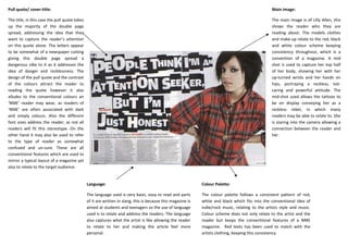
SlideShare a Scribd company logo
Pull quote/ cover-title:                                                                                                                           Main image:

The title, in this case the pull quote takes                                                                                                       The main image is of Lilly Allen, this
up the majority of the double page                                                                                                                 shows the reader who they are
spread, addressing the idea that they                                                                                                              reading about. The models clothes
want to capture the reader’s attention                                                                                                             and make-up relate to the red, black
on this quote alone. The letters appear                                                                                                            and white colour scheme keeping
to be somewhat of a newspaper cutting                                                                                                              consistency throughout, which is a
giving this double page spread a                                                                                                                   convention of a magazine. A mid
dangerous vibe to it as it addresses the                                                                                                           shot is used to capture her top half
idea of danger and recklessness. The                                                                                                               of her body, showing her with her
design of the pull quote and the contrast                                                                                                          up-turned wrists and her hands on
of the colours attract the reader to                                                                                                               hips, portraying a reckless, not-
reading the quote however it also                                                                                                                  caring and powerful attitude. The
alludes to the conventional colours an                                                                                                             mid-shot used allows the tattoos to
‘NME’ reader may wear, as readers of                                                                                                               be on display conveying her as a
‘NME’ are often associated with dark                                                                                                               reckless rebel, in which many
and simply colours. Also the different                                                                                                             readers may be able to relate to. She
font sizes address the reader, as not all                                                                                                          is staring into the camera allowing a
readers will fit this stereotype. On the                                                                                                           connection between the reader and
other hand it may also be used to refer                                                                                                            her.
to the type of reader as somewhat
confused and un-sure. These are all
conventional features which are used to
mirror a typical layout of a magazine yet
also to relate to the target audience.


                                               Language:                                                      Colour Palette:

                                               The language used is very basic, easy to read and parts        The colour palette follows a consistent pattern of red,
                                               of it are written in slang, this is because this magazine is   white and black which fits into the conventional idea of
                                               aimed at students and teenagers so the use of language         indie/rock music, relating to the artists style and music.
                                               used is to relate and address the readers. The language        Colour scheme does not only relate to the artist and the
                                               also captures what the artist is like allowing the reader      reader but keeps the conventional features of a NME
                                               to relate to her and making the article feel more              magazine. Red texts has been used to match with the
                                               personal.                                                      artists clothing, keeping this consistency

More Related Content

What's hot

Magazine Analysis
Magazine AnalysisMagazine Analysis
Magazine Analysis_megkiely
 
Evaluation question 1
Evaluation question 1Evaluation question 1
Evaluation question 1asmediaf12
 
Media - Existing Product Analysis
Media - Existing Product AnalysisMedia - Existing Product Analysis
Media - Existing Product Analysistamsinrwg
 
Magazine cover analysis 1,2,3
Magazine cover analysis 1,2,3Magazine cover analysis 1,2,3
Magazine cover analysis 1,2,3JosetteHo
 
Existing product research (front cover)
Existing product research (front cover)Existing product research (front cover)
Existing product research (front cover)alextownsley
 
Analysis of magazines
Analysis of magazinesAnalysis of magazines
Analysis of magazines
brigitg
 
Front cover analysis
Front cover analysisFront cover analysis
Front cover analysismariatou
 
Magazine Photography Analysis and Research
Magazine Photography Analysis and Research Magazine Photography Analysis and Research
Magazine Photography Analysis and Research selinargyrou
 
Nme analysis of magazine
Nme analysis of magazineNme analysis of magazine
Nme analysis of magazineasmediaf12
 
Magazine cover reviews
Magazine cover reviewsMagazine cover reviews
Magazine cover reviewsToddwhitsey
 
Magazines
MagazinesMagazines
Magazinesdapaz93
 
Analysing magazine features and connotations
Analysing magazine features and connotationsAnalysing magazine features and connotations
Analysing magazine features and connotationsJoshWilliamson14
 
Deconstructing magazines
Deconstructing magazinesDeconstructing magazines
Deconstructing magazinesLauracharlotte
 
Evaluation of my media product
Evaluation of my media productEvaluation of my media product
Evaluation of my media productsophieemarinaa
 
Evaluation Question 5
Evaluation Question 5Evaluation Question 5
Evaluation Question 5bymckee
 
Contents page
Contents pageContents page
Contents pagemickyb96
 

What's hot (19)

Front cover analysis
Front cover analysisFront cover analysis
Front cover analysis
 
Evaluation
EvaluationEvaluation
Evaluation
 
Magazine Analysis
Magazine AnalysisMagazine Analysis
Magazine Analysis
 
Evaluation question 1
Evaluation question 1Evaluation question 1
Evaluation question 1
 
Media - Existing Product Analysis
Media - Existing Product AnalysisMedia - Existing Product Analysis
Media - Existing Product Analysis
 
Magazine cover analysis 1,2,3
Magazine cover analysis 1,2,3Magazine cover analysis 1,2,3
Magazine cover analysis 1,2,3
 
Existing product research (front cover)
Existing product research (front cover)Existing product research (front cover)
Existing product research (front cover)
 
Analysis of magazines
Analysis of magazinesAnalysis of magazines
Analysis of magazines
 
Front cover analysis
Front cover analysisFront cover analysis
Front cover analysis
 
Magazine Photography Analysis and Research
Magazine Photography Analysis and Research Magazine Photography Analysis and Research
Magazine Photography Analysis and Research
 
Nme analysis of magazine
Nme analysis of magazineNme analysis of magazine
Nme analysis of magazine
 
Media Reseach
Media ReseachMedia Reseach
Media Reseach
 
Magazine cover reviews
Magazine cover reviewsMagazine cover reviews
Magazine cover reviews
 
Magazines
MagazinesMagazines
Magazines
 
Analysing magazine features and connotations
Analysing magazine features and connotationsAnalysing magazine features and connotations
Analysing magazine features and connotations
 
Deconstructing magazines
Deconstructing magazinesDeconstructing magazines
Deconstructing magazines
 
Evaluation of my media product
Evaluation of my media productEvaluation of my media product
Evaluation of my media product
 
Evaluation Question 5
Evaluation Question 5Evaluation Question 5
Evaluation Question 5
 
Contents page
Contents pageContents page
Contents page
 

Similar to Lilly allen double page spread analysis copy

Case studies and comparable products
Case studies and comparable productsCase studies and comparable products
Case studies and comparable productsameliaskill9
 
Front Cover Research 3
Front Cover Research 3Front Cover Research 3
Front Cover Research 3JosetteHo
 
Magazine cover analysis q magazine
Magazine cover analysis  q magazineMagazine cover analysis  q magazine
Magazine cover analysis q magazineadamtimms22
 
Front Cover Research
Front Cover ResearchFront Cover Research
Front Cover Researchjessheap
 
Music magazine analysiss
Music magazine analysissMusic magazine analysiss
Music magazine analysissreece1213
 
Analysis of front covers
Analysis of front coversAnalysis of front covers
Analysis of front coversLUCYcrowther
 
Analysis of front covers
Analysis of front coversAnalysis of front covers
Analysis of front coversLUCYcrowther
 
Nme magazine analysis
Nme magazine analysisNme magazine analysis
Nme magazine analysisasmediaf12
 
Magazine Cover Analysis
Magazine Cover AnalysisMagazine Cover Analysis
Magazine Cover Analysisemilygrimshaw
 
Front cover music magazine analysis
Front cover music magazine analysisFront cover music magazine analysis
Front cover music magazine analysisSimone Walsh
 
Magazine Cover Analysis
Magazine Cover AnalysisMagazine Cover Analysis
Magazine Cover Analysisemilygrimshaw
 
Music contents new
Music contents newMusic contents new
Music contents newDragonium
 
Evaluation question 1
Evaluation question 1Evaluation question 1
Evaluation question 1asmediaf12
 
Double page spread analysis
Double page spread analysisDouble page spread analysis
Double page spread analysisChrisDonnellan
 
Magazine cover analysis nme
Magazine cover analysis  nmeMagazine cover analysis  nme
Magazine cover analysis nmeadamtimms22
 
Task 2 – analysing magazine 2
Task 2 – analysing magazine 2Task 2 – analysing magazine 2
Task 2 – analysing magazine 2asmediaf12
 
Magazine cover analysis worksheet the big cheese
Magazine cover analysis worksheet  the big cheeseMagazine cover analysis worksheet  the big cheese
Magazine cover analysis worksheet the big cheeseadamtimms22
 

Similar to Lilly allen double page spread analysis copy (20)

Number 4
Number 4Number 4
Number 4
 
Case studies and comparable products
Case studies and comparable productsCase studies and comparable products
Case studies and comparable products
 
Front Cover Research 3
Front Cover Research 3Front Cover Research 3
Front Cover Research 3
 
Magazine cover analysis q magazine
Magazine cover analysis  q magazineMagazine cover analysis  q magazine
Magazine cover analysis q magazine
 
Front Cover Research
Front Cover ResearchFront Cover Research
Front Cover Research
 
Front page analysis
Front page analysisFront page analysis
Front page analysis
 
Music magazine analysiss
Music magazine analysissMusic magazine analysiss
Music magazine analysiss
 
Analysis of front covers
Analysis of front coversAnalysis of front covers
Analysis of front covers
 
Analysis of front covers
Analysis of front coversAnalysis of front covers
Analysis of front covers
 
Nme magazine analysis
Nme magazine analysisNme magazine analysis
Nme magazine analysis
 
Magazine Cover Analysis
Magazine Cover AnalysisMagazine Cover Analysis
Magazine Cover Analysis
 
Magazine anaysis2
Magazine anaysis2Magazine anaysis2
Magazine anaysis2
 
Front cover music magazine analysis
Front cover music magazine analysisFront cover music magazine analysis
Front cover music magazine analysis
 
Magazine Cover Analysis
Magazine Cover AnalysisMagazine Cover Analysis
Magazine Cover Analysis
 
Music contents new
Music contents newMusic contents new
Music contents new
 
Evaluation question 1
Evaluation question 1Evaluation question 1
Evaluation question 1
 
Double page spread analysis
Double page spread analysisDouble page spread analysis
Double page spread analysis
 
Magazine cover analysis nme
Magazine cover analysis  nmeMagazine cover analysis  nme
Magazine cover analysis nme
 
Task 2 – analysing magazine 2
Task 2 – analysing magazine 2Task 2 – analysing magazine 2
Task 2 – analysing magazine 2
 
Magazine cover analysis worksheet the big cheese
Magazine cover analysis worksheet  the big cheeseMagazine cover analysis worksheet  the big cheese
Magazine cover analysis worksheet the big cheese
 

More from ChelseaHowsin1994

Media preliminary task flat plans
Media   preliminary task flat plansMedia   preliminary task flat plans
Media preliminary task flat plansChelseaHowsin1994
 
First draft front cover analysis
First draft front cover analysisFirst draft front cover analysis
First draft front cover analysisChelseaHowsin1994
 
Nme double page spread florence and the machine analysis
Nme double page spread   florence and the machine analysisNme double page spread   florence and the machine analysis
Nme double page spread florence and the machine analysisChelseaHowsin1994
 
Nme the wombts front cover analysis
Nme   the wombts front cover analysisNme   the wombts front cover analysis
Nme the wombts front cover analysisChelseaHowsin1994
 
Media analysis of prliminary task
Media   analysis of prliminary taskMedia   analysis of prliminary task
Media analysis of prliminary taskChelseaHowsin1994
 
Media analyse and evaluate photographs
Media   analyse and evaluate photographsMedia   analyse and evaluate photographs
Media analyse and evaluate photographsChelseaHowsin1994
 

More from ChelseaHowsin1994 (20)

Alt profiler
Alt profilerAlt profiler
Alt profiler
 
Alt reader board
Alt reader boardAlt reader board
Alt reader board
 
Alt reader board
Alt reader boardAlt reader board
Alt reader board
 
Media image analysis 2
Media image analysis 2Media image analysis 2
Media image analysis 2
 
Media evaluation
Media evaluationMedia evaluation
Media evaluation
 
Magazine planning
Magazine planningMagazine planning
Magazine planning
 
Media preliminary task flat plans
Media   preliminary task flat plansMedia   preliminary task flat plans
Media preliminary task flat plans
 
Media evaluation
Media evaluationMedia evaluation
Media evaluation
 
Media contacts
Media contactsMedia contacts
Media contacts
 
Media contacts
Media contactsMedia contacts
Media contacts
 
First draft front cover analysis
First draft front cover analysisFirst draft front cover analysis
First draft front cover analysis
 
Magazine reader profile
Magazine reader profileMagazine reader profile
Magazine reader profile
 
Magazine reader profile
Magazine reader profileMagazine reader profile
Magazine reader profile
 
Magazine reader profile
Magazine reader profileMagazine reader profile
Magazine reader profile
 
Preliminary task evaluation
Preliminary task evaluationPreliminary task evaluation
Preliminary task evaluation
 
Nme double page spread florence and the machine analysis
Nme double page spread   florence and the machine analysisNme double page spread   florence and the machine analysis
Nme double page spread florence and the machine analysis
 
Nme content page analysis
Nme content page analysisNme content page analysis
Nme content page analysis
 
Nme the wombts front cover analysis
Nme   the wombts front cover analysisNme   the wombts front cover analysis
Nme the wombts front cover analysis
 
Media analysis of prliminary task
Media   analysis of prliminary taskMedia   analysis of prliminary task
Media analysis of prliminary task
 
Media analyse and evaluate photographs
Media   analyse and evaluate photographsMedia   analyse and evaluate photographs
Media analyse and evaluate photographs
 

Lilly allen double page spread analysis copy

  • 1. Pull quote/ cover-title: Main image: The title, in this case the pull quote takes The main image is of Lilly Allen, this up the majority of the double page shows the reader who they are spread, addressing the idea that they reading about. The models clothes want to capture the reader’s attention and make-up relate to the red, black on this quote alone. The letters appear and white colour scheme keeping to be somewhat of a newspaper cutting consistency throughout, which is a giving this double page spread a convention of a magazine. A mid dangerous vibe to it as it addresses the shot is used to capture her top half idea of danger and recklessness. The of her body, showing her with her design of the pull quote and the contrast up-turned wrists and her hands on of the colours attract the reader to hips, portraying a reckless, not- reading the quote however it also caring and powerful attitude. The alludes to the conventional colours an mid-shot used allows the tattoos to ‘NME’ reader may wear, as readers of be on display conveying her as a ‘NME’ are often associated with dark reckless rebel, in which many and simply colours. Also the different readers may be able to relate to. She font sizes address the reader, as not all is staring into the camera allowing a readers will fit this stereotype. On the connection between the reader and other hand it may also be used to refer her. to the type of reader as somewhat confused and un-sure. These are all conventional features which are used to mirror a typical layout of a magazine yet also to relate to the target audience. Language: Colour Palette: The language used is very basic, easy to read and parts The colour palette follows a consistent pattern of red, of it are written in slang, this is because this magazine is white and black which fits into the conventional idea of aimed at students and teenagers so the use of language indie/rock music, relating to the artists style and music. used is to relate and address the readers. The language Colour scheme does not only relate to the artist and the also captures what the artist is like allowing the reader reader but keeps the conventional features of a NME to relate to her and making the article feel more magazine. Red texts has been used to match with the personal. artists clothing, keeping this consistency
  • 2. Pull quote/ cover-title: Main image: The title, in this case the pull quote takes The main image is of Lilly Allen, this up the majority of the double page shows the reader who they are spread, addressing the idea that they reading about. The models clothes want to capture the reader’s attention and make-up relate to the red, black on this quote alone. The letters appear and white colour scheme keeping to be somewhat of a newspaper cutting consistency throughout, which is a giving this double page spread a convention of a magazine. A mid dangerous vibe to it as it addresses the shot is used to capture her top half idea of danger and recklessness. The of her body, showing her with her design of the pull quote and the contrast up-turned wrists and her hands on of the colours attract the reader to hips, portraying a reckless, not- reading the quote however it also caring and powerful attitude. The alludes to the conventional colours an mid-shot used allows the tattoos to ‘NME’ reader may wear, as readers of be on display conveying her as a ‘NME’ are often associated with dark reckless rebel, in which many and simply colours. Also the different readers may be able to relate to. She font sizes address the reader, as not all is staring into the camera allowing a readers will fit this stereotype. On the connection between the reader and other hand it may also be used to refer her. to the type of reader as somewhat confused and un-sure. These are all conventional features which are used to mirror a typical layout of a magazine yet also to relate to the target audience. Language: Colour Palette: The language used is very basic, easy to read and parts The colour palette follows a consistent pattern of red, of it are written in slang, this is because this magazine is white and black which fits into the conventional idea of aimed at students and teenagers so the use of language indie/rock music, relating to the artists style and music. used is to relate and address the readers. The language Colour scheme does not only relate to the artist and the also captures what the artist is like allowing the reader reader but keeps the conventional features of a NME to relate to her and making the article feel more magazine. Red texts has been used to match with the personal. artists clothing, keeping this consistency
  • 3. Pull quote/ cover-title: Main image: The title, in this case the pull quote takes The main image is of Lilly Allen, this up the majority of the double page shows the reader who they are spread, addressing the idea that they reading about. The models clothes want to capture the reader’s attention and make-up relate to the red, black on this quote alone. The letters appear and white colour scheme keeping to be somewhat of a newspaper cutting consistency throughout, which is a giving this double page spread a convention of a magazine. A mid dangerous vibe to it as it addresses the shot is used to capture her top half idea of danger and recklessness. The of her body, showing her with her design of the pull quote and the contrast up-turned wrists and her hands on of the colours attract the reader to hips, portraying a reckless, not- reading the quote however it also caring and powerful attitude. The alludes to the conventional colours an mid-shot used allows the tattoos to ‘NME’ reader may wear, as readers of be on display conveying her as a ‘NME’ are often associated with dark reckless rebel, in which many and simply colours. Also the different readers may be able to relate to. She font sizes address the reader, as not all is staring into the camera allowing a readers will fit this stereotype. On the connection between the reader and other hand it may also be used to refer her. to the type of reader as somewhat confused and un-sure. These are all conventional features which are used to mirror a typical layout of a magazine yet also to relate to the target audience. Language: Colour Palette: The language used is very basic, easy to read and parts The colour palette follows a consistent pattern of red, of it are written in slang, this is because this magazine is white and black which fits into the conventional idea of aimed at students and teenagers so the use of language indie/rock music, relating to the artists style and music. used is to relate and address the readers. The language Colour scheme does not only relate to the artist and the also captures what the artist is like allowing the reader reader but keeps the conventional features of a NME to relate to her and making the article feel more magazine. Red texts has been used to match with the personal. artists clothing, keeping this consistency
  • 4. Pull quote/ cover-title: Main image: The title, in this case the pull quote takes The main image is of Lilly Allen, this up the majority of the double page shows the reader who they are spread, addressing the idea that they reading about. The models clothes want to capture the reader’s attention and make-up relate to the red, black on this quote alone. The letters appear and white colour scheme keeping to be somewhat of a newspaper cutting consistency throughout, which is a giving this double page spread a convention of a magazine. A mid dangerous vibe to it as it addresses the shot is used to capture her top half idea of danger and recklessness. The of her body, showing her with her design of the pull quote and the contrast up-turned wrists and her hands on of the colours attract the reader to hips, portraying a reckless, not- reading the quote however it also caring and powerful attitude. The alludes to the conventional colours an mid-shot used allows the tattoos to ‘NME’ reader may wear, as readers of be on display conveying her as a ‘NME’ are often associated with dark reckless rebel, in which many and simply colours. Also the different readers may be able to relate to. She font sizes address the reader, as not all is staring into the camera allowing a readers will fit this stereotype. On the connection between the reader and other hand it may also be used to refer her. to the type of reader as somewhat confused and un-sure. These are all conventional features which are used to mirror a typical layout of a magazine yet also to relate to the target audience. Language: Colour Palette: The language used is very basic, easy to read and parts The colour palette follows a consistent pattern of red, of it are written in slang, this is because this magazine is white and black which fits into the conventional idea of aimed at students and teenagers so the use of language indie/rock music, relating to the artists style and music. used is to relate and address the readers. The language Colour scheme does not only relate to the artist and the also captures what the artist is like allowing the reader reader but keeps the conventional features of a NME to relate to her and making the article feel more magazine. Red texts has been used to match with the personal. artists clothing, keeping this consistency