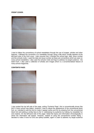
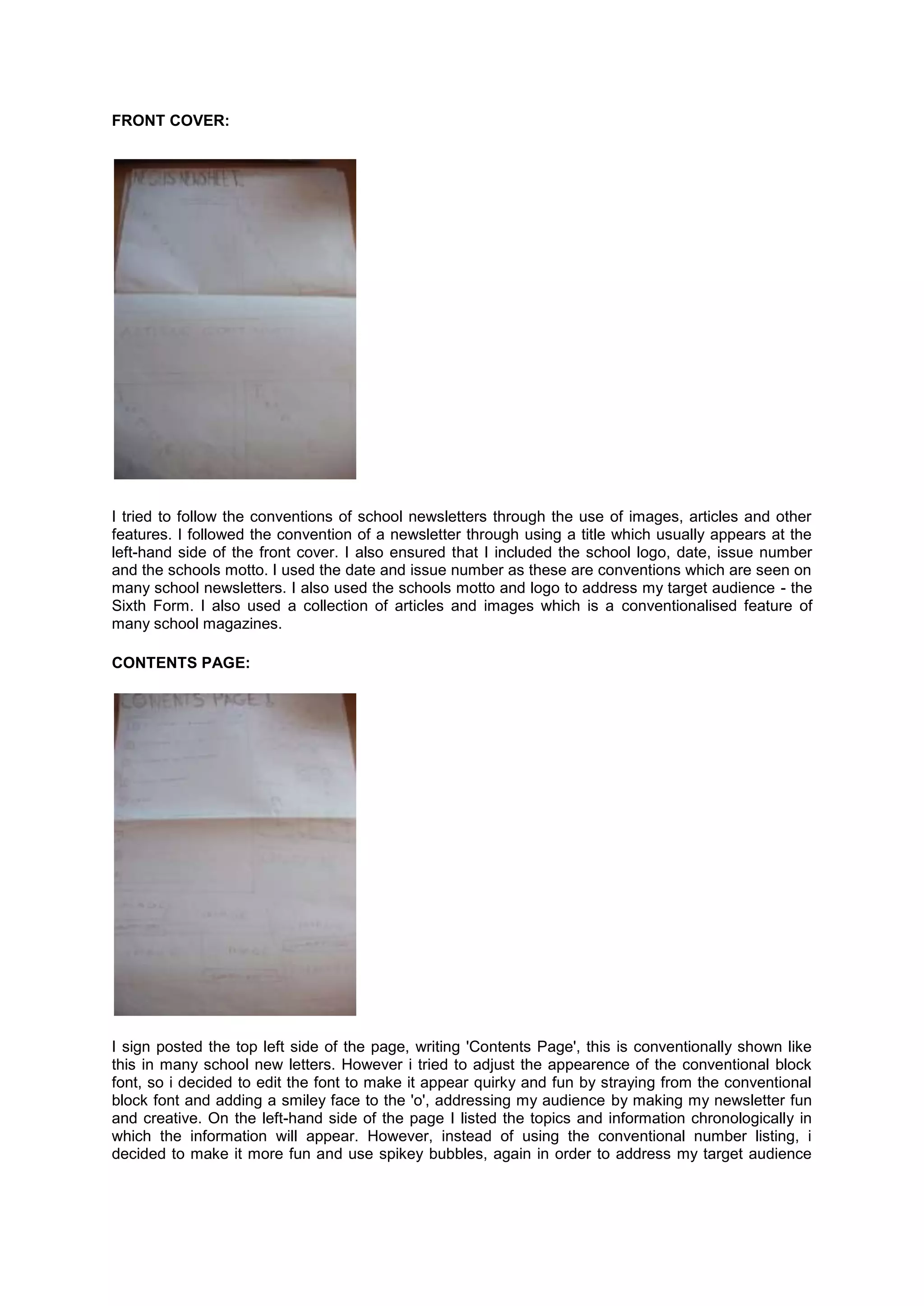
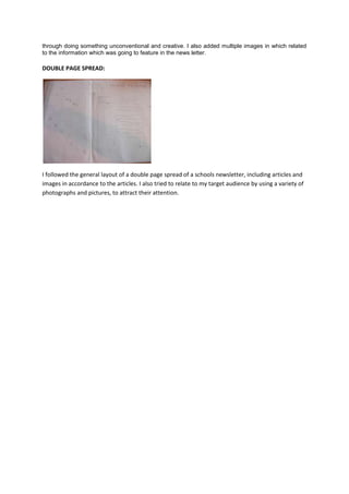
FRONT COVER:


I tried to follow the conventions of school newsletters through the use of images, articles and other
features. I followed the convention of a newsletter through using a title which usually appears at the
left-hand side of the front cover. I also ensured that I included the school logo, date, issue number
and the schools motto. I used the date and issue number as these are conventions which are seen on
many school newsletters. I also used the schools motto and logo to address my target audience - the
Sixth Form. I also used a collection of articles and images which is a conventionalised feature of
many school magazines.

CONTENTS PAGE:


I sign posted the top left side of the page, writing 'Contents Page', this is conventionally shown like
this in many school new letters. However i tried to adjust the appearence of the conventional block
font, so i decided to edit the font to make it appear quirky and fun by straying from the conventional
block font and adding a smiley face to the 'o', addressing my audience by making my newsletter fun
and creative. On the left-hand side of the page I listed the topics and information chronologically in
which the information will appear. However, instead of using the conventional number listing, i
decided to make it more fun and use spikey bubbles, again in order to address my target audience
through doing something unconventional and creative. I also added multiple images in which related
to the information which was going to feature in the news letter.

DOUBLE PAGE SPREAD:


I followed the general layout of a double page spread of a schools newsletter, including articles and
images in accordance to the articles. I also tried to relate to my target audience by using a variety of
photographs and pictures, to attract their attention.

Media preliminary task flat plans

  • 1.
    FRONT COVER: I triedto follow the conventions of school newsletters through the use of images, articles and other features. I followed the convention of a newsletter through using a title which usually appears at the left-hand side of the front cover. I also ensured that I included the school logo, date, issue number and the schools motto. I used the date and issue number as these are conventions which are seen on many school newsletters. I also used the schools motto and logo to address my target audience - the Sixth Form. I also used a collection of articles and images which is a conventionalised feature of many school magazines. CONTENTS PAGE: I sign posted the top left side of the page, writing 'Contents Page', this is conventionally shown like this in many school new letters. However i tried to adjust the appearence of the conventional block font, so i decided to edit the font to make it appear quirky and fun by straying from the conventional block font and adding a smiley face to the 'o', addressing my audience by making my newsletter fun and creative. On the left-hand side of the page I listed the topics and information chronologically in which the information will appear. However, instead of using the conventional number listing, i decided to make it more fun and use spikey bubbles, again in order to address my target audience
  • 2.
    through doing somethingunconventional and creative. I also added multiple images in which related to the information which was going to feature in the news letter. DOUBLE PAGE SPREAD: I followed the general layout of a double page spread of a schools newsletter, including articles and images in accordance to the articles. I also tried to relate to my target audience by using a variety of photographs and pictures, to attract their attention.