The document summarizes key elements of magazine contents pages. It describes logos, mastheads, images, and subheadings used to organize content and draw reader attention. Main images showcase artists to promote stories within. Mastheads and logos use large, bold text and colors to ensure recognition. Subheadings and indexes help readers navigate content easily. Certain design elements, like warning colors on subscriptions, aim to highlight specific sections. Overall the contents pages are organized to attract readers and allow them to find topics of interest.
1. Logo of the magazine- its
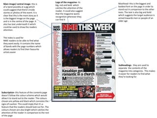
Main image/ central image- this is Masthead- this is the biggest and
big, red and bold which
of a band possibly at a gig which boldest font on the page in order to
catches the attention of the
could suggest that there’s inside stand out in comparison to the other
reader. It could also suggest
stories or photos of the event. It is texts. The text is also big and bold
that the magazine wants
clear that this is the main story as it which suggests the target audience is
recognition wherever they
is the biggest image on the page aimed towards men or people of an
can find it
and is in the centre of the page. It older age
also has text underneath it which
could be used to draw the readers
attention.
The index is used for
NME readers to be able to find what
they want easily. It contains the name
of bands with the page numbers which
allows readers to find their favourite
artists easier
Subheadings- they are used to
separate the contents of the
magazine into categories. This makes
it easier for readers to find what
they’re looking for
Subscription- this feature of the contents page
doesn’t follow the colour scheme which would
allow it to stand out to the reader. The colours
chosen are yellow and black which connotes the
signs of caution. This could imply that it’s a
feature that the readers should look out for. The
colours chosen are also bright which catches the
attention of the reader in comparison to the rest
of the page
2. Masthead- it is white and bold
There is emphasis on the letter “v” on which stands out against the very
both features on the page. This is dark background. The letters are
possibly to promote the magazine very large so is easily recognised
called “vibe” so they’ve taken the first
letter of the name. with the artist in the
main image, she makes the shape of a
“v” with her legs
Subheadings- these are used to
organise and separate the
Her heels could connote her feminine different pages which makes it
side. It may also suggest she's into easier for the reader to find
fashion and the latest trends. They are what they're looking for in the
in contrast with the colour scheme of magazine. Below the titles, there
the rest of the page is more information on the
contents of the pages which is
more precise and lets the reader
know exactly what they're
looking for and what is expected
Main image- it is of the main artist in this
magazine. She is dressed in very little close
and is posed in a very seductive way. This
could possibly be for the attention of male
readers as it would more likely appeal to
men. The jewellery she is wearing could
suggest that she is wealthy and wants to
Her facial expression is quite
show it off which could represent her
seductive which adds to her
confidence in the work that she does
costume and composition of her
body with her legs in the air
3. Background- the background is a very Masthead- its one for the largest and
light grey which allows the contents of eye-catching fonts on the page which
the page to stand out against it. The allows attention to be drawn to the
first letter of the music magazine is in audience. The style of it is quite unique
the background which could suggest which could give readers the idea that
that they want recognition and for it isn't a typical music magazine
readers to become familiar with the
music magazine they are reading.
His facial expression is quite hard to Costume- He is dressed in the style of
read as his face is still. The could show smart casual which could imply that he
that he wants to be taken seriously is interested in the latest fashion and
even though his story may be about his making a statement about the style of
love-life. This may also suggest that he his clothing. It could also suggest that
is serious about his love-life the magazine contains other aspects
such as fashion
Subheadings- these are used to
organise and separate the different
The colour scheme is quite dull and
pages which makes it easier for the
grey with only grey and black used
reader to find what they're looking for
throughout. However, the only colour
in the magazine. Below the titles, there
on the page is the red heart that is held
is more information on the contents of
by a hand from behind Kanye onto his
the pages which is more precise and
chest. This could imply that the inside
lets the reader know exactly what
story focuses on his love life
they're looking for and what is
expected