1. Pre Photoshop task evaluation:
In what ways does your media product use, develop or challenge forms and
conventions of real media products?
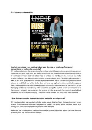
My media product uses the conventions of a media product it has a masthead, a main image, a main
cover-line and other cover-lines. My media product uses the conventional features of a magazine as
it has the cover-lines in bold with a backdrop, to contrast and stand out to the audience. My media
product challenges and does not conform to the general colour scheme f an indie/rock magazine e.g.
NME as it is all in gold and white whereas a product like NME would conventionally follow a colour
scheme or red, black and white. It also does not have any tag line in which most indie magazine
have. The product also exceeds the expectations as the main cover-line takes up the majority of the
front page and there are not many other cover-lines except for 1 which is very conventional for a
front cover. I believe it also challenges the concept of indie, as an indie front cover is usually black
and white and un-crowded conveying a simplistic nature whereas this front cover is the opposite.
How does your media product represent particular social groups?
My media product represents the indie social group; this is shown through the main cover
image. The mise-en-scene used conveys this image, the skinny jeans, the tee, blazer and
messy hair, which are representative of an indie life-style.
Moreover the individual and creative masthead suggests something about the indie life-style
that they also are individual and creative.
2. Who would be the audience for your media product?
1) People who genuinely have an interest and passion for music
2) Indie people
3) Students/teenagers
4) People who are in a band
5) Individuals who write their own music
6) Individuals who can play an instrument, in this case preferably acoustic guitar
7) Individuals with a simplistic life-style
8) Enjoys gigs, concerts and festivals
9) Motivated individual
10) Individuals who enjoy freedom and life
11) Enjoy expressing themselves and voicing their opinions
12) Aimed more at the lower/working class and not the higher class
How did you attract/address your audience?
1) My main cover image has been used to attract indie readers, as the boy on the front page
portrays a indie style image therefore addressing the target audience through the mise-en-
scene.
2) The use of an unconventional layout and colour scheme was used to be different from other
conventional magazines, and in the same way indie people would view themselves the
same. So in the same way as the magazine is different from other magazines, so is the
individual different from other individuals. I attract the individual more on a personal basis
through doing this.
3) Hoping the colour palette would attract readers, I used the masthead to engage them more
as it conveys a sense of individuality and creativity, in which the indie reader is assumed to
be like, in that way the magazine connects with the indie reader.
4) According to previous research candidates voted that if a magazine had tour dates in it they
would be more likely to buy the product. My magazine conveys this feature addressing my
target audience.
Looking back at your preliminary task, what do you feel you have learnt in the
progression from it to the full product?
Looking back on my preliminary task I believe I have a better understanding on how to relate
to my target audience through my media product through images, colour scheme, cover-
lines and tag-lines e.c.t. I also think I now have a slightly better understanding on how to lay
out a magazine. On the other hand I learnt from my mistakes from my preliminary task, not
to stretch images as much as it loses the quality of the photograph. This is a main evaluation
point as all magazines spend the majority of their time editing and making sure their images
look professional and are of good quality otherwise readers would not want to buy them if
the picture was not of good quality.
I have also learnt that the layout of a front cover is very important and can even relate to the
reader when done right. I have learnt from my product that its layout is not laid out as well as
it could be, but it still somewhat attracting due to the bold font and colours used.
3. Additionally comparing my media product to many magazine my product tends not to
conform therefore may not be as successful as other products however it individuality may
attract customers to look at it and maybe even buy it.