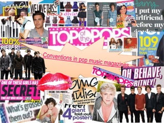
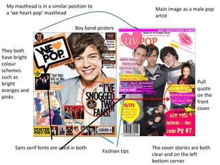
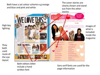
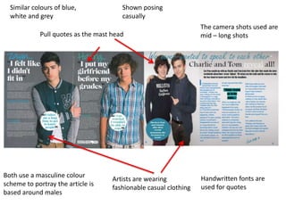
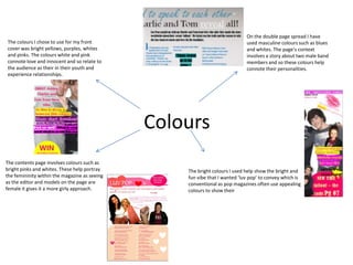
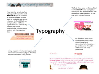
My masthead is in a similar position to
                                                           Main image as a male pop
 a ‘we heart pop’ masthead
                                                           artist

                                Boy band posters


They both
have bright
colour
schemes
such as
bright                                                                        Pull
oranges and                                                                   quote
pinks                                                                         on the
                                                                              front
                                                                              cover


     Sans serif fonts are used in both                    The cover stories are both
                                           Fashion tips
                                                          clear and on the left
                                                          bottom corner
The cover stories are
    Both have a set colour scheme e.g orange       clearly shown and stand
    and blue and pink and white                    out from the other
                                                   stories


High key                                                                    Images of
lighting                                                                    what is
                                                                            included
                                                                            inside the
                                                                            magazine

They
both
used
route of
the eye
layout
             Both editors letter
             include a hand                    Sans serif fonts are used for the
             written font                      page information
Similar colours of blue,             Shown posing
  white and grey                       casually
                                                                  The camera shots used are
            Pull quotes as the mast head                          mid – long shots


Both use a masculine colour                                       Handwritten fonts are
                                    Artists are wearing
scheme to portray the article is                                  used for quotes
                                    fashionable casual clothing
based around males
They are standing quite casually
  The images I have used are conventional                which connotes innocent and shows         I tried to make the models look enticing
  for a pop magazine as they convey the                  their youth.                              and by them smiling and looking happy it
  young and youth within the audience.                                                             give them a more enthusiastic and
                                                                                                   positive vibe.


The models I used are of the ages
16 -17 which is similar to the ages of
many pop artists featured in
magazines which is conventional as
                                                           Images
the audience can relate to them and
aspire to be like them.
                                                                                                       The female models I used are young
                                                                                                       and attractive which is conventional as
                                                                                                       it appeals more the target audience as
                                                                                                       they are of a similar age, they are
                 I have used mid shots for the front                                                   wearing casual but fashionable clothing
                 covers main image of the three boys,            There are shown wearing               which makes them look stylish and so
                 this is conventional as pop music                                                     the audience see them as role models
                                                                 fashionable and trendy clothing
                 magazines often portray the artist in                                                 and aspire to dress like them.
                 full display to show their emotions
                                                                 which shows they are modern
                 and outfits. For the double page                which the audience will take
                 spread I used a long shot as this               interest in and the male
                 showed the boys full bodies and their           percentage of my audience can
                 emotions.                                       relate to
I have used a route of the eye layout        I chose to put the masthead in the
     which is conventional as pop magazines       top left hand corner which is
     often use this to portray each piece of      where the audience are most
     information in key areas in which the        likely to look first concluding in the     I showed the cover story of my
     audience will notice it and take in the      name of the magazine becoming
                                                                                             magazine in the bottom right hand
     information.                                 familiar with them
                                                                                             corner. This is in a terminal area which
                                                                                             is conventional as it will become more
                                                                                             memorable with the reader as they will
                                                                                             see it last.


                                                    Layout
                                                                                           I placed my coverlines each side of the
                                                                                           images, this is conventional as it does not
                                                                                           block out too much of the main image but
The main image is in the centre of the
                                                                                           still shows enough for the cover lines to be
magazine page on the front cover which
                                                                                           clear and bright.
makes it bright and bold in the readers face to      The layout I used for my double
notify them of what the magazine will include.       page spread is conventional as
This is conventional as it shows the audience        it showed the models on the
who the magazine is featuring which will have        left page and the article on the
an influence on them buying it.                      left which looks neat and
                                                     ordered making it easier for the
                                                     audience to navigate
The Masthead uses the word
  ‘Luv’ which is associated with                                                       I included slang such as ‘OMG’ and ‘Luv’
  the age group as they use                                                            which is conventional for the magazine im
  ‘text’ language and so the                                                           producing. The target audience will be
  name is immediately eye                                                              familiar with this language and will
  catching to the reader.                                                              understand


                                         Language                                                  On my front cover one of my
                                                                                                   cover lines included ‘Michelle
                                                                                                   talks about her love life.’ the
The double page spread involved                                                                    younger generation will be
language such as ‘the boys we all know                                                             interested in these topics and
and love.. ‘ which is welcoming to the                                                             because a ‘celeb’ is talking
                                         I tried to use simple syntax and short
reader which is conventional as it                                                                 about it, it makes it more
                                         sentences, this way I am not boring my
creates a friendly atmosphere with the                                                             appealing, this is conventional
                                         audience but keeping them interested with
audience.                                                                                          as many pop magazines use
                                         snappy and quirky information to keep them
                                                                                                   celeb gossip to entice their
                                         enticed. This is conventional as pop
                                                                                                   audiences into reading their
                                         magazines are aimed at a young audience and
                                                                                                   magazines.
                                         so do not want complex and intellectual
                                         sentences.
On the double page spread I have
The colours I chose to use for my front                                      used masculine colours such as blues
cover was bright yellows, purples, whites                                    and whites. The page’s context
and pinks. The colours white and pink                                        involves a story about two male band
connote love and innocent and so relate to                                   members and so these colours help
the audience as their in their youth and                                     connote their personalities.
experience relationships.


                                               Colours
The contents page involves colours such as
bright pinks and whites. These help portray        The bright colours I used help show the bright and
the femininity within the magazine as seeing       fun vibe that I wanted ‘luv pop’ to convey which is
as the editor and models on the page are           conventional as pop magazines often use appealing
female it gives it a more girly approach.          colours to show their
The font I chose to use for the masthead
                                                                was ‘Gabriola’ which is simply but
I kept to similar fonts throughout                              not too plain. It is shown bright and bold
my magazine for example I used                                  to help show the brand idenity of ‘Luv
‘Broadway’ for my coverlines                                    Pop’ which is fun and exciting.
on my front cover and for a pull
quote on my double page spread.
I also used the ‘Gabriola’ font
for my masthead and for my
page numbers and names on my
contents page. This is
conventional as it familiarises the
audience with the magazines
style.                                             Typography
                                                                      For the Editors letter on the
                                                                      contents page I used a hand
                                                                      written font which is
                                                                      conventional as it gives a more
                                                                      personal touch to the reader
                                                                      and makes it look more
                                                                      professional
 For my magazine I tried to stick to plain, bold
 and modern fonts. This way it gives the whole
 magazine a stylish and funky persona

Question 1 conventions

  • 2.
    My masthead isin a similar position to Main image as a male pop a ‘we heart pop’ masthead artist Boy band posters They both have bright colour schemes such as bright Pull oranges and quote pinks on the front cover Sans serif fonts are used in both The cover stories are both Fashion tips clear and on the left bottom corner
  • 3.
    The cover storiesare Both have a set colour scheme e.g orange clearly shown and stand and blue and pink and white out from the other stories High key Images of lighting what is included inside the magazine They both used route of the eye layout Both editors letter include a hand Sans serif fonts are used for the written font page information
  • 4.
    Similar colours ofblue, Shown posing white and grey casually The camera shots used are Pull quotes as the mast head mid – long shots Both use a masculine colour Handwritten fonts are Artists are wearing scheme to portray the article is used for quotes fashionable casual clothing based around males
  • 5.
    They are standingquite casually The images I have used are conventional which connotes innocent and shows I tried to make the models look enticing for a pop magazine as they convey the their youth. and by them smiling and looking happy it young and youth within the audience. give them a more enthusiastic and positive vibe. The models I used are of the ages 16 -17 which is similar to the ages of many pop artists featured in magazines which is conventional as Images the audience can relate to them and aspire to be like them. The female models I used are young and attractive which is conventional as it appeals more the target audience as they are of a similar age, they are I have used mid shots for the front wearing casual but fashionable clothing covers main image of the three boys, There are shown wearing which makes them look stylish and so this is conventional as pop music the audience see them as role models fashionable and trendy clothing magazines often portray the artist in and aspire to dress like them. full display to show their emotions which shows they are modern and outfits. For the double page which the audience will take spread I used a long shot as this interest in and the male showed the boys full bodies and their percentage of my audience can emotions. relate to
  • 6.
    I have useda route of the eye layout I chose to put the masthead in the which is conventional as pop magazines top left hand corner which is often use this to portray each piece of where the audience are most information in key areas in which the likely to look first concluding in the I showed the cover story of my audience will notice it and take in the name of the magazine becoming magazine in the bottom right hand information. familiar with them corner. This is in a terminal area which is conventional as it will become more memorable with the reader as they will see it last. Layout I placed my coverlines each side of the images, this is conventional as it does not block out too much of the main image but The main image is in the centre of the still shows enough for the cover lines to be magazine page on the front cover which clear and bright. makes it bright and bold in the readers face to The layout I used for my double notify them of what the magazine will include. page spread is conventional as This is conventional as it shows the audience it showed the models on the who the magazine is featuring which will have left page and the article on the an influence on them buying it. left which looks neat and ordered making it easier for the audience to navigate
  • 7.
    The Masthead usesthe word ‘Luv’ which is associated with I included slang such as ‘OMG’ and ‘Luv’ the age group as they use which is conventional for the magazine im ‘text’ language and so the producing. The target audience will be name is immediately eye familiar with this language and will catching to the reader. understand Language On my front cover one of my cover lines included ‘Michelle talks about her love life.’ the The double page spread involved younger generation will be language such as ‘the boys we all know interested in these topics and and love.. ‘ which is welcoming to the because a ‘celeb’ is talking I tried to use simple syntax and short reader which is conventional as it about it, it makes it more sentences, this way I am not boring my creates a friendly atmosphere with the appealing, this is conventional audience but keeping them interested with audience. as many pop magazines use snappy and quirky information to keep them celeb gossip to entice their enticed. This is conventional as pop audiences into reading their magazines are aimed at a young audience and magazines. so do not want complex and intellectual sentences.
  • 8.
    On the doublepage spread I have The colours I chose to use for my front used masculine colours such as blues cover was bright yellows, purples, whites and whites. The page’s context and pinks. The colours white and pink involves a story about two male band connote love and innocent and so relate to members and so these colours help the audience as their in their youth and connote their personalities. experience relationships. Colours The contents page involves colours such as bright pinks and whites. These help portray The bright colours I used help show the bright and the femininity within the magazine as seeing fun vibe that I wanted ‘luv pop’ to convey which is as the editor and models on the page are conventional as pop magazines often use appealing female it gives it a more girly approach. colours to show their
  • 9.
    The font Ichose to use for the masthead was ‘Gabriola’ which is simply but I kept to similar fonts throughout not too plain. It is shown bright and bold my magazine for example I used to help show the brand idenity of ‘Luv ‘Broadway’ for my coverlines Pop’ which is fun and exciting. on my front cover and for a pull quote on my double page spread. I also used the ‘Gabriola’ font for my masthead and for my page numbers and names on my contents page. This is conventional as it familiarises the audience with the magazines style. Typography For the Editors letter on the contents page I used a hand written font which is conventional as it gives a more personal touch to the reader and makes it look more professional For my magazine I tried to stick to plain, bold and modern fonts. This way it gives the whole magazine a stylish and funky persona