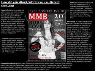
How did you attract/address your audience?                                                                   Fonts: With the fonts I used I found
                                                                                                              ones that were easy to read, as
 Front Cover                                                                                                  otherwise readers won’t want to
                                                                                                              read it if it isn’t clear. I used bold in
House style: By using red, black and                                                                          places to make them stand out as
white provides a neutral house style                                                                          the more important aspects, rather
which don’t hold connotations for                                                                             than the other information, I
being gender specific. This then                                                                              wanted my readers to read that
attracts both genders to buy my                                                                               first.
magazine. By using the bright colours
of white and red, instantly grabs the                                                                     Main Image: By using a female artist as
attention of the readers, whilst the                                                                      my front cover will guarantee that the
black helps make it look professional.                                                                    female readers will be interested as
In addition by using these 3 colours,                                                                     they will see her in many different
have connotations of being edgy and                                                                       forms, whether as an inspiration or
modern which is a stereotypical view                                                                      that they can relate to her. She is
held upon indie people.                                                                                   looking at the readers, inviting them in
                                                                                                          to read the magazine itself. By having
                                                                                                          the image in black and white, it goes
  Coverlines: With my coverlines I have                                                                   with the house style and creates a
  tried to appeal to both genders by                                                                      certain individualism of the artist,
  using a mix of artists to make a                                                                        which is one of the stereotypes
  balance between the two. Some of                                                                        associated with “indie” people of being
  them will obviously be attractive to                                                                    individual. Through my research I have
  both genders like the festivals one as                                                                  noticed that the majority of indie acts
  that is another stereotype associated                                                                   are non-groomed and the pictures of
  with “indie” people.                                                                                    them aren’t sexualised, which is what I
                                                                                                          tried to get across through the picture,
                                                                                                          with hardly any make-up on except the
                                                                                                          dark eyes, the clothing being everyday
                                                                                                          stuff and her hair being naturally blown
                                                                                                          by the wind all appeals to the readers.
Competitions/freebies: By using these freebies and competition will get my readers interested in my magazine
as they might have the chance to win a good prize or some free posters. I have also put anything relating to this
aspect behind a black background to highlight its importance especially the use of the flasher to really attract
my readers, as they will see this quickly when looking at the magazine cover.
How did you attract/address your audience?
Contents Page
House style: Carried on through with
my house style from my front cover to
keep up the professionalism and to           Main images: Here I have selected two
keep the non-gender based colours.           images to be in contents page, one
                                             being a male artist the other being a
                                             female band, to again to appeal to
                                             both genders. In both images the
                                             backgrounds are every simple pulling
                                             focus into the artists themselves. Also
                                             they are wearing simple stuff and
Fonts: With my fonts I used the              haven’t got loads of make-up on or
same as fonts as the front cover,            edits on the picture, making it a lot
making them very easy fonts to read,         natural.
I have put the titles of the articles in
capitals, to highlight that that is the
most important of the information.
                                              Language: For my contents page the
                                              language is informal, with a hint of
                                              colloquial but not too much. I haven't
Articles: I have tried to get a good          used standard English as the readers
mix of artists to appeal to different         are teenager and young adults
personal opinions and more                    interested in music, so to appeal to
importantly to both genders. I have           them I didn’t want to sound dull or
also opted to get a wide range of             boring hence being informal.
articles not just on artists, to get
some sub-interests off the readers,
like reviews of latest films, books,
and musical gadgets. Others that I
used are buskers and new bands alert
so the readers can relate to them or
be an inspirational guide for others.
How did you attract/address your audience?                                                                      Images: With the same
Double Page Spread                                                                                              format as the front cover
                                                                                                                by being in black and
                                                                                                                white and having the
                                                                                                                naturalistic feel to them.
                                                                                                                I’ve added more so the
Colours: Same colours as                                                                                        artist can appeal better to
other pages to keep with                                                                                        the readers and by adding
the non-biased colours to                                                                                       an acoustic guitar shows
appeal to both genders.                                                                                         that she is definitely indie
                                                                                                                pop/rock and has a good
                                                                                                                interest in music, so she
 Standfirst: This acts                                                                                          basically fits in with a lot
 like a summary of                                                                                              of the stereotypes to do
 the artist and as a                                                                                            with “indie” people.
 teaser for readers, as
 the font is bigger
 anyway, so they
 would read it first                                                                                            Pull-Quote: I put this pull-
 before the actual                                                                                              quote on the pictures, to
 article, it should get                                                                                         attract the readers into
 them more                                                                                                      reading the article, give
 interested in the                                                                                              them a little teaser before
 article itself.                                                                                                they read the article. By
                                                                                                                placing it on the pictures
                                                                                                                makes it stand out more
                                                                                                                rather than have it on the
                                                                                                                article page. This
                            Language: In this article I have used informal and very colloquial language, to     guarantees that the
                            appeal to the younger audience. By using this sort of language will be more         readers will notice it.
                            interesting for my target audience as it makes them feel more involved in the
                            conversation and more closer to the artist themselves as they can actually relate
                            to her more as they are getting to know them her better. Which is the main thing
                            most fans want from their artists.

Evaluation Question 5

  • 1.
    How did youattract/address your audience? Fonts: With the fonts I used I found ones that were easy to read, as Front Cover otherwise readers won’t want to read it if it isn’t clear. I used bold in House style: By using red, black and places to make them stand out as white provides a neutral house style the more important aspects, rather which don’t hold connotations for than the other information, I being gender specific. This then wanted my readers to read that attracts both genders to buy my first. magazine. By using the bright colours of white and red, instantly grabs the Main Image: By using a female artist as attention of the readers, whilst the my front cover will guarantee that the black helps make it look professional. female readers will be interested as In addition by using these 3 colours, they will see her in many different have connotations of being edgy and forms, whether as an inspiration or modern which is a stereotypical view that they can relate to her. She is held upon indie people. looking at the readers, inviting them in to read the magazine itself. By having the image in black and white, it goes Coverlines: With my coverlines I have with the house style and creates a tried to appeal to both genders by certain individualism of the artist, using a mix of artists to make a which is one of the stereotypes balance between the two. Some of associated with “indie” people of being them will obviously be attractive to individual. Through my research I have both genders like the festivals one as noticed that the majority of indie acts that is another stereotype associated are non-groomed and the pictures of with “indie” people. them aren’t sexualised, which is what I tried to get across through the picture, with hardly any make-up on except the dark eyes, the clothing being everyday stuff and her hair being naturally blown by the wind all appeals to the readers. Competitions/freebies: By using these freebies and competition will get my readers interested in my magazine as they might have the chance to win a good prize or some free posters. I have also put anything relating to this aspect behind a black background to highlight its importance especially the use of the flasher to really attract my readers, as they will see this quickly when looking at the magazine cover.
  • 2.
    How did youattract/address your audience? Contents Page House style: Carried on through with my house style from my front cover to keep up the professionalism and to Main images: Here I have selected two keep the non-gender based colours. images to be in contents page, one being a male artist the other being a female band, to again to appeal to both genders. In both images the backgrounds are every simple pulling focus into the artists themselves. Also they are wearing simple stuff and Fonts: With my fonts I used the haven’t got loads of make-up on or same as fonts as the front cover, edits on the picture, making it a lot making them very easy fonts to read, natural. I have put the titles of the articles in capitals, to highlight that that is the most important of the information. Language: For my contents page the language is informal, with a hint of colloquial but not too much. I haven't Articles: I have tried to get a good used standard English as the readers mix of artists to appeal to different are teenager and young adults personal opinions and more interested in music, so to appeal to importantly to both genders. I have them I didn’t want to sound dull or also opted to get a wide range of boring hence being informal. articles not just on artists, to get some sub-interests off the readers, like reviews of latest films, books, and musical gadgets. Others that I used are buskers and new bands alert so the readers can relate to them or be an inspirational guide for others.
  • 3.
    How did youattract/address your audience? Images: With the same Double Page Spread format as the front cover by being in black and white and having the naturalistic feel to them. I’ve added more so the Colours: Same colours as artist can appeal better to other pages to keep with the readers and by adding the non-biased colours to an acoustic guitar shows appeal to both genders. that she is definitely indie pop/rock and has a good interest in music, so she Standfirst: This acts basically fits in with a lot like a summary of of the stereotypes to do the artist and as a with “indie” people. teaser for readers, as the font is bigger anyway, so they would read it first Pull-Quote: I put this pull- before the actual quote on the pictures, to article, it should get attract the readers into them more reading the article, give interested in the them a little teaser before article itself. they read the article. By placing it on the pictures makes it stand out more rather than have it on the article page. This Language: In this article I have used informal and very colloquial language, to guarantees that the appeal to the younger audience. By using this sort of language will be more readers will notice it. interesting for my target audience as it makes them feel more involved in the conversation and more closer to the artist themselves as they can actually relate to her more as they are getting to know them her better. Which is the main thing most fans want from their artists.