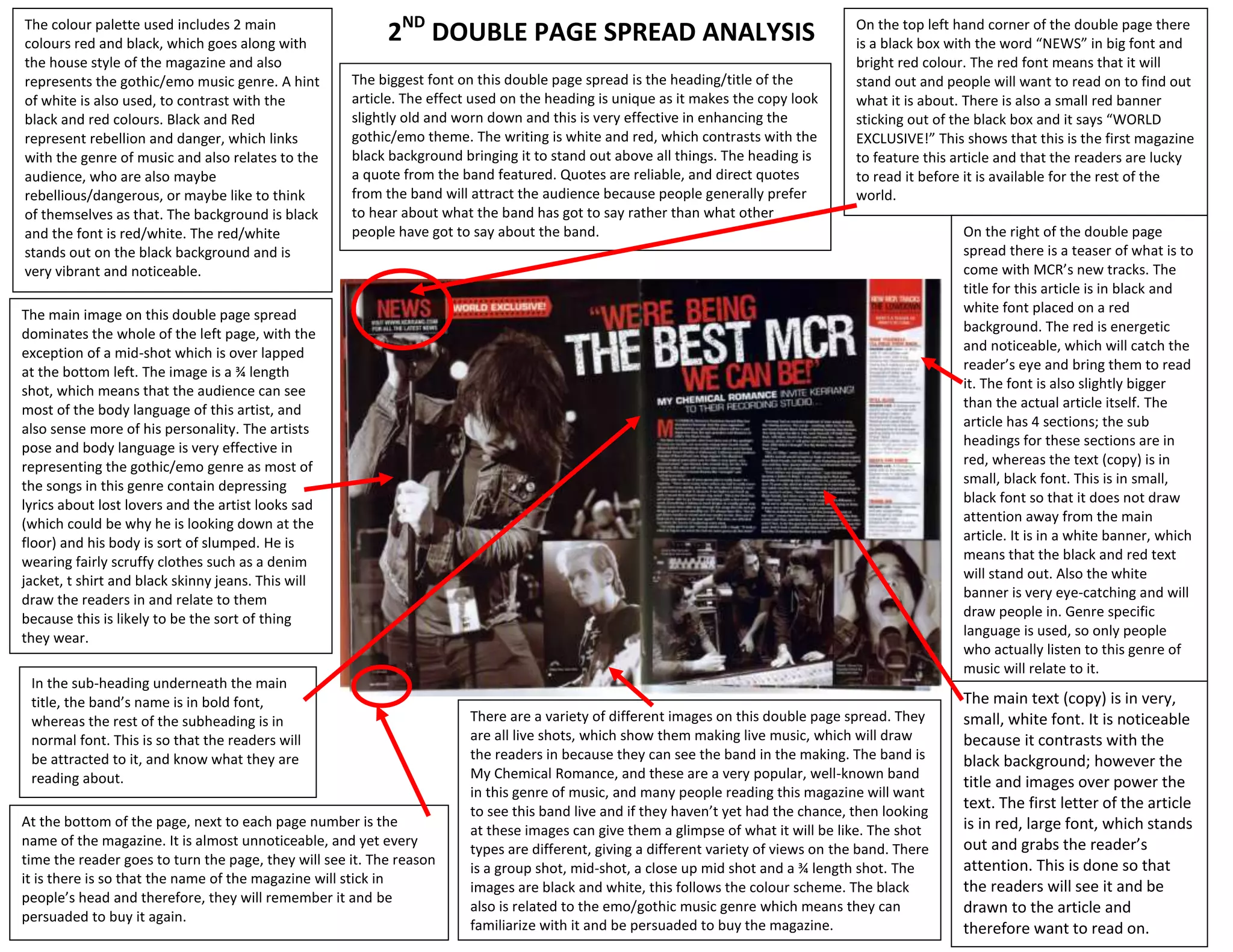
The document analyzes the design elements of a double page magazine spread promoting an emo/gothic music band. The spread uses red and black colors that match the genre and magazine style. Images of the band live dominate one page to engage readers who want to see the band perform. Text sections on the other page are designed in red and black fonts on white backgrounds to stand out from the black page and draw attention to key information without distracting from the main article. Overall, the layout strategically uses colors, images, and formatting to match the target audience's interests and effectively promote the band and music genre.


![Vibe Coding vs. Spec-Driven Development [Free Meetup]](https://cdn.slidesharecdn.com/ss_thumbnails/vibecodingvsspecdrivendevelopment-251209105622-43f455e7-thumbnail.jpg?width=640&height=640&fit=bounds)


