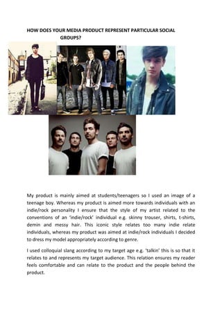
Develops:                                                                             Challenges:
I developed and outstood the                                                          My media products challenge magazine
general conventions of a front                                                        conventions as it does not completely
cover image, as many front                                                            conform to a conventional colour
covers use either a mid-shot or a                                                     scheme, I decided to add gold to be
close-up shot of their model                                                          different and creative; relating to the
whereas I used a high angle shot                                                      audience I am trying to target.
this challenged yet also develops
conventions because it is not                                                         My additionally photos also challenge
usual. I decided to use this shot                                                     conventions as I decided to use a
even though it has connotations                                                       Polaroid template to enable the photo
to vulnerability I believe it                                                         to stand out without conventionally
relates to my target audience.                                                        giving it a boarder/outline.
High-angle shots in reality relate                                                    I also added a competition which is not
to my target audience as they                                                         generally seen within music magazines.
are assumed to have vulnerable
personalities      e.g.      indie                                                    In comparison to other music magazine
individuals – these individuals in                                                    it may be added that my masthead does
specifically are addressed to                                                         not conventionally match as it is grey
have troubled lives.                                                                  and white, whilst many other music
                                                                                      magazine mastheads are conventionally
                                                                                      black and white or red and white.


 Uses:
 My media product conformed to the conventions of a music magazine through using tag lines, announcing tour dates, new
 music, albums, and competitions e.c.t.

 My product conformed by using conventions of many music magazine: masthead, tag-lines, ‘plus’, main cover lines, general
 cover-lines and a barcode.

 My product uses the conventionally colours of many music magazines red and black which is regularly seen in ‘NME’.

 When researching current music magazines I realised they used a variety of text font and sizes, so I put this in the action. I
 made cover-lines bigger than the information underneath in order for the cover-line to stand out. I also realised many
 magazines used drop shadows and outlines to make the text stand out more.

 Many magazines use additional pictures to relate to their cover lines and to relate to the audience so I decided to add extra
 photos of concerts; capturing individual band members.
COLOUR SCHEME: RED,
              TAG LINE     BLACK, WHITE, GOLD


MASTHEAD


                                                 FRONT COVER
                                                 IMAGE

MAIN COVER-
LINE/ STORY
LINE
                                                 ADDITIONAL
                                                 PHOTOS


COVER-LINE


       TAG-LINE
                  ‘PLUS’             BARCOD
                                     E
My media product challenges conventions of music
magazines as in general when the masthead/logo is
repeated on the contents page it is usually the same size
and colour e.c.t whereas mine is a different colour and size
this I s because I had problems with the layout and colour                   My research of many music magazines
scheme. The grey and white mast head did not contrast well                   help me conclude that many contents
and did not stand out therefore it would not been effective                  pages apply the date/month to the
to use the exact same logo on the front cover.                               contents page.


                                                                                                      My magazine
                                                                                                      uses a variety
                                                                                                      of text, as do
                                                                                                      other
                                                                                                      magazines, in
                                                                                                      order create
Looking at many                                                                                       proportion,
NME magazines I                                                                                       clarity and to
saw the band                                                                                          address a
index feature                                                                                         certain
arise many times                                                                                      layout.
so I decided to
add this feature
to my contents
page.


                                                                                                      Whilst
                                                                                                      researching
                                                                                                      many music
                                                                                                      magazines I came
                                                                                                      across a
My magazine                                                                                           ‘subscribe’
conforms as it                                                                                        feature in which
uses many                                                                                             many magazines
photos like many                                                                                      use. This Is ideal
magazines…                                                                                            for customers as
                                                                                                      it saves them
                                                                                                      money when
                                                                                                      subscribing to
 My magazine has a page                                                                               the magazine
                                     My product used the conventions of
 number which many                                                                                    monthly
                                     a music magazine by numbering
 magazines however it                photos and stories in order to direct
 challenges and develops             the reader.
 conventions as it is situated
 at the bottom left of the
 page which is unusual.
Many                            However I believe my information on the artists                                 The mode of
magazines                       develops conventions as it is usually not boxed at the                          address is
take the                        bottom left of the page; it is usually fee text                                 usually
convention of                   underneath the title just before the article is written.                        informal and
having                                                                                                          colloquial
information                                                                                                     slang to allow
about the                                                            The image usually used is of a rather      the reader to
artists who                                                          large scale and on the left hand side      feel
feature in the                                                       of the page.                               comfortable
                  Many double page spreads are in
article for                                                                                                     e.g. ‘talkin’
                  columns this is to ensure that the
those who do
                  article has structure and that it is
not know the
                  easier to read.
artists.


                                                                                                   The name of the artist
 Many double page spreads in                                                                       whom features in the
 magazines usually use a large image               Pull-quotes are regularly used on               article is usually in colour.
 which usually uses direct address,                double page spreads. This is usually
 the models looking directly at the                a quote from the celebrity from the
 camera.                                           interview.


                                                  I consider my pull-quotes to challenge
                                                  the conventions of many double page
                                                  spreads as it is smaller than many
                                                  other pull-quotes
Many magazines I researched had
                                                  an information box on the side of
                                                  their article to disclose extra
                                                  information about gigs, artists and
                                                  new albums e.c.t.


The artist or band featuring the article usually headlines the top of the
double page spread informing the reader who they are going to read about.
Text is usually bold and contrasts with another colour in order for it to be
headlining and eye-catching. One convention that is used a lot within
magazines is stretched text. I consider to have developed this convention to
have stretched the text more than the average, enabling the text to stand
out and appeal to the reader more.
HOW DOES YOUR MEDIA PRODUCT REPRESENT PARTICULAR SOCIAL
           GROUPS?


My product is mainly aimed at students/teenagers so I used an image of a
teenage boy. Whereas my product is aimed more towards individuals with an
indie/rock personality I ensure that the style of my artist related to the
conventions of an ‘indie/rock’ individual e.g. skinny trouser, shirts, t-shirts,
demin and messy hair. This iconic style relates too many indie relate
individuals, whereas my product was aimed at indie/rock individuals I decided
to dress my model appropriately according to genre.

I used colloquial slang according to my target age e.g. ‘talkin’ this is so that it
relates to and represents my target audience. This relation ensures my reader
feels comfortable and can relate to the product and the people behind the
product.
In my first draft I used a colour scheme of blue and white I developed this as I
considered it to be only directed towards males; therefore I developed my
colour scheme according to conventions addressing both sexes. I also used a
variety of images of both females and males in order to address my mixed
gender target audience.

Whereas my media product is mainly aimed at teenagers/students I ensured
that the product was of an affordable price at £2.00. As according to recent
research, results showed that individuals are more likely to buy my product if
there was a free gift attached or competitions inside. As according to research I
ensured to add this feature to my magazine.

As according to research on magazine conventions, I learnt that these
conventions can be used to attract your audience. For example using certain
colours to contrast and to use bold lettering attracts customers to look at your
product.

My target audience are individuals who have a genuine interest in music
therefore are likely to attend gigs and festivals so I addressed this concept
through applying gig photographs of artists and band performing.

What have you learnt about technologies from the process of constructing
this product?

                 When we first started using Photoshop I did not understand
                 how to use it and was not confident at using it either as I
                 never used it before. However as I became more familiar
                 with the software and looked at many tutorials on how to use

                       it on YouTube I became more confident in
                       understanding how the software worked and how to
                       use it.


Airbrushing - Photoshop tutorial:
http://www.youtube.com/watch?v=ZM1ldtI4bFI

Removing spots/imperfections – Photoshop tutorial:
http://www.youtube.com/watch?v=AQvtsy_7uxQ
However I did not edit photos to an extent where they looked fake and tacky. I
also did not want to edit photos as much as my target audience are individuals
who are all about the music therefore having a perfect image is not as
important. However I ensure my models had a clean cut and natural image by
using the patch tool, selecting and focal blur tool.


I extracted a photo from Google to display how I would have used the patch,
spot healing tool and healing brush tool.


I also used the crop tool to adjust my proportionately and accordingly. For
example I had a photograph in which I only wanted to capture one individual
out of a selection of people within the photo. The crop tool was sufficient to
crop the other individuals out of the image leaving the one individual that I
needed for my product.

                                        To address my target audience
                                        efficiently I used Survey Monkey to
                                        create a questionnaire in which I sent
                                        to many people to feedback. I used
                                        this information in order to construct a
                                        media product in which was
conventional and address my audience successfully. At first I was unfamiliar
with the programme as I have never used it before and was finding it difficult,
once my questionnaire was finished to upload it onto my blog for viewers to
answer. The website was a little hard to use however I persevered with it and
finally uploaded my questionnaire onto my blog.

                       Furthermore when taking my photographs for my
                       media product I ensured I used a professional camera,
                       a canon Eos 650d.

                        I have never used a professional/ high tech camera
                        before so I used the internet to Google the product to
                        see effectively how to use it when taking photographs.
I also asked my friend who knew a lot about cameras who is also a media
        student to help me use it effectively when taking pictures.

        What is more I used social media to upload my media product and get
        feedback from my target audience in order to develop my magazine
       and how to improve my product and make it look more professional
       and conventional to real media products.

                           I also used Blogger and Slide share to upload my
                           coursework. This was a viral source which allowed
                           my product and work to be easily viewed by
           teachers enabling them to give me feedback. However it was also
           used to allow my target audience to upload comments on how I
           could improve my product by answering a questionnaire e.c.t
Looking back at your preliminary task, what do you feel like you have learnt
in progression from it to the full product?

Looking back at my preliminary task my research on real media products has
allowed me to understand how real media products address their target
audience through using conventions and features.

Additionally I have learnt how to use Photoshop effectively to create a
professional looking product. Whereas when I created my student magazine I
used Microsoft Publisher therefore my product was not as professional as it
could have been because Publisher does not have the developed and
professional tools in which Photoshop has.

Looking back at my preliminary task I believe it helped me understand how to
use house colours in order to relate and address your target audience. When
creating my preliminary task I used the house colours of blue, red and black as
it related to our schools uniform colour therefore relating to the audience I
was trying to address.

I have also learnt how to develop and adjust photographs accordingly to genre
and professionalism. Previously I did not use the crop tool and I also stretched
my images to much so they did not look professional, this caused the quality to
be affected. Whereas when creating my full product I understood that I had to
ensure that my images were professional and was not un-focused or stretched.

Media evaluation

  • 1.
    Develops: Challenges: I developed and outstood the My media products challenge magazine general conventions of a front conventions as it does not completely cover image, as many front conform to a conventional colour covers use either a mid-shot or a scheme, I decided to add gold to be close-up shot of their model different and creative; relating to the whereas I used a high angle shot audience I am trying to target. this challenged yet also develops conventions because it is not My additionally photos also challenge usual. I decided to use this shot conventions as I decided to use a even though it has connotations Polaroid template to enable the photo to vulnerability I believe it to stand out without conventionally relates to my target audience. giving it a boarder/outline. High-angle shots in reality relate I also added a competition which is not to my target audience as they generally seen within music magazines. are assumed to have vulnerable personalities e.g. indie In comparison to other music magazine individuals – these individuals in it may be added that my masthead does specifically are addressed to not conventionally match as it is grey have troubled lives. and white, whilst many other music magazine mastheads are conventionally black and white or red and white. Uses: My media product conformed to the conventions of a music magazine through using tag lines, announcing tour dates, new music, albums, and competitions e.c.t. My product conformed by using conventions of many music magazine: masthead, tag-lines, ‘plus’, main cover lines, general cover-lines and a barcode. My product uses the conventionally colours of many music magazines red and black which is regularly seen in ‘NME’. When researching current music magazines I realised they used a variety of text font and sizes, so I put this in the action. I made cover-lines bigger than the information underneath in order for the cover-line to stand out. I also realised many magazines used drop shadows and outlines to make the text stand out more. Many magazines use additional pictures to relate to their cover lines and to relate to the audience so I decided to add extra photos of concerts; capturing individual band members.
  • 2.
    COLOUR SCHEME: RED, TAG LINE BLACK, WHITE, GOLD MASTHEAD FRONT COVER IMAGE MAIN COVER- LINE/ STORY LINE ADDITIONAL PHOTOS COVER-LINE TAG-LINE ‘PLUS’ BARCOD E
  • 3.
    My media productchallenges conventions of music magazines as in general when the masthead/logo is repeated on the contents page it is usually the same size and colour e.c.t whereas mine is a different colour and size this I s because I had problems with the layout and colour My research of many music magazines scheme. The grey and white mast head did not contrast well help me conclude that many contents and did not stand out therefore it would not been effective pages apply the date/month to the to use the exact same logo on the front cover. contents page. My magazine uses a variety of text, as do other magazines, in order create Looking at many proportion, NME magazines I clarity and to saw the band address a index feature certain arise many times layout. so I decided to add this feature to my contents page. Whilst researching many music magazines I came across a My magazine ‘subscribe’ conforms as it feature in which uses many many magazines photos like many use. This Is ideal magazines… for customers as it saves them money when subscribing to My magazine has a page the magazine My product used the conventions of number which many monthly a music magazine by numbering magazines however it photos and stories in order to direct challenges and develops the reader. conventions as it is situated at the bottom left of the page which is unusual.
  • 4.
    Many However I believe my information on the artists The mode of magazines develops conventions as it is usually not boxed at the address is take the bottom left of the page; it is usually fee text usually convention of underneath the title just before the article is written. informal and having colloquial information slang to allow about the The image usually used is of a rather the reader to artists who large scale and on the left hand side feel feature in the of the page. comfortable Many double page spreads are in article for e.g. ‘talkin’ columns this is to ensure that the those who do article has structure and that it is not know the easier to read. artists. The name of the artist Many double page spreads in whom features in the magazines usually use a large image Pull-quotes are regularly used on article is usually in colour. which usually uses direct address, double page spreads. This is usually the models looking directly at the a quote from the celebrity from the camera. interview. I consider my pull-quotes to challenge the conventions of many double page spreads as it is smaller than many other pull-quotes
  • 5.
    Many magazines Iresearched had an information box on the side of their article to disclose extra information about gigs, artists and new albums e.c.t. The artist or band featuring the article usually headlines the top of the double page spread informing the reader who they are going to read about. Text is usually bold and contrasts with another colour in order for it to be headlining and eye-catching. One convention that is used a lot within magazines is stretched text. I consider to have developed this convention to have stretched the text more than the average, enabling the text to stand out and appeal to the reader more.
  • 6.
    HOW DOES YOURMEDIA PRODUCT REPRESENT PARTICULAR SOCIAL GROUPS? My product is mainly aimed at students/teenagers so I used an image of a teenage boy. Whereas my product is aimed more towards individuals with an indie/rock personality I ensure that the style of my artist related to the conventions of an ‘indie/rock’ individual e.g. skinny trouser, shirts, t-shirts, demin and messy hair. This iconic style relates too many indie relate individuals, whereas my product was aimed at indie/rock individuals I decided to dress my model appropriately according to genre. I used colloquial slang according to my target age e.g. ‘talkin’ this is so that it relates to and represents my target audience. This relation ensures my reader feels comfortable and can relate to the product and the people behind the product.
  • 7.
    In my firstdraft I used a colour scheme of blue and white I developed this as I considered it to be only directed towards males; therefore I developed my colour scheme according to conventions addressing both sexes. I also used a variety of images of both females and males in order to address my mixed gender target audience. Whereas my media product is mainly aimed at teenagers/students I ensured that the product was of an affordable price at £2.00. As according to recent research, results showed that individuals are more likely to buy my product if there was a free gift attached or competitions inside. As according to research I ensured to add this feature to my magazine. As according to research on magazine conventions, I learnt that these conventions can be used to attract your audience. For example using certain colours to contrast and to use bold lettering attracts customers to look at your product. My target audience are individuals who have a genuine interest in music therefore are likely to attend gigs and festivals so I addressed this concept through applying gig photographs of artists and band performing. What have you learnt about technologies from the process of constructing this product? When we first started using Photoshop I did not understand how to use it and was not confident at using it either as I never used it before. However as I became more familiar with the software and looked at many tutorials on how to use it on YouTube I became more confident in understanding how the software worked and how to use it. Airbrushing - Photoshop tutorial: http://www.youtube.com/watch?v=ZM1ldtI4bFI Removing spots/imperfections – Photoshop tutorial: http://www.youtube.com/watch?v=AQvtsy_7uxQ
  • 8.
    However I didnot edit photos to an extent where they looked fake and tacky. I also did not want to edit photos as much as my target audience are individuals who are all about the music therefore having a perfect image is not as important. However I ensure my models had a clean cut and natural image by using the patch tool, selecting and focal blur tool. I extracted a photo from Google to display how I would have used the patch, spot healing tool and healing brush tool. I also used the crop tool to adjust my proportionately and accordingly. For example I had a photograph in which I only wanted to capture one individual out of a selection of people within the photo. The crop tool was sufficient to
  • 9.
    crop the otherindividuals out of the image leaving the one individual that I needed for my product. To address my target audience efficiently I used Survey Monkey to create a questionnaire in which I sent to many people to feedback. I used this information in order to construct a media product in which was conventional and address my audience successfully. At first I was unfamiliar with the programme as I have never used it before and was finding it difficult, once my questionnaire was finished to upload it onto my blog for viewers to answer. The website was a little hard to use however I persevered with it and finally uploaded my questionnaire onto my blog. Furthermore when taking my photographs for my media product I ensured I used a professional camera, a canon Eos 650d. I have never used a professional/ high tech camera before so I used the internet to Google the product to see effectively how to use it when taking photographs. I also asked my friend who knew a lot about cameras who is also a media student to help me use it effectively when taking pictures. What is more I used social media to upload my media product and get feedback from my target audience in order to develop my magazine and how to improve my product and make it look more professional and conventional to real media products. I also used Blogger and Slide share to upload my coursework. This was a viral source which allowed my product and work to be easily viewed by teachers enabling them to give me feedback. However it was also used to allow my target audience to upload comments on how I could improve my product by answering a questionnaire e.c.t
  • 10.
    Looking back atyour preliminary task, what do you feel like you have learnt in progression from it to the full product? Looking back at my preliminary task my research on real media products has allowed me to understand how real media products address their target audience through using conventions and features. Additionally I have learnt how to use Photoshop effectively to create a professional looking product. Whereas when I created my student magazine I used Microsoft Publisher therefore my product was not as professional as it could have been because Publisher does not have the developed and professional tools in which Photoshop has. Looking back at my preliminary task I believe it helped me understand how to use house colours in order to relate and address your target audience. When creating my preliminary task I used the house colours of blue, red and black as it related to our schools uniform colour therefore relating to the audience I was trying to address. I have also learnt how to develop and adjust photographs accordingly to genre and professionalism. Previously I did not use the crop tool and I also stretched my images to much so they did not look professional, this caused the quality to be affected. Whereas when creating my full product I understood that I had to ensure that my images were professional and was not un-focused or stretched.