Download as PDF, PPTX


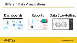
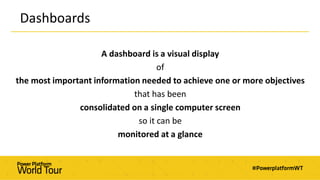
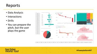
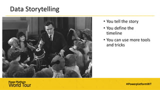


This document provides guidance on best practices for data visualization. It begins by defining different types of data visualizations like dashboards, reports, and data storytelling. It then discusses principles of human perception and visualization guidelines. The document outlines best practices for specific visual types like time series, categorical data, maps, and use of color. It emphasizes that effective visualization requires both art and science skills to tell clear and meaningful stories with data.


![Screw You Bullet Points! [Rest in Peace]](https://cdn.slidesharecdn.com/ss_thumbnails/screwyoubulletpoints-151208171941-lva1-app6892-thumbnail.jpg?width=640&height=640&fit=bounds)