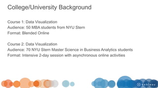
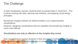
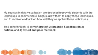
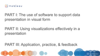
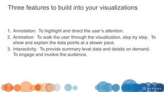
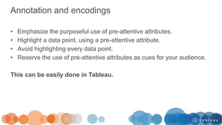
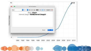
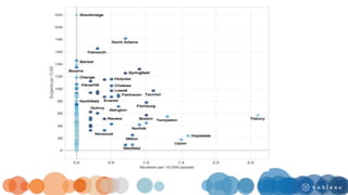
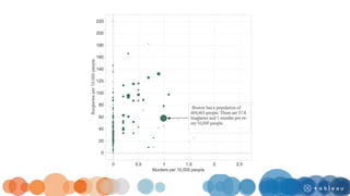
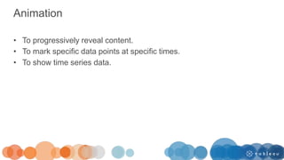
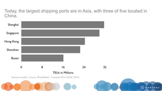
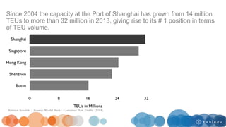
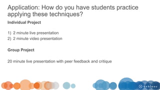
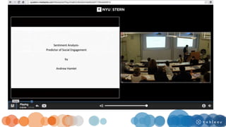
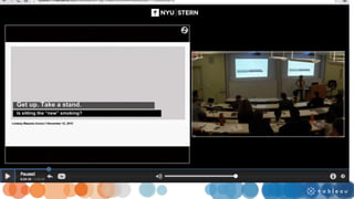
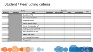
This document summarizes a presentation by Kristen Sosulski on teaching data visualization. It discusses her background and experience teaching courses on data visualization to MBA and analytics students. It outlines challenges in teaching students to design visualizations that provide insights rather than just being visually appealing. The presentation covers using software like Tableau to incorporate annotation, animation, and interactivity into visualizations. It also provides techniques for effectively presenting visualizations, including identifying key takeaways, putting findings in context, and presenting key numbers. Students practice these skills through individual and group projects involving live and video presentations with feedback.
The future of assessment: five principles, five targets for 2025Jisc
How will assessment change over the next 5-10 years? Will it change to be more accessible? More secure? Will it be more closely aligned to what a learner will experience in their career? Will automation play a role? Will we see more and new forms of continuous or even lifelong assessment?
Jisc has recently launched a report, The future of assessment: five principles, five targets for 2025, that explores these issues and what role Education 4.0 technology might play in changes to assessment.
A presentation by Andy McGregor, director of edtech, Jisc.
Learning Analytics (or: The Data Tsunami Hits Higher Education)Simon Buckingham Shum
Keynote Address to The Impact of Higher Education: Addressing the Challenges of the 21st CenturyEuropean Association for Institutional Research (EAIR) 35th Annual Forum 2013, Erasmus University, Rotterdam, the Netherlands, 28-31 August 2013. http://www.eair.nl/forum/rotterdam
What organisational variables support a positive student digital experience?Tabetha Newman
Talk for ALTC 2018 using Jisc student insight survey data, including factor analysis to identify most important factors in explaining the student digital experience.
Anna Chiaretta Lavatelli, Trilce Navarrete, Elena Villaespesa, Emily Robbins
The Media Production and Branding SIG and the Data and Insights SIG have combined efforts to develop an online survey to gain an understanding of the scope of production and goals of production in museums today. In this talk we will present an analysis of the collected data from the survey to gain understanding of the state of video production in museums.
User Experience Showcase lightning talks - University of EdinburghNeil Allison
Lightning talk slide decks from a University of Edinburgh User Experience event held 13 October 2017. Topics: User needs, Web strategy, Digital Standards, Edinburgh Global Experience Language, Current student UX case study.
An institutional perspective on analytics that focusses on a particular tool developed using an agile methodology to visualise learner behaviours in MOOCs via Sankey diagrams.
UCD and Technical Communication: The Inevitable MarriageChris LaRoche
Presentation about the increasingly collaboration and needs of technical communication to work with and become competent within UX and UCD methods and principles.
Inclusive Practices in Project Management: Leveraging Digital Frameworks for Diverse Minds
Tuesday 30 April 2024
APM North West Network Conference, Synergies Across Sectors
Presented by:
Caroline Keep, PhD researcher Digitization in Education Organisation, University of Central Lancaster
Conference overview:
https://www.apm.org.uk/community/apm-north-west-branch-conference/
Content description:
This talk aimed to provide actionable insights and strategies for embedding inclusivity into the fabric of project management, thereby unlocking the new dimensions of productivity and innovation in the digital sphere.
The main conference objective was to promote the Project Management profession with interaction between project practitioners, APM Corporate members, current project management students, academia and all who have an interest in projects.
This presentation covers how to combine traditional qualitative methods and user research approaches to satisfy your clients and add value to findings.
This proposal of work contains details and samples of the user centric design process I follow. I have been trying to find a good graph that represents the process, but at the end I have decided to make my own! ;)
How are students’ expectations and experiences of their digital environment c...Jisc
Speakers:
Ruth Drysdale, senior co-design manager, Jisc
Natalie Norton, head of technology enhanced learning and digital literacies, University of Winchester
Universities and colleges are increasingly working in partnership with their students on the development of their digital environment. But do we really know how students are using technology and how are their expectations changing? In this workshop we will hear from staff and their students on how they are using the Jisc student and staff digital experience tracker to support the development of their digital student experience.
Tell me what you want and I’ll show you what you can have: who drives design of technology for learning?
Associate Professor Sue Cobb
Interactive Technologies and Games (ITAG) Conference 2014
Health, Disability and Education
Dates: Thursday 16 October 2014 - Friday 17 October 2014
Location: The Council House, NG1 2DT, Nottingham, UK
Thinking about delivering a class session online? This workshop introduces you to best practices in delivering live online courses using web conference software used at the W.R. Berkley Innovation Lab @NYUSTERN. You’ll learn how to conduct a live online class discussion and how best to develop content for this teaching format. You will also receive tips for the teaching setup and configuration.
This is a tutorial on editing charts in ADOBE ILLUSTRATOR.
We can easily remove the chart junk elements such as borders and tick marks. It’s simple to edit text as well such as titles, scales, x and y axis labels.
Download this PDF file at http://bit.ly/illustrator_ex to follow along with the example or work with your own. The charts should be saved as a PDF file before you open them in Illustrator. The example used is a chart created in R.
The Future of Business Intelligence: Data VisualizationKristen Sosulski
Kristen Sosulski
The future of business intelligence: Data Visualization
How can data visualization be used as a platform to reveal intelligent insights and help business analysts make timely decisions? In this talk, Kristen Sosulski will discuss the opportunities for personalized, location aware, context relevant, and platform independent information visualizations as a toolkit for business analysts.
The workshop will provide examples and strategies for the design of the experiential online education. Participants will explore what makes a great education experience and define the attributes that contribute to a great online learning experience.
Eager to create some short mini lectures for your course? These slides are from a workshop that we offered on creating short teaching videos in the studio. We provided a studio tour, tips, demonstration, and discussion of considerations for teaching & learning.
Why use video in your classes? Introduction to some concept or phenomena
Demonstration of problem solving
Illustration of a technique or approach
Inclusion of alternative viewpoints or perspectives
Evaluation of the source (the video content itself)
Creating Effective Visuals for Teaching and PresentationKristen Sosulski
Topics:
-Overview of presentation design and readability.
-Common presentation pitfalls.
-Best practices for using and delivering charts and graphs in your presentations.
-Examples of effective visual communication through the use of data visualization.
Designing Experiential Learning: A field exampleKristen Sosulski
The design of an experimental learning course in operations management for MBA students. The course is called Ops in NYC and leverages NYC as the classroom and we hold class meetings at the site of real businesses.
Seven things to highlight about your teaching practiceKristen Sosulski
January is a good time to reflect on your accomplishments from the previous academic year.
Many of us in academia have to provide annual reports on our progress as faculty.
From personal experience, I feel that we undersell the work we do as teachers.
Here are some things that are worth highlighting with regard to your teaching practice.
Learn how to avoid errors made by data visualization software. By checking for the five common errors made by data visualization software, you’ll be on your way to creating data visualizations like a pro.
Chatty Kathy - UNC Bootcamp Final Project Presentation - Final Version - 5.23...John Andrews
SlideShare Description for "Chatty Kathy - UNC Bootcamp Final Project Presentation"
Title: Chatty Kathy: Enhancing Physical Activity Among Older Adults
Description:
Discover how Chatty Kathy, an innovative project developed at the UNC Bootcamp, aims to tackle the challenge of low physical activity among older adults. Our AI-driven solution uses peer interaction to boost and sustain exercise levels, significantly improving health outcomes. This presentation covers our problem statement, the rationale behind Chatty Kathy, synthetic data and persona creation, model performance metrics, a visual demonstration of the project, and potential future developments. Join us for an insightful Q&A session to explore the potential of this groundbreaking project.
Project Team: Jay Requarth, Jana Avery, John Andrews, Dr. Dick Davis II, Nee Buntoum, Nam Yeongjin & Mat Nicholas
Show drafts
volume_up
Empowering the Data Analytics Ecosystem: A Laser Focus on Value
The data analytics ecosystem thrives when every component functions at its peak, unlocking the true potential of data. Here's a laser focus on key areas for an empowered ecosystem:
1. Democratize Access, Not Data:
Granular Access Controls: Provide users with self-service tools tailored to their specific needs, preventing data overload and misuse.
Data Catalogs: Implement robust data catalogs for easy discovery and understanding of available data sources.
2. Foster Collaboration with Clear Roles:
Data Mesh Architecture: Break down data silos by creating a distributed data ownership model with clear ownership and responsibilities.
Collaborative Workspaces: Utilize interactive platforms where data scientists, analysts, and domain experts can work seamlessly together.
3. Leverage Advanced Analytics Strategically:
AI-powered Automation: Automate repetitive tasks like data cleaning and feature engineering, freeing up data talent for higher-level analysis.
Right-Tool Selection: Strategically choose the most effective advanced analytics techniques (e.g., AI, ML) based on specific business problems.
4. Prioritize Data Quality with Automation:
Automated Data Validation: Implement automated data quality checks to identify and rectify errors at the source, minimizing downstream issues.
Data Lineage Tracking: Track the flow of data throughout the ecosystem, ensuring transparency and facilitating root cause analysis for errors.
5. Cultivate a Data-Driven Mindset:
Metrics-Driven Performance Management: Align KPIs and performance metrics with data-driven insights to ensure actionable decision making.
Data Storytelling Workshops: Equip stakeholders with the skills to translate complex data findings into compelling narratives that drive action.
Benefits of a Precise Ecosystem:
Sharpened Focus: Precise access and clear roles ensure everyone works with the most relevant data, maximizing efficiency.
Actionable Insights: Strategic analytics and automated quality checks lead to more reliable and actionable data insights.
Continuous Improvement: Data-driven performance management fosters a culture of learning and continuous improvement.
Sustainable Growth: Empowered by data, organizations can make informed decisions to drive sustainable growth and innovation.
By focusing on these precise actions, organizations can create an empowered data analytics ecosystem that delivers real value by driving data-driven decisions and maximizing the return on their data investment.
Opendatabay - Open Data Marketplace.pptxOpendatabay
Opendatabay.com unlocks the power of data for everyone. Open Data Marketplace fosters a collaborative hub for data enthusiasts to explore, share, and contribute to a vast collection of datasets.
First ever open hub for data enthusiasts to collaborate and innovate. A platform to explore, share, and contribute to a vast collection of datasets. Through robust quality control and innovative technologies like blockchain verification, opendatabay ensures the authenticity and reliability of datasets, empowering users to make data-driven decisions with confidence. Leverage cutting-edge AI technologies to enhance the data exploration, analysis, and discovery experience.
From intelligent search and recommendations to automated data productisation and quotation, Opendatabay AI-driven features streamline the data workflow. Finding the data you need shouldn't be a complex. Opendatabay simplifies the data acquisition process with an intuitive interface and robust search tools. Effortlessly explore, discover, and access the data you need, allowing you to focus on extracting valuable insights. Opendatabay breaks new ground with a dedicated, AI-generated, synthetic datasets.
Leverage these privacy-preserving datasets for training and testing AI models without compromising sensitive information. Opendatabay prioritizes transparency by providing detailed metadata, provenance information, and usage guidelines for each dataset, ensuring users have a comprehensive understanding of the data they're working with. By leveraging a powerful combination of distributed ledger technology and rigorous third-party audits Opendatabay ensures the authenticity and reliability of every dataset. Security is at the core of Opendatabay. Marketplace implements stringent security measures, including encryption, access controls, and regular vulnerability assessments, to safeguard your data and protect your privacy.
1. Teaching with Tableau: Showing
insights and telling data-driven stories
Professor Kristen Sosulski
2. Today’s Speaker
Kristen Sosulski, Ed.D
Associate Professor
Director of Education
W. R. Berkley Innovation Lab
New York University
Leonard N. Stern School of
Business
3. Bio
Dr. Kristen Sosulski develops innovative practices for higher education as the
Director of Education for the NYU Stern W.R. Berkley Innovation Lab. She also
teaches MBA students and executives data visualization, R programming, and
operations management as an Associate Professor at NYU’s Stern School of
Business.
As a leading expert on data visualization, Kristen regularly consults, delivers
seminars, and leads workshops on data visualization techniques and best
practices. You can find her speaking on the subject at events like Social Media
Week NYC and to organizations like the National Association of Pubic Opinion,
Digital Analytics Association, and the National Economic Research Associates.
Follow Kristen on Twitter at @sosulski and learn more at
http://kristensosulski.com
4. College/University Background
Course 1: Data Visualization
Audience: 50 MBA students from NYU Stern
Format: Blended Online
Course 2: Data Visualization
Audience: 70 NYU Stern Master Science in Business Analytics students
Format: Intensive 2-day session with asynchronous online activities
5. The Challenge
In data visualization courses, students learn to present data in visual form. This
involves working with data, learning new software, and applying visual design
principles.
Sometimes imaging software by default enables us to create beautiful
visualizations.
However, designing visualizations that are readable and provide key insights is
much more difficult.
Visualizations are only as effective as the insights they reveal.
How can professors support students in their process of creating purposeful and
interpretable visualizations and use they as powerful tools in their presentations?
6. As visualization designers we are “melding the
skills of computer science, statistics, artistic
design, and storytelling.”
K. Cukier (2010). Show me: New ways of visualizing data.
http://www.economist.com/node/15557455
8. My courses in data visualization are designed to provide students with the
techniques to communicate insights, allow them to apply those techniques,
and to receive feedback on how well they’ve applied those techniques.
This done through 1) demonstration 2) practice & application 3)
critique and 4) expert and peer feedback.
9. PART I: The use of software to support data
presentation in visual form
PART II: Using visualizations effectively in a
presentation
PART III: Application, practice, & feedback
10. PART I: The use of software to support data
presentation in visual form
PART II: Using visualizations effectively in a
presentation
PART III: Application, practice, & feedback
11. Three features to build into your visualizations
1. Annotation: To highlight and direct the user’s attention.
2. Animation: To walk the user through the visualization, step by step. To
show and explain the data points at a slower pace.
3. Interactivity: To provide summary level data and details on demand.
To engage and involve the audience.
12. Annotation and encodings
• Emphasize the purposeful use of pre-attentive attributes.
• Highlight a data point, using a pre-attentive attribute.
• Avoid highlighting every data point.
• Reserve the use of pre-attentive attributes as cues for your audience.
This can be easily done in Tableau.
13.
14.
15.
16.
17. Animation
• To progressively reveal content.
• To mark specific data points at specific times.
• To show time series data.
21. Trend animation
• Trend animation shows all trends simultaneously.
• It works best for presentation rather than analysis.
• It is limited to approximately 200 data points on a single display.
22.
23. • Use the pages card
• Drag year (or time-
based data) to the
pages card
• Filter time series data
using the filters card
• Determine the speed
(slow, normal, or fast)
• Select color of
encodings from the
marks card.
24. Trace animation
• Trace animation uses fade-in bubbles/links to show the direction of
the flow of data points and history.
• Traces work best for analysis when the result is not cluttered.
• Beware of too many data points and visual clutter.
• Consider small multiples for analysis rather than animation.
25.
26. • Select Show History
from the Pages marks
card.
• Select show history for
all
• Select show Marks
• Select a color and
transparency for the
marks
27. Transition animation
• Short animation keeps users in context during view/data
transitions.
• These usually follow an action, such as connect, select,
or explore, for interactive displays.
28.
29. • Click to highlight the
data point that you
want to keep
highlighted
• Works nicely when
combined with trace
animation for time
series data where
categories change
over time.
30. Interactivity
• To enable audience interaction and involvement
• To filter details on demand
• To traverse the data set to compare and contrast different
attributes.
33. PART I: The use of software to support data
presentation in visual form
PART II: Using visualizations effectively in a
presentation
PART III: Application, practice, and feedback
35. Technique #1: Identify the key takeaway
• Provide clear takeaways for each visualization.
• Write it in the notes or the title of the slide.
36. Today, the largest shipping ports are in Asia, with three of five located in
China.
Kristen Sosulski | Source: World Bank - Container Port Traffic (2014).
36
37. Technique #2: Put your findings in context
• Provide a context for your findings.
• Without a context, data is meaningless.
• In the example on the next slide, an insight is communicated that puts
the number one position (Shanghai) in context and provides an
explanation for the rise to the top.
38. Since 2004 the capacity at the Port of Shanghai has grown from 14 million
TEUs to more than 32 million in 2013, giving rise to its # 1 position in terms
of TEU volume.
Kristen Sosulski | Source: World Bank - Container Port Traffic (2014).
39. Technique #3: Present the key numbers
• It is important to summarize the key findings and present the numbers
in a meaningful context that is comprehensible to the audience.
• For example, it may be more helpful to show a percentage change
from year to year when presenting an increase over time, rather than
with absolute numbers.
• Specifically, if the core point is to compare the change from year to
year, percentage change is an effective metric.
40. 20,172.3
23,640.2 24,416
25,816.8 26,433.5
2010 2011 2012 2013 2014
China’s total import and export value from 2010 to 2014 (in billion Yuan)
There was a 31% increase from 2010 to 2014
Kristen Sosulski | Source: Statistica (2014).
41. Summary
By incorporating these tips students can tell better stories with their data and use
visualizations to reveal important insights about the data
Identify the takeaway Contextualize findings Present the key numbers
42. PART I: The use of software to support data
presentation in visual form
PART II: Using visualizations effectively in a
presentation
PART III: Application, practice, and feedback
43. Application: How do you have students practice
applying these techniques?
Individual Project
1) 2 minute live presentation
2) 2 minute video presentation
Group Project
20 minute live presentation with peer feedback and critique
56. Instructor - Assessment Rubric: Individual Project
Criteria
0 = Lacking, 3 =
Excellent
Creative Idea 3
Compelling Idea 3
Well-conceived idea 2
Clear proof of concept 2
Visuals targeted @ appropriate audience 1
Data represented accurately 2
Data represented adequately 2
Visuals exhibit good design principles 3
Well-designed slide presentation 3
Persuasive / compelling presentation 2
57. Observed Pitfalls
• Over time limit (#4)
• Talked over visuals without explicitly
referencing them (#8)
• Looking at the board
• Lack of audience engagement (#1)
• Lack of a clear vision or story (#1, #7)
• Too much information (#5)
61. • 20 minutes
• 10 minute Q & A
• All team members must be present, but all do
not have to present. Peer feedback and
ratings will be factored into your grade.
• Review the presentation testing & delivery
standards
62. • Is sitting the new smoking?
• Refugee crisis: Is it really that bad?
• Measuring good neighbors: Social cohesion index
• Do you believe in UFO sightings?
• Use movie compass to pick your next flick.
• Making decisions about student loan debt and college
• Election outcome prediction. Can twitter data help?
• How does AirBnB affect branded hotels?
• Twitter and the response to current events
Group project topics
63. Audience guidelines and role
• No laptops
• Respond to prompts by the presenters (if
applicable)
• Take note of what worked well and areas for
refinement
• Share you comments and feedback with the
team during the critique
64. Critique – 10 minutes
• How well did the team tell a story with data?
• How well did the team select visual displays to
present their data?
• How well did the team do at communicating key
insights?
• What are the key takeaways from the
presentation?
• What worked well? Do you have suggestions for
future work?
68. What worked well?
• Concise stories
• Use of data and visuals as evidence
• Questions or prompts for the audience
• Dynamic presenters
• Interesting data and presentation of that data
• Data points were put in context
• Provided reference points or points of comparison
69. Interesting in learning more and keeping in touch?
Go to my website and sign up for my mailing list at:
http://bit.ly/datavisupdates
You’ll immediately receive access to:
“Ten common pitfalls for presentations and data
visualizations?
70. Upcoming Talks
May 16th: Digital Analytics Association - Engaged
Storytelling with Information Visualization: Techniques
for Audience and Presenter Driven Stories
November 16th: Plot Com. The Plot.ly Conference
The total value of Chinese imports and exports hit $3.87trillion (£2.45trillion) in 2012 – edging past the $3.82trillion (£2.44trillion) trade registered by the US.
6261.2
Plan the key elements of your presentation
Storyboard
Design. Refine the storyboard information using graphics, videos, pictures, etc as appropriate. Select theme.
Build Aggregate information in PowerPoint. Add talking points to the notes section of your PowerPoint
Rehearse, test, and revise