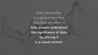
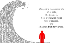
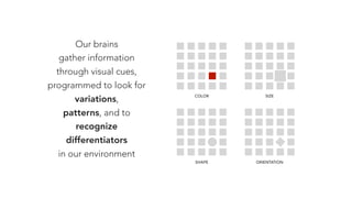
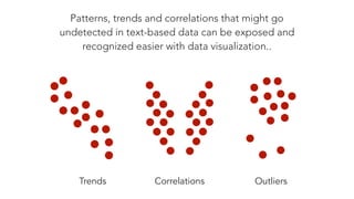
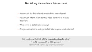
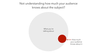
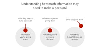
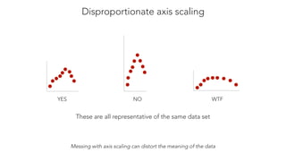
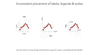
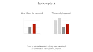
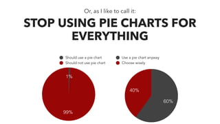
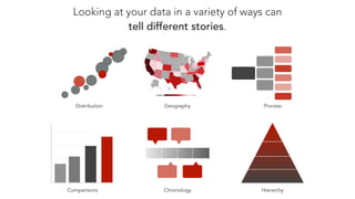
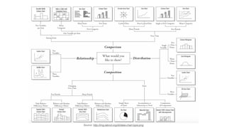
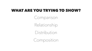
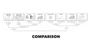
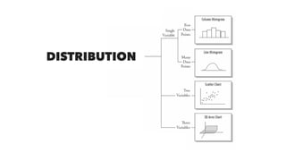
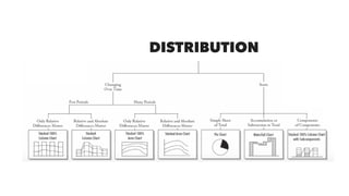
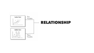
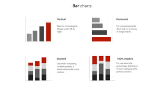
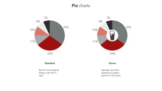
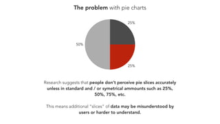
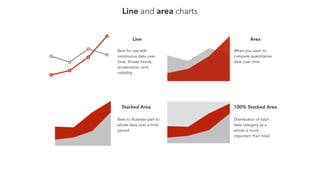
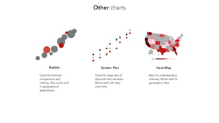
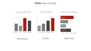
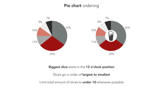
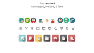
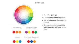
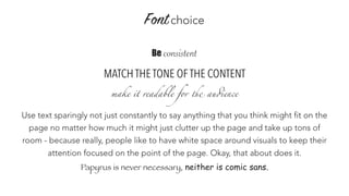
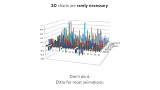
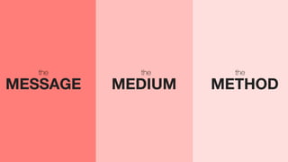
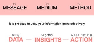
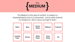
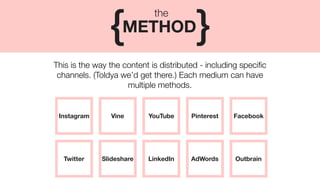
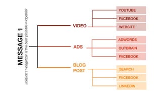
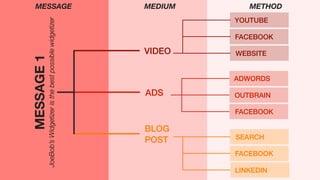
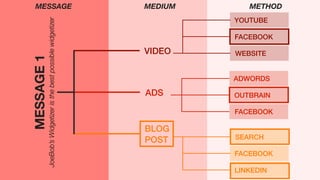
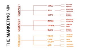
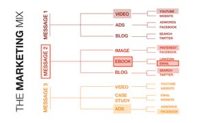
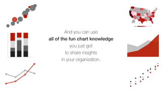
DATA
MARKETING
driven
Erin Robbins | GinzaMetrics
@texasgirlerin | erin@ginzametrics.com
GETTING THE MOST OUT OF YOUR DATA
WHAT ARE WE TALKING ABOUT & WHY?
DATA VISUALIZATION
‣ What is it
‣ Common mistakes
‣ Choosing the right visual
‣ Making the right visual look less crappy
MAKING SENSE OF YOUR MARKETING
‣ Defining market, message, method, medium
‣ Using them to gain strategic insights
ON THE
AGENDA
Data visualization
is a general term that
describes any effort to
help people understand
the significance of data
by placing it
in a visual context.
We need to make sense of a
lot of data.
The trouble is,
there are varying types,
tons of sources,
and
channels that don’t share.
Excellence in statistical
graphics consists of
complex ideas
communicated with
clarity, precision, and
efficiency.
“
“- Edward Tufte, 

The Visual Display of Quantitative Information
SIMPLY PUT, YOUR
data
IS ONLY AS USEFUL AS ITS ABILITY TO
find
OR
tell
A
story
Our brains
gather information
through visual cues,
programmed to look for
variations,
patterns, and to
recognize
differentiators
in our environment
COLOR SIZE
ORIENTATIONSHAPE
Patterns, trends and correlations that might go
undetected in text-based data can be exposed and
recognized easier with data visualization..
Trends Correlations Outliers
COMMON
IN DATA VISUALIZATION
mistakes
‣ How much do they already know about the subject?
‣ How much information do they need to know to make a
decision?
‣ What level of detail is necessary?
‣ Are you using icons and symbols that everyone understands?
Did you know that 5% of the population is colorblind?
(1 in 12 men and 1 in 200 women.)
http://colorlab.wickline.org/colorblind/colorlab/
Not taking the audience into account
Not understanding how much your audience
knows about the subject?
What you’re
talking about
How much
your audience
knows about it
Understanding how much information they
need to make a decision?
Information
you’re giving
them
What they need to
make a decision
What they need
to make a
decision
Information you’re
giving them
What they
thought they’d be
getting
What you gave them
Disproportionate axis scaling
YES NO WTF
Messing with axis scaling can distort the meaning of the data
These are all representative of the same data set
Inconsistent placement of labels, legends & scales
Lable
Label Title
Label
Label
Title
Label
Label
Title
It’s not cute to move things around from visual to visual - just distracts the reader.
Isolating data
Good to remember when building your own visuals
as well as when viewing other people’s.
What it looks like happened What actually happened
CHOOSING THE
VISUAL
correct
Title
99%
1%
Should use a pie chart
Should not use pie chart Title
40%
60%
Use a pie chart anyway
Choose wisely
Or, as I like to call it:
STOP USING PIE CHARTS FOR
EVERYTHING
Looking at your data in a variety of ways can
tell different stories.
Comparisons Chronology Hierarchy
ProcessGeography
0
5
10
15
20
0 3 6 9 12Distribution
Source: http://img.labnol.org/di/data-chart-type.png
WHAT ARE YOU TRYING TO SHOW?
Comparison
Relationship
Distribution
Composition
COMPARISON
DISTRIBUTION
DISTRIBUTION
RELATIONSHIP
Bar charts
Vertical Horizontal
Stacked 100% Stacked
Best for chronological.
Always order left to
right.
For comparisons that
don’t rely on timelines
or longer labels.
Use when comparing
multiple parts to a
whole where total count
matters.
For use when the
percentage distribution
of each category is the
primary concern.
Pie charts
7%
8%
10%
11%
29%
35%
7%
8%
10%
11%
29%
35%
Standard
Best for chronological.
Always order left to
right.
Donut
Typically used when
displaying a graphic
element in the center.
The problem with pie charts
Research suggests that people don’t perceive pie slices accurately
unless in standard and / or symetrical ammounts such as 25%,
50%, 75%, etc.
This means additional “slices” of data may be misunderstood by
users or harder to understand.
50%
25%
25%
Line and area charts
50
100
150
200
April May June July
0
50
100
150
200
April May June July
0
25
50
75
100
April May June July
Area
Stacked Area 100% Stacked Area
Best to illustrate part to
whole data over a time
period
Distribution of each
data category as a
whole is more
important than total
0
25
50
75
100
April May June July
Line
Best for use with
continuous data over
time. Shows trends,
acceleration, and
volatility
When you want to
compare quantitative
data over time
Other charts
0
5
10
15
20
0 3 6 9 12
0
5
10
15
20
0 3 6 9 12
Bubble
Good for nominal
comparisons and
ranking. Also works well
in geographical
applications.
Scatter Plot
Good for large sets of
data with two variables.
Works well with data
over time.
Heat Map
Best for understanding
intensity. Works well for
geographic data.
Bars per capita
Bars per capita
Heatmaps for Search
Sometimes people tell me heat maps
aren’t applicable to search… They’re
wrong.
Paying attention to usage of specific
keywords across various geographies
can give you a leg up over the
competition.
Things to consider include:
‣ Search volume comparison
‣ Competition score
‣ Rank
‣ Competitor rank
MAKING
VISUALS
LESS
crappy
Order data correctly
Bourbon Gin Scotch Whiskey
General popularity of drinks
Gin Bourbon Whiskey Scotch
How often I drink them
9pm8pm 10pm7pm
Timeline of what I was drinking
Gin
Bourbon
Whiskey
Scotch
Alphabetically By value Sequentially
Pie chart ordering
7%
8%
10%
11%
29%
35%
7%
8%
10%
11%
29%
35%
Slices go in order of largest to smallest
Biggest slice starts in the 12 o’clock position
Limit total amount of slices to under 10 whenever possible
Use consistent
iconography, symbols, & fonts
Color use
‣ Use color sparingly
‣ Choose complementary colors
‣ Use no more than five colors in
a visual
‣ Choose colors than match the
subject matter and tone of the
visual
Fontchoice
Be consistent
MATCH THE TONE OF THE CONTENT
make it readable for the audience
Use text sparingly not just constantly to say anything that you think might fit on the
page no matter how much it might just clutter up the page and take up tons of
room - because really, people like to have white space around visuals to keep their
attention focused on the point of the page. Okay, that about does it.
Papyrus is never necessary, neither is comic sans.
CALLOUTS
Use
highlights
and other jazz-hands types of
font tricks as little as possible.
Basically never.
3D charts are rarely necessary.
Don’t do it.
Ditto for most animations.
FINDING A
IN YOUR DATA
story
The greatest value of a
picture is when
it forces us to
notice what we never
expected to see.
“
“- John Tukey
MEDIUMMESSAGE METHOD
thethe the
INSIGHTSDATA ACTION
using to gather & turn them into
MEDIUMMESSAGE METHOD
thethe the
is a process to view your information more effectively
This is your specific value proposition, campaign
message, tagline, feature, benefit, etc.
MESSAGE{ }
the
New

Feature
Product
Release
Got
Milk
Nachos
>
Pizza
Back to
School
Sale
The Medium is the type of content. A medium is
characterized by how it is consumed - not by what channel
it is shared on. (Don’t worry we’ll get to that.)
MEDIUM{ }
the
Video Blog
Preso/
Slides
Webinar Podcast
Ebook
White
Paper
Case
Study
Ad
Landing

Page
This is the way the content is distributed - including specific
channels. (Toldya we’d get there.) Each medium can have
multiple methods.
METHOD{ }
the
Instagram Vine YouTube Pinterest Facebook
Slideshare LinkedIn AdWords OutbrainTwitter
Sell $100K in JoeBob’s Widgetizers in October
Message 1: JoeBob’s Widgetizer is the best possible widgetizer
Message 2: Enjoy 50% off JoeBob’s Widgetizer at PubCon
Message 3: Widgetizers are way better than Widgetozers
CAMPAIGN MESSAGES
MESSAGE1
JoeBob’sWidgetizeristhebestpossiblewidgetizer VIDEO
ADS
YOUTUBE
FACEBOOK
WEBSITE
ADWORDS
OUTBRAIN
FACEBOOK
SEARCH
FACEBOOK
LINKEDIN
BLOG
POST
MESSAGE1
JoeBob’sWidgetizeristhebestpossiblewidgetizer VIDEO
ADS
YOUTUBE
FACEBOOK
WEBSITE
ADWORDS
OUTBRAIN
FACEBOOK
SEARCH
FACEBOOK
LINKEDIN
BLOG
POST
MESSAGE MEDIUM METHOD
MESSAGE1
JoeBob’sWidgetizeristhebestpossiblewidgetizer VIDEO
ADS
YOUTUBE
FACEBOOK
WEBSITE
ADWORDS
OUTBRAIN
FACEBOOK
SEARCH
FACEBOOK
LINKEDIN
BLOG
POST
MESSAGE MEDIUM METHOD
MESSAGE1MESSAGE2MESSAGE3
VIDEO
ADS
BLOG
IMAGE
EBOOK
BLOG
VIDEO
CASE
STUDY
ADS
YOUTUBE
WEBSITE
ADWORDS
FACEBOOK
SEARCH
TWITTER
SEARCH
TWITTER
LINKEDIN
EMAIL
PINTEREST
FACEBOOK
YOUTUBE
WEBSITE
EMAIL
WEBSITE
ADWORDS
FACEBOOK
THEMARKETINGMIX
MESSAGE1MESSAGE2MESSAGE3
VIDEO
ADS
BLOG
IMAGE
EBOOK
BLOG
VIDEO
CASE
STUDY
ADS
YOUTUBE
WEBSITE
ADWORDS
FACEBOOK
SEARCH
TWITTER
SEARCH
TWITTER
LINKEDIN
EMAIL
PINTEREST
FACEBOOK
YOUTUBE
WEBSITE
EMAIL
WEBSITE
ADWORDS
FACEBOOK
THEMARKETINGMIX
The 4th M : MARKET
You can overlay your
message, medium, and method
data geographically to
understand how different cities
and regions respond to
various messages, campaigns,
or marketing channels.
Using
Medium, Method, Message, & Market
allows you to gather & share insights
that maximize what works without
dismissing channels, messaging, or distribution
based on inaccurate data views.
And you can use
all of the fun chart knowledge
you just got
to share insights
in your organization.
0
5
10
15
20
0 3 6 9 12
0
5
10
15
20
0 3 6 9 12
0
25
50
75
100
April May June July
0
25
50
75
100
Thank you
Erin Robbins | GinzaMetrics
@texasgirlerin | erin@ginzametrics.com
Deck will be available on Slideshare at
slideshare.net/ginzametrics

Data Driven Marketing